Anil
10/8/2010 01:55 | Hi I tried the quick form web part ,everything is working fine except that recipient email is not working .I tried with a sample email address and i didn't receive the form ,is there anything we need to configure to make the email working. |
|
Anil
10/8/2010 02:07 | Sorry my bad.our outgoing email is not configured yet.This is really a nice webpart |
|
Urs Christen
11/17/2010 16:24 | Super Web Part!! Einen kleinen Verbesserungsvorschlag h�tten wir dennoch anzubringen. Wir setzen das Teil im MOSS 2007 ein. Schwierigkeiten bereiten die Pflichtfelder. Angenommen, wir wollen auf der Seite mit dem Webpart noch einen anderen Webpart einf�gen, erscheint bei den Pflichtfelder die Meldung, dass invalid data nicht gespeichert werden kann.
Gr�sse Urs Christen |
|
David A
11/30/2010 18:58 | Another fine web part! Is there a way to optionally set the sender email as the person logged in? It would also be nice to include text in the email that is not on the form. (in my case text tags that manipulate the helpdesk system) |
|
Juerg
12/2/2010 16:02 | David,
we now have added the
- {usermail} placeholder (to provide the current user�s e-mail address),
- a new static �S� field input type that can be used to enter �static� text
- and the new �E-Mail Template� field to optionally allow you to freely design your outgoing e-mail message body (see description above).
|
|
Mike Ruffle
12/9/2010 16:56 | I have this in a test environment at the moment using an evaluation copy and it is working excellently. I have found how to email multiple recipients which is a bonus. What I would like to know is there anyway of capturing the data for viewing? |
|
Juerg
12/9/2010 17:02 | Mike,
would you like to capture the data in a Sharepoint List (in this case every form would need its own matching List) or just a text-based Log file ? |
|
Mike Ruffle
12/9/2010 17:26 | Preferably in a sharepoint list so that we can create a view from the captured data similar to the way data is captured from a custom list that is set up as a Form in sharepoint (hope that makes sense)? |
|
GaryM
12/9/2010 21:02 | Hi, is there any way to highlight the Completion Message (size, color etc) to make it more obvious to the user that they have made a successful post, Thanks. |
|
Juerg
12/9/2010 21:15 | GaryM,
yes, by adding HTML to the "Completion Message" box as eg.
<span style='font:18pt verdana;color:red'>Your message has been sent! Thank you.</span> |
|
GaryM
12/9/2010 23:17 | Thanks Juerg, much appreciated |
|
Mike Ruffle
12/22/2010 15:23 | Hi Juerg.
I refer to my previos posting ( Mike Ruffle 12/9/2010 16:56 ) about capturing submitted data in a sharepoint list. Is this possible?
|
|
Doris
12/22/2010 16:16 | Alternatively, would it be possible to redirect away from the form altogether and just show the message so there is no doubt the message was submitted successfully? |
|
Juerg
12/22/2010 17:06 | Mike,
this is currently not possible but we will add this feature to the next release (scheduled for mid January) |
|
Juerg
12/23/2010 18:34 | Doris,
we have now added the new �Page Redirection� setting which allows you to enter the URL of the target page for redirection after form submission.
Please re-download the updated Zip file, extract and then replace the DLL, followed by an �iisreset� command if you placed the DLL in c:\windows\assembly. |
|
Doris
2/6/2011 13:06 | Hi Juerg, did you have an opportunity to work on the request above to have the information saved to a list? Great idea! |
|
Juerg
2/7/2011 11:30 | Doris,
not yet, but this feature will be added to the next release (due by the end of February) |
|
Tony Robins
2/10/2011 14:32 | Hi Juerg,
just trying out this and it works great. Just 1 slight annoyance. The E-mail Template is very basic and all the text just concatonates into 1 continuous line. Is there any way to create a more pleasing looking e-mail template. |
|
Juerg
2/10/2011 15:18 | Tony,
you can actually embed HTML tags into the E-Mail template and thus add line breaks.
Example:
This is some static text<br>
Firstname={First Name}<br>
Lastname={Last Name} |
|
Mike
2/22/2011 13:21 | Hi Juerg.
Is it possible to use a drop-down and populate it from a sharepoint list? For instance, if I have a sharepoint list of 50-items already created can I pull this list into Quick Form rather than rewriting/copy-pasting the items into a Quick Form drop-down? |
|
Tom Wright
3/1/2011 17:11 | Any plans to allow attachments to forms? |
|
Aidan Dunsdon
3/2/2011 11:45 | Hi Juerg. Will this work with an anonymous access sharepoint site in SP 2007? I wonder if adding list integratiopn will preventing it working on anon sites. We tried a webpart from another vendor that didnt work in anon sites for this reason. We need a form like this for our external anon acccess site. I understand that MS fixed this in 2010 but we neeed it for a 2007 installation. Thanks. |
|
Juerg
3/2/2011 18:39 | Aidan,
the current version of the �Quick Form� web part does not use Sharepoint Lists (eg. it just sends the data to one or more e-mail recipients). We will add a feature in the next release to also allow to store the submitted data in a Sharepoint List. We aim to also make this available for anonymous users (by adding the data to the List using �elevated privileges�, eg. using the Sharpoint application pool account acting on behalf of the user). |
|
Juerg
3/2/2011 19:09 | Tom,
we will be going to add this feature to the next release (scheduled for the end of March).
|
|
Marco
5/4/2011 14:31 | Hi Juerg, great webpart (bought it). I've to recommendations for optimization:
- Additional field where the text "please enter a value " for empty mandatory fields could be overwritten
- If a page contains the webpart and mandatory fields are defined, these fields must be filled in order to checkin the page (otherwise an error message occures).
regards Marco |
|
Carlos
5/4/2011 20:41 | Is it possible to add a field to grab the current user logged into Sharepoint instead of having to enter their name manually? |
|
Juerg
5/5/2011 09:46 | Carlos,
yes, if you set up your own e-mail template (via the web part�s �E-Mail Template� setting) you then can embed the following placeholders:
{usermail} current user's e-mail address
{username} current user's name
{uid} current user's logon name
This will automatically be filled in by the web part so the (authenticated) user will not have to manually fill out a �Name� field. |
|
Abbas
5/21/2011 22:09 | Any plans to allow attachments to forms?? |
|
Shawn
6/9/2011 23:10 | I am testing out this form and I entered the column break with a # but it did not do so. Here's my entry:
Phone Number=T12;#;No. of PCs=T4;
Any reason you see that it wouldn't work? |
|
Juerg
6/10/2011 09:36 | Shawn,
can you quickly check the web part�s version number by opening the web part�s tool pane and looking it up at the top ? It should read 1.0.12 or 1.0.13
Please note that this feature was recently added on May 13.
If you have an older version, please re-download the updated Zip file, extract and then replace the DLL, |
|
Dave K
8/5/2011 23:51 | Great web part! One thing I have run into is the ability to add a static field to a list, is this possible? I am trying to write the Title of the new list item as well as the username and email of the person submitting, but they dot populate in the list it seems unless they are on the form. Also, the S option does not seem to like using the special placeholders such as {username}. Also, is there a way to specific the border color as a hex color? For example border:5px solid orange; works as expected, however border:5px # ffffcc or color:#ffffcc doesn�t seem to work. Thanks so much for all the great tools! |
|
Juerg
8/8/2011 14:03 | Dave K,
we have now added the capability to have also the �static text� submit its value to the List.
It now also accepts the {usermail}, {username} and {uid} placeholders.
Regarding the CSS border: Please note that the proper CSS syntax for borders is: border:5px solid #ffffcc
Please re-download the updated Zip file, extract and then replace the DLL, followed by an �iisreset� command if you placed the DLL in c:\windows\assembly. |
|
Dave K
8/8/2011 14:31 | Worked like a champ! Thanks so much for the great products and outstanding support! |
|
Ron
8/12/2011 22:36 | Is there a way to post multiple attachments, or will it work with multiple attachment fields? We are going to use this for a whislteblower contact form and would like the users to not have to zip multiple attachments into a folder. Otherwise it is working great in testing!! |
|
Juerg
8/15/2011 15:17 | Ron, we have now added the capability to place multiple attachment fields on the form. (a single �multiple file upload control� will be considered for a future release due to its complexity). Please re-download the updated Zip file, extract and then replace the DLL, followed by an �iisreset� command if you placed the DLL in c:\windows\assembly. |
|
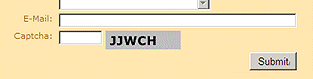
Richard Everett
8/24/2011 19:06 | Any chance of some form of human challenge-response authentication (like CAPTCHA). We are getting "a lot" of spam on just one of the forms we have active. That aside, an excellent web part. |
|
Juerg
8/24/2011 19:32 | Richard, you might consider to add a mandatory numeric field as follows:
*Please enter the value 123=T10|numeric
This should stop bots from successfully submitting the form. We also will consider to add a �Captcha� field type in the next version. |
|
Mike H
8/25/2011 15:39 | Hi Juerg. I'm evaluating the webpart and have a few questions. The date validation is great, but is there a way to use a standard date picker (Date=X;)? The impersonation is great in some cases, but generally I would like to see the created by field populated with the actual authenticated user, is there any way to do this? When tying into an existing generic list, the field name might be 'Title', but it would be nice if on the form I could use a friendly display name like, 'Annoucement Subject', is this possible? Thanks! |
|
Abbas
9/2/2011 09:56 | Hi, Is it possible to add a field to grab the "IP Address" of the Sender?
regards, Abbas |
|
Juerg
9/2/2011 14:08 | Abbas,
no, this is currently not possible.
Would this be an important feature for you ? |
|
Juerg
9/2/2011 17:21 | Mike H, we have now added the 3 features as follows:
- You now can add a �Date Picker� field ("P"). This allows to use the Sharepoint date picker control to enter a date
- The �Created by� List column is now populated with the user that posted the form
- You now can separate the List field name from the displayed label as follows:
Announcement subject|Title=T40 (ie. add the target column name, separated by the pipe character) Please re-download the updated Zip file, extract and then replace the DLL, followed by an �iisreset� command if you placed the DLL in c:\windows\assembly. |
|
Abbas
9/2/2011 20:50 | Hi Juerg,
Yes, I think this is important because the specifications of the sender (such as IP Address & ClientName) can be usefull.
I also need to insert images for background or logo in the form.Is it possible too?
regards, Abbas |
|
Juerg
9/5/2011 18:46 | Abbas,
we�ll add the feature to insert the user�s IP number (using the {ip} placeholder) in the next version.
You can embed images as follows:
Form Template:
<img src='/Site Pictures/triangle.gif'>; Title=D[Mr.,Mrs.,Miss]; First Name=T40;
and use a Form background image as follows:
Form CSS Style:
border:5px solid #408080;background-image:url(/Site Pictures/mapleLeaf.jpg)
|
|
Earl Libby
9/15/2011 19:17 | Our target market for SP Marketplace (spmarketplace.com) is the multi-tenant hosted sharepoint environment like Office 365. Have you considered putting your configuration information into a Sharepoint List to drive the Webpart as a sandboxed web part. |
|
Juerg
9/16/2011 14:55 | Earl,
we�ll have a �sandbox� compatible version of the Quick Form web part ready in about 3 to 4 weeks.
|
|
Asvin
9/20/2011 06:20 | How does one apply styling to invidual form elements?
Thats is to reorganise the form field positions to make it use the width of the page rather than just be a single column.
Thanks in advance.
Greate solution btw. I have been searching for this for ages! |
|
Juerg
9/20/2011 14:43 | Asvin, you currently cannot apply CSS styling to the individual form elements but you might consider to use multi-column form layout by using the # column break option (see description on top of page). |
|
Asvin
9/23/2011 05:03 | Bit of a shame about the fields.
Thanks Juerg! |
|
Asvin
9/24/2011 09:21 | The multi columning is working well.
Perhaps a suggestion - for more field validation (US zip, phone & SS not useful for us down under!) .
|
|
Mike H
9/26/2011 18:26 | I receive the following error when I try to submit a form, and ideas?
Form List Insert Error: Length cannot be less than zero. Parameter name: length
sendMessageClick
Page is valid=True
getting user info
|
|
Juerg
9/26/2011 19:01 | Mike,
please make sure to not enter a trailing "/" in the web part's "Target List" URL setting. |
|
Mike H
10/19/2011 23:29 | Adding the 'P' option for date picker fields was hugely helpful, but I now have a request to use this web part for room booking. Would it be possible to allow for date only or date/time when using a date picker field?
Also, making the created by match the actually submitter has opened up some great opportunities for us, but we do still have uses for an anonymous submission option, such as the 'CIO Suggestion Box' which I would love to move to this web part from another automation platform. Is it possible to make anonymous submission optional? |
|
Renee
10/26/2011 03:47 | An anon option would be a big help for us also. We have a large number of users in a production environment who use our web in kiosk mode. They don't have credentials for the network and if they could still submit forms requesting support or reporting production data it would save us a lot of paperwork. |
|
Juerg
10/26/2011 13:19 | Renee,
can you quickly check the web part�s version number by opening the web part�s tool pane and looking it up at the top ?
We have added support for anonymous users with version 1.0.8
Are you planning to submit the form data to a Sharepoint List ?
|
|
Mike H
11/3/2011 23:11 | Would it be possible to extend the field substitution capability to the completion message field? It would be nice if I could say 'Thank you for your submission, Michael'. To indicate that we do know who send in the form. |
|
Juerg
11/4/2011 12:37 | Mike H,
we have now added the capability to add a field placeholder to the web part�s �Completion Message� setting.
Example: Thank you for your submission, {First Name}
Please re-download the updated Zip file, extract and then replace the DLL, followed by an �iisreset� command if you placed the DLL in c:\windows\assembly. |
|
Zeytoon
11/5/2011 15:00 | Hi,
Thanks for this cool web part. How can I use it for sending a new record (Discussion) in Discussion Boards?
I want to use it in one of my projects
thank you |
|
Juerg
11/7/2011 10:56 | Zeytoon, you easily can create a new discussion thread by adding the following two fields to the form:
Subject=T40;Body=M40/4
If you rather need to be able to reply to an existing thread, we will have to do some investigation to check if this is possible. |
|
Matt
11/7/2011 11:12 | Could you add a people picker tag, so we can select a user on the site and then send the email to that person? thanks |
|
Juerg
11/7/2011 22:39 | Matt,
would you like to be able to add a People Picker control to the form or to the web part's tool pane to set the "Recipient E-Mail" property ? |
|
Matt
11/8/2011 10:45 | To the form, we'd like users to be able to email each other, so the easiest way for this is for them to be able to select a user from the site.
We'd need a token for this also, to pick up the selected user (user from people picker) email address, so we can add to the recipient email field. thanks |
|
Matt
11/8/2011 18:40 | Is it possible to have a query string token in the Recipient Email field? |
|
Juerg
11/9/2011 19:48 | Matt,
we have now added the new qs: prefix to pass in an URL query string parameter to be used as the recipient e-mail address.
Example: qs:recipent
(using a page URL like: yourpage.aspx?[email protected]) |
|
Adam
11/10/2011 20:38 | I have v27, I have to fill in information before I can publish a form with required fields. Is there a setting that I need to change, so that I don't have to completely fill in the form? |
|
Juerg
11/10/2011 21:12 | Adam,
there is a yet unresolved problem with mandatory fields and Publishing pages.
You will need to enter a value into each mandatory field whenever you check in the page.
We unfortunately have not yet found a means to detect this particular situation (so we could temporarily disable the RequiredFieldValidator).
|
|
zeytoon
11/11/2011 10:13 | Hi, I have some qustions.
Is it possible to:
1- set default value for the fields?
2- use "lookup fields" in the form?
3- define multi column for "Radio buttons" & "Checkboxes"
Thank you |
|
Stephen Meier
11/17/2011 21:26 | Is there a way to add values from the form to the Page Redirection?
(/thankyou.aspx?email={email}) |
|
Matt
11/18/2011 09:22 | Excellent, thanks Juerg! |
|
Alaki
11/22/2011 14:44 | Hello dear admin,
Like "Zeytoon" I need to use some "lookup fields" in my "contact-us list". Is it possible to use this web part for filling this fiels in my form?
Thank you
I also like to set some default values for my fields. Is it possible too?
thanks a lot! |
|
Nicole
12/1/2011 17:01 | Hi,
I am using the Target List option to save data entered using this web part into a list on our site, but it seems to be erroring out because the Name has been changed on the list. When we create the list, we name it without using spaces so the URL is clean, but then we go back and add spaces to the name to make it more readable. Any way this could be fixed so that we could have the best of both worlds? |
|
Dan Neuman
12/1/2011 17:49 | Can you add the capability to add rich text or enhanced rich text fields, so the users can add bold and other font information to the messages? |
|
Dan Neuman
12/1/2011 17:50 | Anonymous access is disabled on my sharepoint site. How do I populate a field with the authenticated person that submitted the form? |
|
Juerg
12/1/2011 18:06 | Dan,
regarding adding the user name to the target List:
We actually added this feature with version 1.0.20 on August 29, 2011. This means that the logged in user will be reflected in the Sharepoint List�s �Created by� field.
Can you quickly check the web part�s version number by opening the web part�s tool pane and looking it up at the top ?
If you have an older version, you might consider to re-download the updated Zip fileand then replace the DLL, followed by an �iisreset� command if you placed the DLL in c:\windows\assembly. |
|
Dan Neuman
12/1/2011 18:18 | Is there a way to combine two or more form fields into one sharepoint list field? I want to use an announcement list to get the summary look on a webpart, but want to combine two fields into the title of the list. i.e. TargetName + ' / ' + TargetDepartment ==> Title field of sharepoint announcement. |
|
Juerg
12/1/2011 19:31 | Dan, field concatenation is not supported by the web part, but you could add a new column of type �Calculated� to your List as follows:
=[TargetName] & "/" & [TargetDepartment]
and then change the summary web part to use the new column instead of the Title column (if this is possible). |
|
Juerg
12/2/2011 17:22 | zeytoon and Alaki,
we have now added the option to set default values for the fields:
- Preset a text field by appending the preset value separated by a colon.
Example: Name=T30:Fred
- Preset a radio button by prefixing the preset value with an exclamation mark.
Example: Sex=R[male,!female]
- Preset a checkbox by prefixing the preset value with an exclamation mark.
Example: My favorite colors=C[red,!green,blue,pink]
- Preset the date picker by appending the preset date separated by a colon.
Example: Due by=P:12/24/2011 |
|
Mona
12/6/2011 14:57 | How to insert a metadata field? This error occurs when I tried to insert the S field to contain metadata field: Form List Insert Error: The given value for a taxonomy field was not formatted in the required ;#| format.
I've tried to use itemID;#TermName|termGUID
Thanks in advance! |
|
Lauren
12/13/2011 16:35 | Is there a way to include a clear or cancel button besides submit? |
|
Juerg
12/13/2011 17:23 | Lauren,
this is currently not supported. Would this be important for you ? |
|
Dan Neuman
12/13/2011 18:18 | From the previous posts, I see you were going to add the capability to have the computer name/ip address to the email feature. My users would like to know the computer name that submitted the form. How can I do this? |
|
Juerg
12/13/2011 19:54 | Dan,
we will be adding the {ip} placeholder in the next version but we will not be able to also add the local user�s computer name, since this information is not available to the server. You also could consider to use the {username} placeholder if your users are authenticated.
|
|
Abbas
12/16/2011 09:44 | Hi Juerg
1- Is it possible to use "Lookup Fields" in this wb part?
2- Is it possible to have multi-column fields, between some of the rows?
3- Is it possible to add more than one field placeholder to the web part's "Completion Message" setting? I also need to send the value of "ID" field to the sender! Example: Thank you for your submission, {First Name} & " " & {LastName}. This is Your message id: "{id}" ! Thank you Juerg |
|
Juerg
12/16/2011 18:50 | Stephen, we now have added the option to embed a form field placeholder in the web part�s �Page Redirection� setting. Please re-download the updated Zip file, extract and then replace the DLL, followed by an �iisreset� command if you placed the DLL in c:\windows\assembly or update the WSP solution. |
|
Vitek
12/19/2011 13:10 | Hello Juerg, i have tried evaluation version of the webpart, it seems to be exactly what I'm looking for. But before purchase I want to ask, if you plan to add posibility of localization error messages to another language than english (e.g. some property file). |
|
Juerg
12/19/2011 13:26 | Vitek,
you can localize the text strings displayed by the web part (the web part tool pane will still be in English though) by adding the Locale.txt file (which is cantained in the downloadable Zip file).
Please add the Locale.txt file to the following location on each of your Sharepoint web front end servers:
SP 2007:
c:\Program Files\Common Files\Microsoft Shared\Web Server Extensions\12\template\features\AEFormWebpart
SP 2010:
c:\Program Files\Common Files\Microsoft Shared\Web Server Extensions\14\template\features\AEFormWebpart
The file contains 10 text strings which you can freely modify and translate to your language. |
|
Vitek
12/19/2011 13:35 | Hello Juerg, thank you very much for your fast replay. I wish you many satisfied customers. We already bougt this webpart, which save our time of development. |
|
Vitek
12/19/2011 15:57 | Juerg, I'm using webpart to store results in List and try to use "S" filed to store form name (as an ID where entry comes from). And I'm getting error Form List Insert Error:
Object reference not set to an instance of an object.
sendMessageClick Page is valid=True getting user info
Site=http://www.cleverlance.com/cz/Lists
List=RegContactList
Field=Title/s
Using "T" field type works fine, so list and field name should be correct. Have you any idea? Thank you very much.
P.S. I'm using this webpart also on publishing pages, so I'm facing same problem as Adam (filling entries before publish). |
|
Vitek
12/19/2011 17:42 | Hello,
using image button will not call validation of form e.g. mandatory fileds and send empty form.
|
|
Juerg
12/19/2011 19:29 | Vitek, did you enter the static field into the web part's "Field Template" setting as follows:
Title=S[some static text here]; |
|
Vitek
12/19/2011 21:37 | Hello Juerg,
after several tests it seems, that using template "Title=S[some text]" works only for logged users. An anonymous user obtain error message mentioned above. When I'm NOT using "S" template it works for both (logged and anonymous) users. Hope this helps to find problem. Thanks. |
|
Juerg
12/20/2011 14:22 | Vitek,
we have now fixed the problem with the "S" field and anonymous users.
Please, re-download the updated Zip file and then replace the DLL, followed by an �iisreset� command if you placed the DLL in c:\windows\assembly |
|
Mario
12/23/2011 12:31 | Hello Juerg,
We have not tested it yet.
But is it possible to NOT empty the fields after the save.
So we can enter the values and save it multiple times?
With or without a page refresh.
Kind regards,
Mario |
|
Juerg
12/23/2011 14:25 | Vitek, the image submit button now also supports the form field validation.
Please re-download the updated Zip file, extract and then replace the DLL, followed by an �iisreset� command if you placed the DLL in c:\windows\assembly or update the WSP solution |
|
Juerg
12/23/2011 14:35 | Mario,
we have now added a new option which preserves the field values after having submitted the form. You can activate the feature by entering �noclear� into the web part�s �Page Redirection� setting:
Please re-download the updated Zip file, extract and then replace the DLL, followed by an �iisreset� command if you placed the DLL in c:\windows\assembly or update the WSP solution |
|
Mario
1/12/2012 22:54 | Hello Juerg,
We want to make a form with a Date Picker / Hours / Minutes columns beside each other. So these columns are seperated with # (P;#;T;#;T).
There are also other fields in the form so it is quite impossible to get these 3 columns nicely beside each other.
Or do you have a good advise how to achieve this?
Kind regards,
Mario |
|
Mario
1/13/2012 09:15 | Hello Juerg,
We send 1 parameter in the url that opens the form.
And we need to be able to save this parameter value in a sharepoint list column.
Can this be done?
Kind regards,
Mario |
|
Juerg
1/13/2012 13:42 | Mario,
we have now added this feature as follows:
First Name=T40;~Last Name=T40;~E-Mail=T40
ie. if you prefix the field definition with a ~ tilde character, the field will then be displayed on the same line.
Please note that you now also can have the date picker display the date AND the time as follows by using the new �/datetime� option:
Birthday=P/datetime;
We have now added the option to pass URL querystring parameters to the Sharepoint List as follows:
SomeField=S[this is {someUrlParameter}];
ie. you can now pass the value of an URL parameter (enclosed in curly braces) via the �Static� field to your Sharepoint List.
|
|
Juerg
1/13/2012 16:02 | Dan,
we have now released an new version of the web part which supports a rich text field option as follows:
Mxx/yy/r: Multi-line rich text input field where xx is the number of columns and yy is the number of rows
Example:
Comment=M50/8/r |
|
Mario
1/15/2012 23:15 | Hello Juerg,
Great. Thanks.
A technical issue: We have chosen for Form Layout "Vertical" but the ~ makes these fields jump to "LeftAdjust".
Kind regards,
Mario |
|
Mario
1/16/2012 13:40 | Hello Juerg,
It would be nice if we could use in the {field label} in the Completion Message.
Kind regards,
Mario |
|
Mario
1/16/2012 15:01 | Hello Juerg,
An issue of great importance for us:
When an item is created in the sharepoint list the "created" event is not triggered.
In our case this means that planned workflows do not start when the item is created.
Can you fix this?
Kind regards,
Mario |
|
Juerg
1/16/2012 18:55 | Mario,
we have now added the new /uid switch (to be appended to the web part�s �Target List� setting) which uses the logged-in user account to create the List entry. This ensures that the workflow (when using SP 2010) is properly started as expected.
Please note that the users now need �contribute� permissions on the target List. (we will add support for anonymous users at some later point).
Example: http://sharepoint.com/someSite/Lists/someList/uid
We also have fixed the problem with multiple fields on the same line when using the vertical layout.
Furthermore, you now can use any (and also multiple) field label placeholder in the web part�s �Completion Message� setting:
Example: Dear {First Name} {Last Name}.<br>Your message has been sent. Thank you.
Please re-download the updated Zip file from our web site at /apps/page.asp?Q=5793, extract and then replace the DLL, followed by an �iisreset� command if you placed the DLL in c:\windows\assembly. |
|
Abbas
1/17/2012 08:43 | Hi Juerg,
Thank you for your nice and fast support. I want to report a bug:
I think there is a conflict between "entering �noclear� into the web part�s �Page Redirection� setting" and "using field label placeholder in the web part�s �Completion Message� setting"!
We can not use both of them!
Thank you, Abbas |
|
Abbas
1/17/2012 08:47 | Hi Juerg!
Is there any way to change the location of �Completion Message� in some cases?
For example, I want to show it at top of the form, (when I have a big form!)
Thank you, Abbas
|
|
Juerg
1/17/2012 14:29 | Abbas,
the problem with the "noclear" option in combination with placeholders used in the "Completion Message" setting has now been fixed.
We now have added the option to place the completion message at the top of the form (as opposed to the bottom) by appending �/top� to the web part�s �Completion Message� setting.
Example:
Thanks for your submission/top
Please re-download the updated Zip file , extract and then replace the DLL, followed by an �iisreset� command if you placed the DLL in c:\windows\assembly. |
|
Abbas
1/17/2012 15:40 | Hi Juerg,
I'm using it now. It works great!
Thanks, Abbas |
|
Jon
1/17/2012 16:30 | Hi Juerg, firstly id just like to say how great this webpart is....I have so many different uses for it its unreal and its an absolute lifesaver, so thankyou. Also amazed at how you ahve implemented so many of the posters comments into the new versions of the form. great.
Now for a question. Is there a way of only letting the user signed into sharepoint only filling out the form once? i work in a school and use this for collecting information from Students and they seem to enjoy just hitting the submitt button over and over and over! :-)
many thanks
Jon |
|
Jon Whiles
1/17/2012 17:41 | Hi Juerg, It seems that when using the attachment field option there is a limit on the file size. Is this something i can change, it currently semes to fail after about 1.5mb with an error "exceeds limit" but it would be really useful to ajust this to around 5mb. Thanks again for your help.
p.s I am in the process of buying this webpart from you, just awaiting confirmation from the powers that be. thanks. |
|
Juerg
1/17/2012 18:59 | Jon,
can you check your �Maximum Upload Size� setting by going to:
Central Administration/Application Management/Manage Web Applications (assuming you are using SP 2010).
Then click on �General Settings� and scroll down to the �Maximum Upload Size� setting.
we have now added a new option to let a specific user only submit a form once.
You can enable the feature by adding /once to the web part�s �Submit Button Text� setting.
Example:
Submit Form/once
|
|
Praveen
1/19/2012 15:50 | Great product, we started using it and it works well.
One item that does not work for me is the Rich Text editor.
Secondly, I have a multi line text box in the form and when user enters text in multiple paragraphs, the formatting is lost in the email sent. everything is concatinated into one single paragraph. Anything I can do to retain the format that the user entered in the multiline text box? |
|
Juerg
1/19/2012 19:39 | Praveen,
we just recently added the rich text feature two days ago.
We now also have fixed the problem with the missing line breaks entered into the Multiline text box.
Please re-download the updated Zip file , extract and then replace the DLL, followed by an �iisreset� command if you placed the DLL in c:\windows\assembly. |
|
Mario
1/20/2012 12:12 | Hello Juerg, 2 issues:
1 when we use "|numeric" it does not accept a decimal.
2 We have a Dutch site. In case we use a decimal we have to use a dot instead of a comma.
Any chance to have this adjusted? Kind regards, Mario |
|
Juerg
1/20/2012 15:46 | Mario,
we have now improved the �numeric� field validator so that it now also accepts a decimal separator (which is correctly applied according to the site�s regional settings).
Please re-download the updated Zip file, extract and then replace the DLL, followed by an �iisreset� command if you placed the DLL in c:\windows\assembly. |
|
Mike Kea
1/20/2012 16:15 | Juerg,
Is there a way to have a dropdown that displays one value on the form, but provides a different value in the email? Example, State=D[PA,TX,DE]; but the value chosen yields Pennsylvania or Texas or Delaware in the email? |
|
Juerg
1/23/2012 18:54 | Mike,
we have now added a new feature which allows you to define both a display value in the form and transmit a different value:
Example:
State=D[PA¦Pennsylvania,TX¦Texas,DE¦Delaware]
ie. add the value to be transmitted, separated by a �broken� pipe character.
Please re-download the updated Zip file, extract and then replace the DLL, followed by an �iisreset� command if you placed the DLL in c:\windows\assembly. |
|
Abbas
1/24/2012 09:05 | Hi Juerg,
Is there a way to set the location of the web part in the web part zon (or in the page)? I want to set it in the center of the page.
Thank you,
Abbas |
|
Abbas
1/24/2012 09:17 | Hi Juerg, Thank you very much for providing "Lookup Field" in this web part as follows:
L[LookupList,LookupColumn]
Example:
Color=L[ColorLookupList,ColorName]
The lookup values will be presented as a dropdown list in the form. When saving the form data to a Sharepoint List, either a text or a �Lookup� column can be specified for the target column. please add this new feature in top of this page, I think it is very important for many users.
Thanks, Abbas |
|
Michael Kea
1/24/2012 21:51 | Juerg,
is it possible to combine add a feature to the lookup field in the webpart? Feature: Set a display value and a transmit value from the same list.
Syntax: L[LookupList,LookupColumn,TransmitColumn]
Car=L[CarLookupList,Model,Model] would show Ford Focus or Nissan Altima but only transmit Focus or Altima once the form was submitted. |
|
Juerg
1/25/2012 19:00 | Abbas,
we have now added the new �Center Web Part� option which horizontally centers the Form web part in the available web part zone.
Please re-download the updated Zip file, extract and then replace the DLL, followed by an �iisreset� command if you placed the DLL in c:\windows\assembly. |
|
Juerg
1/25/2012 19:04 | Michael,
we have now added the new option to optionally specify a second Lookup List column name as follows (per your suggestion):
L[LookupList,LookupColumn,LookupTransmitColumn]
Please re-download the updated Zip file, extract and then replace the DLL, followed by an �iisreset� command if you placed the DLL in c:\windows\assembly. |
|
Abbas
1/25/2012 21:25 | Hi Juerg,
I downloaded the new release and checked it. It works great!
Thanks and regards,
Abbas
|
|
NG
1/25/2012 23:00 | Is it possible to have a form input field, such as email, as the Sender Email? We would like the email template to come from the email address in the Email field. We would also like the ability to cc the sender. Thanks. |
|
Juerg
1/26/2012 13:59 | NG,
you can pass the value of a form field both to the web part's "Sender E-Mail" and "Recipient E-Mail" settings by using the {Field Label} placeholder.
Example:
Sender E-Mail={E-Mail Address}
Recipient [email protected];{E-Mail Address} |
|
NG
1/26/2012 21:18 | That's great to hear! Is that feature in a recent release? We downloaded the web part several months ago. Thanks. |
|
Juerg
1/27/2012 00:51 | NG,
the features were added in October 2011 with version 1.0.24 so you might redownload the current veriosn and update the DLL. |
|
Dan Neuman
1/31/2012 18:56 | Loving this form. I have a request to add a date field, and default it with today's date. Is there a way to default a date field with today's date? i.e. Found on=P:{today}? |
|
Juerg
1/31/2012 20:45 | Dan,
we have now added the option to preset a date field with today�s date as follows:
Examples:
Found on=P:{today}
Found on=P:{today}|date
Please re-download the updated Zip file, extract and then replace the DLL, followed by an �iisreset� command if you placed the DLL in c:\windows\assembly. |
|
Mike H
2/6/2012 17:50 | I am using the quick form to submit data to a SharePoint list. I have a category dropdown with multiple options, but I'd only like this particular form to be used for one type of event. Is it possible to set a default value for that field without making it visible on the form? |
|
Mike Kea
2/7/2012 20:13 | Juerg,
Is it possible to change the page redirection link based on a value selected in a form? for example: /Pages/{selection}.aspx
I realize that the page would have to be named the same as the selection, and that's fine. Thanks. Great app by the way. |
|
Juerg
2/8/2012 11:39 | Mike,
yes, you can add on or more placeholders in the web part�s �Page Redirection� setting.
Example:
/Pages/{Selection}.aspx
where {Selection} corresponds to a field in your form.
We added this feature in December 2011 with version 1.0.29 so you might have to update the web part. |
|
Juerg
2/8/2012 23:23 | Mike,
yes, please use the �s� form field type:
S[text]: static text
The "S" field input type allows to enter �static� text, eg. text that will not be shown on the form but be placed into the e-mail body and/or saved ot the target list.
Example:
Category=S[Vacation] |
|
Abbas
2/12/2012 12:50 | Hi Juerg,
I created a form for filling up a list. In that list I want to record the "UserName" of the sender.I used this methods:
User name=T35:{uid}
and:
User name=T35:{username}
But it does not work correctly! please help me whats my fault?
Thanks , Abbas |
|
Abbas
2/12/2012 16:46 | Hi Juerg,
I want let a specific user only submit a form once. I added the "/once" to the web part�s �Submit Button Text� setting.
Example:
Submit/once
But I have some problems:
1- I deleted the record (item) from the list, but still can not submit again!
2- When I log on to site with another UserName, I can not submit anything, and the "Submit-Button" is disabled!
I think I need your help again Juerg!
Thanks, Abbas |
|
Mike H
2/13/2012 22:49 | I love that you've added the ability to preset the date picker, any chance you could add functionality similar to that build-in to SharePoint so I could preset to today +/- some number of days? This would be excellent for providing standard announcement expiration. |
|
Juerg
2/17/2012 14:40 | Mike,
we have now added the possibility to enter a �number of days� offset to the {today} preset placeholder.
Examples:
Expires:P{today+5}
Started:P{today-10}
(please make sure to enter the sign and value without any blank characters).
Please re-download the updated Zip file, extract and then replace the DLL, followed by an �iisreset� command if you placed the DLL in c:\windows\assembly. |
|
Juerg
2/17/2012 18:24 | Abbas,
the �/once� option actually uses a browser cookie to keep track of the users that already have submitted the form. Thus once a user on a certain computer has submitted the form, no one will be able to submit it again using the same computer.
We might change this behavior by using cookies that take care of the logged-in user account name, but this would not work on a anonymous site. |
|
Juerg
2/17/2012 18:28 | Abbas,
you currently can apply the {uid} and {username} placeholders to the e-Mail template and to the �S� static text form field, but not to a �T� Text field. |
|
Laura
2/21/2012 15:40 | This is just what I've been needing. However, when I try to make the "comment" field required, it's not working. The form is still submitting. Help? |
|
Laure
2/21/2012 20:25 | When setting up a lookup field pulled from a SharePoint list, is there a way to NOT make the drop down field pre-selected with the first item from the lookup list? Can the first choice be a blank or be empty and then the rest of the list follows? |
|
Juerg
2/22/2012 13:05 | Laura,
we have now fixed the problem with the rich text box configured as �required�.
We also have added the new option to allow for a blank first choice for the Lookup dropdown box by specifying:
Label=L[LookupList,LookupColumn,,0]
Please note that the new �0� option is actually the fourth parameter within the square brackets (the third parameter is explained in my post dating from January 25, 2012).
Please re-download the updated Zip file, extract and then replace the DLL, followed by an �iisreset� command if you placed the DLL in c:\windows\assembly. |
|
Anon
2/22/2012 17:31 | When using a lookup field as the Recipient email gives an error. The form template I created is Email form to=L[Contacts,E-Mail]. If I replace with a hard coded email address instead of using the label name, then it works fine. Any thoughts. I'm getting the following error when using {Email form to} in the Recipient email.
Form Send Error: Object reference not set to an instance of an object.
sendMessageClick
Page is valid=True
getting user info
sending to: {Email form to}
creating Mail
creating receiver/True |
|
Juerg
2/22/2012 20:20 | Anon,
we have now fixed this problem and it is now possible to use a Lookup field to select the recipient e-mail address.
Please re-download the updated Zip file, extract and then replace the DLL, followed by an �iisreset� command if you placed the DLL in c:\windows\assembly. |
|
Laure
2/24/2012 16:16 | Thanks Juerg for making a blank first choice for Label=L[LookupList,LookupColumn,,0], but when defining this as a required field with the *, it's not checking this column to make sure there is actually a value chosen when it's coming from this label. Not sure if you can include a script to check to make sure it's not defined as 0 also when a * is assigned to the drop down label.
|
|
Juerg
2/27/2012 16:16 | Lauren,
we have now taken care of this omission (ie. you now can also make a Lookup field required).
Please re-download the updated Zip file from our web site, extract and then replace the DLL, followed by an �iisreset� command if you placed the DLL in c:\windows\assembly. |
|
Mike H
3/1/2012 23:53 | Are there any plans to implement the feature Abbas referenced on 2/12/12? I think it would be great if we could pre-populate information we already have about the user, such as name and email address. |
|
Juerg
3/2/2012 11:22 | Abbas and Mike,
we have now implemented the option to use the following placeholders to preset a form text box:
{uid}
{usermail}
{username}
Example:
Your Name=T40:{username}
Please re-download the updated Zip file , extract and then replace the DLL, followed by an �iisreset� command if you placed the DLL in c:\windows\assembly. |
|
Mike H
3/5/2012 15:43 | This web part is quickly becoming my go to form automation tool. These functions might go beyond the scope of your web part, but I'm wondering fi you've thought about the possibility of using cascading lookups? For instance, if I select US in the country field, the city field would only contains US cities. Also is there any possibility of allowing for a multiple selection listbox to be used with lookup fields? |
|
Niek
3/12/2012 13:56 | Hi Juerg,
I saw the variable fields like: Page URL={url}
How can i save this variable (page url) to de targetted SharePoint list?
Many thanks in advance! |
|
Juerg
3/12/2012 14:56 | Niek,
we have now also added the �{url}� placeholder to the �S� (Static Text) field. This allows you to transmit the page URL by including the following field in the web part�s �Form Template�:
PageURL=S[{url}]
If you also define a �PageURL� column in your Sharepoint List (of type �single line of text�), the value will also be stored in your target List.
Please re-download the updated Zip file, extract and then replace the DLL, followed by an �iisreset� command. |
|
Doris
3/13/2012 18:49 | Hi Juerg, I haven't looked at this is a while. What a great bunch of new features you added!! Two questions: 1) I would like to use columns in the middle of the page. I assume I can use <br> to skip lines to bring the text in the second column in line with the first. But is there any way to stop the columns and return to a single column? Or do I need to use the ~ feature? 2) Do I have to do something more than put Dear {First Name} {Last Name}. in the �Completion Message� setting? It didn't seem to work for me. Thanks!
Example: Dear {First Name} {Last Name}. |
|
wc
3/14/2012 14:58 | Is there a way to make sure the form is only submitted once per user? |
|
Juerg
3/14/2012 15:24 | wc,
yes, you can configure the web part to let the users only submit a form once. You can enable the feature by appending /once to the web part�s �Submit Button Text� setting.
Example:
Submit Form/once |
|
wc
3/14/2012 16:25 | Thanks! That disabled the button after submission. How does it keep track of it? I'm using a sharepoint list, does it work if form is only emailed? |
|
Juerg
3/14/2012 21:36 | wc,
the web part keeps track of the users that already have submitted the form by setting a browser cookie in the client's browser. |
|
Juerg
3/15/2012 18:09 | Doris,
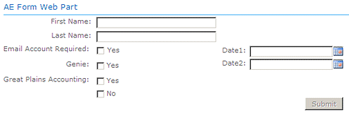
You can actually use two (or more) columns by using the # column break character. You then also would need to insert blank vertical space to line up the controls in the second column using <div> tags.
Example:
First Name=T30;
Last Name=T30;
Email Account Required=C[Yes];
Genie=C[Yes];
Great Plains Accounting=C[Yes,No];
#;
<div style='height:113px'></div>;
Date1=P;
Date2=P;
<div style='height:40px'></div>
The �Completion Message� text is actually not passed on to the target page (as set up via the �Page Redirection� setting). We could add a feature to pass it on via an URL parameter but you then would need to be able to pick it up on your target page. |
|
Adam K
3/27/2012 22:49 | Hi, I don't know if I am missing this but is there a way that the mail subject can be filled out by the user in the form? This way it is not the same email subject every time.
Thanks. |
|
heriberto
3/27/2012 23:37 | hi, how can I change the color of the fields in form templete?
thanks |
|
Juerg
3/28/2012 11:22 | Heriberto,
you can add the following style to your Sharepoint CSS style sheet:
DIV.aeformstyle INPUT {font-size:12px;background-color:green}
The above will affect all textboxes within the web part�s <div> form container. |
|
Juerg
3/28/2012 11:27 | Adam,
just add the name of the field label (enclosed in curly braces) to the web part�s �Mail Subject� setting:
Example:
Sent by {First name} |
|
Anita
4/11/2012 17:20 | I don't see any input field for the Page Redirection. Is that feature in a new version of the web part? Thank you. |
|
Juerg
4/12/2012 11:47 | Anita,
can you quickly check the web part�s version number by opening the web part�s tool pane and looking it up at the top ? We added this feature with version 1.0.4 on December 23, 2010 |
|
Dan Neuman
4/24/2012 22:43 | I am trying to put the quick form on another page and the email feature isn't working. I never receive it. Do you have any suggestions on how I would find the problem? |
|
Dan Neuman
4/24/2012 23:39 | Nevermind on the SMTP Question. My security guys disabled the SMTP traffic on the sharepoint server. I had to change the SMTP server in Central Admin, and now it is all working again. Thanks for a great Web Part! |
|
Steve
5/4/2012 17:02 | Hi, I have a form with three multiline text boxes M80/10/r and it sends e-mail at the end. A user filled out the form with about 1k worth of text in each. The first one showed up ok, the 2nd one was truncated and the 3rd never made it in the e-mail at all. Are there some limits on the size of the email messages or is there a fix? I am using 1.0.43 on MOSS 2007.
Thanks. |
|
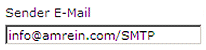
Juerg
5/7/2012 14:02 | Steve,
we have now added a new option to force the web part to use the SMTP outbound server (as opposed to the internal Sharepoint SMTP mail utility).
To set the switch please append /SMTP to the web part�s �Sender E-Mail� setting.
Please re-download the updated Zip file and then replace the DLL. |
|
Steve
5/8/2012 15:35 | The /SMTP fix worked perfectly. Thanks for the speedy update! |
|
Paul S
5/23/2012 14:30 | Have created a form and trying to post to a sharepoint list when user clicks on submit button but getting following error:-
"Form List Insert Error: Value does not fall within the expected range"
Labels are called the same so any ideas? |
|
Juerg
5/24/2012 10:45 | Paul,
can you send us both the content of the web part's "Form Template" setting and your Sharepoint List's column types (via "List Settings") to [email protected] ? |
|
Erin Hively
5/31/2012 19:31 | Is there a way to place a picture on the form? I'm creating a sharepoint page where employees can order items and wanted to place a picture of the item directly onto the order form. Thanks! |
|
Juerg
6/1/2012 11:41 | Erin,
You can either embed an image as follows:
Form Template:
<img src='/Site Pictures/triangle.gif'>;Title=D[Mr.,Mrs.]; First Name=T40;
or use a Form background image as follows:
Form CSS Style:
background-image:url(/Site Pictures/mapleLeaf.jpg) |
|
Dan Neuman
7/3/2012 19:02 | Is there a way to use the value of a checkbox to display a conditional message in the email template?
In the form Template, I have a checkbox called, Reply Requested=C[Yes]. Within the email template, is there a way to do something like... IIF({Reply Requested}, "Call the User", "No need to respond").
As always, thanks for your help. |
|
Juerg
7/9/2012 14:10 | Dan,
we have now added the option to enter two strings corresponding to a checkbox field into the web part�s "E-Mail Template" setting as follows:
Example:
{Reply Requested|Call the User;No need to respond}
ie. enter the two optional strings after the label name, prefixed by a �|� pipe character and separated by a semicolon.
Please re-download the updated Zip file, extract and then replace the DLL, followed by an �iisreset� command. |
|
Wendy
7/27/2012 10:48 | FYI, we have discovered that if more than one field starts with the same word, AE Form crashes the page and has to be delete by Web Part Maintenance view. e.g. "Previous work location" and then another field called "Previous job title" will crash the page throwing up an Unknown Error. |
|
Juerg
7/27/2012 11:05 | Wendy,
the problem you are observing was present in the first versions and has actually been fixed in later versions (the current version is 1.0.49).
Please download the current Zip file from our web site, extract and then replace the DLL, followed by an �iisreset� command if you placed the DLL in c:\windows\assembly. |
|
Chris
7/30/2012 17:35 | Juerg
Is there anyway to BCC or CC someone in the SendTo feature? I been trying to play with this and haven't found a way. Everything else we need works GREAT good work but can't figure out if this is possible or not. |
|
Juerg
7/30/2012 17:59 | Chris,
you actually can add multiple recipients to the �Send To� setting:
[email protected];[email protected]
(ie. separate the recipients by semicolons). We also have now updated the web part by adding both a �Recipient E-Mail Cc:� and a �Recipient E-Mail Bcc:� Web Part setting. |
|
Dave K
8/4/2012 00:22 | Is it possible to post to a list anonymously? It seems there was an update that may have taken this away? We would like to use the form to solicit anonymous feedback on some activities, but can�t seem to get it, but I was able to do it in the past before the .20 update.
Thanks!
Dave
|
|
Juerg
8/4/2012 17:02 | Dave,
to allow to submit data to a Sharepoint List anonymously please add the /anon postfix to the URL entered into the web part�s �Target List� setting.
Example:
http://Intranet/Helpdesk/Lists/Tickets/anon |
|
Sirish
8/9/2012 01:10 | Thanks for this great web part.
How can we edit the email body ? Once I submit the form I'm getting an email but looks like the email looks like a paragraph. There is no separation between the columns. Is there any way we can give a space between the columns ? |
|
Juerg
8/9/2012 12:58 | Sirish,
if you define your custom mail template via the web part's "E-Mail Template" setting, please make sure to add HTML <br/> line breaks to the template for each line. |
|
Dave K
8/9/2012 16:44 | Juerg,
When I add the /anon postfix to the URL, I reveive an error detailing: Form List Error: List 'anon' does not exist at site with URL...
Please advise.
Thanks!
Dave |
|
Jon Beever
8/10/2012 01:28 | we are getting the following error:
Form List Insert Error: Length cannot be less than zero. Parameter name: length
there is no trailing /, any ideas? |
|
Juerg
8/14/2012 11:59 | Dave,
can you quickly check the web part�s version number by opening the web part�s tool pane and looking it up at the top ?
We added the �/anon� switch with version 1.0.30 on December 21, 2011 |
|
Cathy W
8/15/2012 00:52 | Hi Juerg, was wondering if it would be possible to specify the content type when saving the form info to a list with more than one content type? |
|
Juerg
8/16/2012 16:21 | Cathy,
this is currently not possible but we could add this feature in the next release if it is important for you. |
|
Adam D
8/20/2012 22:47 | The updated the ip of our SMTP server. I have one form that properly emails and another that doesn't because it has the old SMTP address. How do I clear the old SMTP address from the quick form cache? |
|
Juerg
8/21/2012 13:28 | Adam,
the �Quick Form� web part actually does not use a cache.
Did you configure the web part to use the SMTP outbound server (as opposed to the internal Sharepoint SMTP mail utility) as follows:
|
|
Jon Antalvari
8/29/2012 19:37 | I was wondering if I'm wondering if you've thought about the possibility of using cascading lookups? For instance, if I select US in the country field, the city field would only contains US cities. Possibly, even taking that to a third level. This question was asked in the User Comments, but I did not see an answer. |
|
Kirri
9/10/2012 08:46 | This Web Part is infinitely useful. However, I've noticed it's not possible to get fields in the Form to write into 'Person or Group' fields in the List - could this be enabled? To facilitate this, it would be good to have a people picker on the form, so users can choose the correct person. |
|
Darryl
9/13/2012 18:02 | Hi Juerg - we have a couple of requests from our users that I haven't been able to deliver. Is this functionality in the form, or can it be added in upcoming versions?
1. Dynamic (expanding) content - so, I could have a radio button for "do you want a drink with that?". If the user chooses, "no", the continue as usual, but if they choose "yes", the form expands to give them drink options.
2. Another approach (less ideal but workable) for this would be to have conditional page redirects on exit: if field1=no then page= xxxxx.aspx, if field1=yes then yyyyyy.aspx
Thanks!
Darryl
|
|
Paula
9/17/2012 15:25 | Hi Juerg,
I have multiple file upload fields on one of my form and I also created a List with the same fields. I can open the attachments from the file upload field in the email that I receive, but I cannot open the attachments from the List that I created. The attachment are in the list and I can see them, but when I click on them I get only a square with a red X inside, like the image is not stored anywhere. I was wondering if I am doing something wrong. Thank You!
|
|
Juerg
9/19/2012 11:07 | Paula,
we have now fixed the problem regarding the attachments if you both send the form to a mail recipient and a Sharepoint List.
Please re-download the updated Zip file, extract the WSP filea and then update the solution. |
|
Kirri
10/3/2012 00:54 | I've just updated to version 1.0.57 (in MOSS2007), and it seems that the date picker does not work anymore (it did in the previous version). If users click on the calendar icon, nothing happens. |
|
Juerg
10/8/2012 18:46 | Kirri,
the date picker should work as usual in version 1.0.57 (we both checked with SP2007 and SP2010). |
|
Abbas
10/13/2012 10:13 | Hi juerg,
I have some problem in this very useful web part:
1- How can I set the "lookup" field input type, to contain values from a column of a Sharepoint List that isn't defined in the same site? I want to select some values from some sharepoint lists in another sub sites.
Is there a way to Set a value from a list in another sub site? and defining its addres? Syntax: L[LookupList,LookupColumn,,,/Sites/site1]? Like:
SenderDepartment=L[Deps,Title,,0,/EN] would show depatment names from that list.
2- And also is there a way to Set a value from our content types?
I like This web part very much and its just what I've been needing.
Many thanks, Abbas |
|
Andy
10/17/2012 11:35 | More lookup based questions. Is there any way this can be based on a view of a list? |
|
Juerg
10/17/2012 15:34 | Andy,
yes, please append the View name to the List name, separated by a colon.
Example:
Color=L[ColorList:ViewName,ColorName] |
|
Christy
10/19/2012 17:48 | I'm trying to have a field in my form (ticket number) display in the Subject of the email when the form is sent. I have tried putting {ticket number} in the subject but the email is sent with exactly that in the subject and not the ticket number from the form. Any suggestions on how this is done? |
|
Juerg
10/19/2012 19:20 | Christy,
to be able to use a field label placeholder in the e-mail subject, please use the web part's "E-Mail Template" setting since the default e-mail formatting does not support placeholders in the subject line. |
|
Juerg
10/24/2012 16:17 | Abbas,
you can actually specify a List contained in another site of the same site collection by using the following syntax:
L[Sitename/Listname,Columnname]
We also recently added the option to specify the content type when saving the form data to a Sharepoint List by specifying the �ContentType� form field:
Examples:
My Content Type|ContentType=D[Item,Link,Announcement]
ContentType=S[Announcement]
The first example shows how the user can interactively choose the content type (and also how you can specify a friendly form label) and the second example show how the content type is set in the background (not visible on the form). |
|
Sam
10/25/2012 19:31 | Loving this product so far. The one issue I am having is enabling the user to enter additional email addresses for the form to be sent to. I created a field Email:T20 and thought that I could use either {Email} or qs:Email in the Recipient CC field based on their use in other fields. Neither is working, in either the Recipient or Recipient CC fields. Am I missing something or is this not working properly? |
|
Juerg
10/26/2012 11:35 | Sam,
both the �Recipient E-Mail Cc:� and the �Recipient E-Mail Bcc:� fields currently only support the {usermail} placeholder, but do not allow to refer to any form fields.
However, the �Recipient E-Mail� setting allows this (including Lookup fields) and also allows to specify multiple recipients (separated by semicolons):
{Email1};{Email2}
Please send us a note if you need to be able to use the field placeholders also in the Cc: and Bcc: fields. |
|
Abbas
10/27/2012 17:06 | Hi juerg,
thank you for your nice recent support. I have 2 questions:
1- How can I set the "lookup" field input type, to contain values from a site column? Is it possible?
2- Please help me for using the parameters of your example in setting the "lookup" field input type, to contain valuse from content types. I mean the following example:
My Content Type|ContentType=D[Item,Link,Announcement]
(Please help me to use it for setting the lookup fields with Site columns & content types).
Many thanks, Abbas |
|
Sam
10/30/2012 15:14 | Juerg, thanks for the clarification. For some reason it was not working even in the Recipient field earlier, but it is working now. Maybe I had something wrong.
Also, are you aware of problems with the rich text editor widget? When I first tried to use it, I got errors indicating that something could not be found and it would not let me save the page. I tried again later to capture the error message to report here, but it didn't re-occur and the page saved ok. However, I could not click in the text box and I could no longer edit the page in IE 9. I switched to Chrome and it did let me edit the page there to remove the field, but the rich text widgets did not appear. |
|
Juerg
10/30/2012 16:06 | Sam,
can you send us the content of the web part�s �Field Template� setting for analysis ?
Also, are you using SP 2010 or SP2007/WSS3.0 ? |
|
Sam
11/1/2012 13:58 | Just completed testing validators & default values ... great features!
Question: Is there a way to provide a default value for a Lookup field? |
|
Juerg
11/1/2012 16:33 | Sam,
this is currently not possible. Would this option be important to you ? |
|
Sam
11/2/2012 14:11 | Juerg, it is not a requirement for our decision to purchase this, but it would be nice to have. What could be just as helpful is knowing how the order of what is listed is determined so that we might have the 'default' at the top of the list. |
|
Juerg
11/2/2012 14:29 | Sam,
you actually can create a view for your Lookup list to be able to define your custom sort order and the specify your view in the Lookup form field definition:
Example:
Country=L[CountryList:MyViewName,Title]
(ie. append the optional List View name to the List name, prefixed by a colon). |
|
Sam
11/2/2012 14:46 | Awesome! I think that will satisfy our needs.
Recommendation: note this in the documentation above :) |
|
Steve
11/2/2012 17:46 | Hi Juerg,
I'm having the same issue that Kirri mentioned on 10/3/2012. We are using MOSS 2007 and recently upgraded to 1.0.57. The date picker no longer works for us. Clicking on the calendar icon doesnt do anything. Dates typed into the field appear as 12/31/9999 when the form is submitted.
|
|
Steve
11/2/2012 18:04 | Scratch what I said about 12/31/9999. I havent been able to reproduce that, but the date picker is definitely not appearing when I click the icon. |
|
Juerg
11/2/2012 18:09 | Steve,
the problem is most probably caused by the date field�s label containing a blank character (as for example �Requested Date�) which breaks the date picker in SP 2007.
We fixed this problem on October 11 with version 1.0.58, so you might consider to update the web part (or change the label to say �Requested_Date�). |
|
Abbas
11/7/2012 19:15 | HI Juerg,
We want to create a form for assining some tasks to our members. Is it possible to have a field that works like a "User lookup field" or "Users picker"?
Thanks and regards,
Abbas |
|
Abbas
11/16/2012 14:43 | Hi Juerg;
Thanks for your kindly suppoert. The version in this page is still 1.0.61, but you created a new version with the new �A� People Picker form field type (V1.0.62).
I used a list lookup field that connect to a list with more than 700 Items. It's difficult to chose an item with this field. Is there any way to work this field type as an "Auto complete field" in the form?
Thanks and regards;
Abbas |
|
Juerg
11/19/2012 13:39 | Abbas,
we have now added the new "A" People Picker form field type to the �Quick Form� web part.
Usage:
Assigned To=A250
AssignedTo=A250/m
where 250 in the example above is the desired width of the control in pixels and the optional "/m" parameter allows to select multiple users.
Please re-download the Zip file, extract the WSP file and then update the web part solution. |
|
Cyril
11/28/2012 12:03 | Hello,
For the 'Page Redirection' can i use xxx URL query string parameter={xxx}.
this is just to return to my previous page.
thks |
|
Juerg
11/28/2012 14:39 | Cyril,
it is possible to embed a form field placeholder in the web part�s �Page Redirection� setting as for example:
/thankyou.aspx?email={email}
but I assume that you rather would like to be able to dynamically inject an URL query string parameter into the �Page Redirection� URL. |
|
Cyril
11/28/2012 14:58 | Hi Juerg .
Yes,
i try to use this:
MY page url with the form:
/Pages/Partager-Information.aspx?pagetitre=petroplus&shareurl;=http://ServerUrl/medias/Pages/Article2.aspx
Form Template:
*Nom|Nom complet=T30;*Envoyer �|=T50|email;*Titre de la page|=T50;Commentaires|Commentaires=M60/5;Source=S[{shareurl}]
Page redirection:
/Pages/redirect.aspx?returnurl={Source}
but it's don't work {Source} is empty ?
Can i help me? |
|
Juerg
11/28/2012 16:30 | Cyril,
we updated the web part so that the Redirection URL now also accepts the value of a �Static� field.
Furthermore, you can now directly inject an URL parameter into the Redirection URL without having to use a static form field:
Example:
Page URL:
/Pages/Partager-Information.aspx?pagetitre=petroplus&shareurl=http://ServerUrl/medias/Pages/Article2.aspx
�Page Redirection� setting :
/Pages/redirect.aspx?returnurl={shareurl}
Please re-download the updated Zip file, extract the WSP file and then update the web part solution. |
|
Cyril
11/28/2012 17:00 | Hi juerg,
i'll try tomorow and i tell you.
Vielen Dank.
Cyril |
|
Cyril
11/29/2012 09:26 | Hi juerg,
i'ts work fine.
Thks. |
|
Mario
12/2/2012 16:33 | Hello Juerg,
I see some amazing things happening with the lookup field.
But question: Can you add the option to filter the lookup values with CAML making use of the URL query string parameter?
Kind regards,
Mario |
|
Juerg
12/10/2012 15:03 | Mario,
it would actually be quite complex to set up a dynamic CAML query for the lookup form field but we could add the option to dynamically specify the Lookup List name and the Lookup View name via an URL query string parameter. |
|
Bob Terry
12/17/2012 19:50 | Is it possible to capture the information from this data to a sharepoint list? It looks like a great way to build like an online order form, if the fields can be mapped and captured to a sharepoint list. Is there any limitation for the number of fields? |
|
Juerg
12/17/2012 19:54 | Bob,
the Quick Form web part allows you to save the form data in a Sharepoint List via the "Target List" web part setting (please see description at tthe top of this page).
Also, the web part currently supports up to 99 fields per form. |
|
Juli
1/8/2013 16:34 | I love this. Is it possible to have a text input field and then set it up so an end user can automatically add a second one if needed?
Example: I have set this up to report an unused bulletin number. The only thing that is necessary for the user to enter is the ATB number. It is possible however that they might need to enter more than one and rather than them having to submit multiple messages, It would be great if there was a way that they could click a button or something to insert a new instance of the field. |
|
Juerg
1/8/2013 18:14 | Juli,
this is currently not possible (and also would be rather complex to implement).
If you just send the form by e-mail (as opposed to saving the ATB number into a Sharepoint List) you might consider to add one or more extra text fields and maybe add some explanatory text to the form. |
|
Pete
1/9/2013 18:14 | Juerg,
Great web part. Is it possible to pass the value of the {today} preset placeholder through static text to a SharePoint list? I'd like to capture the date that the form was submitted in the list. |
|
Juerg
1/9/2013 18:21 | Pete,
each List actually sports a �Created� column which is automatically set when a list item is created.
Please send us a note if you think that a {today} placeholder still would be useful. |
|
Pete
1/9/2013 18:25 | 'Created' works. Didn't think of that. Thanks for the quick response! |
|
Thomas
1/23/2013 22:13 | When I use the lookup field with a calculated column the dropdown shows "string;#" before every item in the list. Any way to just show the contents of the column? It works fine for non-calculated fields. |
|
Cathy
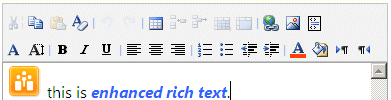
1/24/2013 00:28 | Hi. Is it possible for enhanced rish text to be incorporated in the form? Thanks |
|
Juerg
1/24/2013 10:02 | Cathy,
yes, to create a multiline rich text field, please use the �M� field option in your �Form Template� (please see documentation at the top of this page).
Mxx/yy/r: Multi-line rich text input field
where xx is the number of columns and yy is the number of rows
Example: Comment=M50/8/r |
|
Juerg
1/24/2013 10:54 | Thomas,
we have now fixed the problem with Lookup fields referring to a calculated column.
Please re-download the updated Zip, extract the WSP file and then update the web part solution. |
|
Juerg
1/25/2013 14:07 | Cathy,
we have now added support for �enhanced rich text� as follows by using the new �/e� option.
Example:
Enter your text=M60/4/e
Please re-download the updated Zip file, extract the WSP file and then update the web part solution. |
|
Adam K
1/29/2013 21:01 | Hi, I am using a target list and when a new item is added to the list the user that created the item shows as the created by user but the modified by user shows as system account and it won't automatically run my workflow. Is it possible to have the user that created the new item show as both created by and modified by fields? Thanks! |
|
Juerg
1/30/2013 18:42 | Adam,
we now fixed the web part to also set the �Modified By� list field when writing to a Sharepoint List.
Please re-download the updated Zip file, extract the WSP file and then update the web part solution. |
|
Mike
2/5/2013 00:02 | Is there any timeline for when this web part will be available for SharePoint 2013 Foundation? |
|
Juerg
2/5/2013 11:59 | Mike,
the Quick Form web part is ready for Sharepoint 2013.
Please use the install2013.bat file (contained in the Zip file) for installation. |
|
Thomas Babcock
2/6/2013 19:27 | I have a lookup column that is filtered by a view. The view filters based on date. The form drop-down is blank and the form gives an error: List Lookup Error: Value does not fall within the expected range. |
|
Gresh
2/18/2013 14:19 | Hi, we are currently using the web part to capture user ideas. The user enters his name, surname, idea ect and the information is pushed to a sharepoint list. The user gets a "thank you for your suggestion" message once they submit. Is it possible to pull the unique ID from the list that the users info is being pushed to once they click submit in order to show in the "thank you message"?, or if not can a unique reference number be rendered on each submission for the "thank you" message?. Thanks |
|
Juerg
2/18/2013 16:31 | Gresh,
we have now added the new {id} placeholder which can be embedded in the web part�s �Completion Message� setting.
Example:
Thank you for your submission. You reference number is {id}
Please re-download the updated Zip file, extract the WSP file and then update the web part solution. |
|
Gresh
2/20/2013 11:29 | Hi Juerg
The updated version is 1.0.75?. On submission the completion message only shows the {id} placeholder and does not pick up the ID form the list. Should a field be created for id?, Thanks |
|
Emily
3/13/2013 20:22 | Is it possible for the end user to determine who receives the �recipient email�. For instance, Field= Manager (John Doe): Recipient email= Manager ([email protected]). |
|
Juerg
3/14/2013 16:56 | Gresh,
yes, the update version is 1.0.75
Did you embed the {id} into the web part�s �Completion Message� setting as shown in the below example:
The unique ID is {id}
which should produce:
Dear John Doe,
your message has been sent. Thank you.
The unique ID is 47 |
|
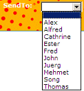
Juerg
3/14/2013 17:01 | Emily,
you can for example create a dropdown form field to let the users select the person to receive the e-mail:
Example:
SendTo=L[Employees,Firstname,Email]
The above example assumes that you have a Sharepoint List named �Employees� that both has a �Firstname� and an �Email� column (specifying two columns allows you to display a friendly name in the dropdown box and transmit the e-mail address behind the scenes):
You then also have to enter the form field name into the web part�s �Recipient E-Mail� etting (enclosed in curly braces):
Example:
|
|
SBudaj
3/18/2013 21:17 | We are looking to use the Quick Form as an input screen for our IT support tickets. Is there the ability to have a placeholder for the IP address of the computer and another for the computer name. |
|
SBudaj
3/18/2013 21:53 | I am using the People Picker field to allow users to select their name instead of typing it into the prompt. I am saving the form information to a list and the user name appears as
0;#i:0#.w|fmcmain\scollins
However within the e-mail confirmation the user name is display correctly. |
|
Juerg
3/19/2013 13:58 | SBuday,
we have now added the new option to add the �{ip}� and �{host}� placeholders to the �S� static form field (which is not displayed on the form but included in the e-mail and also saved to the target Sharepoint list).
Examples:
IP=S[{ip}];
Computer=S[{host}];
The �{host}� placeholder returns the client computer name and the "{ip}" placeholder returns the client IP address. |
|
Juerg
3/20/2013 11:55 | Scott,
we were now able to locate and fix the problem with the People Picker field.
Please re-download the updated Zip file, extract the WSP file and then update the web part solution. |
|
Juerg
4/5/2013 12:59 | SBuday,
we were now able to locate and fix the problem with the People Picker field.
Please re-download the updated Zip file, extract the WSP file and then update the web part solution. |
|
Matteo
4/10/2013 16:37 | Hello Amrein,
Have you considered integrating the Google reCaptcha tool in to the quick form we part? Here is the link to the tool.
http://www.google.com/recaptcha
regards
Matteo |
|
Juerg
4/10/2013 19:21 | Matteo,
you also might consider to add a �Verification� text field and specify a custom validation rule in form of a regular expression (see below in green).
Example:
The user is forced to enter a 10 digit number.
The rule to allow for exactly 10 numeric digits is:
*Verification=T10|custom:^[0-9]{10}$|please enter a 10 digit number; |
|
Christy
4/18/2013 20:00 | Hello,
I've been using this web part all over our site for different forms however I'm noticing that it is slow to respond once a user clicks submit. Is there an issue to having multiple forms on the site. I don't think the are all used at the same time because we are a small organization however the slowness is troubling. |
|
Bill Dewey
5/8/2013 21:03 | Just downloaded and installed for testing, very nice. A couple of questions.
1. can the "qs" (Query String) parameter be used to pre-populate any field on the form? I see the note for recipient, is this generic?
2. On validations, any chance of having the webpart allow a regular expression with a custom error for field validation?
We use some technology for field validations that does this, but I am guessing that if we use your web part as the input to this list, the field validations will not occur.
Thanks! |
|
Erick
5/9/2013 08:54 | Hello, Any updates on a sandboxed version of the webpart (sharepoint 2010)? |
|
Juerg
5/9/2013 13:00 | Bill,
we have now added a new option to let you specify a querystring parameter as a preset for a text field by adding the querystring parameter surrounded by curly braces, prefixed by a colon:
Example:
First Name=T30:{firstname}
Please re-download the updated Zip file, extract the WSP file and then update the web part solution.
Regular Expression Field Validation:
You can specify a custom validation rule in the form of a regular expression by using the following syntax ( �|custom:� followed by the regular expression and an optional custom error message):
field definition|custom:regular expression|error message
Example:
Student ID=T10|custom:^[0-9]{10}$|please enter a 10 digit number;
the above example allow for exactly 10 numeric digits. |
|
Doris
5/9/2013 18:43 | Hi Juerg. Is it possible to use Allow 'Fill-in' choices with the Checkbox feature. I am trying to find a way to include an "Other" checkbox where the user can specify the Other and have that populate the target list. Thanks! |
|
Doris
5/9/2013 20:13 | Also, to upload multiple attachments, is the best/only way to include multiple =U50 lines? Thanks! |
|
Doris
5/9/2013 21:08 | Two last questions for today!
1) If the completion message is displayed at the top, is it possible to have the page display from the top after the submission. It refreshes back to the bottom where the submit button is.Or maybe I'll just keep the message at the bottom. :)
2) Is it possible to change the style of some/all of the labels? Make larger, bold, etc.? Or is that a Sharepoint CSS style sheet thing?
Thanks! |
|
Juerg
5/10/2013 13:23 | Doris,
"Fill-In" Choices:
yes, just add a text field below the checkbox field and point it to the same List column.
Example Form Template:
Color=C[red,green,blue];Other|Color=T20;
Both fields in the above example point to the same �Color� List field and the �Other� textbox automatically only takes precedence if no checkbox has been checked (see screenshot below).
Multiple Upload fields:
yes, you can just add more than one �U� upload form field.
Form Template:
Upload1=U40;Upload1=U40;etc.
Page Refresh position:
this can currently not be influenced (we�ll look into this)
Field Label style:
Yes, please just use the web part�s �Field Label CSS Style� setting to style your form labels.
Example:
font:10pt Segoe UI;font-weight:bold
|
|
Eric L
5/10/2013 22:20 | Is it possible to send a conformation email to the person who submitted the form and then send a different email to different people that contains the same submitted information but worded differently.
Example:
Email 1: The information below has been submitted, someone will contact you shortly....
Email 2: "username here", submitted the following information: Please contact them. |
|
Juerg
5/14/2013 16:57 | Erick,
we decided to not publish a sandboxed version due to the many technical limitations of the Sharepoint Office365/Sandbox environment (no e-mails, no date-time and rich-text controls etc.) which would severly cripple the Quick Form web part when used in the sandbox. |
|
Mario
5/15/2013 15:06 | We populate a field (email / text) using an url parameter.
Can we make the form field read only?
Please advise.
Kind regards, Mario |
|
Juerg
5/17/2013 19:28 | Mario,
we have now added the new option to specify a text field to be �read-only� as follows:
Example:
Name=T30:{SomeURLparameter}|readonly
Please re-download the updated Zip file, extract the WSP file and then update the web part solution. |
|
Gaurav
6/3/2013 08:15 | Hi, Do we need a Mobile adapter to display the web part in the mobile view in sharepoint 2013? Do we need to have a mobile adapter for all custom web parts in sharepoint 2013? |
|
Juerg
6/3/2013 16:06 | Gaurav,
you would need to switch from the SP2013 mobile "Contemporary View" to the "Full Site View" to see the web parts as i a desktop browser. |
|
Sam Smith
7/3/2013 20:27 | Great web part! Is it possible to save a form I create to use on multiple sites/pages. I have a feedback module that I'd like to be able to add to various pages that have different access privileges without having to reformat the web part every time. |
|
Juerg
7/4/2013 16:01 | Sam,
you can actually save an already configured web part as a .webpart file via the web part�s �Export..� option:
You might first have to set the web part�s �Export Mode� to �Export all data�:
You then can save the file, rename it to, say �FeedbackForm.webpart� and upload it to the site collection�s �Web Part Gallery�. It now can be add to any page. |
|
Dan Neuman
7/9/2013 17:16 | I have users saying they receive 85% of the emails. Is there a way to debug to see why the emails are failing? |
|
Juerg
7/11/2013 12:44 | Dan,
did these users also check their spam filters ?
There is no easy way to debug this.
You might however consider to use the option to force the web part to use the SMTP outbound server (as opposed to the internal Sharepoint SMTP mail utility).
To set the switch, please append /SMTP to the web part�s �Sender E-Mail� setting. |
|
Adam D
7/11/2013 21:18 | Is it possible for a Lookup list to display 2 columns? I am trying to display text field and then a number field ex (7/13/13, 15) |
|
Christine
7/12/2013 13:01 | Is it possible to limit the number of characters that can be entered into a Multi-line text input field? |
|
Juerg
7/13/2013 21:21 | Christine,
you can specify a custom validation rule in the form of a regular expression by using the following syntax ( �|custom:� followed by the regular expression and an optional custom error message):
field definition|custom:regular expression|error message
Example:
Description=M30/4|custom:^[0-9]{120}$|please enter no more than 120 characters
the above example allows for a maximum of 120 characters to be entered into the multiline field. |
|
Stew Fuller
7/18/2013 11:20 | Hi, I am trying to 'lookup' a list (current vacancies) and looking for the lookup to pick up a filtered view not the overall all items view. Do you know how I can apply this to the Quick link form please with the text. Currently have the following:
Vacancies=L[Vacancies,Job role]
Thanks |
|
Juerg
7/18/2013 18:24 | Stew,
please append the View name to the List name, separated by a colon.
Example:
Vacancies=L[Vacancies:ViewName,Job role] |
|
Juerg
7/27/2013 19:08 | Adam,
that would indeed be a nice feature but the web part currently supports no dynamic client-side interactivity (besides the field input validation option).
We will consider this for a future version. |
|
Daniel
7/29/2013 10:24 | I am trying to find a way to have a dropdown box with multiple selection choice but could not find parameter in the documentation. Am I missing something? |
|
Juerg
7/29/2013 13:48 | Daniel,
the "D" Dropdown box form field does not support multiple selections but you can use the "C" Checkbox form field instead. |
|
Umeeke
8/5/2013 21:11 | I am using the "People Picker" in a form and have marked it as a required field. The asterick appears after the screen name, but the form is being submitted w/o content in this field. Is the "required" option not available for People Picker?
|
|
Juerg
8/6/2013 13:40 | Umeeke,
we have now fixed the problem with mandatory People Picker fields that are left empty.
Please re-download the updated Zip file, extract the WSP file and then update the web part solution. |
|
Christine
8/12/2013 10:34 | Is it possible to for multiple check box options to each appear on a new line in the e-mail template as apposed to a , separated list?
eg: red,blue,green
displayed as
red
blue
green
|
|
Juerg
8/12/2013 12:08 | Christine,
we have now added the new "/n" option to the web part's "E-Mail Template" setting that allows you to use line breaks (instead of commas) for multiple choice checkbox fields.
Example:
My favorite color is:<br>{Color/n}
Please re-download the updated Zip file, extract the WSP file and then update the web part solution. |
|
Umeeke Napier
8/13/2013 19:39 | Hello!
I have created a 2 part form using the quick form web part. When part 1 of the form is submitted, the data is saved to the target list and at that time a request # is assigned. Is there a way to reference the request # in the second part of the form so when submitted that data is saved in the same target list, but with the applicable request#?
Right now when the second portion is submitted it is saved as if it is another request/record.
Thanksin advance for your assistance and make it a great day!
|
|
Juerg
8/14/2013 12:32 | Umeeke,
you might add a List Lookup form field to the second Quick Form web part which looks up the most recent request # from your target list by creating a list view that is sorted by �ID� (descending) and is restricted to show only one item (the most recent added item). The Lookup field would then automatically contain the most recent request #.
This however is not transaction-safe since if two users submit the form at exactly the same time, there is a chance that the second form gets the wroung request #. |
|
Dan Neuman
8/28/2013 20:48 | Back on 7/9, I reported a inconsistency with emails not being received when the form is submitted. After further investigation, I have discovered a pattern. If the End-user puts a double-quote in one of the fields, the email is never received. I am using version 1.0.39. Can you let me know how to resolve this? |
|
Juerg
9/3/2013 12:31 | Dan,
do you mean that if one of the form fields (for example a text field) contains a double quote character (entered by the user filling out the form) , then the e-mail will never get received ? |
|
Thomas Babcock
9/4/2013 00:39 | I have a unique problem.
I am trying to use the form to send in a ticket into a helpdesk system. If I use the custom email template I am able to put some special lines in the email to auto-configure the ticket parameters like status, submitter, due date.
The problems is that the e-mail template field on Sharepoint strips out all carriage returns and the helpdesk strips out all the html codes in the email, including the <br/> tags used to separate the lines. I just get a big blob of text in the resulting ticket.
I don't have this problem if I use the default email as it send it with carriage returns separating the lines as well as the html codes. Using the default email removes the ability to auto-configure the tickets.
Is there any way to have the email template not remove carriage returns? |
|
Juerg
9/6/2013 18:41 | Thomas,
we have now added the new option to embed line breaks in the web part�s �E-Mail Template� setting using the �¬� character.
Example:
Market Budget:{Markget Budget}¬
Market Manager: {Market Manager}¬
Event:{Event}¬
Expected Cost:{Expected Cost}¬¬
Comments:{Comments}/plaintext
You also might need to set the �/plaintext� mail option (see above in red) to create a plain text mail body (as opposed to an HTML mail body).
Please re-download the updated Zip file, extract the WSP file and then update the web part solution. |
|
Thomas Babcock
9/6/2013 19:21 | That worked perfectly.
Thank you. |
|
Umeeke Napier
9/9/2013 18:45 | When saving data to a target list, can the SP list be in a different site collection or does it need to be in the current site collection where the form is? |
|
Juerg
9/9/2013 19:17 | Umeeke,
the target list can actually be located in another site collection within the same Sharepoint application. |
|
Umeeke Napier
9/10/2013 15:40 | Is there a way to limit form submission based on a field other than the submit button? For instance, I'd like to base submission on the name of the team site and not the person submitting. This particular form is for compliance purposes and there may be several sites assigned to the same site owner. |
|
Kirri
9/12/2013 04:03 | I was just wondering if you had considered enabling cascading lookups?
This was also suggested by Mike H (3/5/2012 15:43), and Jon Antalvari (8/29/2012 19:37), but I couldn't find a response so far. |
|
Juerg
9/14/2013 17:10 | Kirri,
implementing cascading lookups requires AJAX and is quite complex to implement, but we'll consider to add this option to the web part's next major release. |
|
Derek
9/17/2013 15:04 | Would it be possible to indicate a Text box should be masked, like a password field? Thanks. |
|
Juerg
9/17/2013 18:29 | Derek,
we have now added the new �/password� option to let you define a masked text input box.
Example:
Password=T30/password
Please re-download the updated Zip file, extract the WSP file and then update the web part solution. |
|
Calico
9/20/2013 22:25 | Hi Juerg, very versatile web part & love it! I created a form and the last field uses the people picker. Problem is, after the user submits the form, the user's name in the people picker still displays. How can I configure it so that the people picker field is cleared after the user submits the form? Thanks so much! |
|
Mario
9/23/2013 23:23 | Can we:
1. Populate a Lookup field via url string parameter? ( I forgot)
2. Hide the Lookup field?
Kind regards,
Mario |
|
Juerg
9/26/2013 19:22 | Mario,
both options do currently not exist.
Which Lookup parameter would you like to be able to pass in via an URL parameter ? |
|
10/2/2013 16:16 | When using the Quick Form is it still necessary to have a default DispForm.aspx? |
|
Juerg
10/17/2013 14:58 | Umeeke,
what exactly are you trying to achieve ? |
|
Takis
10/23/2013 15:43 | Is it possible to add if/else logic to this web form? For instance, I would like my users to choose (radio button) A or B and have the form present the user with a different set of input fields for A and for B.
Example:
Is your question answered?
If yes -> do nothing
If no -> present textarea field for user input |
|
Juerg
10/23/2013 18:58 | Takis,
this is unfortunately currently not possible. |
|
Katie
10/28/2013 19:16 | How do I add explanatory text. not bold. disclosure type text giving the user direction on what is needed to be filled out. |
|
Juerg
10/29/2013 12:52 | Katie,
just place the text into the �Form Template� setting at the desired position (separated by semicolons from the form fields above and below the text).
Example:
Last Name =T20; Comment =M50/5;Thank you for requesting training. We will confirm your booking within the next 3 working days.
You also can embed HMTL tags to format your text. |
|
Ian C
11/7/2013 10:53 | Hi, just started using this web part with SP2010 server. Is there any way to link a drop down input field to an existing managed metadata set?
Thanks
|
|
Juerg
11/7/2013 18:38 | Ian,
the Quick Form web part currently does not support Managed Metadata fields since we want to keep the web part compatible both with Sharepoint Server and Sharepoint Foundation (which lacks the term store feature). |
|
Niki
11/18/2013 20:17 | Hello. How can I configure the e-mail template to use the names from a people picker field as the email recipients? |
|
Juerg
11/19/2013 15:28 | Niki,
this is currently not possible but we could proceed to add this option if this would be an important feature for you. |
|
Russ
11/21/2013 12:28 | is there anyway of adding an extra space between the field label and text box that follows it in the vertical layout?
other than that - great webpart... |
|
Juerg
11/21/2013 15:57 | Russ,
please use the below CSS style to create some extra vertical space between the labels and the form fields:
.aeformstyle label {line-height:20pt}
You can add the stype either to your Sharepoint CSS style sheet or directly enter it into the web part�s �Form Template� setting as follows:
<style>
.aeformstyle label {line-height:20pt}
</style>
;Name=T30;Phone=T20;.. |
|
Niki
11/21/2013 19:04 | When using the people picker option, I've noticed that the Active Directory browser window does not launch when that field begins with a number. For example: 'Name=A250' will launch a browser window. '1. Name=A250' will not launch a browser window. Is there a way around this? I've tried using '1) Name=A250' and '1 Name=A250' but neither work. |
|
Juerg
11/26/2013 13:52 | Niki,
we have now added the option to use a People Picker form field for the recipient e-mail.
We also have fixed the problem with the decimal point in when using a people picker field.
Please re-download the updated Zip file, extract the WSP file and then update the web part solution. |
|
Russ
12/13/2013 16:37 | Hi Juerg,
great webpart, but i was wondering if it was possible to make a pick list a mandatory field? i have added the 0 to give ita blank first field but wondered if i could enforce a seclection? i have added a * but this didnt work...
Also are there any plans to add any more place holders? i would love to see things like workphone, and title, compnay etc?
Thanks again for all your support
|
|
Juerg
12/15/2013 17:18 | Russ,
the dropdown form field actually supports the �mandatory� option, but it interprets the blank first value as a valid entry, so we will be going to fix this issue in the web part�s next release.
The Text input field currently also supports the following placeholders:
{firstname}
{lastname}
{workphone}
These values are taken from the Sharepoint User Information List, which also contains the �Title�, �Department�, �Office� and �Job Title� fields, but not a �Company� field. |
|
Alexis
12/19/2013 20:48 | Hi Juerg,
Is there a way to split the form to use both 1 and 2 columns. I have 3 sections of information for a user complete. In the first section of the form I'd like everything in 1 column (full width of the webpart), the middle section would be two columns and the third section of information would be back to 1 column (stretch full width).
I've used the # & div tags to create the 2 column look i, but it does justify the entire form as if it were 2 columns instead of full width of the webpart where there is only 1 column of information.
Thanks - this is a fabulous tool all around |
|
Juerg
12/20/2013 19:49 | Alexis,
to keep the next field on the same line, prefix it with a ~ tilde character.
Example:
Name=T40;
Workphone=T20;~Cellphone=T20;
City=T40
The above example renders the Name in a single column, the next two fields in two columns and the last field again in a single column. |
|
Roberta Freese
1/27/2014 19:50 | Hi,
We are looking for a form to email that will let us prefill default text fields using the query string parameter, something like
ourpage.aspx?parameter1=value1¶meter2=value2 for example.
It looks like the qs: does not work in the field template, and trying to use it put the web part into a state where it had to be removed via maintenance mode.
Is this something possible for a feature? As long as we set validation on the fields to be posted, we think we should be protected from "bad" data getting through. |
|
Dustin
1/28/2014 01:58 | Have you been able to get the workflows on the target list to start with an anonymous user posting to the form? We need this feature. |
|
Juerg
1/28/2014 19:47 | Roberta,
you actually can preset text fields with default values from the page URL as follows:
SomeField=T20:{parameter1}
where �parameter1� is the name of the querystring parameter passed in via the page URL.
(eg. append the name of the querystring parameter enclosed in curly braces). |
|
Juerg
1/30/2014 10:27 | Dustin,
are you using the form on an authenticated site ?
If yes, you can use the /uid switch (to be appended to the web part�s �Target List� setting) which uses the logged-in user account to create the List entry. This ensures that the workflow is properly started as expected.
Please note that the users now need �contribute� permissions on the target List.
Example:
http://spserver.com/someSite/Lists/someList/uid
If you need the feature to work without the user needing the contribute permissions to submit to the list, you can specify a specific user (one who has permission to write to the List) for impersonation when saving the form data to a Sharepoint List.
Please append the User ID of the user to be impersonated to the �Target List� setting as follows (example):
http://spserver.com/someSite/Lists/SomeList/uid=27
You can look up the user ID�s by navigation to the Sharepoint User Information List located at /_catalogs/users/simple.aspx |
|
Dan
2/6/2014 06:43 | Hi there Juerg
In regards to specifying a custom validation rule
I have tried:
Your complaint=M60/8|custom:^[0-9]{400}$|please enter no more than 400 characters;
The Message does comes up, but the user can still keep typing..
How can I restrict the amount of text being typed in..Any way to fix this?
Many thanks! |
|
Juerg
2/6/2014 13:10 | Dan,
we recently added (with release 1.0.104) the new �Mcc/rr/maxlength� option that allows you to specify the maximum number of characters to be entered into a multiline textbox.
Example:
Comment=M80/5/100
The above example limits the number of characters that can be entered to 100. |
|
Dan
2/11/2014 08:35 | Hi there Juerg
Thank you for that, as our version of the webpart is 1.0.79 would the same license key be valid for release version 1.0.104?
thanks.
|
|
Dan
2/11/2014 08:53 | Sorry, also what is the process to updating from version 1.0.79 to 1.0.104
cheers |
|
Juerg
2/11/2014 15:24 | Dan,
yes, you will be able to use your existing license key.
Please update the solution (after placing new wsp file in the c:\ root folder using the following Sharepoint PowerShell cmdlet (run as admin):
Update-SPSolution �Identity AEFormWebpart.wsp �LiteralPath c:\AEFormWebpart.wsp -GACDeployment |
|
Dan
2/13/2014 04:34 | Thanks Juerg! All is working
Also, how do we put a static field to display a message? (maximum charactor statement)
Thanks again |
|
Juerg
2/13/2014 15:57 | Dan,
you can insert text lines as follows (by sandwiching the text into the appropriate spot):
Example:
Title=D[Mr.,Mrs.];First Name=T30;Request=M30/4;(please enter no more than 200 characters);<br>;E-Mail=T50|email;
|
|
Niki
2/14/2014 17:34 | We are using a query string parameter to pre-populate fields within the form. Is there a way to make those fields 'read-only' to prevent the user from editing them? |
|
Juerg
2/16/2014 19:09 | Niki,
the option to specify a text field to be �read-only� works as follows by appending �|readonly� to the field definition:
Example:
Name=T30:{SomeURLparameter}|readonly |
|
Karsten Svenningsen
4/8/2014 13:45 | High I have evaluated Sharepoint Quick Form Web Part, and it works fine when I am logged in, but not with anonymous access. Is it because its not licensed? I need it to write to a list |
|
Juerg
4/8/2014 15:14 | Karsten,
to allow the web part to submit data to a Sharepoint List �anonymously� please configure it by adding the /anon postfix to the URL entered into the web part�s �Target List� setting.
Example:
http://Intranet/Helpdesk/Lists/Tickets/anon |
|
TKO
5/20/2014 19:45 | Excellent web part, Juerg. Any update on adding a CAPTCHA option to the Quick Form? We would really like to cut down on the number of spam submissions. Adding a required numeric field as you suggested only cut down a small number...not very successful. |
|
Juerg
5/20/2014 19:59 | TKO,
we added the �Captcha� form field in March 2014 with version 1.0.113:
Please add the �V� Captcha control to the form as follows:
Example 1 (using the default settings):
Captcha=V5
Example 2:
Captcha=V5,bgcolor=silver,fgcolor=black,size=12,height=25,width=100,font=Verdana
where
- 5 is the number of characters to be displayed
- bgcolor is the box color
- fgcolor is the character font color
- size is the font size
- height is the box height in pixels
- width is the box width in pixels
- font is the character font family
Please re-download the updated Zip file, extract the WSP file and then update the web part solution. |
|
Matthew
5/22/2014 23:06 | Hi,
I am trying to use the enhanced text field, but I cannot get the formatting menus to appear like shown in the examples. All I get is what looks like a plain text box with "Click for help about adding HTML formatting." under the box.
Can you tell me what I am doing wrong?
Form Template
Suggestion Title=T60;Suggestion=M61/15/e; |
|
Matthew
5/23/2014 06:18 | Ok, I think i have worked out that it works in IE but not chrome, how do I get it to work in chrome? |
|
Matthew
5/23/2014 06:36 | Sorry, one more question... can this web part use the Built in editor options from the SharePoint 2013 ribbon? |
|
Juerg
5/23/2014 10:59 | Matthew,
the Sharepoint Rich Text editor option indeed is only available for Internet Explorer. We'll see if we can integrate the Sharepoint 2013 format ribbon in a future version. |
|
Matthew
5/28/2014 05:55 | Hi,
Computer=S[{host}] seems to give me the ip address only, can anyone confirm it is working for them?
|
|
Juerg
5/28/2014 09:56 | Matthew,
we recently added an option to explicitly enable this feature since a DNS lookup to retrieve the host name might take a few seconds depending on the network.
Please enable the option by entering the below into the web part�s �Options� setting:
DnsLookup=1 |
|
Chase
6/10/2014 16:57 | Is there a way to make the E-mails being sent out by a form 'Urgent' or 'High Priority'? |
|
Juerg
6/10/2014 17:43 | Chase,
we have now added the new �priority=high� option (to be entered into the web part�s �Options� setting) to send the message with high priority.
Please re-download the updated Zip file, extract the WSP file and then update the web part solution. |
|
Niki
6/19/2014 19:36 | Is it possible to add an image to the e-mail template? |
|
Juerg
6/19/2014 19:53 | Niki,
you can images to the e-mail template, but you then will also need to add the below HTML to embed the image in the body of the message (otherwise it is sent as a mail attachment):
Example:
<!DOCTYPE HTML PUBLIC "-//W3C//DTD HTML 4.01//EN" http://www.w3.org/TR/html4/strict.dtd>
<html>
<head>
<meta http-equiv="Content-Type" content="text/html; charset=utf-8">
</head>
<body>
<H2>Greetings!</H2>
{Your Message}<br/>
<img src="your image url">
</body>
</html> |
|
Carlo
7/4/2014 11:38 | Is there a way to specify the maximum number of characters that can be entered into a Text Box similar to the "Mcc/rr/maxlength� for the Multiline textbox? |
|
Juerg
7/4/2014 12:14 | Carlo,
to restrict the number of characters that can be entered to the size of the text box, please append an exclamation mark postfix to the form field.
Example:
Name=T30! |
|
Carlo
7/4/2014 15:47 | This works great! Thanks! |
|
SBI
7/8/2014 09:06 | Are there any restrictions in the trial version? |
|
Juerg
7/8/2014 10:58 | SBI,
no, there are no restrictions applied to the trial version. |
|
SBI
7/8/2014 12:24 | Thanks a lot for your quick answer!
The reason why i asked this question is: When i�m trying to use multiple people picker fields a strange problem occurs. After saving the changes, i can no longer edit the webpart or the site. Only way to fix this, is to delete the site and create a new one.
|
|
Carlo
7/9/2014 13:16 | Is there a way to set a limit for the number of checkboxes a user can tick in a form? For example from a list of 4 checkboxes a user can only tick a maximum of 3. Is this possible? |
|
Juerg
7/9/2014 16:46 | Carlo,
the most recent version now allows to add JavaScript to implement custom behavior.
To limit a checkbox array to a maximum of 3 checkboxes that are simultaneously checked, please add the below JavaScript to the web part's "Options" setting:
jquery=1|javascript=$("#c2 :checkbox").click(function() {
if($("#c2 :checkbox:checked").length >= 3) {
$("#c2 :checkbox:not(:checked)").prop("disabled", "disabled");
} else {
$("#c2 :checkbox").prop("disabled", "");
}
});
The JavaScript refers to the checkbox form field via the �#c2� ID. Each form field has its ID, which is numbered according to the position of the field within the form.
The above example assumes that the checkbox field is the third field in the form (numbering starts with �0�).
Please also include the jQuery library (if it is not already included via your master page) by adding the below to the web part�s �Options� setting:
jquery=1
Please re-download the updated Zip file, extract the WSP file and then update the web part solution. |
|
Juerg
7/9/2014 19:15 | SBI,
we have never observed this problem before. Which Sharepoint version are you using ?
Can you also check the web part�s version number by opening the web part�s tool pane and looking it up at the top ? |
|
KY
7/15/2014 07:26 | Juerg,
Really an amazing web part you have. Is there anyway we can disable one of the choices within the radio button options?
We are making use of this form for our users to select a suitable time for themselves to attend our training session. When a certain number of users have already chosen a particular slot, we want to show grey out this choice and inform users that this slot is fully booked. |
|
Juerg
7/15/2014 14:33 | KY,
we have now added the new "^" option to disable a radio button or a checkbox.
Example: Sex=R[male,^female]
Please re-download the updated Zip file, extract the WSP file and then update the web part solution. |
|
KY
7/16/2014 04:18 | Amazing and thanks Juerg. All working fine now! |
|
Huseyin
7/24/2014 14:59 | I'm using a dropdown form field to let the users select the person to receive the e-mail. My code is
Recipients=L[EmailRecipients,Subject,E-Mail]
My question is, how do I add the Subject field from my list to the Mail Subject message in the web part's settings? |
|
Huseyin
7/24/2014 15:52 | Sorry, me again.
Is there a way to pre populate a dropdown menu using a url parameter? In the case of my previous message, I'd like to be able to specify the subject dropdown field using a link.
Is this possible?
Many thanks for a great web part. |
|
Juerg
7/24/2014 19:23 | Huseyn,
although the dropdown field displays the "Subject" field, it only transmits the "EmailRecipients" field.
You thus will need to create a new calculated column (name it say "MailAndSubject") which combines the two fields by using the below formula:
=[EmailRecipients] & "~subject=" & [Subject]
Please then replace the "EmailRecipients" field in the Form Template with the name of your new calculated column and also enter the new "{lookup}" token into the web part's "Mail Subject" setting (this token refers to the "Subject" part of your calculated field).
Please re-download the updated Zip file, extract the WSP file and then update the web part solution.
To pre-select a Lookup form field with a specific value, append the below to the Lookup field definition in the "Form Template":
SendTo=L[Listname,DisplayColumn,MailAndSubject]:{sender};
where "sender" would be your URL parameter name and the value of the URL parameter should be the List item ID of the value to be pre-selected. |
|
Huseyin
7/25/2014 14:10 | Hi Juerg, thank you so much, especially for the quick turnaround. This will be so useful on a site I'm working on.
|
|
Huseyin
7/28/2014 17:36 | Thanks Juerg, got it working today and it's just how I had hoped it would work.
Really appreciate the time you took to update the web part. |
|
Carlo
8/21/2014 09:44 | Hi,
Is there a way to have a dropdown list which then populates another dropdown list depending on which selection is chosen in the first one?
We would like to implement something similar to eliminate long drop down lists by grouping selections together and using two lists instead.
Thanks |
|
Kelli
9/8/2014 17:42 | Hi Juerg - I'm trying to include the form submitter's name in the email notification subject line. I've read a couple of comments about that but my subject line simply gives me exactly what I put in the configuration field and does not replace the curly brackets with the data. I've tried both of the following in the Mail Subject configuration box:
Suggestion from {First name}
Suggestion from {username}
Any thoughts on what I'm doing wrong? |
|
Juerg
9/8/2014 18:20 | Kelli,
we have now added the option to use the {uid} and {username} tokens also in the e-mail subject.
Please re-download the updated Zip file, extract the WSP file and then update the web part solution. |
|
Darryl
9/16/2014 18:41 | Juerg, we have this working on our site and sending an email as expected, but the captcha code does not display - we just see "Captcha=V5" displayed at the bottom of the form.
It's currently on an internal (secure) site but will be published into a non-secure public zone as well. Any ideas? Could it be firewall-related? |
|
Juerg
9/17/2014 17:10 | Darryl,
can you quickly check the web part�s version number by opening the web part�s tool pane and looking it up at the top ?
The �Captcha� form field option was added with version 1.0.113 in March 2014. |
|
Chrystal
9/25/2014 18:10 | LOVE THIS WEBPART! :)
Is there a way to carry the value from one of the form fields to the Recipient E-Mail Cc: line?
I am using this as an EMEA Corporate Card request form for our employees. One of my form fields is "Direct Manager email address" and once the end user completes the form, we would like a copy of this to be sent to the email address they enter into this field. |
|
Juerg
9/25/2014 18:49 | Chrystal,
yes, just put the label of your form field containing the e-mail address (enclosed in curly braces) into the web part�s �Recipient E-Mail Cc:� setting.
Example:
{Direct Manager email address} |
|
Sheri K
10/2/2014 00:42 | Hi there, after entering the info for the Form WebPart, the recipient email is not working. Could you kindly help? |
|
Juerg
10/8/2014 13:15 | Sheri,
can you check if you configured your �Outgoing E-Mail Settings� on all 3 web front-end servers via �Central Administration/System Settings�.
On the System Settings page, in the �E-Mail and Text Messages (SMS)� section, click �Configure outgoing e-mail s� |
|
MikeZz
10/8/2014 23:24 | Just a quick question on list URLs....
Can I use a relative URL ... ie /sites/xxxxx?
What happens if the List has a space in it?
Do I use the real URL with the "%20" or a space?
Other than that, it works great!
Thanks! |
|
Brenda
10/14/2014 20:13 | Has anyone been succesful in getting a completion message to go to the top of the form once submitted? I tried the /top and it did not work. Here is my message:<span style='font:18pt verdana;color:red'>Thank you {username} for submitting your suggestion! We will be contacting you soon.</span> |
|
Juerg
10/14/2014 20:24 | Brenda,
can you check the web part�s version number by opening the web part�s tool pane and looking it up at the top ?
We added the "/top" option with version 1.0.34 in January 2012.
Please also make sure to append the "top" options as follows:
Thank you {username} for submitting your suggestion! We will be contacting you soon./top |
|
Brenda
10/14/2014 20:30 | I have this version: � 2014 AMREIN ENGINEERING AG
Version 1.0.117 |
|
Brenda
10/14/2014 20:39 | I tried your suggestions /top and still no results. Do you know if a reset form button is available? |
|
Juerg
10/14/2014 20:48 | Brenda,
the "/top" option should actually work fine. Can you leave and then re-enter the page and then submit the form to check ?
Also, the web part does not need a "reset" button, since the form is automatically cleared after submission. |
|
Brenda
10/14/2014 20:48 | When I removed the text formatting /top works. |
|
Juerg
10/14/2014 20:50 | Brenda,
what do you mean by "text formatting" ? |
|
Brenda
10/14/2014 20:56 | <span style='font:18pt verdana;color:red'>Thank you {username} for submitting your suggestion! We will be contacting you soon.</span>
I removed the html tags. |
|
Juerg
10/14/2014 21:05 | Brenda,
please enter your text into the "Completion Message" field as shiown below:
<span style='font:18pt verdana;color:red'>Thank you {username} for submitting your suggestion! We will be contacting you soon.</span>/top |
|
Brenda
10/14/2014 21:23 | I added the text formatting back to the completion message and it worked. Thank you.
I am trying to get the form centered on the page. I have tried clicking on center webpart but the forms text is center and not in alignment.
|
|
Brenda
10/15/2014 18:10 | When populating the form to a sharepoint list, the requestor name appears like this: 300;#i:0#.w. with the users name attached (using people picker). Is there anyway to modify this so that only the user name will appear in the sharepoint list. |
|
Juerg
10/16/2014 17:05 | Brenda,
the form field labels are also centered when the web part's "Center" option is selected due to a bug which you can fix by entering the below into the web part's "Options" setting:
css=.aeformlabelbox {text-align:left !important} |
|
Juerg
10/16/2014 17:11 | Brenda,
regarding the People Picker:
is your target List field of type "Person or Group" ? |
|
Brenda
10/16/2014 19:40 | The SharePoint list field is type - single line of text |
|
Juerg
10/16/2014 19:46 | Brenda,
the web part actually expects the target column to be of type "Person or Group" (as opposed to "single line of text"). Please indicate if you need the column to be a text column. |
|
Brenda
10/16/2014 20:23 | I deleted the field from my list and re-created using using person/group. It works; however, I am using the list to do a lookup and the field does not show when creating a lookup for another SharePoint list. |
|
Brenda
10/16/2014 20:54 | Where in the options should the css=.aeformlabelbox {text-align:left !important} be placed from the below fields:
-Form Template
-Form CSS Style
-Field Label CSS Style
-Form Label Layout
|
|
Frank
10/16/2014 21:08 | I am looking to setup a form that allows users to select items from an unsponsored items charitable list in sharepoint. Once the form is submitted, I want to update the charitable list with the sponsor info so that it doesnt appear for the next user (note: it would be good to throw a validation error if the record was already sponsored during the entry time window). Is this functionality something that your tool could do out of the box? |
|
Brenda
10/17/2014 17:16 | Is there a way to get an extra line between labels. My form is left adjust. Also, it seems as if the labels are not close enough to the text boxes. Any suggestions. |
|
Brenda
10/17/2014 18:02 | Had do I change the text size for option buttons (see example below):
*Your Suggestion will=C[Save Money,Make Operations more efficient and effective,Increase Revenue,Improve Safety] |
|
Juerg
10/17/2014 18:29 | Frank,
the Quick Form web part currentl yonly supports adding new items to a List, but not updating existing items. |
|
Juerg
10/17/2014 18:39 | Brenda,
regarding the "css=" option:
please enter it into the web part's "Options" setting.
regarding the line spacing between labels:
you can adjust the row size via the "aeformrow" CSS class as for example:
css=.aeformrow {height:40px}
regarding the space between the labels and the input fields:
can you send us a screen shot to [email protected] ?
regarding the text size for option buttons:
you can adjust the row size via the below CSS selector as for example:
css=.ms-input TR TD LABEL {font-size:18px} |
|
Rahim AmirAli
10/23/2014 12:15 | Hi, is there any possibility to add a feature like Attaching a file and send it the recipient ? Any one |
|
Juerg
10/24/2014 13:21 | Rahim,
the web part actually already supports file attachments.
You just need to add an field of type �U�:
Unn: File Upload field
where nn is the width (expressed in characters) of the field.
The uploaded file will be sent as an attachment and/or added to the List item as a List item attachment.
Example: Name=U30 |
|
Brian
10/29/2014 21:36 | First, I'd like to thank you for the amazing development of this tool. I've been using it for a few years and thoroughly enjoy the tool.
Second, is it possible to capture the current data/time and pass it as a field or placeholder? Usually, I would write an item to an SP List and use the Created data/time. However, for this initiative, I cannot use the Created field from an SP List. |
|
Juerg
10/30/2014 11:39 | Brian,
will you need to populate a List field of type "Date and Time", a list field of type "Single line of text" or just send it via e-mail ? |
|
Brian
10/30/2014 14:41 | Juerg,
Actually, I was going to pass the data using query string parameters by dynamicaly building a URL using the form's redirect option. Feel free to email me if you want to have a discussion offline. |
|
Bill Dewey
11/7/2014 16:49 | Cross Site Collection "Created and Modified" by incorrect. We found that when our Target List was in another Site Collection the Created by and Modified fields are incorrect, in one case they both ended up empty. What a very thorough reading of ALL the comments, and I thank everyone for them, I ran into the /uid on the end of the target list, which interesting fixes the Cross Site Collection problem. I am suggesting that this is important enough that you should call this out in the Documentation section at the top of the page, specifically referring to the creation of cross-site-collection lists, which is a HUGE help if fixing one of the most annoying things in SharePoint. Glad I found it, even though it was not in reference to our specific problem. Just a Heads Up to all. |
|
Bill Dewey
11/7/2014 16:54 | We are also having a problem with populating fields from the User Profile, such as {jobtitle} and {department}. Neither will populate, they just show as the exact text "{jobtitle}".
This is the template for one form where this is occurring:
"*Name=T30:{firstname} {lastname};*Phone=T20:{workphone};*Department=T30:{department};*Job Title=T30:{job title};*Office=T30:{office};*Full Name=T30:{username}; Email=T50:{usermail}"
Any ideas? And should we be able to populate any item from the User Profile? In the case of "{jobtitle}" I looked at our Profile list and I see that the "Job Title" field is mapped to {title}, so I also tried {title} as well as {Job Title}, none of them worked.
On a side question, I saw the reference to look at the Profiles using the _catalog link, is there a way to actually display the ID on the last, or just to find it by examining the URL for each user? This is what let me see how the mapping was happening in my prior post.
Thanks, |
|
Bill Dewey
11/7/2014 16:56 | Forgot to note, we are using Version 1.0.89. |
|
Juerg
11/7/2014 18:35 | Bill,
the user profile tokens were added with version 1.0.117 in March 2013 (the current version is 1.0.137).
Please re-download the updated Zip file, extract the WSP file and then update the web part solution. |
|
Bill Dewey
11/7/2014 23:21 | Can the Target List be variable? We have a situation where based upon a list we would like to add the entry to one of a number of lists, each of which is configured the same. The ideal situation would be if we could get the Target List from a field in our lookup table.
Thanks, |
|
Bill Dewey
11/7/2014 23:46 | One more on using the Form to work across Site Collections. Is there a way to utilize a list from another Site Collection for a Lookup? Ideally we would like to get one piece of information on the Form that could then be used in the name of the Lookup List.
Thanks, |
|
Juerg
11/14/2014 19:33 | Bill,
regarding the variable Target List URL:
is it correct that the user would choose a value from a dropdown form field which would then be used as the Target List URL ?
regarding Lookups across site collections:
this is currently not possible. You can specify a site within the current site collection, but not another site collection.
Would this be an important feature for you ? |
|
Wayne
12/2/2014 15:30 | Hi Juerg
Can Quick Form be used to only write data to a list and not to email? |
|
Juerg
12/2/2014 15:41 | Wayne,
yes, in this case just leave the web part's "Recipient E-Mail" setting empty. |
|
Henry
12/3/2014 22:16 | AE Form Web Part version 1.0.133, attachments haven't been sent to E-Mail recipients. Any thoughts?
Notice that: The previous version was working fine |
|
Jennifer H.
12/4/2014 02:40 | Hi Juerg,
Are you able to do any simple calculations (sum totals) on any of the form fields. My current form I am building includes budget information and would possibly like to do a sum total in a form field?
Thanks. |
|
Juerg
12/4/2014 11:18 | Henry,
this problem was fixed with version 1.0136, thus please re-download the current version (1.0.138) , extract the WSP file and then update the web part solution. |
|
Bill Dewey
12/11/2014 17:02 | Sorry for the late reply. On the Target List URL, that is what would be useful. Ideally the dropdown would contain a "friendly" name, and a second field could be used which contains the URL to insert into the Target List field.
Having the ability to use a Lookup across site collections would allow us to have, for example, one list of User Directory information located at the root of our site and then be able to use that single list in any of our site collections, rather than having to replicate the list for each site collection.
One other question. Is it possible to have a Dropdown or Lookup utilize the choices from a Choice field in the list? Or is the only way to accomplish this to have a separate Lookup list with the choices?
Thanks, this web part is suddenly being used all over our Portal. |
|
Terri
1/5/2015 19:05 | What a fantastic Web Part! We are having trouble using Financial amounts (like 00,000 or $25,000) in selections for checkboxes or radio buttons without the code trying to separate the number at the comma (thus making it two selections). Has anyone else had this issue? Is there a work around to keep a financial amount showing accurately without omitting the comma? (we want to make sure our users don't get lost in counting zeros - big difference in selecting 10,000 or 10,000,000). |
|
Juerg
1/13/2015 19:34 | Terri,
when using a checkbox you can escape the comma by entering two commas.
Example:
Amount=C[100,,000,150,,000,200,,000]
Please note that the radio buttons do not yet support this escape mechanism, but we�ll be adding it to the web part�s next release. |
|
Terri
1/13/2015 20:33 | Juerg- The double commas worked perfectly!! Thanks so much for your assistance. |
|
Zach
1/15/2015 18:46 | Great web part! I'm currently using an image as the Submit button. Is there a way to use CSS to place the image on the bottom left of the form, instead of the default bottom right? Thanks! |
|
Juerg
1/15/2015 20:20 | Zach,
to left-align the "Submit" button, please enter the below into the web part's "Options" setting:
css=.aeformbutton {text-align:left} |
|
Darryl
1/20/2015 17:35 | Juerg, we have a problem with the captcha code when we use the form on multiple pages in our website.
Imagine page A and page B both have the form webpart (with captcha enabled). The user completes a form on page A and then goes to page B. The captcha code shown on page B is identical to the one on page A, but when the user enters the text as it appears, the form shows an error that the characters don't match (even if they're identical to what's shown on screen).
We've discovered that the user has to refresh the second page to have the captcha code "updated" to display the actual code it's testing against.
It's quite confusing for users to enter the captcha characters exactly but have an error say that it's incorrect, and I expect very few of them would realize that they need to refresh the page (and re-enter all of their form information) to make it work.
You can try it on these pages, if you want (please just clearly indicate that it's a technical test so the people monitoring the inboxes are aware):
http://www.cbe.ab.ca/get-involved/request-to-share-information-with-schools/Pages/request-to-share-information-with-schools.aspx
http://www.cbe.ab.ca/about-us/contact-us/Pages/feedback.aspx
Any suggestions to fix? Thanks! |
|
Juerg
1/23/2015 18:45 | Darryl,
this is a known issue and you thus might rather use the Google �reCaptcha� form control.
Please add the new �G� Google ReCaptcha control to the form as follows:
Label=GTheme,PublicKey,Privatekey,ErrorMessage
where
� Theme is one of the 4 avaialble themes (see https://developers.google.com/recaptcha/docs/customization)
� PublicKey is your public key (see https://www.google.com/recaptcha/admin/create )
� PrivateKey is your private key
� ErrorMessage is the customized message if the user enters the wrong text (default: �No match - please re-enter the characters!�)
Example:
Captcha=Gclean, 6LdNke8SAAAAAHHdXwF489Bo9zRRSwC_tMWpaIxp,6LdNke8SAAAAALZ5BbnXjIF9zlvUz8GCmbnCKinT,Please re-enter! |
|
Terri
1/23/2015 19:31 | I have used this part for several forms and our business groups love it! I have run into an issue with some testers entering too much text in fields like comments or description (well beyond the amount I've set when using Comments=T100 or Description=M100/4 ); the email stretches accross the page and eventually cuts off the end characters. Our Compliance team wants to use this webpart for a form but are concerned they will not get all the info in the email if the text fields are not a 'fixed' length. Any suggestions? Thanks for your help. -Terri |
|
Terri
1/26/2015 18:24 | I have a group who likes the format of the form so well they want it in the email! Is there a way to keep the format of the form in the email or to attach the form as a PDF? Thanks for your help! |
|
Juerg
1/27/2015 14:20 | Terri,
this is only indirectly possible by using the web part�s �E-Mail Template� setting to manually create an HTML based template that mimics the form as displayed on the page.
To limit the number of characters that can be entered into a �T� textbox, please append an exclamation mark as shown in the below example:
Comment=T30!
to limit the number of characters that can be entered into an �M� multi �line textbox, please append the max. number of characters as shown in the below example:
Comment=M50/4/100
(the above example limits the number of characters to 100). |
|
Eric
1/29/2015 04:40 | Nice tool!
Question on the e-mail functionality. I created a field in my form called E-Mail, but when the Form is emailed to me it does not come from that email address? Can that be done? Thank you |
|
Eric
1/29/2015 12:34 | Figured it out, thanks |
|
Eric
2/5/2015 20:47 | In the e-mail template, I cannot BOLD my headings since I have them broken into sections for a New Hire Form. I am able to use the <B><B/> commands in the Form template, but not in the E-Mail temp. When I add <B><B/> in the e-mail temp, its will bold the entire form, not the text inside <B>text<B/>. Can this be done? Thank you |
|
Juerg
2/6/2015 16:36 | Eric,
can you send both the "Form Template" and the "E-Mail Template" settings to [email protected] ? |
|
Ryan
2/12/2015 15:48 | I am creating a web form and need to validate the total amount of a number of fields.
Example:- We have a total of 100 (entered in a field by user) students and user needs to divide them in different categories ex: travelling by mini van, by foot, by car etc.. The validation needs to be that the total amounts listed in the fields add up to the total amount of students listed initially. |
|
Juerg
2/12/2015 18:02 | Ryan,
you would need to add this validation using JavaScript or jQuery.
Below is an example of adding a jQuery script to the web part:
To limit a checkbox array to a maximum of 3 checkboxes that are simultaneously checked, please enter the below JavaScript into the web part's "Options" setting:
jquery=1|javascript=$("#c2 :checkbox").click(function() {
if($("#c2 :checkbox:checked").length >= 3) {
$("#c2 :checkbox:not(:checked)").prop("disabled", "disabled");
} else {
$("#c2 :checkbox").prop("disabled", "");
}
});
The JavaScript refers to the checkbox form field via the �#c2� ID. Each form field has its ID, which is numbered according to the position of the field within the form.
The above example assumes that the checkbox field is the third field in the form (numbering starts with �0�).
Please also include the jQuery library (if it is not already included via your master page) by adding the below to the web part�s �Options� setting:
jquery=1 |
|
Terri
3/4/2015 17:57 | Hi Juerg- We have been using this webpart for a while now and it seems the configurations are endless! I have been given a request that has me stumped and I hope you are able to help.
Some users hit 'enter' as they are filling out the form and this inadvertantly submits the form (half completed). Is there a way to force the form to only be submitted by clicking the 'submit' button?
Thanks for your help. |
|
Andrew
3/9/2015 03:37 | Just a note to those people using the E-Mail Template feature.
I was using reasonably complex HTML and CSS to generate a telephone message. When I started adding the form fields I was finding that the HTML was breaking further down the page. This ultimately turned out to be rendering errors introduced by the Sharepoint 2013 mail engine. Once I changed to the /SMTP switch, all the errors went away. |
|
Mo A.
3/20/2015 15:02 | I want to personalize the email a bit by saying �Thank you Juerg�.� So I have the following as a hidden field in the form:
First Name=S[{firstname}];
But it does not seem to work. It works only when I use
First Name=T30:{firstname}; |
|
Juerg
3/22/2015 16:16 | Mo A.
we have now added the option to directoly embed user related tokens in the web part's "E-Mail Template" setting.
Example:
Thank you {firstname}...
Please download the updated Zip file, extract the WSP file and then update the web part solution. |
|
Mo A.
3/25/2015 23:29 | I have a drop down list and it wraps on two lines. I tried to append a length i.e. Category=D150[Category Here...]. This did now work. I want the drop down list to expand to accommodate the category with the largest number of characters. On this project, I would like to fit 60 characters. |
|
Mo A.
3/26/2015 13:08 | I figured this one out. I had a comma in my text which I beleive is interepeted as a break between drop down items. |
|
Juerg
4/1/2015 20:51 | Terri,
we have now added the new �submitbehavior=1� option (to be entered into the web part�s �Options� setting) to disable the �Enter� key:
submitbehavior=1
Please re-download the updated Zip file, extract the WSP file and then update the web part solution. |
|
Carlo
4/2/2015 16:52 | Hi, We are having a problem with the E-Mail notifications received after setting the E-Mail Template. We have quite a bit of text in the template with the form fields listed afterwords. After a number of characters (752) we get '! ' displayed in the email text. (For example: E-mail Adress: r! [email protected]). Are you aware of this issue and if there is a way to avoid this?
Also when we set Checkboxes and Radio Buttons to be displayed horizontally using the /3 tag we get these cluttered and not nicely spaced like they are in the examples that we see in this page. Is there a way to space these so they look nicer? |
|
Juerg
4/2/2015 18:14 | Carlo,
would it be possible to send us the content of your web part�s �Form Template� and �E-Mail Template� settings to allow us to replicate the issues ?
Please send to [email protected] |
|
Dinah
4/10/2015 20:01 | I am trying to create am email template to display the information from a series of checkboxes and radio button. The code from the form is
Please Select all Boxes that Apply to your Request;
=C[New Space];
=C[Existing Space reconfiguration - select below];
=R[New Furniture,Existing Furniture]/2;
=C[Systems Furniture Reconfiguration] - New Furniture Required - select below;
=R[Yes,No]/2;
=C[New Free Standing Furniture];
=C[Construction];
=C[Move];
=C[Other];
I can not figure out how to set up the template correctly. |
|
Ian C
4/17/2015 16:53 | Hi,
I am currently using a people picker in my quick form, however after submitting the form this field is not clearing (the remaining fields are).
Is there a way to clear this, I can redirect to the same page but this instantly clears the thankyou message?
Also if there is an error on the people picker (e.g. the person is not found) the form still submits anyway.
Is there a way to stop this?
Thanks |
|
Dan Neuman
4/29/2015 01:30 | I am using a lookup field to allow the user to make a selection. Based on that selection the Send To email address is changed which is working beautifully. I want to include the selected display name in the email body. I tried following the post from 7/24/2014, and I don't understand what you are recommending and how the webpart is splitting the values apart.
- My Form template field is: Suggestion Type=L[Email-Wiki-Form,DisplayValue,Email]
- My Recipient E-Mail field is: {Suggestion Type}
- How do I display the "DisplayValue" from the {Suggestion Type} field in the E-Mail Template field? |
|
Juerg
4/30/2015 13:46 | Dan,
we have now changed the web part�s behavior to always use the �Display Value� of a lookup form field in the �E-Mail Template� setting.
Please re-download the updated Zip file, extract the WSP file and then update the web part solution. |
|
Juerg
4/30/2015 13:47 | Ian,
we fixed this problem with version 1.0.116 on March 12 2014.
Can you quickly check the web part�s version number by opening the web part�s tool pane and looking it up at the top and update the web part if your version is older ? |
|
Irosha G
5/8/2015 12:36 | Hi Experts,
currently our sharepoint server has version 1.0.87 installed. i am trying to install the latest version which is 1.0.149 but i am getting below error message
--------
A solution with the same name "aeformwebpart.wsp" or id "d9919f1c-8f94-47c7-918
b-f1c248295332" already exists in the solution store.
C:\AEFormWebpart\AEFormWebpart.wsp: The Solution installation failed.
------
please help |
|
Juerg
5/8/2015 15:44 | Irosha,
please update the solution (after extracting and then placing the WSP file in the c:\ root folder of the Sharepoint web front end server using the following Sharepoint PowerShell cmdlet (run as admin) as follows:
Update-SPSolution �Identity AEFormWebpart.wsp �LiteralPath c:\AEFormWebpart.wsp -GACDeployment |
|
Irosha G
5/11/2015 12:40 | Thank you juerg. it worked!!! |
|
Mo A.
5/15/2015 20:23 | Hello Juerg - this form works great writing to a SharePoint list but I have a requirement to write to external SQL table. Is this feature available in this product? If not, is something you're considering. It will really be a great add on. |
|
Juerg
5/16/2015 15:58 | Mo,
we actually have the "SQL Edit" web part (see /apps/page.asp?Q=5753) which also allows you to add a new record to a SQL database table.
To use it in standalone mode, please enter the below into the web part's "Options" setting:
addnew=2 |
|
TKO
5/20/2015 18:48 | Quick question about submitting once...does the "/once" configuration still use browser cookie and prevent repeat submission on the same computer?
Is there a possible way to integrate the "/once" to look at whether the form is using anonymous submit ("/anon"; uses cookies to track submission) or authenticated submit ("/uid"; uses username to track submission)? |
|
Juerg
5/22/2015 11:19 | TKO,
yes, the �/once� option to allow the user to submit the form only once is based on a browser cookie. To track the users that have submitted the form, the web part would need to maintain a Sharepoint list and we will consider to add this the web part�s next release. |
|
Frank
6/1/2015 16:57 | Hi Juerg,
is it also possible to compare two fields with each other and generate some kind of error if their inserted value is not the same?
We are trying to use two masked password fields, where the user should type the password twice. In case of a misspelling, we would like to display some kind of error.
Is there anything planned like this for the future?
|
|
Juerg
6/7/2015 17:56 | Frank,
you can use the below option to create a confirmation field.
Example:
Password=T60;
Please retype=T60|=Password;
ie. please add the �|=� match validator, followed by the label of the field to be compared. |
|
Frank
6/12/2015 14:28 | Thank you, Juerg,
just one more question. Is it also possible to determine a minimum amount of characters that need to be entered?
We are using a password field and are wondering about that.
|
|
Juerg
6/14/2015 17:57 | Frank,
yes, please enter the below custom input validation field (by using a regular expression):
Password=T20|custom:.{8,}|please enter at least 8 characters;
the above example requires the field to contain at least 8 characters. |
|
Eric
6/24/2015 16:35 | Is it possible to change the POST action to send to a URL instead of an email address? |
|
Juerg
6/24/2015 17:07 | Eric,
the most recent version (1.0.154) supports the �postbackurl=target URL� option (to be entered into the web part�s �Options� setting) to post the form data to another page as shown in the below example:
postbackurl=/_layouts/formprocessing.aspx |
|
Arpan
7/7/2015 14:17 | Hi, I'm trying to add a field for user to enter the other email address - say, "Managers Email". So once the all details are field and when the user clicks submit, the email template should also be sent to the Managers email id. I've tried putting {Manager} placeholder in recipients email. Doesn't seems to be working. Can you help |
|
Juerg
7/7/2015 15:31 | Arpan,
to send the e-mail to an e-mail address as entered into one of the form fields by the users, please enter the field label of the field containing the e-mail address into the "Recipient E-Mail" web part setting, enclosed in curly braces.
In your case please enter
{Managers Email} |
|
Christina
7/14/2015 10:56 | I am using sharepoint web interface to create a form via aeform web part (html) and I need to retrieve data from a text field (<input type="text"...>) and store it in a custom list in sharepoint web interface.First of all is this possible, and if yes, how? Thanks |
|
Juerg
7/14/2015 12:20 | Christina,
yes, this is possible.
Please use the below web part settings:
Form Template:
Title=T50
Target List:
URL of your list that should receive the above value.
The above example assumes that the text entered by the user will be stored in the �Title� field of your Sharepoint list. |
|
Monica
7/14/2015 21:58 | Hello, users are getting a "true" error after selecting a date from the calendar on a date picker field. My code is
Desired Delivery Date=P
The error is making it so that they cannot enter any values on the fields below it. Please Help!! |
|
Christina
7/15/2015 12:33 | Thank you for your reply . We created a form using html 5. The solution you provided did not work with html 5. We are trying to use Javascript functions so that we could transfer data collected from the form into the custom list. Can you suggest anything else we could do to solve this issue please? |
|
Juerg
7/21/2015 12:21 | Christina,
is it correct that you would like to use the �Quick Form� web part to collect data to be stored in a Sharepoint List ?
If yes, can you explain what exactly does not work when using the web part ? |
|
Juerg
7/21/2015 12:22 | Monica,
could it be that the below line is either missing or commented out in your Sharepoint master page:
<meta http-equiv="X-UA-Compatible" content="IE=8" /> |
|
Niki
7/27/2015 20:38 | This form web part is great and our company has been utilizing it a lot within our internal communication intranet! In one situation, we are using this form to submit new project requests, which are getting populated into a list for further review and approval. Is it possible to have a separate form that users can select their line item from the master list so they can make revisions (rather than having them go directly to the list to make the revisions?) We are wanting to use a form so an email can be generated when the revision is submitted. |
|
Juerg
7/28/2015 19:48 | Niki,
for this we would need to enhance the �Quick Form� web part so that it would allow for a dropdown box to select a specific list item and then update the underlying list item (as opposed to create a new list item). |
|
Monica
8/13/2015 21:28 | Hi Juerg!
Is there a way to validate a duplicate field? For example, if we have an "email" field and then have a "confirm email" field, is there a way to ensure that the two entries match? Thank you! |
|
Juerg
8/14/2015 15:37 | Monica,
you can use the below option to create a confirmation field.
Example:
Email=T60;
Please retype=T60|=Email;
ie. please add the �|=� match validator, followed by the label of the field to be compared. |
|
Sharon
8/25/2015 23:57 | This is a fabulous webpart. I had a question about a previous post, you mention:
We have now added the new option to optionally specify a second Lookup List column name as follows (per your suggestion):
L[LookupList,LookupColumn,LookupTransmitColumn]
I am trying to pull a column from a lookup list, but I would also like to pull the associated columns data and populate my list with it.
For example I have a lookup list that has a has few columns and I would like to pull that into my list. Column1=School, Column2=Address, Column3=Phone. I want the user to pick the school, and then it to also write into my list the associated address and phone number for that school.
Currently I have School=L[SchoolLookupList, School, Address,,0] This results in the user being allowed to pick the school, but then fills the form out with the address.
Is this possible? |
|
Juerg
8/27/2015 16:11 | Sharon,
please note that the web part�s �Lookup� form field is able to display one list column, but transmit another list column
but it is not able to transmit a concatenated value created by concatenating the values from two (or more) columns.
However, you could create a �calculated� column in your Lookup list which concatenates the �Address� and the �Phone� fields and then specify this column in the web part.
The formula to be used in the calculated column would be
=[Address] & " " & [Phone] |
|
Leanne
9/2/2015 16:02 | Hi, I have created a form and wondered if there was a way that individuals who are filling in the form could input an email address and it is sent to them. As this is used by multiple people and needs to be able to go to multiple people i am unable to insert a 'generic' email address in the 'recipient e-mail/ box. I hope this makes sense.
Thanks,
Leanne |
|
Juerg
9/2/2015 16:46 | Leanne,
you can add a Text field as shown below and then enter the label of the field (enclosed in curly braces) into the web part�s �Recipient E-Mail� setting as shown in the below example:
{Email}
|
|
Kiran
9/3/2015 18:29 | How can i put the validation? |
|
Juerg
9/3/2015 18:57 | Kiran,
Field Input Validation:
You can append one of the following keywords (separated by the | pipe character) to the form field to validate the data entered into the field by the user:
| email |
checks for a valid e-mail address |
| numeric |
checks for a positive numeric value |
| name |
checks for a valid name |
| zip |
checks for a valid US ZIP code |
| phone |
checks for a valid US phone number |
| date |
checks for a valid date |
| ssn |
checks for a valid US social security number |
| url |
checks for a valid URL | Example: *E-Mail Address=T50|email |
|
Juli
9/15/2015 16:10 | We are using this webpart to create a subscriber list for a blog. We would also like to use another instance as an unsubscribe. There are only 3 fields in the associated list, email address, status and subscribe date.
I was hoping that in the second instance it would see the email address already existing and update the status field to inactive rather than active.
Is this something we can do?
|
|
Juli
9/18/2015 14:19 | We would like to set the {url} placeholder to equal the static value of the unsubscribe page in our form. Is it possible to display the URL as a friendly name rather than the entire link.
Example: To unsubscribe from ARRIS Travel News, click here
Where 'here' would be the link to the unsubscribe page |
|
Juerg
9/18/2015 15:39 | Juli,
you can embed HTML into the form as shown in the below example where a hyperlink is embedded:
To unsubscibe, please click <a href="/somesite/somepage.aspx}">here..</a>;other form fields..
Please note that the �{url}� placeholder is of no use here (it simply refers to the current page). |
|
hassab
9/24/2015 19:33 | Hi Juerg,
Great Webpart!! How can I specify the size of the text in a dropdown? The default is a little small for our users to read.
Thanks
Hassab |
|
Juerg
9/25/2015 15:01 | Hassab,
to increase the font size of the dropdown boxes, please enter then below into the web part�s �Options� setting:
css=.aeformcontrolbox SELECT {font-size:12pt}
(please adjust the font size as needed) |
|
CC
10/6/2015 20:50 | I get a URL error when I try to input a URL with an ampersand (&) or equals sign (=) in it. How do I let it accept these characters? |
|
Juerg
10/20/2015 13:21 | CC,
please note that you currently can't use the �|url� field input validator if the URL contains any URL parameters.
We will be fixing this issue in the web part�s next version. |
|
Bob A
10/21/2015 03:28 | I have unsuccessfully been able to trigger an email to anyone in the recipient emails of CC or BCC - including {usermail} |
|
Juerg
10/23/2015 19:09 | Bob,
the web part actually supports the �usermail� placeholder and also allows to enter multiple recipients (using the semicolon as a the separator). |
|
Richard
10/30/2015 16:09 | Hello,
we are trying to localize the error Messages of this Webpart. We followed the instructions of your post from 12/19/2011 13:26, where you explained to add the locale.txt to a special Directory.
However, we use SharePoint Server 2013. Is it not possible get the localization of error messages working with SharePoint 2013?
Best regards |
|
Juerg
10/30/2015 18:50 | Richard,
we have now fixed this isse, eg. the web part now expects the "Locale.txt" file in the "15" hive for SP 2013 at
c:\Program Files\Common Files\Microsoft Shared\Web Server Extensions\15\TEMPLATE\FEATURES\AEFormWebpart
Please re-download the updated Zip file, extract the WSP file and then update the web part solution. |
|
AG
11/6/2015 20:30 | I am using the people picker type field in my form. It�s a mandatory field and defaults to the users name.
*User Name=A305:{uid};
When the form is submitted, it submits and displays the completed message but it does not default back to users name again. It clears the username and then displays an error message �You must specify a value for this required field�.
Is there a way for this field to reset to the default value once it submits and still display the completion message?
|
|
Juerg
11/27/2015 13:06 | AG,
we have now fixed this issue (eg. preset people picker fields flgged as mandatory will not be cleared anymore after the form has been submitted.
Please re-download the updated Zip file, extract the WSP file and then update the web part solution. |
|
Richard S
12/2/2015 14:44 | Hi,
i have a question regarding the translation of the error messages:
You mentioned where to place the translated files in your post from 12/19/2011 13:26. However, you did not mention SP 2013.
Does this solution also work for SP 2013? We don't seem to be able to get the translated error Messages for SP 2013 working.
Thank you for any Information on this. |
|
Richard S
12/2/2015 14:57 | Hi Juerg,
We just realized our version needs to be updated with your newest release.
Thank you for the update. |
|
Adam D
12/4/2015 22:29 | I just updated to version 1.1.4 from 1.0.96. When I try to use CAPTCHA, I get the below error when trying to add it to the form "Captcha Field Error: Object reference not set to an instance of an object.". How do I fix the reference, so I can use the CAPTCHA feature? |
|
Juerg
12/5/2015 20:26 | Adam,
the web part solution contains a few additional components relating to the Captcha control, so you will need to update the web part as explained below:
Please download the web part and then update the solution (after extracting and then placing the WSP file in the c:\ root folder of the Sharepoint web front end server using the following Sharepoint PowerShell cmdlet (run as admin):
Update-SPSolution �Identity AEFormWebpart.wsp �LiteralPath c:\AEFormWebpart.wsp -GACDeployment |
|
Adam D
12/10/2015 18:14 | Can emails be sent based on conditional statements from a checkbox field such as using if/then?
Here is example: Checkbox has 4 choices, if first option is chosen email goes to employee A, if second option is chosen email goes to employee B, if third option is chosen email goes to both employee A and B. |
|
Alexis
12/10/2015 22:59 | Hi Juerg,
Can you tell me if the placeholders - specifically {usermail} pull from the iConnect profile or from Active Directory, or is this something that is set at the top-site level? |
|
Juerg
12/11/2015 18:58 | Alexis,
the placeholders refer to the user data maintained by Sharepoint.
When a user is added , Sharepoint gets the user data from the Active Directory and stores it in the top site�s �User Information List�. |
|
Niki
12/13/2015 19:18 | Is it possible to change the date format to DD-MM-YYYY? |
|
Juerg
12/14/2015 11:57 | Niki,
the date format used by the date picker form control is governed by the site�s regional settings (eg. the �Locale� setting). |
|
Leanne Fortner
12/17/2015 16:16 | Hi,
I am trying to create a form that allows the user to input their individual email address so the form only goes back to themselves rather than anybody else, however the email address in question isnt recognised in the sharepoint, they have been granted access via their name due to IT issues. Therefore i cannot use {usermail}. Is there an option for someone to freely input their email address on the form and the form be submitted there?
I hope this makes sense,
Thanks |
|
Juerg
12/17/2015 17:53 | Leanne,
in this case you need to add a text form field to have the users enter their mail address manually and then also enter the field�s label into the web part�s �Recipient E-Mail� setting, enclosed in curly braces.
Example:
{My E-Mail}
(assuming that the form field label is �My E-Mail�) |
|
Juerg
12/20/2015 18:13 | Adam,
we have now added support to specify multiple mail recipients in the checkbox form field as shown in the below example:
SomeLabel=C[[email protected]�Label A,[email protected]�Label B,[email protected][email protected]�Label C];
(eg. separate multiple e-mail addresses using the plus sign).
Please re-download the updated Zip file, extract the WSP file and then update the web part solution. |
|
Leanne
12/22/2015 11:12 | Hi,
Is it possible, if you were to select something from a list of choices, that it automatically populates some options in a second list of selections? Thanks,
Leanne |
|
Juerg
12/30/2015 18:29 | Leanne,
the web part currently does not support �cascaded� dropdown boxes.
However, you might use some JavaScript to implement this behavior as shown in the below example:
Specify a Javascript function for the �onchange� event of a dropdown form field which for example allows you to hide or show a specific section of the form.
As an example, the JavaScript code to hide a specific form field in the form looks like shown below:
function toggle(args)
{
if (args.value == "Germany") {
document.getElementById('d2').style.display = 'none';
}
else {
document.getElementById('d2').style.display = 'block';
}
}
The above code toggles the form field having the ID �d2� between visible and �hidden� (please see below regarding the ID�s).
Please place the above code into the web part�s �Options� setting, prefixed by �javascript=�
Please also change the �master� dropdown form field in the web part�s �Form Template� as shown below:
Country=D[Spain,Germany,etc.]onchange:toggle(this);
eg. append �onchange:toggle(this)� to the �D� form field (�Country� in the above example).
Please note that each row in the form now sports an ID (�t5� in the above example).
The ID is composed of the form type (�t� for text, �x� for static text, �a� for People picker, �m� for multiline text, �d� for dropdown, �r� for radio etc.) and a number which refers to the n-th form element (starting with �0�):
Maybe it�s best if you inspect the form using the browser�s developer tool to look up your form field�s ID. |
|
Niki
1/5/2016 21:14 | Hi Juerg! Is it possible to have validation on multiple items within a form for ranking? We have a user who will be sending out a survey asking customers to rank items in order of importance from 1-8, and we want to be able to mandate that their selections are not duplicated (so they can't rank multiple items as 1) |
|
Juerg
1/6/2016 19:53 | Niki,
you could add a JavaScript to the web part (it allows you to specify JavaScript via the "javascript" option).
However, the script would be quite complex since it would have to scan all 8 text fields for a duplicate entry whenever the user enters a value into a field and pop up a message saying that the value is already in use.
|
|
Alejandro
1/12/2016 11:07 | Hello Juerg, Is there any way to set the email template direction to rtl? Thank you!
|
|
Juerg
1/12/2016 16:58 | Alejandro,
you can wrap your email template into a
<p dir="rtl">your template..</p>
HTML paragraph tag. |
|
Niki
1/30/2016 01:50 | Can you help me with the correct format for entering a url into the email template that will direct the user to a different page on the site? I want the email to say 'Click here to approve' and have the entire text be the link. Thank you! |
|
Niki
1/30/2016 02:53 | Hi Juerg - another question. Is it possible to create a trigger as to whether an email is generated or not? I have a list of 'approvers' that need to receive an email, but only if the user requests it by clicking on a check box (or a drop down) whichever works best. |
|
Juerg
2/1/2016 17:17 | Niki,
you can embed HTML tags in the email template, so you can for example add a link as follows:
<a href="http://somedomain/somesite/somepage.aspx">Click here to approve</a> |
|
Juli
2/10/2016 16:51 | I have some text that is part of this webpart and I want to style the text only without affecting the field.
This is my template:
Report Unused ATB Number;ATB Number=T30;Unused=S[yes]
I want to style the font for just the text portion: Report Unused ATB Number without affecting the text size or color in the ATB Number field.
I tried to do this using the form CSS style but it changed the text characteristics for the text being entered into the field and I don't want that.
How can I style just the text and not the label or the field text? |
|
Juerg
2/10/2016 19:53 | Juli,
we recommend to place the text to be formatted within a �<span>�, �<div>� or �<p>� HTML tag, assign it a CSS class name and then defining the class style via the web part�s �Options� setting as illustrated below:
Field Template:
<p class=FormTitle>Report Unused ATB Number</p>;ATB Number=T30;Unused=S[yes]
Options:
css=.FormTitle {font:12pt Segoe UI;color:white}
|
|
Niki
2/22/2016 04:43 | I have a field on a form I want to pre-populate with the users email address, but I don't want it to be visible. Is it possible to hide this from the form view? |
|
Juerg
2/23/2016 17:16 | Niki,
yes, please use the �H� (hidden) form field type as shown in the below example:
Title=T40;Reviewer=H:{userid};Email=H:{usermail} |
|
Jan
3/1/2016 11:01 | On my form I defined a checkbox field: Calculatie=C[Yes,No]/2. My list also contains a Yes/No Calculatie field but it isn't populated. What's missing? |
|
Juerg
3/1/2016 12:19 | Jan,
please use �1� (yes) and �0� instead of �Yes� and �No� (also rather use a radio button field as opposed to a checkbox field):
Calculatie=R[1�Yes,0�No]
The above example transmits �1� and �0�, but displays �Yes� and �No� |
|
timothy
3/2/2016 00:25 | Do you still not have a solution for Office 365? Is this no longer planned? Or is this still in the works for some point in the future? |
|
Juerg
3/2/2016 14:08 | Timothy,
custom web parts deployed to Office365 are not allowed to send out e-mails.
We thus currently have a pre-release version for Office365 which can save the form data to a Sharepoint list (but not send it as an e-mail). |
|
Jan
3/3/2016 11:36 | I defined five different fields which must be presented on the same line (Calculatie=R[1�Ja,!0�Nee]/2;MKK=R[1�Ja,!0�Nee]/2;Monster=R[1�Ja,!0�Nee]/2;Modelwijziging=R[1�Ja,!0�Nee]/2;Tekening=R[1�Ja,!0�Nee]/2). Using the ~ sign doesn't work, and when I use the # sign the next field starts at the fifth column. What is the right way to do this? |
|
Juerg
3/3/2016 14:13 | Jan,
you can use the �~� prefix and then also choose �vertical� for the �Form Label Layout� setting:
Calculatie=R[1�Ja,!0�Nee]/2;~MKK=R[1�Ja,!0�Nee]/2;~Monster=R[1�Ja,!0�Nee]/2;~Modelwijziging=R[1�Ja,!0�Nee]/2;~Tekening=R[1�Ja,!0�Nee]/2 |
|
Jan
3/7/2016 15:00 | My form contains a checkbox Calculatie=R[1�Ja,!0�Nee]/2. The form populates a target list. The target list contains a choice field which contains 4 options. Is there a possibility to select one of the options of the choice field if the checkbox in the form is checked? |
|
TKO
3/7/2016 16:17 | Hello, I'm trying to use QuickForm to post info to a list in a different farm, is that possible? When I provide the full URL to the target list and try to submit a simple form with 2 text fields, I get the followign error:
Your message has been sent. Thank you.
Form List Insert Error (general/elevated): The Web application at [target URL] could not be found. Verify that you have typed the URL correctly. If the URL should be serving existing content, the system administrator may need to add a new request URL mapping to the intended application.
I did verify that the target URL is correct, I copied-and-pasted it from the URL of the browser. |
|
Juerg
3/8/2016 19:53 | TKO,
the Quick Form web part is able to address lists in other site collections or web applications in the same farm, but is not able to connect to another farm. |
|
Juerg
3/10/2016 19:19 | Jan,
do you mean that you would want to be able to specify which one of the 4 options should be selected when the radio button is set to �Ja� (so for example you would like to set the 3rd option in this case) ? |
|
Michael
3/20/2016 23:58 | Hello,
I'm trying to restrict the size of the full name field to 60 characters, "Full Name=T60;" doesn't seem to do it, I can paste whole paragraphs in the field and it still works. |
|
Juerg
3/21/2016 10:49 | Michael,
to restrict the number of characters that can be entered, please add the �!� postfix as shown in the below example which restricts the number of characters to 60:
Full Name=T60! |
|
Michael
3/21/2016 22:15 | " Michael,
to restrict the number of characters that can be entered, please add the �!� postfix as shown in the below example which restricts the number of characters to 60:
Full Name=T60!"
Thanks Juerg that works perfectly on text-boxes, is there a way to do the same for multi-line inputs e.g Message=M80/20!? |
|
Michael
3/21/2016 22:23 | Never mind! I just saw another comment from you, I can restrict input using Comment=M50/4/100 |
|
timothy
3/23/2016 00:54 | In the new sandbox version for SharePoint Online, the calendar control is not registering properly. Please see the example that I have mailed you separately, Juerg.
|
|
Juerg
3/30/2016 19:27 | Timothy,
the Office365/Sharepoint Online Quick Form web part update is now ready (including the �P� datepicker form field type).
Please download it from /download/AESBFormWebpart.zip and then update the WSP solution.
|
|
Lee
4/15/2016 20:29 | Juerg....any way to send the form fields as query parameters to a target url? Not to a target list to be inserted... just a target url that would carry all or selected form fields as query strings...
i.e. http://my-target-url.com?field1=Yes&field2;=hello |
|
Juerg
4/17/2016 15:49 | Lee,
you can actually embed the form field values in the target URL by enclosing the form field names to be added to the URL in curly braces as shown in the below example:
http://my-target-url.com?field1={Married}&field2;={Department} |
|
timothy gray
5/11/2016 17:34 | Juerg, please let us know if you have any updates on the issue with the file upload with the Sandbox WSP. Thank you. |
|
Shawn
5/17/2016 21:33 | Can this web part be used anonymously? For instance, on a public web set, can we allow this form to have required fields, an anonymous use fills it out, the complete message has the link to the download and after submitting, it sends that data to a sharepoint list? Or will that still require enabling Anonymous access?? |
|
Juerg
5/18/2016 13:17 | Shawn,
the web part by default allows anonymous users to fill out a form that saves the data into a Sharepoint list (the list entry is actually by default created using the Sharepoint service account). |
|
Ryan Pellicano
5/24/2016 08:38 | I am using the AE form webpart and I am getting this error Field Template Error: Index was outside the bounds of the array. What do you think the problem might be? Thanks |
|
Juerg
5/24/2016 18:39 | Ryan,
please make sure to not add more than 200 form fields (this is the current limit) to avoid this issue. |
|
Edgar Alexander Garcia Daza
5/25/2016 05:25 | Hi.
This Webpart works in sharepoint foundation? |
|
Ryan Pellicano
5/25/2016 08:36 | Thanks for your reply Jeurg is there a way to increase the number of fields the form accept? |
|
Juerg
5/25/2016 10:31 | Edgar,
yes, the web part works on all versions of Sharepoint. |
|
Juerg
5/25/2016 10:33 | Ryan,
no, 200 is the current maximum. However, just make sure to not use semicolons (the form field separators) in text-only sections.
For exaxmple use
<br><br><br>
instead of
<br>;<br>;<br> |
|
Shawn Finer
5/27/2016 20:33 | Hello! Is it possible allow for multiple select for the Lookup field?? |
|
Matteo
5/30/2016 16:55 | Hello Amrien,
I am using version 1.1.14 of the Quick Forms Webpart. I am having trouble with the Captcha option.
Here is my "Form Template" value
Title=T60;Description=T60;Email=T60;Captcha=V5
I am also saving this to a Sharepoint List
When I run the page, I see the Captcha label and the field to enter the Captcha Value, however I do not see the Captcha image with the text to enter.
I see a �X� where the Captcha value should be. It is displaying just as if the url to the image does not exist.
Since I cannot see the Captcha image with the text to enter, I cannot get off the page.
When I click on the properties of the �X� to get the underlying URL I get
http://intranet.contoso.com/_layouts/AEFormWebpart/AECaptcha.aspx?t=0
I did a view page source and found the following img tag.
<img title="Please enter the code exactly as shown into the text form field" src="/_layouts/AEFormWebpart/AECaptcha.aspx?t=0" style="border-width:0px;vertical-align:top;margin-left:4px" />
Can you take a look.
Matteo
|
|
Juerg
6/1/2016 15:20 | Shawn,
currently on dropdown boxes allowing for a single selection can be used for lookup form fields. |
|
Juerg
6/1/2016 19:05 | Matteo,
please make sure to have �Session State� enabled on your Sharepoint Farm.
Please follow the below step to enable session state for SP 2010 Server:
Enter the below PowerShell command in the SharePoint 2010 Management Shell window:
Enable-SPSessionStateService �DefaultProvision |
|
Thomas
7/1/2016 01:49 | is there a way to format the way the text boxes look? e.g. height, width, corner rounding, etc. I tried looking at the DOM but could not find anything obvious |
|
Juerg
7/1/2016 10:42 | Hi Thomas,
you can style the form text boxes via the .ms-input CSS class and inject your custom CSS via the web part�s �Options� setting as shown in the below example:
css=.ms-input {border:3px solid gray;background:yellow;border-radius:8px}
|
|
Thomas
7/1/2016 16:55 | i am using 1.0.4 - i don't seem to have an options area in the webpart. can i reference the CSS i need from a stab alone css file or perhaps put it all in the form template?
|
|
Juerg
7/1/2016 17:00 | Thomas,
please update the web part (this is free of charge) to the current version (your version dates from 2010). |
|
Haim
7/18/2016 11:24 | Hi,
when selecting upload file as mandatory (adding *),
the form is still submitting , on other fields the mandatory (*) is working fine.
can you please advise?
Thanks,
Haim. |
|
Juerg
7/18/2016 13:55 | Haim,
we recently (with version 1.2.1) added support to flag upload form fields as �required�.
Please note that this only works for modern browsers (eg. it will not work in IE9 and older versions of IE)
If your version is older, please re-download the Zip file from our web site, extract the WSP file and then update the web part solution. |
|
Elizabeth
8/4/2016 18:53 | The blank first choice for a lookup column doesn't appear to be working for me. I am using version 1.1.8.
L LabelID=11:Color511|fsize=[Dropdowns,Color,,0]
�Lookup Color:=Dropdowns ..items found:3
filling combo:Color
Red ..adding item 1 to:0
Yellow ..adding item 2 to:1
Green ..adding item 3 to:2
|
|
Elizabeth
8/4/2016 19:50 | I am trying to add a checkbox and date on the same line using ~ with the right adjust label layout. However, there appears to be some wrapping issues. Changing the label layout to vertical fixes it. Is it possible to use right or left adjust? |
|
Artem
8/8/2016 23:34 | Hello everybody.
I need help with CSS styles for form.
I use SharePoint Quick Form Web Part to make a form.
-Question 1: how to set up :hover or :active element for form? - I tried do it via Options->Miscellaneous->Form CSS Style but it didn't work...
-Question 2: how to change a stile of more then 1 HTML tag or class/id?
I tried do it in Miscellaneous->Options but I can successfully change style only for one element.
How can I make kind of this?: css=input, textarea {border-radius:3px; border: 1px solid RGBA(0,128,128,0.6);}, textarea:active {bacground-color: RGBA(128,0,0,0.2}
|
|
Juerg
8/9/2016 11:37 | Elizabeth,
can you send us the content of your "Form Template" setting for inspection to [email protected] ? |
|
Juerg
8/9/2016 21:18 | Artem,
to style the INPUT and TEXTAREA fields when hovering or when the field gets the focus, please use the below �Options� setting:
css=.aeformcontrolbox INPUT:hover {background:yellow} .aeformcontrolbox TEXTAREA:hover {background:yellow} .aeformcontrolbox INPUT:focus {background:pink} .aeformcontrolbox TEXTAREA:focus {background:pink}
(adjust the styles as needed) |
|
Lee Seidel
8/11/2016 04:33 | Is there a way to just effect the error message font/color/size, etc.? |
|
Juerg
8/11/2016 13:07 | Lee,
we have now added the new �aeformerror� CSS class name to allow you to style the error message via CSS. You can for example add the CSS style to the web part�s �Options� setting as illustrated below:
css=.aeformerror {color:red;font-size:12pt}
Please re-download the updated Zip file, extract the WSP file and then update the web part solution. |
|
Ruchi
8/16/2016 05:21 | The cost per server is for each Web Front End in SharePoint farm ? Please clear my understanding on this. Is there any license to be bought for development server as well ? |
|
Juerg
8/16/2016 11:22 | Ruchi,
the web part is licensed per Sharepoint web frontend server. No extra licenses are need for your non-production servers. |
|
Anton
8/19/2016 09:49 | I'd like to create a hidden field that displays the date of submission in the e-mail. Is there a way this can be done? |
|
Juerg
8/19/2016 14:04 | Anton,
we have now added the new �{now}� option to embed the form submission date in the e-mail sent out by the form as illustrated in the below example �Form Template�:
Name=T40;Message=M40/4;Submitted=H:{now}
Please re-download the updated Zip file, extract the WSP file and then update the web part solution. |
|
MikeZz
8/22/2016 19:32 | I'm having trouble getting form to populate a URL column on my list. Since the list is in a different collection, I need to save the URL where the form was used so I can get back to it.
Result list column value is just text: "{url}" and not the actual URL.
All the other hidden columns like User Name and Email come across as values just fine. My settings are listed below.
Also, is there a way to just send the Site URL and not the page URL?
Thanks! MikeZz
Settings I'm using:
I've tried numerous variations on the form and list side including:
H:url H:{url}
On the list side I've tried both making the column a URL column and string.
Here is my current Form Template:
Apply Branding=R[Yes,No];Delete Data Prior to=P/datetime;Facility=T4;!Job Department=T20;Desk Instruction Categories=M50/2;Default Category=T20;Commodities=T50;Default Commodity=T15;Comments=M50/2;UserName=H:{username};UserEmail=H:{usermail};SiteURL=H:{url}; |
|
Juerg
8/22/2016 19:55 | Mike,
please rather use
SiteURL=S[{url}]
instead of
SiteURL=H:{url} |
|
timothy gray
9/6/2016 21:07 | Juerg - please let us know where you stand on developing a version for SharePoint Online that does not utilize sandbox code. Thank you. |
|
Juerg
9/7/2016 19:57 | Timothy,
the Sharepoint Add-In is scheduled for November 7, 2016.
|
|
MikeZz
11/3/2016 17:41 | Is there a way to add "read only" text to the form? I actually use an excel workbook macro to help build up the Form and Email template strings... and part of it has a Form Version timestamp that goes in the email. I'd like to show it somewhere at the bottom of the form if possible as well.
Thanks |
|
Juerg
11/3/2016 18:54 | Mike,
you can embed �read only� text anywhere in your form as illustrated below:
Name=T50;Building=D[Seattle,Boston,Miami];This is some read only text
|
|
Agnes
11/4/2016 16:24 | Is there a way to specify the width of the dropdown box for lookup field? |
|
Juerg
11/4/2016 17:43 | Agnes,
yes, please append "width:nnnpx" to the field (where "nnn" is the desired number of pixels) as for example:
Country=L[Countries,Country]width:75; |
|
Matthew
11/8/2016 13:19 | I am trying to build a form where I tried using so that I could align the label as required. but when doing this the required fields will refresh the entire form and clear all the data that would have been inputted |
|
Matthew
11/8/2016 13:21 | Sorry for not showing the code & n b s p since this transformed into blank space |
|
Juerg
11/8/2016 16:26 | Matthew,
we were able to identify and fix the issue with regards to the embedded � � tags.
Please re-download the updated Zip file, extract the WSP file and then update the web part solution. |
|
Sunshine State
11/10/2016 22:31 | Hey Juerg, I keep getting this message.
"Your mesage has been sent. Thank You.Form List Insert Error (gnereal/elevated):List " does not exist at site with URL"http://mysite
* Option =
Page is Valid = True
getting user info
Site=http://mywsite/list
List=
When ever I fill out the form and submit it. It gives this message and does not fill out the list with the information.
Any suggestions?
|
|
Juerg
11/11/2016 12:05 | Justin,
I assume that you would like to send the form data to a Sharepoint list.
If yes, did you correctly enter the URL of your target list into the web part�s �Target List� setting ?
Example:
Your list is located at
http://somedmain/somesite/Lists/someList/AllItems.aspx
Please then enter:
http://somedmain/somesite/Lists/someList |
|
timothy
11/28/2016 21:24 | Do you have any updates for us on the version of the web part for Office 365/SharePoint Online? Will it be released this week? Thank you, Juerg. |
|
Juerg
12/1/2016 19:11 | Timothy,
unfortunately not, since Microsoft still has not yet released the Sharepoint �Framework� platform which now should be used to develop web parts for Office365.
The current beta version of the �Framework� cannot be used to release a web part since Microsoft still is making changes to their code which will break web parts whenever they create a new build.
We just hope that Microsoft will get the �Framework� platform out before year�s end (although they have not yet announced a release date). |
|
Paolo
12/28/2016 19:39 | Hi. I am stumped on this one. We use the form for users to upload attachments and send to a specific email. We are looking to have it also uploaded to a SharePoint 2010 list for archival. The list part works fine and I see the attachments; however, the attachments are being stripped from the email. If we remove the target list, the attachments are in the email. Is there a setting to allow both? Thank you. |
|
MikeZz
1/3/2017 19:26 | Getting error when submitting form (red text after Submit button is pressed)... The email is sent but the item does not get logged into the list as set up in web part properties:
Form List Insert Error (general/elevated): Invalid text value. A text field contains invalid data. Please check the value and try again.
The error occurs when someone puts the string pasted below into a text box on the form.... NOTE: I did try pasting the same string into the destiation list in the text field that is set up and it works by hand... but the web part just is not able to create the list item:
Other; RFQ; Sharepoint; 1. Zero Defect Strategy and Q5 (5.1); 2. Global Commodity Strategy (5.2); 3. Global Raw Material Strategy (5.3); 4. Risk Management (5.4); 5. Make or buy analysis (5.5); 6. Early supplier involvement. Supplier innovation (5.6); 7. Autoliv 1P1P strategy (5.7); 8. Cost Analysis (Part and Tooling) (5.8); 9. Landed cost analysis (5.9); 10. TFC Process (5.10)
Thanks for any help,
Mike Zz
|
|
Juerg
1/6/2017 20:38 | Mike,
we tested and it seems to work OK for us.
Is your target field of type �Multiple lines of text� ?
Can you also send us your �Form Template� for inspection ? |
|
Ian M
1/12/2017 09:17 | I would like that when someone enter a name in lowercase in a name field, it automatically changes the first letter into upper case. I need this when sending an email through the same AE form.
Can you please indicate whether and how this is possible? |
|
Ian C
1/13/2017 09:59 | Hi Juerg,
many thanks for this web part we are using it quite extensively.
I have however come across an issue with the date picker
If I try to uses the datetime option and the default of today together it causes a correlation error after saving the page and then trying to edit it again.
The code in my web part is:
Date and Time of Call=P/datetime:{today}
Using either /datetime or {today} works fine but together I get the issue. Thanks |
|
Juerg
1/15/2017 13:50 | Ian M,
we have now added support for the "onchange" form field event, so you now can inject some custom JavaScript as illustrated below:
Form Template:
Name=T40/onchange:Uppercase(this);City=T40
Options:
javascript=function Uppercase(args) {var s=args.value.charAt(0).toUpperCase() + args.value.slice(1);args.value=s}
The above example transforms the first character of the "Name" field to uppercase.
Please re-download the updated Zip file, extract the WSP file and then update the web part solution. |
|
Juerg
1/15/2017 14:01 | Ian C,
please rather use:
Date and Time of Call=P:{today}/datetime;
(eg. add the "/datetime" option at the end). |
|
Juerg
1/17/2017 16:22 | Paolo,
the current version (1.2.23) of the web part does not expose this issue.
Can you check the web part�s version number by opening the web part�s tool pane and looking it up at the top ? |
|
wc
2/21/2017 14:13 | I have a field with date and time and suddenly it is creating problem when I edit the page... I cannot get in to edit page
Hour, Minute, and Second parameters describe an un-representable DateTime.
Description: An unhandled exception occurred during the execution of the current web request. Please review the stack trace for more information about the error and where it originated in the code.
Exception Details: System.ArgumentOutOfRangeException: Hour, Minute, and Second parameters describe an un-representable DateTime.
Source Error:
An unhandled exception was generated during the execution of the current web request. Information regarding the origin and location of the exception can be identified using the exception stack trace below.
Stack Trace:
[ArgumentOutOfRangeException: Hour, Minute, and Second parameters describe an un-representable DateTime.]
System.DateTime.TimeToTicks(Int32 hour, Int32 minute, Int32 second) +10392576
System.DateTime..ctor(Int32 year, Int32 month, Int32 day, Int32 hour, Int32 minute, Int32 second, Int32 millisecond) +62
System.Globalization.GregorianCalendar.ToDateTime(Int32 year, Int32 month, Int32 day, Int32 hour, Int32 minute, Int32 second, Int32 millisecond, Int32 era) +88
System.Globalization.Calendar.ToDateTime(Int32 year, Int32 month, Int32 day, Int32 hour, Int32 minute, Int32 second, Int32 millisecond) +67
System.DateTime..ctor(Int32 year, Int32 month, Int32 day, Int32 hour, Int32 minute, Int32 second, Int32 millisecond, Calendar calendar) +89
Microsoft.SharePoint.WebControls.DateTimeControl.GetDateTimeFromTextBox() +703
Microsoft.SharePoint.WebControls.DateTimeControl.ChangesByUser(Object sender, EventArgs e) +240
System.Web.UI.WebControls.TextBox.OnTextChanged(EventArgs e) +11213950
System.Web.UI.Page.RaiseChangedEvents() +89
System.Web.UI.Page.ProcessRequestMain(Boolean includeStagesBeforeAsyncPoint, Boolean includeStagesAfterAsyncPoint) +2777
|
|
wc
2/21/2017 14:31 | The above datetime issue is related to this field "P/datetime:{today}" and I can get in via Edit web part but not edit page. Only start happening when use the time I believe (before when it is only date no such issue). |
|
Juerg
2/21/2017 19:37 | wc,
this is a bug in the Sharepoint Date/Time picker for SP 2010 and 2013 which occurs as soon as you both configure it to also display the time picker and preset it with a value (in your case the "{today}" preset).
There is unfortunately no workaround for this problem (besides removing the "{today}" preset). |
|
wc
2/21/2017 21:10 | Thx Jureg... yes I got rid of the preset today and it is fine... |
|
wc
2/28/2017 17:24 | a very weird issue... not sure if I'm crazy... when I have a filed on the form called "Employee Type" the other field which is datetime had the time part disappearing (only the date part remain)... I changed the filed to "Employment Type" and the time part re-appeared on the other field |
|
Thomas
3/20/2017 08:38 | Hi J�rg, since we use many of your Webparts for our customers, i hope you have a solution for my Problem. We use the Quick form Webpart and need a captcha solution. The Google reCaptcha v1 which you Support is old and not supported by Google anymore. Is there an Option to swith to Version v2 ? (i am not a Robot...) |
|
Nathan
4/17/2017 21:14 | Hi Juerg,
We were recently notified by our District Office that we need to remove "mailto:" from our site, so using this form webpart is great. It solves the individual departments. However, I am also using the AE Staff Directory webpart for our campuswide needs which has an email MailTo field. Can I connect the these two webparts together? I want users to be able to click on the name and this form pops up, rather than searching for the person via list look. |
|
Juerg
4/18/2017 17:44 | Nathan,
you actually can append �/encrypt� to the �WorkEmail� column in the �Field Template� setting of your Staff Directory web part which then will use JavaScript with the underlying mail address being scrambled to protect your mail addresses.
Example:
WorkEmail|Email/encrypt;
|
|
Juerg
4/19/2017 19:23 | Thomas,
we have now added support for Google reCaptcha V2.
Please re-download the updated Zip file, extract the WSP file and then update the web part solution.
Please then register your URL with Google (a login is required):
https://www.google.com/recaptcha
Please then add both the �Site key� and the �Secret key� into the web part�s �Options� setting as illustrated below:
recaptchakeys=6LfuwR0UAAAAAOqtsuu7BLL54SdimqEMZVcNUpWs,6LfuwR0UAAAAAHpPTlcb8ug-UP5H00lx1A_Gfve5
(eg, enter the site key, followed by a comma, followed by the secret key). |
|
Ian C
4/27/2017 13:20 | Hi,
Sorry to ask a question that has been asked in the past (11/28/2016), do you have an update on whether a version of this webpart will be available for use on Office 365/SharePoint Online? Many thanks |
|
Thomas H
4/27/2017 15:02 | Can i save {id} to the target list? i can't seem to save it to the list but i can easily display "your proposal is #" where # displays the value of {id} |
|
Juerg
4/27/2017 15:07 | Thomas,
please note that "ID" is a reserved Sharepoint List column name (eg. every list already has such a column which is internally managed by Sharepoint to assign a unique ID to each list item.
You thus might use a different name for your ID column (as. eg."ProposalID"). |
|
Thomas H
4/27/2017 16:20 | Sorry Juerg - yes, thank you for the response. I understand the reserved field on the sharepoint and to that point, in the form config i had PID=s:{id}; but that is not saving to the PID field in the target list..what am i doing wrong? Thanks again for all your help |
|
Juerg
4/27/2017 19:07 | Thomas,
this actually should work fine. Is your "PID" column of type text or number ?
Also, can you check the web part�s version number by opening the web part�s tool pane and looking it up at the top ? |
|
Thomas H
5/6/2017 21:24 | Hi Juerg - thanks all your help. I am creating a uniform 'block' for all elements in my form and while appending width:175; to look up fields works great, the same doesn't seem to work for data picker and people picker controls. is there a way to define the width for those controls? I am on v 1.2.2 . Thanks again |
|
Thomas H
5/6/2017 21:40 | on version 1.2.2, is there a way to create tooltips on hover (of either label or element) in order to add content/description to the field so the user has more specific info about what the box/selection/text control wants to capture |
|
Juerg
5/7/2017 15:06 | Thomas,
you can define a tooltip for a form field by appending the tooltip text to the form field definition in the "Form Template", prefixed by an "~" tilde character as eg.
Email=T50~please enter your email address;
Regarding controlling the form field widhts, can you send a screen shot to illustrate your issue to [email protected] ? |
|
Thomas H
5/12/2017 19:01 | Can tooltips read from a sharepoint list rather than putting the text in the template configuration? e.g. instead of doing:
*Description|Description=M96/10~Enter Proposal Description & Assumptions
do this instead:
*Description|Description=M96/10~L[Metadata,tooltip,Descriptiontip] |
|
Juerg
5/15/2017 11:38 | Thomas,
this is currently not possible. How would you want to select the proper entry from your "Metadata" list" and why do you want toh tooltip to be dynamic ? |
|
Thomas H
5/15/2017 14:51 | Good point Juerg, the tooltip really doesn't need to be dynamic. I guess i was thinking that the Tooltip would match on the label name and provide the result tooltip. Likely that a level of a control that is overkill and not very useful for most folks. thanks for the follow up! |
|
Thomas H
5/17/2017 17:38 | I have 2 date pickers in my config - e.g.
*Planned Start|Pstart=P:{today+30};~*Planned End|Pend=P:{today+90};
Is there a way to make planned end bound to start such that someone cannot select a date for planned end that is before planned start?
Thanks |
|
Juerg
5/17/2017 19:50 | Thomas,
there is no such built-in validation option, but you could add your own JavaScript code to check for a valid user input.
However, this might be quite some work in this case since you would need to compare the two values which first would need to be parsed into JavaScript dates. |
|
Tony
7/19/2017 23:05 | Hello Juerg, our organization would like to prevent email impersonation when the form sends email, and wants to force a "donotreply" email address in the SENDER field, and make the field read-only. Is there anyway to do this? Or, some way to configure all AE Forms Web Part from the server to override the SENDER value to a "donotreply" email? |
|
Juerg
7/20/2017 17:38 | Tony,
we have now added the option to specify a custom sender display name.
Please note that you also will need use the �/SMTP� option (which requires you t have an SMTP outbound server configured for your Sharepoint web application).
Please enter your sender e-mail address into the web part�s �Sender E-Mail� setting as follows:
[email protected]:Do Not Reply/SMTP
(where �Do Not Reply� would be your sender display name).
Please re-download the updated Zip file, extract the WSP file and then update the web part solution. |
|
Adam D
8/30/2017 19:32 | I just updated to the latest form version 1.2.33, how do I get the v2 captcha option to show up on the form as the previous captcha (5 character of v1) is still showing? |
|
Andreas T
8/30/2017 21:57 | Having a problem with version 1.2.9. I made a File Upload field mandatory (by adding *), but the form will still submit without uploading a file. No error message is displayed. However, it makes me select a file before I can edit or save the page. Other field types seem to work correctly. |
|
Juerg
8/31/2017 10:58 | Adam,
to be able to use the Google reCaptcha V2 control, you need to register your URL with Google (a login is required) via https://www.google.com/recaptcha
Please then add both the �Site key� and the �Secret key� into the web part�s �Options� setting as illustrated below:
recaptchakeys=6LfuwR0UAAAAAOqtsuu7BLL54SdimqEMZVcNUpWs,6LfuwR0UAAAAAHpPTlcb8ug-UP5H00lx1A_Gfve5
(eg, enter the site key, followed by a comma, followed by the secret key). |
|
Juerg
8/31/2017 19:22 | Andreas,
please update the web part to the current version.
It will respect mandatory upload fields when using a modern browser (as eg. Chrome, IE10 and IE11).
|
|
Natasha
9/1/2017 12:19 | Great webpart! Is there a way where I can display certain fields, depending on which radio button or check box I have selected previously pls? |
|
Juerg
9/4/2017 15:58 | Natasha,
you actually can specify a Javascript function for the �onchange� event of a dropdown form field which for example allows you to hide or show a specific section of the form.
The JavaScript code to hide two specific form fields in the form looks like shown below:
function toggle(args)
{
if (args.value == "no") {
document.getElementById('t2').style.display = 'none';
document.getElementById('c3').style.display = 'none';
}
else {
document.getElementById('t2').style.display = 'block';
document.getElementById('c3').style.display = 'block';
}
}
The above code toggles the two form fields having the ID �t2� and �c3� between visible and �hidden� (please see below regarding the ID�s).
Please place the above code into the web part�s �Options� setting, prefixed by �javascript=�
Please also change the corresponding dropdown form field in the web part�s �Form Template� as shown below:
Do you have a mobile phone=D[yes,no]onchange:toggle(this);
eg. append �onchange:toggle(this)� to the form field
Please note that each row in the form has an ID (�t5� in the above example).
The ID is composed of the form type (�t� for text, �x� for static text, �a� for People picker, �m� for multiline text, �r� for radio etc.) and a number which refers to the n-th form element (starting with �0�):
Maybe it�s best if you inspect the form using the browser�s developer tool to look up your form field�s ID. |
|
Andreas T
9/7/2017 19:44 | Update on the File Upload field issue.
"Having a problem with version 1.2.9. I made a File Upload field mandatory (by adding *), but the form will still submit without uploading a file. No error message is displayed. However, it makes me select a file before I can edit or save the page. Other field types seem to work correctly."
We installed the latest version (1.2.38) as suggested, but the form would still submit without attaching a file. I eventually found the problem. I was using the submitbehavior=1 option in the Options field. Removing it (Options field empty) fixed the problem in both versions of the web part. Both versions now will not submit without an attachment. |
|
Paul
9/25/2017 17:56 | Is it possible to have an answer on the form be stored in the SharePoint list as a different value? For example, the answers displayed on the Form are Excellent, Good, Fair, Poor, but they are stored as 4, 3, 2, or 1 in the SharePoint list? |
|
Juerg
9/28/2017 18:26 | Paul,
can you indicate your web part�s �Form Template� setting ? |
|
Paul
9/29/2017 16:38 | Here are the first few questions in our Form Template.
1. In general, how would you rate your health?|RateHealth=R[Excellent, Very Good, Good, Fair, Poor]/5;
2. On a scale of 1-10 how motivate are you to improve your health?|ImproveHealth=R[1,2,3,4,5,6,7,8,9,10]/10;
3. How often do you exercise for at least 20 minutes per day? (*Exercise includes walking, jogging, a sport or playing hard with your kids, etc)|Exercise=R[Every day, 3-6 days, 1-2 days, 0 days]/4;
4. How often do you lift weights?|Weights=R[3-6 days, 1-2 days, 0 days]/3;
5. How often do you stretch or do flexibility training for at least 20 minutes?|Stretch=R[Every day, 3-6 days, 1-2 days, 0 days]/4;
For the questions that have text selections as the possible answers, we would like to store the selections as numeric values so that we can calculate a score based on their answers.
For example with the first question, if the user selects Excellent, then we want it to store the result as a 5, if they choose Very Good then store a 4, Good = 3, Fair = 2, Poor = 1
Thanks,
Paul |
|
Juerg
9/29/2017 17:07 | Paul,
please modify the Field Template as follows by adding the values to be transmitted to the list as prefixes, separated by the ��� character:
1. In general, how would you rate your health?|RateHealth=R[5�Excellent,4�Very Good,3�Good,2�Fair,1�Poor];2. On a scale of 1-10 how motivate are you to improve your health?|ImproveHealth=R[1,2,3,4,5,6,7,8,9,10];3. How often do you exercise for at least 20 minutes per day?|Exercise=R[1�Every day,2�3-6 days,3�1-2 days,4�0 days]; etc.. |
|
Ankita Meshram
11/27/2017 22:53 | On first click Multi-line enhanced rich/enchanced text input field shows required field validation error on submit click even after adding data to text Box. On Second click the forms gets submitted Could you pls help with issue. |
|
Juerg
11/28/2017 13:04 | Ankita,
this actually should work fine.
Can you indicate the
- browser used
- desktop operating system used
- Sharepoint version used ?
|
|
Ankita Meshram
11/28/2017 21:33 |
Thanks Juerg, it is working fine in chrome but not in IE. please find below the details:
- browser used - IE 11.0.9600.18817
- desktop operating system used - Windows 8.1 Enterprise
- Sharepoint version used - Sharepoint 2010
Pls let me know if you more details |
|
Juerg
11/29/2017 13:48 | Ankita,
there is indeed a bug in Sharepoint when using SP 2010 in combination with IE11 which in this case is forced to emulate IE8. This bug is not present when using the real IE8 browser, so it must be caused by IE 11 set to emulate IE8.
We currently have no workaround for this issue. |
|
Luis Lu
2/27/2018 13:47 | Could you please apply the feature which allows to define a display name for a dropdown item to radio buttons? |
|
Luis Lu
2/27/2018 14:00 | I tried and found the feature which allows to define a display name for a dropdown item uses the format display name�value, but that for radio button item uses the format value�display name. |
|
Daniel Sowell
3/6/2018 02:03 | Love the webpart! I am trying to use the People Picker in the email template to CC to the person added on the form. I tried using curly brackets for the field name, and I don't see the email come through. How do I incorporate the People picker field into the Email CC template? |
|
Juerg
3/6/2018 18:51 | Daniel,
please just enter the corresponding people picker�s form field label into the �Recipient E-Mail Cc:� web part setting, placed in curly braces as illustrated below:
Form Template:
Send To=A250;Comment=M30/5
Recipient E-Mail Cc:
{Send To} |
|
Paolo
5/30/2018 14:55 | I am using Javascript to provide dynamic instructions, so as users make selections in the form the instructions change and display. In regards to the people picker field: 1) Is there a way to get the values entered by the user? 2) Is there a way to reset/clear the field without a full page reset? I am not finding a specific element ID to reference as I am with the other form fields.
Thank you. |
|
Juerg
5/30/2018 15:44 | Paolo,
the Sharepoint people picker is a very complex control with a lot of deeply nested HTML tags.
However, you might try to address the DIV tag having the ID of �divEntityData�.
It holds the user display name in its �displaytext� attribute and the logon name in its �key� attribute. |
|
Paolo
5/31/2018 15:29 | Perfect, thank you. I was able to get the attribute value and use string methods to format. Thank you for the help. |
|
Paolo
8/6/2018 12:55 | Hi. Does the date picker offer any validation, such as preventing the date entered from being less than the current date {today}? I have a workflow setup to use the entered date, but fails when the date is older than the current date for the workflow.
Thank you. |
|
Juerg
8/6/2018 20:09 | Paolo,
the date picker field currently only checks for a valid date, but is not able to validate a date range. |
|
Paolo
8/7/2018 07:12 | Thank you. I just wanted to be sure before implementing a custom solution. Thank you for the fast reply and help! |
|
Ben
8/9/2018 23:49 | Hi Juerg,
Is it possible to also preset a lookup field? I can't seem to make it work. I have the following in my form template:
FirstName=T20:{FN};State=L[States,Title,ST]:{ST}
'FirstName' works great. However, 'State' is always preset to the first item in my lookup list.
|
|
Juerg
8/10/2018 14:48 | Ben,
please note that you will need to pass in the "Display" value of the lookup since the preset needs to match a value displayed by the lookup dropdown box ("Title" in your case) as opposed to matching the value transmitted by the dropdown ("ST" in your case). |
|
Robert
8/21/2018 16:08 | We love the Quick form web part. Do you know when this will be available for the new SharePoint Framework (SPFx), even for just test? |
|
Juerg
8/21/2018 17:55 | Robert,
please note that due to the current technical limitations imposed by Office 365 (as compared to on-premise) it is not possible to create a Form web part (being a third party provider) that allows to send out e-mails to non-Office 365 users.
The forthcoming Microsoft Graph interface might be suited for such tasks but it has not yet been officially released. |
|
Dan Neuman
10/16/2018 01:23 | Is there a way to add a "Reply-To" email address on the form submission, so if a user replies, we can direct the response to a specific individual per form? |
|
Juerg
10/16/2018 11:30 | Dan,
the �reply-to� mail option is currently not supported, but we could proceed to add this option.
However, please note that you then would need use the �/SMTP� option (which requires you t have an SMTP outbound server configured for your Sharepoint web application) since the local Sharepoint mail service does not support the �reply to� message field. |
|
Tony
11/1/2018 19:41 | Hello Juerg, I noticed that if I have a form with pre-populated text field , and drop-down boxes with pre-selected options, after I submit, everything gets refreshed to a blank text field and the first drop-down selection. I have to re-enter the page for all of the pre-populated text and pre-selected options to take effect again. |
|
Juerg
11/2/2018 11:49 | Tony,
you actually can enter
noclear
into the web part�s �Page Redirection� setting to preserve the form field values after the submission. |
|
Lee
1/4/2019 13:58 | Hi Juerg,
Recently we are getting a lot of spams so we are looking for solutions like google reCaptcha. I followed your instruction by adding sitekey,secret in the options fields however recaptcha isn't showing up. Am I miss something?
Please let me know,
Thank you and Happy New Year! |
|
Juerg
1/5/2019 14:17 | Lee,
did you enter both the �Captcha=G� into the �Form Template" and the
recaptchakeys=6LfuwR0UAAAAAOqtsuu7BLL54SdimqEMZVcNUpWs,6LfuwR0UAAAAAHpPTlcb8ug-UP5H00lx1A_Gfve5
into the �Options� setting (by substituting your own keys) ?
Plase also note that the reCaptchaV2 does not work on Sharepoint 2010 in combination with IE 11 (SP 2010 forces the browser to emulate IE8). |
|
wc
5/24/2019 15:28 | My user is wondering is it possible to check the validity of the date to be certain range? |
|
Juerg
5/24/2019 16:35 | wc,
the web part current does not allow to validate a date to be in a certain date range.
However, we could add this option if it is important for your use case. |
|
Vitek
8/15/2019 09:22 | Hello Juerg,
thanks for supporting this web part for such a long time. Is there a possibility to configure default validation messages? Eg. "please enter a value" or "please enter a valid e-mail address" into another language. I found out it in previous questions, that it is possible for custom validations.
Thanks |
|
Juerg
8/15/2019 11:25 | Vitek,
please translate the "Locale.txt" text file found in the zip file download to your language and then place the file into the below directory on your Sharepoint web front end server(s):
SP 2010:
c:\Program Files\Common Files\microsoft shared\Web Server Extensions\14\TEMPLATE\FEATURES
SP 2013:
c:\Program Files\Common Files\microsoft shared\Web Server Extensions\15\TEMPLATE\FEATURES
SP 2016:
c:\Program Files\Common Files\microsoft shared\Web Server Extensions\16\TEMPLATE\FEATURES |
|
wc
8/28/2019 15:31 | Is it possible for the form to trigger a workflow? |
|
Juerg
8/28/2019 16:59 | Wei,
the form can start a workflow when posting the form data to a Sharepoint List (but not when just sending the form data as an e-mail). Please note that you can configure the form to both send an e-mail and also post to a list. |
|
wc
8/30/2019 18:18 | Is it possible for the people picker field to limit to picking from a sharepoint group? |
|
Juerg
9/3/2019 15:21 | Wei,
we have now added the option to select Sharepoint groups in the people picker as illustrated below:
Team=A200/select=SPGroup
You also can both select users and SP groups:
Team=A200/select=User,SPGroup
Please re-download the updated solution, extract the WSP solution and then update the web part solution. |
|
Bill Dewey
9/12/2019 08:22 | Juerg, I am trying to get a Lookup to use a sorted View. No matter what I try I get an error, "List Lookup Error for label Name:* () Object reference not set to an instance of an object". Works fine when I do not add a view. This works: *Name=L[Participants,Title,,0] but the dropdown is ordered by ID. I saw the post from 2012 that shows:Country=L[CountryList:MyViewName,Title] . I tried adding my view after Participants with a colon, and even without the ",,0" Those all returned the error. We are using V 1.2.63 of the webpart. I did not see anything else related to Views or Sorts here. Thanks, |
|
Juerg
9/12/2019 10:19 | Bill,
please make sure to enter the below:
*Name=L[Participants:YourSortedView,Title,,0]
eg. using the below syntax:
L[Listname:Viewname,Column,DisplayColumn,0]
where the optional �0� parameter indicates to include the blank first choice in the dropdown control.
Please also make sure to correctly enter the View name (including the casing). |
|
Bill Dewey
9/12/2019 13:35 | Still not working, Juerg. Here is my template:
*Name=L[Participants:SignIn,Title,,0];Credentials=C[ARNP,DO,DPM,LAc,MA,MAc,MBA,MBBS,MD,MHA,MHS,MLitt,MPA,MPH,MS,MSc,MSHS,MSPH,Other,PharmD,PhD,SFHM]/6;Other Credentials=T30
I copied the ViewName right from the List Settings. I even tried to add the Display Column as Title, still the same error.
I will email you screen shots shortly.
|
|
Bill Dewey
9/16/2019 18:19 | Figured it out, Juerg. Turned out the root problem was that I did not have the column for the lookup listed in the view. Once I did that, all works as expected. Thanks! |
|
Alan
12/3/2019 13:46 | I created a webpart with an amount of uploads, Is there something to do to alarm the users if they exceed the limit before they submit as it is giving them an error when they exceed the upload limit |
|
Juerg
12/3/2019 15:49 | Alan,
we have now added the new �uploadmaillimit� option (to be added to the web part�s �Options� setting):
uploadmaillimit=5000
(the above example sets the upload limit to 5MB). |
|
Matt
12/5/2019 16:39 | Is there a way to use the lookup to then pass that value to another lookup. For instance: user selects a duty assignment and that is passed to filter another lookup for subduty to show only the relevant options? |
|
Juerg
12/5/2019 19:51 | Matt,
the Quick Form web part unfortunately does not support cascaded dropdown/lookup fields. |
|
Juerg
1/10/2020 13:11 | Danny,
the Quick Survey web part does not support this option, but the Quick Form web part actually does (see /apps/page.asp?Q=5793 ).
Please see the below configuration example:
Form Template:
<p style="font-size:17pt">Redirect Test</p>;
Target=R[http://www.amrein.com�Amrein Engineering,http://www.ebay.com�eBay];
<hr>
(eg. add your options, separated by semicolons and enter both the URL and the display values, separated by the ��� character)
Page Redirection:
{Target}
(eg. enter the name of your form field, enclosed in curly braces)
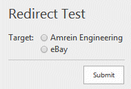
|
|
Dustin
2/10/2020 21:08 | I have a form where I have several checkboxes that list multiple things the user must agree to. I want the form to invalidate anything other than all 5 boxes checked. Example:
Agree=C[Terms A,Terms B,Terms C,Terms D,Terms E];
I tried to simply place an asterisk in front of each option to require each one but that's not supported.
I also tried a regular expression validation by adding |custom:(Terms ATerms BTerms CTerms DTerms E)|Must check all boxes ...but that seems to only be supported in text boxes.
I even tried to use a hidden static text box to match the output of all boxes checked but could not get that to work either.
Is there a way to get what I'm wanting to do? Please help! Thanks! |
|
Juerg
2/11/2020 13:15 | Dustin,
to add �accept� checkboxes, please use the �K� form field type as illustrated below:
Term A=K[agreed];
Term B=K[agreed];
Term C=K[agreed];
This form field disables the submit button unless each checkbox is checked.
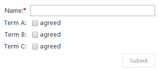 |
|
Dustin
2/11/2020 17:34 | Juerg,
Thanks! I wound up making it work by using separate radio buttons with just one option per each and hiding the label in CSS. I can use the Terms=K[I Agree]; on some other forms though.
With regard to the radio buttons, is there a way to escape the commas? I know in check boxes you can with double commas Day=C[Option 1,, Today,Option 2,, Tomorrow] but this doesn't work with radio buttons.
Thanks again! |
|
Juerg
2/11/2020 18:16 | Dustin,
we have now fixed the issue regarding escaping the commas when using radio buttons.
Please re-download the updated solution, extract the WSP solution and then update the web part solution. |
|
Dustin
3/24/2020 07:41 | Juerg,
Thanks so much for fixing the comma issue on the radio buttons!
I have another form where I'm using an upload field and I would like to limit what file types could be accepted. (.pdf, .jpg, .png). Is that possible? We are already using uploadmaillimit=2048 to limit the size, in the options.
Last question, is there a way to have the attachment post to the list but NOT be sent in the email? We can probably strip this out in exchange somehow but were hoping you had a way to do it in the web part.
Thanks! |
|
Juerg
3/24/2020 18:35 | Dustin,
you can restrict the attachments to images only (eg. jpg,gif,png etc.) by adding the below to the "Upload" form field in the web part�s �Form Template� setting:
File=U30|imagesonly;
You also can save the attachment(s) to the list, but suppress the email attachment by appending:
/noattachments
to the web part�s �E-Mail Template� setting. |
|
Dustin
4/8/2020 05:29 | Juerg,
I know that you can have a dropdown selection hide or reveal another option using phone=D[yes,no]onchange:toggle(this); but can this be done with Checkboxes? Like: Item=C[Item 1,Item 2]onchange:toggle(this); |
|
Juerg
4/8/2020 15:45 | Dustin,
we have now added support for the �onchange:� event for checkboxes.
Please re-download the updated solution, extract the WSP solution and then update the web part solution.
You then can add javascript similar to the below example:
javascript=function toggle(args) {if (args.value == "Red" && args.checked) {document.getElementById("t2").style.display="table-row"; } else {document.getElementById("t2").style.display="none";} |
|
Web Boss
4/16/2020 21:20 | Hi Juerg,
Is there a way to hide the colon which follows the label? I would like to have 2 individual input fields side by side which later will be concatenated using a calculated column. I was able to remove the label but the colon between the fields still remains.
Order No.|OrderIDFront=T4;~|OrderIDBack=T8
|
|
Juerg
4/17/2020 10:19 | Web Boss,
we fixed this issue a while ago,so please re-download the updated solution, extract the WSP solution and then update the web part solution. |
|
Dustin
5/1/2020 22:54 | I know a few have asked for cascading dropdowns in the comments. Any chance we could have that added functionality?
As a workaround, using the JavaScript method your web part supports, I think I could have 3 dropdowns appear or disappear depending on the choice in an above dropdown with 3 choices but the problem then becomes that I can't have the 3 subsequent choices be required. Unless you have an idea on how to do that?
E.G.: Color=D[Red,Blue,Green]onchange:toggle(this);*Red Hue=D[Magenta,Rose];*Blue Hue=D[Sky,Baby];*Green Hue=D[Forest,Chartreuse]
See how if you hide any of those required fields, the user can never complete the form? |
|
Dustin
5/1/2020 23:00 | I should have added... The goal is to have at least one of the 3 subsequent questions be required; whichever one is active/not hidden on submission. |
|
Juerg
5/5/2020 14:29 | Dustin,
we have now added support for JavaScript based client validation.
Please re-download the updated solution , extract the WSP solution and then update the web part solution.
Please then configure the web part as follows:
- Assign a unique name to your form so that the form elements have unique ID�s by adding the below to the web part�s �Options� setting:
formname=YourUniqueName
The form elements now have unique ID�s as eg.
Dustin_0, Dustin_1 etc.. (where the first form element starts with �0�)
- Add your JavaScript code after the above code to manipulate the form field visibility,
followed by your JavaScript validation code to the end of the �Form Template� (via the �Edit Form� button) as shown in the below example:
Name=T40;
Color=D[red,green,pink];
JavaScript=
function toggle(args) {if (args.value == "Red" && args.checked) {document.getElementById("t2").style.display="table-row"; } else {document.getElementById("t2").style.display="none";
Validate=
if (document.getElementById("Dustin_0").value=="")
{
alert("Name Field cannot be blank");
document.getElementById("Dustin_0").focus();
return false;
}
else {
return true;
} |
|
Matthew
12/1/2020 18:19 | Hi! We're using this great web part for many uses, but I'm having trouble figuring out how to save a field value, for example {username} that the user doesn't need to fill out, but I need the value to be included in the email and the SharePoint list.
I can display the field as read only which works except when the form is submitted and the values cleared for the user to resubmit the form. The read only fields also get cleared and so no values are then available to be emailed or saved to the list. Any Ideas?
thanks! |
|
Juerg
12/2/2020 11:43 | Matthew,
please use the "S" form field:
S[text]: static text
The "S" field input type allows to enter �static� text, eg. text that will not be shown on the form but be placed into the e-mail body and/or sent to t the target list. You also can enter placeholders (as eg. {username} etc.)
Examples:
Source=S[Helpdesk Homepage]
User=S[{username}]
|
|
Matthew
12/2/2020 16:31 | The Static Text works perfectly - thanks for the help! |
|
Michael
2/8/2021 10:11 | Is there a way where I can create a custom validation with seven numbers and one letter? Thanks |
|
Juerg
2/8/2021 15:25 | Michael,
you can specify a custom validation rule in the form of a regular expression by using the following syntax ( �|custom:� followed by the regular expression and an optional custom error message):
field definition|custom:regular expression|error message
Example:
Description=T40|custom:^[0-9]{20}$|please enter no more than 20 characters |
|
Michael
2/9/2021 09:04 | Thanks for the response, however I'm still having some trouble with it. The error is still being displayed even if the expression is correct. Is there a way where I don't show the error message? Thanks |
|
Juerg
2/9/2021 11:58 | Michael,
this indicates that your regular expression is not correct.
Can you share the expression you are using ?
Also, should the field contain exactly 7 numbers and one letter (where the position of the letter within the field does not matter) ? |
|
Michael
2/9/2021 12:36 | Hi Juerg,
This is my expression: ID Card Number=T10|custom:^[0-7][M]$|Wrong;
It should allow the user to write seven numbers first and then a symbol. |
|
Juerg
2/9/2021 13:41 | Michael,
to match 7 digits followed by one uppercase character please use:
ID Card Number=T10|custom:^[0-9]{7}[A-Z]$|Wrong |
|
Jim
5/26/2021 17:57 | I am getting the following message from a quick form in sharepoint 2013 when submitting:
Form List Insert Error (general/elevated): Field with name "Why Are you Nominating This Person for Receive this Award?" was not found.
Not a sharepoint expert....thoughts? |
|
Juerg
5/26/2021 18:21 | Jim,
can you check if the list column is exactly named as the field label entered into your web part's "Form Template" ? |
|
Jim
5/26/2021 23:50 | Jeurg, thank you so much for the reply. I looked in the HTML in sharepoint designer and it is not the same...I am not sure if it has ever been the same? Also, is there a quick form designer I should have like infopath? I found all this out by looking in designer and reading the HTML code...I am not sure how to look at quick forms...only by sharepoint designer. |
|
Juerg
5/27/2021 13:34 | Jim,
you do not need Sharepont Designer to configure the web part.
Please put the page into edit mode and then select "Edit Web Part" in the menu located in the upper right corner of the web part.
You now can look up the URL of the list which receives the data from the Quick Form web part in the wweb part's "Target List" setting.
Please now check if this list has columns that correspond to the web part's form field labels.
We also can schedule a screen sharing session to help you fix the issue (please mail to [email protected]). |
|
Ben
7/27/2021 22:22 | When using a regular expression is it possible to include the pipe character to indicate an 'OR' condition? It appears this is not supported, because the pipe is being used as the delimiter to indicate the error message. Is there a way around this? |
|
Juerg
7/28/2021 13:23 | Ben,
in this case please use the "�" broken pipe character for the "or" condition within your regular expression. This then will be automatically handled correctly by the web part. |
|
Ben
7/28/2021 20:49 | Hi Juerg,
I tried the following regular expression which should validate a 2 digit month between 01 and 12. Unfortunately the broken pipe is not acting the way it should for me.
Month=T5|custom:^(0[1-9]�1[012])$|enter a 2-digit month
|
|
Juerg
7/29/2021 11:32 | Ben,
this option was added with version 1.3.13 in October 2019.
Can you check the web part�s version number by opening the web part�s tool pane and looking it up at the top ?
If you version is older, please re-download the web part and then update the solution. |
|
Dan Neuman
9/28/2021 21:35 | After purchase this control and using it for 10 years on our server, we started receiving a message the license has expired. We love this Control. It is incredibly powerful and beneficial to our users. How can I get the license fixed? |
|
Juerg
9/30/2021 18:21 | Dan,
we have now sent you a new license key by e-mail. |
|
Martin Kar
12/13/2021 07:56 | How to hide colon between the label and the field input ? |
|
Juerg
12/13/2021 10:34 | Martin,
to suppress the label�s colons please add the below to the web part�s �Options� setting:
other settings|labelcolon=none |
|
Elizabeth
1/4/2022 17:30 | Is there a way to limit file upload to certain file types? Not just images only? i.e. .docx, .xlsx, .pdf, etc. |
|
Juerg
1/4/2022 17:44 | Elizabeth,
you can add a file type validation individually to each upload control used by the Quick Form web part.
Images only:
Label=U50|imagesonly
PDF only:
Label=U50|pdf
TXT only:
Label=U50|txt
Microsoft Word only (doc and docx):
Label=U50|doc
Microsoft Excel only (xls and xlsx):
Label=U50|xls
Microsoft Powerpoint only (ppt and pptx):
Label=U50|ppt
However, it is currently not possible to specify multiple file types to be accepted for upload.
Would you need this feature ? |
|
Elizabeth
1/4/2022 17:57 | We would need this feature available for a use case we are exploring solutions for. I don't have the exact requirements yet as to which file types would be excepted. |
|
Juerg
1/4/2022 19:41 | Elizabeth,
we have now released an update which allows you to specify multiple file types to be allowed for uploading.
Example:
Label=U50|doc,xls,ppt
The above example allows to upload Microsoft docx, pptx and xlsx files.
Please re-download the web part and then update the solution. |
|
Elizabeth
1/4/2022 20:24 | Thank you so much! |
|
Mark
1/28/2022 07:17 | I have created the form, however upon submit nothing happens as if the the button wasn't clicked. |
|
Abbas
1/28/2022 10:36 | Hello Juerg
Is it possible to use this nice web part for editing an item in a sharepoint list ?
I need to provide a web form for some users that sent us a feedback, to continue and complete their previous item/items that they posted it before!
How can I do this?
regards,
Abbas |
|
Juerg
1/28/2022 14:11 | Mark,
is your page still in "Edit" mode ?
In this case the submit button is disabled. |
|
Juerg
1/28/2022 14:20 | Abbas,
yes, you can edit an existing list item by either passing the list item ID via the �AEQFID� URL parameter or by entering the ID into the web part�s �Options� setting:
itemid=some number |
|
Elizabeth Hemond
2/3/2022 21:46 | We updated our solution to 1.4.49, and tried to limit the to multiple file types. It is only picking up on the first file type. For example, we added Label=U50|pdf,jpg,png and it is only allowing us to submit pdfs.
We are on SP 2013, and were wondering if that solution was updated? |
|
Juerg
2/4/2022 13:04 | Elizabeth,
we have now also added support for the "jpg", "png" and "gif" file formats.
You thus can restrict uploads to:
doc and docx
ppt
xls and xlsx
ppt and pptx
jpg, gif and png
or any combination thereof.
Please re-download the current version (1.4.51) and then update the web part solution. |
|
Abbas
2/9/2022 13:38 | Hello Juerg
I'm using this nice web part since sharepoint 2007 and now I installed the latest version in sharepoint2019 on-premise. (My useage is for filling a sharepoint 2019 announcement list with our language pack witch has 1065 Code, opposed to the 1033 code in english) But I have some problems and question about it:
1-How can I use a lookup field that can referred to a "Site Column" in the root site collection (Not in a list in my website)? This option is very important for me!
2- How can I arrange the orientation of fields and lables from left to right, to Righe to left that is compatible wit our language?
I tried the setting of the "Form Label Layout" in "Righeadjust" and "Leftadjust" , But anything was changed.
3- I used a field for gadering the announcement of type "enhanced rich text" and config it like your "1/25/2013 14:07 " post. but the toolbox for customizing the text is not there in the form.
regards,
Abbas
|
|
Abbas
2/9/2022 18:29 | Hello Juerg
we want to capture user ideas using this web part. The user enters his name, surname, idea ect and the information is pushed to a sharepoint list. The user gets the "Completion Message" once they submit. Is it possible to pull the content of a calculated column from the list that the users info is being pushed to once they click submit in order to show in the "thank you message"?, or if not can a Calculated field (Like this: PID=Len(Title)&Len;(Idea)&{id}) be rendered on each submission for the "Completion Message" ?
regards,
Abbas |
|
Juerg
2/9/2022 19:13 | Abbas,
you actually can embed list field values in the �Completion Message� web part setting by embedding the field name(s) enclosed in double curly braces (including calculated fields) as eg.
You purchased tickets for ${{Price}}. Thank you! |
|
Abbas
2/13/2022 07:13 | Hello Juerg
When I use both "Page Redirection" and "Completion Message", The "Completion message" does not show.
Is it possible to show the "Completion message" in a dialog box before directing to the "Page Redirection" target?
regards,
Abbas |
|
Juerg
2/14/2022 13:29 | Abbas,
this is not possible but you could redirect to a new browser window instead ba appending the below to the web part�s �Page Redirection� setting:
/top |


 Great product! Easy install, just what we needed to get some quick wins!


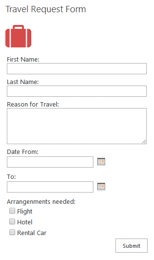
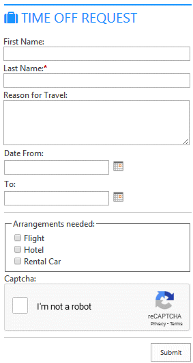
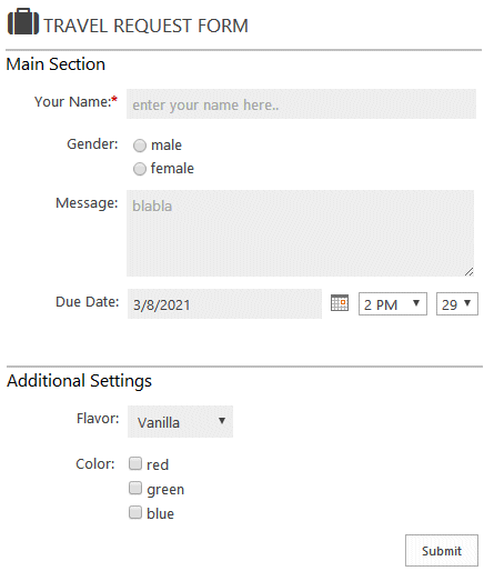
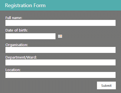
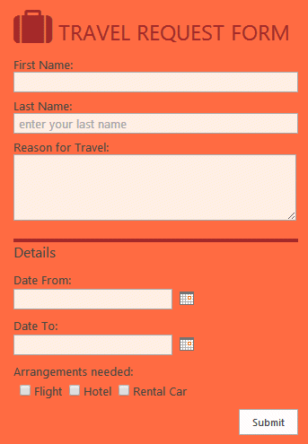
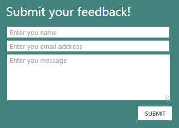

 Quick Form Web Part Installation Instructions (SP 2007)
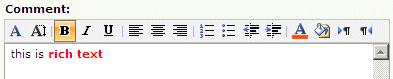

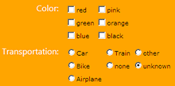
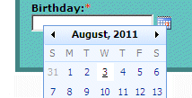


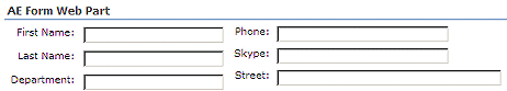
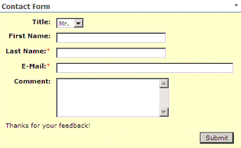
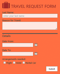

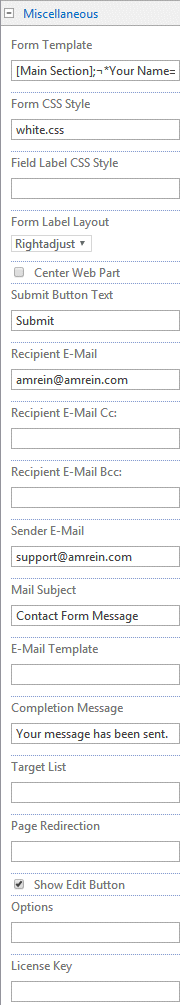
 Post a Comment
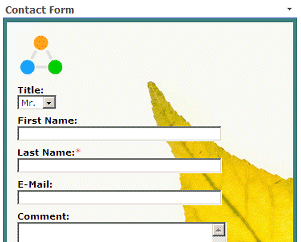
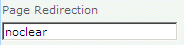