Abbas
5/8/2012 12:48 | Hello Juerg,
This web part looks very nice. Thank you for your develop! I have to buy it, but I still have some request:
1- Is it possible to display the menu items in a table mode? (rows and columns) and limit the number of rows and columns to show?
2- Is it possible to change the alignment of the menu items? for example to "center" or "left" or "Right"? I mean I want to Set pictures vertical and horizontal alignment
Regards, Abbas |
|
Juerg
5/10/2012 15:50 | Abbas,
please add �text-align:right� or �text-align:center to the web part�s �Item CSS Style� setting to align your text.
we have now added the new �Number of columns� option to allow for tabular menu layouts.
Please re-downlaod the Zip file, extract and then replace the DLL, followed by an "iisreset" command.
|
|
Roberta
5/31/2012 00:22 | Hi,
This is a great web part. We are enjoying using it.
Is there a possibility to request that the image column be a Rollup Image (field name is RollupPublishingImage)? Currently with version 1.0.1 it is trying to build the img tag when it is actually already built in that field resulting in the missing image icon. |
|
Roberta
5/31/2012 01:09 | Hi,
A follow up question, is there a suggested way to have a vertical layout with the labels from the description field under the graphic?
Thanks! |
|
Juerg
5/31/2012 14:58 | Roberta,
we have now added support for the �PublishingRollupImage� site column (which is internally handled differently by Sharepoint compared to a �Picture� column).
We also added the
- vertical, Icons above text: display the icons above the text, laid out vertically
�Menu Layout� option on May 10 with version 1.0.2
Please thus re-download the updated Zip file , extract and then replace the DLL, followed by an �iisreset� command. |
|
Tony
6/7/2012 22:20 | Hi,
I've been trying to style the A tags in the li, but can't seem to isolate them, do you have any suggestions on where I should apply styles to the A tags in your web part properties?
Cheers |
|
Juerg
6/8/2012 19:14 | Tony,
you can actually use the web part's "Title CSS Style" sewtting to style the menu hyperlinks. |
|
Juliana
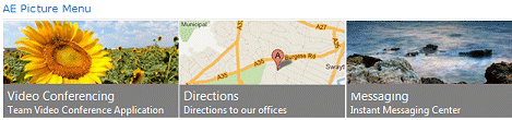
8/15/2012 22:20 | Hi,
This is great.
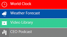
How can we add the white thin lines between the items as shown in the first picture at the top of the page?
Thanks |
|
Juerg
8/16/2012 19:06 | Juliana,
please add the following CSS style to the web part's "Item CSS Style" setting:
border-bottom:1px solid silver; |
|
Juliana
8/18/2012 18:02 | Thanks Juerg.
Is is possible for the description to have a much smaller font than the title ? |
|
Juerg
8/18/2012 18:10 | Juliana,
yes, by using the web part's "Item CSS style" setting to define the CSS style of the description text.
Example:
font:8pt Segoe UI; |
|
aymarr4
8/21/2012 19:18 | j eu une probl�me et je savais pas comment le r�soudre
" Url cannot be accessed"
que est ce que je doit faire ?? |
|
Juerg
8/21/2012 19:38 | aymarr4,
did you enter the name of the List column that contains the URL into the web part�s �Menu URL Field Name� setting? |
|
Anna M
9/7/2012 09:02 | Hi,
This is a great web part. We are enjoying using it.
Only a question: It's possible to open link in a new tab not in a new window ?
Thanks, Anna |
|
Juerg
9/7/2012 10:53 | Anna,
I assume you are using Internet Explorer since both Google Chrome and Firefox automatically open links in a new tab. You need to configure Internet Explorer to also show this behavior.
See for example the following article: http://helpdeskgeek.com/how-to/force-ie-to-open-link-in-new-tab |
|
Abbas
9/7/2012 11:10 | Hi Juerg
Would it be able to have a field for grouping the menu items? I created a column for grouping items in my sharepoint list. Is it possible to show the items under each group name in this web part?
regards, Abbas |
|
Ayush
9/7/2012 12:26 | hii.. wat we vave to give here in Menu URL Field Name..
n when m adding 8 images the error- Url cannot be accessed is shown 8 times ..plz tell anyone y dis is cuming.. |
|
ayush
9/10/2012 07:40 | plz tell me what we have to give in Menu URl Field Name..m nt getting wat u r saying . |
|
ayush
9/10/2012 11:41 |
ok that is done..
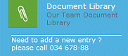
but one more doubt..plz find the attachment i want the name or any text on the left hand side of image,how it can be come.. |
|
ayush
9/10/2012 14:14 | thankyou sir nw its working...
Can u plz tell me how we can move from another page or we link one page to another when clicking on that image or text written on the right hand side of the image.. plz find the attachement |
|
Juerg
9/11/2012 12:19 | ayush,
I assume you added a column of type �Picture or Hyperlink� to your Sharepoint List containing the menu items for the �Picture Menu� web part.
You then just have to enter the name of this column into the web part�s �Menu URL Field Name� setting.
Please then enter the URL of the target page into the �URL� field of the corresponding menu item in your Sharepoint List. |
|
Abbas
9/11/2012 17:15 | Hi Juerg,
1- I want to connect it to one of my sharepoint lists. I created a column of type �Picture or Hyperlink� to my List. It's name is "PicPath" and it contains the URL of picturs & icons. I used it in the field "Menu Picture Field Name". But the web part does not show the picture! What is my fault?
2- How can I set the picture (in "vertical Icons only" mode) in the center of "web part zone" area? I also want to align this web part Center!
Thanks, Abbas |
|
Juerg
9/12/2012 15:23 | Abbas,
- We have now fixed the problem with the �Menu Picture Field Name� pointing to a List column of type �Picture or Hyperlink�.
Please note that you also can upload the icons a a List attachment (and leave the �Menu Picture Field Name� empty)
- To center the web part with the zone please add the following CSS styles to the web part�s �Menu CSS Style� setting:
margin-left:auto;margin-right:auto
|
|
Forest
9/27/2012 15:03 | Will this web part run in SP2010 Foundation? |
|
Juerg
9/27/2012 15:18 | Forest,
yes, it will work in all versions (SP2007, SP2010 Foundation and Server and also in Office365). |
|
Forest
9/27/2012 16:44 | Juerg,
Thank you. I installed the trial version and am working with it right now. Looks pretty darn good. Will be making purchases on multiple products soon. Look forward to SP2013 and Office365, but not there yet.
|
|
Matteo
10/4/2012 21:06 | Hello Amrein,
Is there a way to suppress the "The specified Sharepoint List is empty!" message and just have the web part not display anything when the list/view it points has zero items?
please advise
matteo
|
|
Juerg
10/4/2012 21:30 | Matteo,
we have now added the new option to suppress the message by appending /suppressempty to the �Web Part Footer� setting:
Please re-download the updated Zip file from our web site, extract the WSP file and then update the web part solution. |
|
Dave Williams
10/27/2012 18:53 | Will this web part work in anonymous mode? |
|
Juerg
10/30/2012 17:11 | Dave,
yes, if the Sharepoint List containing the menu links is configured for anonymous access. |
|
Roberta
10/30/2012 23:15 | Hi, we are using SharePoint 2010 and use the web part for horizontal with no title. We are wondering if there is a feature in the future for a horizontal menu with title?
We have tried to set the column for the description with the horizontal no title setting, but when we put in the field the name "Description" which is the name of the column of a picture library, it causes the web part to say "Sharepoint List not found!" |
|
Juerg
10/31/2012 16:02 | Roberta,
we have now added the new �horizontal� menu layout option which allows you to display a single row of menu items including the menu title and description:
You can configure the rendering of the text via the web part�s �Item CSS Style� setting.
Example (see image above):
background-color:gray;font:9pt Segoe UI;color:white;top:80px
The above example creates a gray box positioned 80px below the top edge. |
|
Joel
11/8/2012 17:38 | I feel a little moronic asking this because it is so simple. Basic picture library. I created a new view that does nothing more than filter on "do not display if Field X is blank". When I put that view into the web part, I get "Sharepoint list not found". From designer, I bring up the view, and only the 8 picture out of 131 display as they should.
So I made this the default view, and brought up the site in a browser, and blanked the List View Name in the web part. All 131 icons still show, instead of the 8 that should. I probably just need a break, but....... |
|
Juerg
11/9/2012 10:57 | Joel,
please make sure to include the list columns as specified in the web part in your List View:
- Menu Picture Field Name
- Menu Title Field Name
- Menu Description Field Name
- Menu URL Field Name
|
|
Janina
11/9/2012 20:15 | How do I deploy the new version of a webpart? It seems we are having an issue with updated new versions. Please send me instructions if you have any that way I can them along. I am not the one who installs the webparts. Thanks for your help.. |
|
Juerg
11/10/2012 15:02 | Janina,
assuming you are using SP 2010:
Please update the solutions (after placing new wsp file in the c:\ root folder using the following Sharepoint PowerShell cmdlet (run as admin):
Update-SPSolution �Identity AEMenuWebpart.wsp �LiteralPath c:\AEMenuWebpart.wsp -GACDeployment |
|
Vincent
11/29/2012 11:23 | Juerg, I use a 2 column layout to display items in a pages library. How do I get the 2 colums to have an equal width? Now it adjusts automatically to the text.
Another issue is that the icon doesn't show up for some libraries. I use the PublishingRollupImage as MenuPictureFieldName. |
|
Juerg
11/30/2012 11:06 | Vincent,
you can fix the column widths via the web part�s �Item CSS Style� setting:
Example:
padding:5px;width:250px
The �PublishingRollupImage� column should actually work fine.
Does it not work at all for some libraries but OK for others ? |
|
Vincent
12/4/2012 10:28 | Juerg,
The width is OK now. Thx.
Concerning the images: it seems to work OK with gif-files, but not with jpg or png.
|
|
Damon
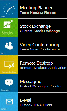
12/6/2012 17:02 | Is there a way to allow you to resize certain tiles to be double size, or half size of other tiles? If you could do the horizontal menu like you show in the comments area just a couple comments up from this one- and allow yourself to do 2 or 3 rows of icons, you could have a "windows 8 metro" style menu. Better yet- allow the option to choose a size for some of the icons, even if simple like "small" or "large vertical" or "large horizonatal", essentially allowing you to mix and match icon sizes to form the grid. |
|
Juerg
12/10/2012 13:00 | Damon,
we recently (September 17, 2012, version 1.0.7) added the option to add double-sized icons to the menu:
The menu depicted above uses the "vertical Icons only" Menu Layout setting with the "Nbr. of Columns" set to 6. |
|
Steve
12/10/2012 20:18 | Would it be possible to add a column length field to the properties? |
|
Juerg
12/10/2012 22:05 | Steve,
assuming that you would like to control the width of the column containing the menu title and description, please add the CSS "width" attribute to the web part's "Item CSS style" setting.
Example:
padding:5px;background-color:orange;border-bottom:1px solid white;width:180px |
|
Vincent
12/12/2012 11:42 | Juerg,
I created a pages library and I want to use a view (BU) to filter the list in the Picture Menu. When I select this View the title field doesn't show up.
When I leave the View empty, the full list is displayed correctly. I included the filter field in the view, so it must be sth else?
|
|
Juerg
12/17/2012 12:39 | Vincent,
to fix the problem with the List View when accessing a �Pages� library in SP2007:
Please also enter the Site name of your �Pages� library into the web part�s �Site Name� setting.
Example:
Assuming that your Pages library is located at:
http://yourSPServercoml/SomeSite/Pages/Forms/AllItems.aspx
then please enter the below URL into the �Site Name� setting:
http://yourSPServercoml/SomeSite |
|
Mike B
1/12/2013 20:16 | I love the pic menu WP!! Is there a way to set height on the thumbnail icons? I am using this with some portrait and landscape pictures and the portrait displays too tall for the space. I realy want to set all pics to the same height and width. I am not concerned if it cuts off some of the image I just like them all to be the same.
Thank you for all your help! |
|
Vincent
1/23/2013 13:25 | Juerg,
Is it possible set the css-styles though a css-file instead of specifying them as a property. This would allow us to centralise these settings.
|
|
Juerg
1/23/2013 14:21 | Vincent,
the web part currently defines the following CSS classes:
surrounding <table> container: AEMWcontainer
Icon Hyperlink: AEMWpiclink
You then can select the menu title as follows:
.AEMWcontainer div a
and the menu title as follows:
.AEMWcontainer div
We also can add additional class names if needed (please send us a quick note in this case). |
|
Juerg
1/28/2013 19:03 | Mike,
you could actually set the desired menu column height via the web part�s �Icon CSS Style�:
Example:
height:60px;background-color:black
This method will introduce aspect ratio distortions if the image�s aspect ratio is does not match the current width and height settings. |
|
Brian
3/22/2013 20:01 | Hey Juerg, My intention is to show the item images in a format of 4x3 grid. I have set the web part property for "Nbr. of Columns" to "4" - thinking that after 4 items it would wrap to the next first column again. However, after adding 6 items to the list - I still see 6 items along one row. What am I missing? |
|
Juerg
3/24/2013 14:15 | Brian,
you will need to choose one of the �vertical� Menu layout options to layout the menu in a grid-like fashion. |
|
Adam
4/3/2013 17:56 | I am using the vertical layout and would like to have the title hidden and only displayed on hover. Is that possible?
Thanks! |
|
Juerg
4/3/2013 20:20 | Adam,
please set the "Menu Layout" to "vertical Icons only" and also set the "Menu Description Field Name" to "Title". |
|
Vinni
4/9/2013 17:54 | Hi,
we are using SharePoint 2010 and use the web part for horizontal with Title and Description but the title and description are overlaying on the icons.. is there any way we can set the title below the icon..
Thanks, |
|
Bisi
4/9/2013 18:34 | Hello Juerg,
How do I link the menu to the sites or subsites.
Regards, |
|
Roberta
4/10/2013 19:57 | Question, does the Item Style CSS work in the vertical menu layout?
|
|
Roberta
4/10/2013 20:07 | Hi,
This is just a general comment. We just love these web parts. However, configuring them is time consuming. If we could just export the settings and import them, it would make them so much more valuable. You could even post setting sets to your site, we could have a community exchange of settings where we share the CSS to make the beautiful layouts that are possible with your programs.
Just a thought - Thanks again! |
|
Juerg
4/29/2013 18:53 | Roberta,
please note that you can export a web part setting via the �Export..� menu entry and then later import the setting either directly onto a Sharepoint page or upload the file into the Sharepoint site collection�s web part gallery. |
|
Juerg
4/29/2013 18:55 | Roberta,
yes,the "Item Style CSS" setting should work OK when using the "vertical" menu layout. What kind of problem do you observe ? |
|
Vincent
8/5/2013 12:10 | Hi Juerg,
I use this web part on many sites, but now I would like to apply audience targeting. Does this wab part support this functionality?
Regards,
Vincent |
|
Juerg
8/5/2013 19:31 | Vincent,
the web part currently does not support audience targeting (this would require us to create specific versions both for MOSS2007 and SHarepoint 2010/2013 Server).
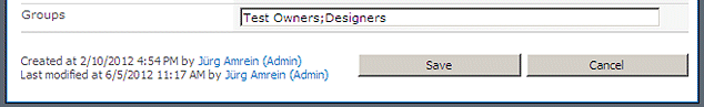
However, the web part actually allows to filter the menu items by Sharepoint group.
Please add a new column named �Groups� (of type �single line of text�) to your Menu List. You then can optionally enter one or more Sharepoint groups (separated by semicolons) into the field:
|
|
Kyle Lipkin
9/12/2013 23:03 | When putting in the URL if the URL has a comma in it when you submit the item the URL will break at the comma, is there anyway you can make it so that if a user puts in a comma in the url it will change it to %2C on the sharepoint side? |
|
Juerg
11/1/2013 15:46 | Kyle,
we have now released version 1.0.19 of the �Picture Menu� web part which fixes the bug with commas embedded in the URL.
Please re-download the most recent version, extract the WSP file and then update the web part solution. |
|
Mike B
11/5/2013 15:40 | I was checking to see if it was possible for you to add the url query in the picture menu just like the light box? I am attempting to build a dynamic menu from multiple lists and point all to one page. Thank you!
Example:
AEMWSitename
AEMWListname
AEMWViewname |
|
Juerg
11/5/2013 17:32 | Mike,
we have now added the new option to pass the Site Name, List Name and View Name via URL parameters. Please enter the URL parameter names enclosed in square brackets.
Example:
Please re-download the updated version, extract the WSP file and then update the web part solution. |
|
Roberta
11/6/2013 16:56 | Yes, I am now able to export the web part with settings, thanks! This is a big time saver.
On the item style, I am noticing that if I elect to use a view, I am not seeing the item styling. This is on an instance of the web part using the horizontal layout. If I use no view, I have item styling - the title shows up with the color and other settings I put in the Item CSS Style when there is no view. If I add the name of a view, I get the images in that view, but no styled titles.
We are also not seeing the images in the same order as the view defines. We may be a version or so behind, so I will try to depoy the latest code. |
|
Juerg
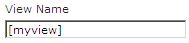
11/7/2013 18:23 | Roberta,
please add the �Title� column to your List View if you specify a view in the web part's "View Name" setting. All the columns referred to by the web part settings need to be included in the list view. |
|
Abbas
12/6/2013 09:51 | Hello Juerg,
Is it possible to use this web part for running some applications? for example: we have an windows application in our organization, located in a share folder and we run it using a shortcut. how can I use it with a link in our web site?
or, Is it possible to use this web part for running microsoft office applications?
Thanks & regards
Abbas |
|
Juerg
12/9/2013 16:07 | Abbas,
this is not possible since the modern browsers do not allow to directly launch desktop applications from within the browser (you can only indirectly launch Office applications by clicking on an link pointing at an Office document).
Microsoft used to support opening desktop applications via VBScript and an ActiveX object embedded in the HTML but this requires ActiveX to be enabled and only works in Internet Explorer. |
|
Abbas
12/9/2013 17:15 | Hello Juerg;
Many thanks for your kindly support. Would you please see the following link?
http://www.websio.com/product.aspx?ID=132
It reffers to a "quick lunch web part" that is very similar to your product. I'll be very thanks if you try to present this feature in your nice web part.
thanks & regards
Abbas |
|
Juerg
12/10/2013 16:43 | Abbas,
Websio actually uses a custom client component (that most probably only works with Internet Explorer). We currently have no plans to also develop such a component, so you might consider to use Websio�s menu instead. |
|
Lynn
12/13/2013 19:19 | Can this web part be used with a pages library? |
|
Juerg
12/15/2013 17:01 | Lynn,
yes it can. If you point the web part to a publishing pages or a wiki pages library, please use the �URL Path� column as the �Menu URL Field Name� to point the menu items to the pages. |
|
Roberta
12/27/2013 15:54 | Hi, I was trying to create a grid 4 across by 2 down, basically 4 columns in the horizontal layout. When I use the 4 columns in the vertical, there is a TD for the title to the right of the image. I am trying to get the titles under the images instead of to the side. Thanks! |
|
Juerg
12/27/2013 19:06 | Roberta,
please use the �vertical Icon above Text� �Menu Layout� option:
|
|
Edgar
3/11/2014 16:42 | Hi.
How we can assign a different color to header webpart? |
|
Juerg
3/11/2014 17:42 | Edgar,
you can wrap the text placed in the web part�s �Header� setting in a DIV tag as follows:
<DIV style=�background-color:red;color:white�>Your header text</DIV>
However, this will probably leave a small left gap at the left edge (depending on if you specified a �padding-left� style in the web part�s �Item CSS Style� setting.
You also can use the new �headerstyle� web part option (to be placed into the web part�s �Options� setting).
Example:
headerstyle=color:white;padding:5px;height:30px;background-color:orange;font:12pt Segoe UI
In this case please re-download the updated version, extract the WSP file and then update the web part solution. |
|
Ei
3/19/2014 03:17 | Hi,
Is there a way to re-arrange the images in that tile table? Please advise.Thanks. |
|
Juerg
3/19/2014 11:19 | Ei,
to show the menu items in a different orde, please create a List view and apply your custom sorting and filtering and then enter the name of your view into the web part's "View Name" setting. |
|
MikeZz
4/8/2014 23:24 | Can I connect this webpart to another web part using "Connections"?
As an example, have a library with Icons for "Approved","Rejected" etc....
When I press the "Approved" Picture, it filter another library web part on the page using "Connections".
Is this Possible? |
|
Juerg
4/9/2014 18:06 | Mike,
the Picture Menu web part cannot act as a Filter web part, but the �Navigator� web part (see /apps/page.asp?Q=5833) actually does. |
|
SClare
5/6/2014 17:33 | Hi.. Once I change from the default view of a Picture Library to a view I've created, the icon I've used with corresponding text in the Description field disappears (in the view); so only the icon is displayed.
Thanks. |
|
Juerg
5/7/2014 12:32 | SClare,
please make sure to add the �Description� column to your �Ordered� view in the Sharepoint picture library. |
|
Catharine Whie
5/13/2014 14:12 | A suggestion.
It would be really useful if we could have an option to have the menu items appear in a different order each time you log in.
We have a vertical menu which has 10 items in it... so the items at the bottom of the list don't get the "exposure". I know that I could have 2 columns etc - or horizontal. In this case the only space on the page is vertical - having the menu options in a "variable/random" order it would give some dynamic to the screen. |
|
SClare
5/14/2014 11:58 | Hi, I have made my 16 pictures all the same width before uploading (180px) however when I apply the vertical icons only property with 4 columns and picture width of 100px... There are 3 columns displayed, two columns with 7 icons and the third column with 2 icons... |
|
Juerg
5/14/2014 19:11 | Serina,
we were able to locate the problem:
the web part detects if a picture is at least twice as wide as tall and then allocates two table cells. This allows for double-sized tiles as shown in the example below:
Since you want your tiles to be square sized, we have now added the new �doubleSize=0� web part option (to be entered into the web part�s �Options� setting) to turn off this behavior.
Please re-download the updated version, extract the WSP file and then update the web part solution. |
|
Colleen
5/15/2014 21:03 | Hello,
I've added the trial version of this webpart. I am using a Publishing Page and a Custom List to feed this webpart. I would like the URL of the item itself to be the Menu Picture URL. Is there a way to do this similiar to the FileRef that pulls in the Title without having to create a URL column and then copy and paste in the link to the DispForm.aspx?ID=x
Thanks!
Colleen |
|
Juerg
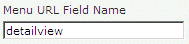
5/16/2014 12:25 | Colleen,
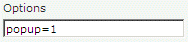
we have now added the option to open the detail view of the menu item by entering �detailview� into the web part�s �Menu URL Field Name� setting:
You now also can optionally open the link in a Sharepoint 2010/2013 popup window by entering �popup=1� into the web part�s �Options� setting:
Please re-download the updated version, extract the WSP file and then update the web part solution. |
|
Juerg
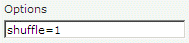
5/19/2014 13:03 | Catharine,
we have now added the new �shuffle"web part option (to be entered into the web part�s �Options� setting) to display the menu items in a random order on each page visit:
Please re-download the updated version, extract the WSP file and then update the web part solution. |
|
SClare
5/21/2014 10:48 | Hi,
Can we add a color property to each item in our list, the same way we do with the Navigator web part?
Regards. |
|
Juerg
5/21/2014 12:09 | SClare,
yes, please add a column named �Color� to the picture library (and make sure to include this column also in your view if you specify a view in the web part�s �View Name� setting): |
|
Tracy
5/21/2014 21:17 | I am in the USA and cannot purchase from an overseas vendors (restriction of our school District). Do you have resellers in the US that I can purchase web parts from? |
|
Alex Fischer
6/5/2014 19:34 | Hi,
is it possible that "Highlight on Hover" does not work (tested with IE 11)
Regards
Alex |
|
Juerg
6/9/2014 14:01 | Tracy
yes, you can order via SHI International Corp., Softchoice or Insight. |
|
Juerg
6/9/2014 14:02 | Alex,
we have now fixed the "Hightlight on Hover" problem with IE11.
Please re-download the updated version, extract the WSP file and then update the web part solution. |
|
Webmagic
6/19/2014 09:09 | Hello,
We are using the trial version of this webpart. I cannot get the title visible in the menu. I have added the description field to the view we are using in the webpart setting, but no luck.
Any idea |
|
Juerg
6/19/2014 18:23 | Webmagic,
please make sure to include the �Title� and �Description� columns in your list view. |
|
ALex
6/20/2014 13:15 | Hi! Nice WP, thnx!
But we've got "The specified Sharepoint List is empty!" under all users except creator of the List.
In wp-settings (under other admin-users) everything is ok.
What we need to do? |
|
Matteo
7/14/2014 01:51 | Hello Amrein,
I was working with the picture menu version 1.0.12 and ran into some problems today.
1) Highlight on hover option was not working
2) Number of menu items
- I set up a list that has 77 menu items
- I am displaying them in 7 Columns
- So i should get 10 items in each column
- However, i am only seeing the first 28 items from the list
- that is 7 columns , 4 items in each column
Can you take a look?
Matteo
|
|
Matteo
7/14/2014 16:51 | Hello Amrein,
My Bad on this one. The reason i was not getting all of the items from the list, was the view i was using had a limit of 30 items. I changed this and then it worked fine.
However, the "Highlight on hover" option is still not working. I am not using any images here just the text and i wonder if the hover code is for images, text or both?
Always fun working with Amrein and the web parts.
Matteo
|
|
Juerg
7/14/2014 18:13 | Matteo,
you can configure the web part to change the menu item�s background color when hovering over it by adding the below to the web part�s �Options� setting:
css=.AEMWitem:hover {background-color:yellow !important}
(please adjust the color as needed). |
|
KY
8/26/2014 07:45 | Hi Juerg, is there any cache retention period for this web part, similar to some of Amrein's other web parts? We have quite a huge number on the menu, and users are telling us that it is taking some time to load the entire page. |
|
Juerg
8/26/2014 15:37 | KY,
we have now added the new "cache=xx� option (to be ebtered into the �Options� setting), where xx is the number of minutes to cache the data) as for example:
cache=60
to cache the data for one hour.
Please re-download the updated Zip file, extract the WSP file and then update the web part solution. |
|
Polly
12/22/2014 22:31 | I'd like to use the Picture Menu Web Part to link to anchor tags on the same page it is displayed on, so because it opens in a new tab (IE) this isn't working. Any ideas on settings or code which would allow me to jump to anchor tags, or similar - a defined place on the page.
Thanks, as always, POLLY |
|
Juerg
12/26/2014 13:44 | Polly,
please make sure to uncheck the web part�s �Open Link in new window� setting in order to jump to an anchor placed on the same page..
Also enter the anchor URL�s as shown in the below example:
#anchorname |
|
Chris
1/15/2015 19:52 | Is there a way to specify for each link whether it opens in a popup, new tab/window or the existing windows. In other words, can I have one link open in a new window and another open in a popup? |
|
Juerg
1/16/2015 14:00 | Chris,
we have now added support for all 3 options on how to open a link.
Please add a new �Choice� column to your list or library named �Target� and configure it to use the below 3 choices:
same window
new window
popup
The web part automatically senses the presence of this column and then uses these values.
Please re-download the updated version, extract the WSP file and then update the web part solution. |
|
Georg
5/29/2015 11:26 | Hi!
I tried to use transparent png and a color column in my List - so I can define the background color individually per list-entry and reuse the Icons.
It seems that the "color" column does not affect the background of the Icon.
Is it possible to use List Columns in the CSS definitions? Something like background-color: {color} ? |
|
Juerg
5/29/2015 19:04 | Georg,
the "Icon CSS Style" web part setting now honors the "{color}" token to dynamically assign it the current background color (as defined by the value of the "Color" column).
Example:
border-bottom:1px solid white;background-color:{color}
|
|
David
7/23/2015 01:19 | We would like to point the menu webpart to a list in a different site collection. Adding the path to the site eg /sites/menu in the site box does not appear to work. Is there a different syntax we need to use for this to work? |
|
Juerg
7/23/2015 12:56 | David,
to point the web part to a site in a different site collection, please enter the full URL to the site into the �Site Name� setting as shown in the below example:
http://somedomain/somesitecollection/somesite |
|
Noah
10/29/2015 18:21 | Hi Juerg,
Everytime I try make the background behind the text transparent, it makes the text transparent too. How can I fix this?
Thanks!! |
|
janice
11/23/2015 19:00 | When I set the color of the font in the CSS item, only the font color for the description changes.. I also would like to change the font of the title.. how do you do? thx |
|
Juerg
11/23/2015 19:31 | Janice,
you can set the title font color via the web part�s �Title CSS Style� setting as shown in the below example:
font-weight:bold;color:red |
|
Hi Juerg,
12/11/2015 23:50 | Is it possible to make the height and width responsive to a mobile device? We love using this WP as our navigation menu, but it isn't displaying well both on a desktop and on mobile because of sizing issues.
Thanks! |
|
Juerg
12/12/2015 19:24 | Hi,
which "Menu Layout" setting are you using ? |
|
wc
7/10/2019 15:37 | I have a bit silly question: I want to use it not a picture menu but just text menu, want to be able to provide links (to document libraries etc) with title say 5 in a row in a tabular format but user is not good with editing pages/html so using a list will be easier for them to enter. So not really have any pictures but want to use text, what is the best way to line these up nicely, I tried a little and seems the text are overlapping.
Each is a link:
X1 X2 X3 X4 X5
X6 X7 X8 X9 X
Thx!
|
|
Juerg
7/10/2019 17:59 | wc,
in this case we recommend the �Quick Links� web part (see /apps/page.asp?Q=5909) which lets you (or your users) set up simple menus.
You could for example use the below layout (using 2 columns):
Adding icons to the links is optional. |


 We have had no problems, so we are pleased with the web part. The configuration was very easy.


 Web Part Installation Instructions


 Post a Comment