Sanodor
4/16/2009 14:29 | Awesome!!! |
|
Nimi Kaul
4/17/2009 11:44 | After adding the web part and editing the properties, instead of the chart, i can only see a placeholder. WHat could the reason be? |
|
Jonathan S
4/17/2009 16:48 | This is an awesome tool!!! One issue I found was that when using the view name to filter data the resulting URL produces an column error causing the broken link.
"http://chart.apis.google.com/chart%3Cp%3ELabel%20column%20error:Center%3C/p%3E?chs=320x240&chtt;=" |
|
Juerg
4/20/2009 13:54 | The broken link was due to the fact that the web part code appended an error message (�Label column error: Center�) with the chart URL. This has now been fixed.
Most probably you have an empty field somewhere in your �Center� label column. We also added code to deal with this issue.
Can you please re-download the updated ZIP file and replace the DLL ?
You might have to restart IIS to force loading the new DLL. |
|
Avi
4/27/2009 17:52 | Hello
I have list called myforms (a infopath form library) and having column state, severity. (http://portal/myforms - list url)
I enteredd myforms in list name and use column name as state, severity, but it is giving me error as "sharepoint List not found".
Please let me know whats wrong I am doing?
Avi
|
|
Michiro
4/29/2009 10:54 | Noticed that the data can work with numeric data only. |
|
Russell Powell
5/20/2009 17:09 | Would be great if the webpart could also use the SQL Query viewer as its datasource in addition to a standard sharepoint list.
-- Russ |
|
Tahir
5/27/2009 17:16 | Simple and functional. This is exactly what I was looking for. |
|
Niels
6/8/2009 16:52 | This is really good. Came across a minor bug. If the "Label List Column Name" contains an ampersand character (&) the graph does not display any label data after the ampersand. |
|
Juerg
6/9/2009 17:43 | Niels,
thanks for the tip! We corrected this error and ampersands should now display OK both in the chart title and chart labels.
Please re-download the ZIP and replace the DLL. Also restart IIS to unload/reload the DLL. |
|
Mauro
6/17/2009 17:59 | I had some trouble installing it... maybe I changed the wrong web.config file... I changed the one at C:\Inetpub\wwwroot\wss\VirtualDirectories\80, but i got a permission error when I tried to insert a new webpart on the page (any wp).
I copied the dll file only to the webpart location (the same above, into bin directory).
The error: The "SimpleChart" Web Part appears to be causing a problem. Request for the permission of type 'Microsoft.SharePoint.Security.SharePointPermission, Microsoft.SharePoint.Security, Version=12.0.0.0, Culture=neutral, PublicKeyToken=71e9bce111e9429c' failed.
|
|
Michael
6/19/2009 17:48 | These are great. Maybe I'm missing something, but I can't seem to get the View setting to work. If I leave the value blank it works fine with the default view, but as soon as I specify a view by name (including the default view: All Items) it returns the error: "Label column error:Title" for each row in the table/view. |
|
Michael Eastaugh
6/20/2009 19:01 | Further to the above, I think there's a bug when using the the Title field as the Label List Column Name in combination with a specified view. I tried renaming the Title column and making it not mandatory, but the web part doesn't like something about the Title column. |
|
Juerg
6/22/2009 11:13 | Mauro, please check if your Trust level is set to "WSS_Minimal".
If yes, please modify the web.config file in the virtual directory root for your site and change the following tag
<TRUST level="WSS_Minimal" originUrl="" /> to
<TRUST level="WSS_Medium" originUrl="" />
The difference between Minimal and Medium is the addition of SharePoint object-model access. |
|
Juerg
6/23/2009 14:36 | Michael,
there is indeed a quirk with using the "Title" column in a View. This happens if you only added the "Title (linked to item with edit menu)" column to the View.
You can quickly fix this by also adding the "Title" column (further down the list of Column Names).
We have now also updated the web part to allow to directly refer to the "Title (linked to item with edit menu)" column by setting the web part Label List Column Name to "LinkTitle" (the internal name of the Sharepoint column).
Please re-download the ZIP, extract and replace DLL, followed by an IIS Reset. |
|
Girija N
7/10/2009 08:10 | This is a great work. It is working perfectly fine with one list. But when i put a view name, it is showing the error.
Data column error:no
Data column error:feedback
Can you please put a solution to it or suggest how to solve this. |
|
Juerg
7/10/2009 10:03 | Girija,
does the view belong to the same list (the one which the web part works OK) ?
Also, do you refer to the same data and label columns ?
The error message indicates that there is a problem with your two data columns "no" and "feedback" (are you trying to display 2 data series ?). These columns must both contain numeric values. |
|
Girija Nanda
7/13/2009 13:08 | Hi Juerg,
I am explaining in detail what i did. I have created a list Demo which is having fields like Month (Text), no (Number), Feedback(Number). I installed your webpart and it is working fine for the list perfectly fine. Then i created a view, which filters according to the month. The name of the view is "view1". In the miscellaneous section i wrote as below:
Site Name:
List Name: Demo
View Name: view1
data List column Name: no
Label List column name: Month
Chart type: vertical bar
But it threw the error as below...
Data column error:no
Label column error:month
Data column error:no
Label column error:month
Data column error:no
Label column error:month
The no of errors are for the no of columns in the list. Can you please help me out to clear the error. Regards, Girija |
|
Juerg
7/14/2009 10:50 | Girija,
can you give the exact details on your View Filter settings ? |
|
Jerome
7/14/2009 21:52 | Can we link this chart to library instead of list? |
|
Juerg
7/15/2009 11:35 | Jerome,
yes, this should work well, too |
|
Girija Nanda
7/16/2009 12:57 | Hi Juerg, the view shows the columns like no, Month, feedback. The no field calculates the sum and the "group by" is on the month field. Regards, Girija |
|
Juerg
7/16/2009 16:41 | Girija, can you give me the exact details of how you defined that view (calculated columns etc.), so we can re-create your view and analyze the problem. |
|
Jarod
7/16/2009 18:08 | This is a great tool. Very simple and easy. Is there any way to pull data from two different lists? |
|
Alex
7/16/2009 18:17 | It works ok with US currency, but not with European currency (as eg, Euro). It's because the format number is different and the comma before decimals doesn't work with APIs Google Chart: in fact, the 5.254,27� value is treated like two values, 5254 and 27.
Am I right? Is there a solution for this bug? |
|
Juerg
7/17/2009 10:14 | Jarod,
no, it can only get data from a single list (I assume you would like to get different data series from different lists) |
|
Juerg
7/17/2009 17:39 | Alex,
we have now fixed this problem regarding culture specific decimal points. Please re-download the ZIP file, extract and replace the DLL (also do an IIS Reset if you have put the DLL in the GAC) |
|
Girija N
7/21/2009 06:27 | Hi Juerg,
I have 4 felds in the list.
Title, Month (Text), no (Number), Feedback(Number).
In the view sum of "no" is calculated and group by is done on Month field.
This is what i did.
Even if i am not doing any filter or group by and selecting only Month and no filed in that view, then also the chart is not working for me. |
|
Jarod
7/23/2009 20:15 | Correct, I would like to pull data from different lists on the same site. |
|
Juerg
7/31/2009 11:04 | Jarod,
we could do this as a custom enhancement since this seems to be quite a specific feature. |
|
Balu
8/3/2009 05:21 | Hi amrein, Everything works fine. But whenever I mouse over the chart, the entire page is flickering continuously until I mouse out the chart. Is there any suggestions? |
|
Rich Winslow
8/4/2009 17:12 | Nice work! There are some good features. We find that the pie chart clips the legends even if the web part is larger and if you select 3D Pie chart, the legend disappears. It was interesting to find out that fancy colorful charts are reduced to basic charts (ex. not mulit-color) based on Microsoft SharePoint performance restrictions.
Any assistance with your web parts would be greatly appreciated! And we appreciate the effort you put into this set of web parts. |
|
Brian
8/5/2009 22:25 | I have a list with muiltiple entries but only want the chart to show the last two. Is that possible? |
|
Juerg
8/6/2009 12:06 | Brian,
you can create a List View with your desired filter settings and then configure the Chart web part to use that View (see "View Name" parameter) |
|
Brian
8/6/2009 13:16 | Thanks, any time I add a view name.. lets say the view name is 2week. I get the error message below
Data column error:Weekly Submitted,Weekly Completed
Label column error:Week Ending
Data column error:Weekly Submitted,Weekly Completed
Label column error:Week Ending
Data column error:Weekly Submitted,Weekly Completed
Label column error:Week Ending
Also, even if I only have one view "All Items" and set it to limit the view to only 2 items, the view shows the last two entries which is what i want but the chart shows all 5 still. |
|
Patrick
8/14/2009 10:35 | After adding the web part and editing the properties, instead of the chart, i can only see a placeholder with a red cross. |
|
Juerg
8/14/2009 13:53 | Patrick,
looks like a broken Image URL. Can you post that URL (or send it to [email protected]) so we can analyze the problem ? |
|
Juerg
8/28/2009 11:22 | Brian,
Data Column Errors: there is a problem with accessing non-default Sharepoint List View columns via the API which we will correct in the next release.
View still shows all entries: did you put a List web part referring to the List addressed by the Chart web part onto the same page as the chart web part ? |
|
Marian
9/10/2009 10:11 | Hi, I just cant get that List View to get working. I changed the trust level to Medium as well as you have mentioned. Any view does not work and as long as i erase the View field it all works. All i have is 5 tasks, one of them is a milestone, so the new view is to filter all when milestone=yes. So in my Milestone View i have one task. All field have values, there is no zero. I am checking two number columns. Hours expected, hours worked. Not sure what to do... The error is same as Girija and Brian. Funny thing is that when i write the View name with small first letter : milestones, it shows different error: list not found...
Thank you, you have great web parts! |
|
Brian Lukanic
9/14/2009 16:32 | This is great. I like how it works, but I took a look at Google's documentation via the link you provide, and they list many more chart type options than the 5 that this web part supports. Do you envision enabling this web part to accommodate the remainder of Google's chart options? |
|
Adam
9/16/2009 17:08 | Does anyone know if the Data List Column Name works if it is a Calculated column? I have 2 columns in my list where Type = Number, and I want to use the graph WP to show the totals of these 2 columns. It works using one of the other 2 fields, but it give me an error with the calculated column. Is there a workaround, or is this a limitation? Thanks! |
|
Rob Fahndrich
9/17/2009 20:51 | Awesome, however my WSS 3.0 is only accessible via HTTPS, the chart will not display unless the page is accessed via HTTP.
Also, any word on charting from a SQL query/dataview and not from a list?
you guys are awesome, keep up the great work.
|
|
Juerg
9/18/2009 09:48 | Rob,
Google unfortunately does not support accessing the charts via https.
You can use our SQL Chart Web Part to chart SQL data instead of Sharepoint List data. |
|
Dhiran
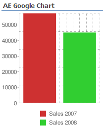
9/18/2009 17:15 | Hi,
I have installed the webpart but I keep getting the data column error (Data column error:Sales2007,Sales2008) based on the list you have as an example.
Can you please advise? |
|
rarodrig
10/2/2009 17:12 | Great web part!!! Is ther a way to create the graphs based on list totals? I have a view that displays my list data grouped by status and it provides a count. I want to create a pie chart using the count of items based on their status... |
|
Tammy
10/14/2009 18:31 | Am I missing something, or will this not work on calculated list fields? Adam mentioned the same thing in a previous post. Really need it to work on a calculated field. |
|
Juerg
10/19/2009 18:02 | Tammy, the web part now also works with calculated columns. We have updated the ZIP file, so just re-download it, extract and then replace the DLL. |
|
martins
10/29/2009 13:37 | Hello I have list called GOOGLE CHART and having column title, sales 2008, Sales 2007. I enteredd GOOGLE CHART in list name and use columSales 2008, Sales 2007, but it is giving me error as "sharepoint List not found". Please let me know whats wrong I am doing? Avi |
|
Medeiros
10/30/2009 00:08 | Hi,the web part work with "group by" columns ? |
|
Juerg
11/2/2009 14:50 | martins,
you might also have to enter a value into the �Site Name� field if the �GOOGLE CHART� list is NOT in the same site as your page where you placed the Chart web part (see Installation Instructions above) |
|
�nio Almeida
1/19/2010 13:16 | webpart don't work when I insert negative number. :(
Don't show line in chart. |
|
Juerh
1/21/2010 12:25 | Enio,
we have fixed this problem and the line and bar charts now are able to also display negative numbers.
Please re-download the Zip package and replace the DLL (also do an �iisreset� if you deployed the DLL to the GAC) |
|
Daryl
2/5/2010 17:11 | I'm having the same problem as Mauro, but my trust level is neither "WSS_Minimal" nor "WSS_Medium", but rather a custom one. I didn't set this up, so I wasn't the one who created the custom trust file in the first place, and I need some help to reverse engineer it.
What settings exactly in the referenced file do I need to add/change to get this working? I've looked at the config file for WSS_Minimal and WSS_Medium, and there are lots of differences, so I don't know which one is "the addition of SharePoint object-model access" that I need to "turn on" in the custom config file.
|
|
Juerg
2/5/2010 17:19 | Daryl,
in this case we recommend to move the DLL from the BIN directory into c:\windows\assembly, where it is automatically granted the necessary permissions.
Please use drag&drop; to move the file (cut&paste; does not work) either directly at the server or via RDP (a network share does not work). |
|
Daryl
2/6/2010 02:41 | Now instead of the error "Request for the permission of type 'Microsoft.SharePoint.Security.SharePointPermission, Microsoft.SharePoint.Security, Version=12.0.0.0, Culture=neutral, PublicKeyToken=71e9bce111e9429c' failed." I see a dialog box with the following message:
Unable to add selected web part(s)
AE Google Chart: Cannot import the Google Chart Web Part.
Are you sure a simple file copy to c:\windows\assembly is all that's needed? I would have expected to need to use GacUtil...
|
|
Juerg
2/8/2010 14:46 | Daryl,
I forgot to mention that you also need to do an �iisreset� command
|
|
Juan
2/16/2010 16:52 | No problem with installation. Is there anyway to have a dinamic chart?Example: A list with 2 columns, Date and Quantity, and a calculated column, Month(=month([date ])). The list has more than 200 rows. I want a chart with the Month as Label list Column, and Quantity as data column (summed per month). Is it possible?. Now it appears a legend called float:n instead of the Months names |
|
Juerg
2/17/2010 13:58 | Juan,
the Google Chart Web Part does not support GROUP BY and SUM but we will add this feature in the next release |
|
Vera
3/3/2010 00:03 | Does the chart work with empty fields. We want to track actual with target. The Target will be set for a year but the actuals will be done daily. We have a webpart but for the empty field it drops the line back to zero. We want it to stop like it does in Excel. |
|
Chris
3/8/2010 12:29 | Hi, I'm using the chart in the same way as the example above, to show our company sales figures.
This works fine until I enter 8 figures into a month...ie; 10,000,000....then it stops working completely.
Can the chart not do this? |
|
Juerg
3/9/2010 17:24 | Chris,
we now have fixed this problem.
Please re-download the Zip file, extract and then replace the DLL.
|
|
Juerg
3/11/2010 18:05 | Vera,
the web part will actually use �0� for empty fields , so it cannot display a gap if you are using a line chart
|
|
Alexey
3/18/2010 10:55 | I have installed this webpart, have specified necessary parametres, but I do not see the diagramme. In what there can be a reason? |
|
Juerg
3/19/2010 12:13 | Alexey, does your browser have Internet access to http://www.google.com ? The web part actually gets the chart image directly from the Google Chart web service. |
|
PeterD
3/24/2010 17:56 | I am also having problems with using the View parameter. I have a simple list that displays just fine if I don't fill out the View parameter. As soon as I provide a view (any view) I get nothing but errors. Any ideas? |
|
Juerg
3/29/2010 18:22 | PeterD, can you please check if you added your �Total Estimated Cost� column to your List View by going to the �Settings� of your View and and checking the column in the �Columns� section ? |
|
David F
4/6/2010 20:10 | I have the chart part installed and it displays the raw data.
I cannot get it to recognize the sum/count functions in the Data List Column Name field.
I get this error:
Data List column not specified or not found:sum:Value
I cannot set the value label using the Column:(x) notation.
I get this error:
Label List column not specified or not found:Day:(x)
I tried using a summary view, but it still shows a full breakout, not the summarized values.
I tried to use a KPI list, but kept getting Object Ref errors, probably due the columns being calculated.
Any help is greatly appreciated
Thank you,
David F |
|
Juerg
4/7/2010 11:29 | David,
did you download the most recent version (1.1.2, the version info can be found at the top of the web part configuration pane) since we've just recently added this feature on March 30 ? |
|
Sunny Rajpal
4/12/2010 12:42 | Juerg , from where i can find 1.1.2 version download, as on site its downloading 1.0.0.0 |
|
Juerg
4/12/2010 14:22 | the DLL version still is 1.0.0.0 but the web part has also an internal version number which can be looked up at the top of the web part�s configuration pane:
|
|
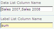
Sunny Rajpal
4/12/2010 14:40 | thanks for quick response Juerg, i downloaded a new version and its not throwing any error now but while using sum its not displaying that value in label fields as shown in article above. but it showing the area with the sum value. So, now problem is its not showing the sum value in labels.. |
|
Juerg
4/12/2010 16:30 | Sunny,
you also need to put the �:(x)� postfix to the �Label Column Name� configuration field.
Example: sum:ProductName:(x)
The �x� placeholder represents the actual data value. |
|
HPHovercraft
4/13/2010 00:54 | I have a list that tracks 2 data values across months, and I am using a vertical column graph to chart it. (This looks almost identical to the "Gadget Sales" example at the top of this page. My question is that I want to get a running total of "Sales 2008" and "Sales 2007" for the year to date. How do I tell it to add up those values? I don't want to make "Months" my Label List Column, because I don't want to display 12 values: only one for a running total. Any help on that one? |
|
Juerg
4/13/2010 12:11 | HPHovercraft,
we have now added the capability to sum multiple data series as follows:
eg. specify one or more data series and enter the �sum� keyword into the �Label List Column Name� field to sum the values as specified in this field:
Please re-download the updated Zip file, extract and then replace the DLL. |
|
HPHovercraft
4/13/2010 17:07 | Awesome. Thanks for your response. I had tried using "sum" in the Label List Column Name field, but it did not work. After downloading the new DLL, and installing it, everything works great. You guys have done a great job with this web part! And of course Google's API is awesome too. |
|
HPHovercraft
4/13/2010 17:58 | Is there a way to summarize the fields like you mentioned before with an Average, rather than a sum or a count? |
|
Jonas
4/16/2010 15:05 | It would be nice to
1) have a field to specify additional paramters to the google chart tools. E.g. chxt=x& to make only the X axis visible and so on.
2) have a test button to see what data will be tranferred to google (security reasons).
|
|
Juerg
4/19/2010 17:27 | Jonas,
we have now added a new �Extra Google Chart Parameters� parameter to allow passing additional Google Chart API parameters (see description above).
You can check the data transmitted to Google by appending the string "/trace" to the "Chart Title" setting.
Example: Sales 2009/trace |
|
Don Zielke
4/19/2010 22:00 | Very impressive! Do you have a version that is packaged as a solution file? Nothing gets installed in our environment unless it is via WSP file. That way we don't have to hand-install on every web front end... |
|
Juerg
4/23/2010 15:00 | Don, we have now added the WSP solution file to the Zip download package. |
|
Brittany
4/26/2010 22:07 |
Hello,
I am trying to make the graph show multiple colors; however it only works for the pie charts. Can you please advise me on what I�m doing wrong?
Thank you in advance
|
|
Juerg
4/27/2010 16:01 | Britanny,
just enter multiple RRGGBB color values into the web part�s �Chart Color� field.
Separate each value by a "|" pipe character. Please note that if you define less colors than the number of actual data values, the colors start repeating from the beginning:
|
|
HPHovercraft
4/27/2010 21:11 | I love this web part! I have 2 question about functionality, though.
1. Is there a way to change the scale? For example one of my charts tracks our customer satisfaction on a scale of 1-10. We are always around 9.75. So, for my purposes, I could see fluctuation much better if the scale of the chart was 9-10 rather than 0-10.
2. Is there a way to adjust the way the data columns display? For example many of our charts display the values of numbers stored as percentages. It is much easier to read 3% than 0.03
Thanks again for this great web part. |
|
HPHovercraft
4/27/2010 23:22 | For anyone interested, I figured out how to fix my two problems listed above using the new "Extra Google Chart Parameters" section.
I'll show you an example of how to scale the chart and change the format to a percentage.
I had to scale both the data scale (chds), and the axis range (chxr). I wanted the scale of my chart to be between 50% (.5) and 90%(.9). The values were on the Y axis, and I wanted the to display a percentages (90% vs. .9). For this, I used chxs.
So, here are the parameters I used to scale my chart to 50%-90%, and display the values as percentages:
&chds;=.5,.9&chxt;=x,y&chxr;=1,.5,.9&chxs;=1N*p*
More info on how to use the parameters can be found here: http://code.google.com/intl/en/apis/chart/docs/chart_params.html
Thanks again for this great web part!! |
|
David F
4/28/2010 01:19 | Version 1.1.1.4 worked fantastically. I got a little hung up on the actual column name notation, due to the examples not showing a combined. So, for those trying count:
ColumnName:(x) = ColumnValue(Count) |
|
HPHovercraft
4/30/2010 01:03 | I have a feature suggestion for a future release. I am currently working with a sharepoint list that maps one data point each week. So for Jan-Apr, I have 16 values. The web part is outputting this for the x axis label: &chxl;=0:|Jan 2010|Jan 2010|Jan 2010|Jan 2010|Feb 2010|Feb 2010|Feb 2010|Feb 2010|Mar 2010|Mar 2010|Mar 2010|Mar 2010|Apr 2010|Apr 2010|Apr 2010|Apr 2010.
So, I can see that it is creating a "Month Year" label for each line of data in the list. I don't want all those repeats. So I can manually enter &chxl;=0:|Jan 2010|Feb 2010|Mar 2010|Apr 2010 in the additional parameters field, and it will overwrite it. But the problem is, this will be a continually updated table. Is there a way to add an option for how to format data axis labels? Or is there a way to look at 4 lines of data, realize they are in the same month, and just output one axis label for them? Thanks! |
|
Bhavini
5/20/2010 13:46 | Has anyone used this webpart in SP2010 yet? Can it be used to create a poll with instant feedback?? |
|
Juerg
5/20/2010 14:04 | Bhavini, you might check out the �Quick Poll� web part at: /apps/page.asp?Q=5755
Yes, all web parts work with Sharepoint 2010. |
|
Mac
6/3/2010 06:36 | Great tool, and congrats on winning those awards! I'm using this on SP2010 with sucess. I too would like to display an average instead of a count/sum as asked by HPHovercraft. Is this possible? |
|
Fronza
6/4/2010 15:36 | How can I enter parameters for the information within the graph, as in the documentation for google? Example Text and Data Value Markers |
|
Ray
6/6/2010 14:55 | Hi, I've been downloading your webparts (excellent by the way!) and have been working on this one for a while now. The install was simple, and the charts work well except for the pie/pie 3D chart; for whatever reason the labels are cut off. Using the standard pie chart it looks like it cuts off after 7 digits; the 3D chart doesn't show any unless I make the chart very tiny. I have looked at the Google codes and found the code to modify chart margins, but have been unsuccessful using this, tried chma=30,30,30,30, to 100,100,100,100 but no changes displayed. Any thoughts? |
|
Ray
6/7/2010 13:14 | Nevermind, found the problem. I actually should have been using the 'chs' string rather than the 'chma'. Thanks again! |
|
Lazaro
6/7/2010 18:02 | How I can configure webpart in subsite inside other subsite ?? For example I have a subsite client inside i have other subsite whose name is Test ... How I can configure a webpart in the second subsite ??? I write this path client/test and no work .... |
|
Gail C
6/13/2010 23:06 | Love the web part! I see that the SUM feature is implemented; any progress on GROUP BY? I need to be able to create a bar chart with two Label List Columns, and I think GROUP BY would do it. Thanks again! |
|
Randy
6/15/2010 22:33 | Great tool! Is there any way to change the angle of the data label? By default it looks like it runs horizontal. Can it be changed to 45 degress or at least vertical? |
|
Juerg
6/16/2010 16:16 | Randy,
this option is unfortunately missing in the Google Chart API! |
|
Nino S
6/22/2010 10:17 | Is the webpart connection feature supported? It would be really useful to set another webpart as data source. |
|
Juerg
6/24/2010 15:24 | Nino, the web part does not support web part connections but is able to use search filters for interactive data selection (see description on this page) |
|
Ben
6/25/2010 18:28 | Can this webpart support Excel files? |
|
Juerg
6/25/2010 18:34 | Ben, no, it relies on a Sharepoint List as its data source but you can check out our SQL Chart Web Part which actually can connect to Excel files. |
|
Juerg
6/30/2010 16:19 | Fronza,
you can actually use the web part �Extra Google Chart Parameters� setting to enter the markers.
Example: &chm;=N*p0*,000000,0,-1,11 |
|
Ahmed
7/15/2010 16:26 | Great webpart !!! I have installed it on my production sharepoint 2010 (2008 server R2, SQL server 2008R2) and it works fine. I have one problem with a chart displaying "Label column error: G�r� par". "G�r� par" is the name of my column, this chart has worker a while and then this error. I have downloaded and installed the latest dll, can you help me ? (this is the most important of my 4 charts...) |
|
Ahmed
7/15/2010 16:34 | Me again, effectively, it is not working since I have empty values in that column, wasn't it already a resolved bug ? |
|
Juerg
7/15/2010 17:50 | Ahmed,
we have now fixed a problem related to empty List columns of type �Date�.
Please re-download the updated Zip file, extract and then replace the DLL (followed by an �iisreset� if you placed the DLL in c:\windows\assembly) |
|
Tony
7/20/2010 12:09 | Hi
The webpart doesn't appears. I see only the name "Simple chart" and a red "x".
Could you help me? |
|
Juerg
7/20/2010 15:29 | Tony,
your client machine needs Internet connectivity to fetch the chart from Google. |
|
Gu Martins
7/29/2010 14:55 | Hi!
how do create a Compound Chart? (http://code.google.com/intl/en/apis/chart/docs/gallery/compound_charts.html).
Is it possible? How?
|
|
Juerg
7/30/2010 16:44 | Gu, this is currently not possible. I assume you would like select 2 data series and the use 2 different chart types to display the series ? |
|
Michael
8/6/2010 16:15 | I have a list of Dates (YYYY-MM) and corresponding prices. The graph is always drafted on a timeline from right to left, means 1999 is on the right end of x-axis and 2010 at the junction with the y-axis. How can I get this in the right order? |
|
Juerg
8/6/2010 16:20 | Michael,
you need to create a Sharepoint List View which sorts the items as desired and then enter the View name into the web part's "View Name" field. |
|
Dan
8/8/2010 19:36 | For some reason, whenever i change the size of the chart beyond the default 320x240 i just a broken x missing image sign...any ideas? |
|
Juerg
8/9/2010 08:08 | Dan, the maximum allowed chart width or height is 1,000 pixels. The width multiplied by the height (in pixels) may also not exceed 300,000 pixels. So a 600x400 chart would be ok but a 600x600 chart would be too big. |
|
Jo
8/11/2010 18:40 | This webpart works great with a local list. However, I am having difficulty when I point this web part to a list in a different site collection or in a different web app?
Can the web part list be ourside of the current site collection? |
|
Juerg
8/12/2010 16:21 | Jo,
the web part unfortunately cannot reach Lists in other site collections or web applications. This limitation is imposed by Sharepoint. |
|
Ray Shu
8/15/2010 13:44 | hello
I have a list where the row is the dates and columns are manufactured products quantity per day. I want to use the filter funtion to isolate the chart on one product only over the period of the month.
thanks a million |
|
Juerg
8/18/2010 11:00 | Ray, the "Search Filter" actually presents the distinct values contained in the specified column for interactive selection, eg. the filter box is not designed to choose a specific List column. |
|
Costas
8/18/2010 15:50 | Is it possible to to use non-numeric data with this web part? For example, can I cound the number of instances under "Location" where the column holds "New York" or "Los Angeles" etc...? |
|
Debs
8/23/2010 11:03 | Hey, am a newbie can anyone temme whether it can be configured to display charts for Surveys...??? |
|
Juerg
8/23/2010 14:25 | Debs,
are you referring to the Sharepoint out-of-the box Survey feature ? |
|
Howard Frizzell
8/28/2010 14:36 | Hi,
I have successfully used the webpart on a SharePoint page. (I direct the webart to a view of a list)
However, when I recreate exactly the same webpart (through manual or export/import of webpart) on another page I get the following error:
Data column error: B Total (Value does not fall within the expected range.)
Label column error:B Total
If I remove the list name, the webpart does work, but shows all records, where I want my named list which only shows current user data.
Please help! Kind Regards and Thanks |
|
Huusom
9/3/2010 09:20 | I'm trying to use this great webpart to show the "Assigned to" field from a tasklist in Sharepoint 2010. But all I get is: "Label column error:Assigned To" multiple times. Does this Webpart not support contactpersons or are empty fields not supported? |
|
Ajay Gupta
9/14/2010 14:12 | I was just wondering if I could use this web part to show number of occurrences of a particular data value in an xslt list view web part on the same page as the chart. Please let me know so I can then download this for evaluation. |
|
Juerg
9/15/2010 18:54 | Ajay,
are you referring to the Sharepoint 2010 XSLT List View Web Part ?
We actually did not yet try this but I assume this should work since the web part actually directly gets its data from the underlying Sharepoint List/List View.
|
|
Iko Knyphausen
9/16/2010 03:20 | Nice part!
A small issue: when I sum(marize) a multi-series chart by group on the x-axis (label list col name) only the first series is summarized correctly. the second series runs non-summarized... Any solution? |
|
Jakob
9/17/2010 13:52 | Great web part, thank you very much!
I get a nice chart but the grid lines look strange. I can see that the web part sets chg=9,09,20 so dash length is 20 which is a little too high. Is there any way I can change that? I've tried using the extra Google chart parameters field but that just makes the grid lines disappear :( |
|
Juerg
9/17/2010 16:12 | Jakob,
the problem actually was caused by your Swedish locale (comma decimal separator). This has now been fixed, so your grid lines should look better now.
Please re-download the updated Zip file, extract and then replace the DLL, followed by an �iisreset� command if you placed the DLL in c:\windows\assembly. |
|
Iko
9/20/2010 20:21 | I found another issue: I am using a list view that is sorted by date so that the chart data is sorted correctly. This works fine until I add and apply a filter to the chart. The sorting breaks at that moment. |
|
Juerg
9/24/2010 11:19 | Iko,
do you simply want to chart the sum of two column side by side ?
In this case you would proceed as described in the post above to HPHovercraft on 13/4/2010
|
|
Iko
9/24/2010 18:17 | Thx Juerg. Mine is a little more complex. I have data in a View that is sorted by date, counted by Month, and filtered by Year. My list has 3 columns: Date, Month, Year (month and year are calculated) and your webpart has "count:Month" in the Label List Column Name, and "@Year" in the Search Filters. It works as long as I don't apply a filter, but the sorting breaks if I filter by a specific year... |
|
AWilson
9/27/2010 09:34 | Great WebPart. One apparent limitation is with lists generated from InfoPath. Forms based on repeating tables create "merged" list items (actualy separated by a line feed). They display correctly in SharePoint but appear as a concatenated field in Google Charts. |
|
Juerg
10/11/2010 16:04 | Iko,
we now have fixed the issue you reported (the web part did not honor the sort order of the underlying List View).
Please re-download the updated Zip file, extract and then replace the DLL, followed by an �iisreset� command if you placed the DLL in c:\windows\assembly.
|
|
Zubol
10/19/2010 17:50 | Awesome work Juerg.
I have one question: is it posible to display Legend instead off Labels in 3d Pie Chart? |
|
Tom
10/20/2010 13:26 | When internal field names are used in the data list column and label list column it returns an error, is this as implemented? It works fine if field display names are used but I expected it to work with internal field names also. Internal field names do actually work if used in the sum: and count: construction. |
|
Tom
10/20/2010 13:31 | An average function (avg:) like count: and sum: would also be a nice feature. |
|
Tom
10/20/2010 16:00 | And a % placeholder for a percentage value in the label would also be very nice. Implemented like the x placeholder. The percentage value should be calculated as a percentage of the total of all values.
This is a feature which isn't available in the Google Chart API, where you can only show the value as a percentage. As in...a value of 44 will be shown as 44% or a value of 0.1 will be shown as 10% regardless of the total of values.
What would be nice is to have functionality like in the following example: If there's is a value of 44 and the total of all values is 176 then the percentage is 25%.
So if you got some spare time on your hands....happy coding :)) |
|
Juerg
10/22/2010 14:51 | Zubol,
we now have added the new �/pielegend� parameter which you can enter (or append) into the �Extra Google Chart Parameters� field to display the data as a legend instead of pie labels:
Please re-download the updated Zip file, extract and then replace the DLL, followed by an �iisreset� command if you placed the DLL in c:\windows\assembly. |
|
kris B
10/24/2010 10:13 | Great Webpart! But unfortunatley I got the Label column error when I add a data list webpart for the same list. |
|
Cliff
10/25/2010 08:34 | Great web part. :)
I have special characters in my data. For example department names = Transport & OHS, Industry & Energy that come from our LOB applications
Can the web part be made to escape speacial characters in text values?
Regards,
Cliff
|
|
Zubol
10/25/2010 10:30 | Hi Juerg,
Thank you for your answer. I have one more question: how to connect "pielegend" with other "Extra Google Chart Parameters"?
I've tried for example something like this: "&pielegend;&chma;=0,0,0,110&chdlp;=b" but unfortunately does not work. |
|
Juerg
10/25/2010 10:39 | Zubol,
please enter the �/pielegend� setting anywhere in your "Extra Google Chart Parameters" field as follows:
&chma;=0,0,0,110&chdlp;=b/pielegend
(eg. use the "/" character instead of the "&") |
|
Juerg
10/26/2010 16:06 | Kris,
we have located the problem which actually is caused by a Sharepoint bug:
If you specify a List View (via the �View Name� parameter) for the Chart web part and if you also place a List View web part onto the same page, the web part cannot properly access the List View anymore.
We have found a workaround and fixed the problem. Please re-download the updated Zip file, extract and then replace the DLL, followed by an �iisreset� command if you placed the DLL in c:\windows\assembly. |
|
Wilson
11/6/2010 09:19 | Hi,
is there any possible way to draw up a chart base on a calendar created under 'List'? |
|
Maciej
11/8/2010 22:44 | Great job guys!
Is it possible to sum values depend on other column filter?
Here is my example:
Got list called "expenses". There are 4 fields: Title, date, amount and category.
It will be great to be able to see piechart of overall costs ('amount' column) filtered by categories.
Something like this: cars - 543 Euro, computers - 7653 Euro, food - 300 Euro etc... where 'cars', 'computers' and 'food' are categories (radiobutton column in SharePoint).
Will, be grateful for answer :)
|
|
Juerg
11/9/2010 18:49 | Wilson,
it doesn�t matter if you refer to a Sharepoint List or a Sharepoint calendar when you either use �sum� or �count� or point your �Data List Column Name� to a numeric column. |
|
Trey
11/11/2010 19:14 | Whenever I try to produce a line chart with a Date as an X axis the resulting format is always Month Year (ex. Nov 2010) How can this be changed to show the Month and the DAY? |
|
Jorge
11/11/2010 20:08 | Excellent webpart�, is there any way to extend the webpart capability to do average in addition to sum and count? Thanks� |
|
Juerg
11/16/2010 13:45 | Trey,
we have now added the option to format the Label dates by appending a format template in the Label List Column Name field (please see detailed description above). |
|
David J
11/24/2010 05:21 | Do not get the sum / count bit. I have a view that count categories. the list has category 1, 2 3 etc. the view counts how many instances of that category. I want to chart the number of instances. At the momebnt I have to manually out the counts into another table and chart that - an extra step. the column is just a category selection. I put the column name in Label but what goes in data list name? There are no value other than the summed count? |
|
David J
11/24/2010 05:32 | Sorry - that did not make sense on reading back. More detail..
1) I have a list that I feed in data in text. One column is a selection of category.
2) I created a view to analyse the category by grouping the view by category and then counting. This way I have a count of each category instance over a specified date range.
I want to chart this data but do not understand how to state this information in the list data name boxes when setting up the chart.
I have no idea what I am doing from a code point of view but appear to have got a long way with this just by trial and error. A great tool.
I would also like the grid lines to disappear but again the code looks like Chinese to me. What would I put in the parameter to remove the grid lines?
Thanks for the tool. It is brilliant. I just wish anyone round my office understood the tech bits. |
|
David J
11/24/2010 15:03 | Hi, solved the problem by automatically allocating a "1" to each data entry to help me sum the categories. This works HOWEVER...I have 2 issues. 1 - the charts update for a while and then go flaky. When i added a data entry for a category I had not yet used - it did not update on the chart. I have redrafted the chart and still does not pick it up??? Also, I cannot get data from 2 views for the same chart - does that not work? Anyway - the data update is the real issue. Any idea why this would happen - or not happen as the case may be. |
|
David J
11/24/2010 17:06 | Me again. The problem with categories not appearing on the chart seems to depend on how the data is brought in. I made a table in data view and manually put numerical data in it. No problem, lots of charts on a page and multiple data sets. However, when pulling data from a list into a data view using a sum to count occurrences of the category, the chart limits to 15 items and then simply stops updating. Not a clue why this is. |
|
Iko
12/10/2010 19:37 | I ran into an issue with filters. If you want a combobox filter for a lookup field, the options include the lookup ID and Displayname, i.e. 1;#Option 1 etc. You cannot filter by these. If I create a textbox filter for these fields, I can filter fine. The whole point of lookup fields is that you do not have to remember the options ;-) It should be easy for you guys to get the text portion of SPFieldLookupValue before populating the combobox... Thx |
|
Juerg
12/10/2010 19:41 | Iko,
this issue has actually recently been fixed.
Please re-download the updated Zip file , extract and then replace the DLL, followed by an �iisreset� command if you placed the DLL in c:\windows\assembly.
|
|
Iko
12/10/2010 20:14 | Hi Juerg, how recent? I just installed the new web part about a week ago. I found also another thing: If you have a calculated field, say "Year" which takes the year portion of a date in another column, your filter will stop working if the resulting field is a Date Type. SharePoint does not care, and will display correctly, and your filter combobox will populate correctly, but the filter will fail. The work-around is to make the calculated field a text field type. I thought you might want to know... |
|
Juerg
12/13/2010 16:34 | Iko,
the update was published on December 6 (Version 1.1.13)
Thanks for pointing out the problem with the calculated column. |
|
Iko
12/15/2010 03:30 | Thanks. Yes I must have had one earlier. I found a few more mini-issues (don't get me wrong, I really like the web part): a) when a field name is wrong the message is "list not found" b) when you want to group by a column that has multiple selections in a lookup field, the results are unpredictable (i think it shows the first column value it finds) c) You can not filter by projected fields (those are other fields from a parent list that you include in your child view). Cheers |
|
Iko
12/23/2010 05:56 | One more finding: when you group by a column and one of the records has an empty value in that column, you throw an error. I think it would be better to show these records as a group (not set) in the chart. |
|
Iko
12/31/2010 06:01 | I just discovered another thing, unfortunately critical. I have a list of 91 items that "expire" on different dates. In order to group them by months, I have a calculated column for MONTH and another one for YEAR. I have 24 items expiring in March, 56 in April, 3 in May, 1 in Aug, and 7 in Dec. The years involved are 2006, 2011, and 2012. My label list column name is set to : count:Month:(x)
I also have a filter for the YEAR and a filter for the items (type of fruits). The chart is based on a list view where all items have an expiration date, and the view is sorted by this expiration date.
When I leave the year and fruit filters empty it shows a total of 30 fruits expiring in April. When I start filtering by year, no specific fruits, I get 1 item for 2006, 24 for 2011, and 22 for 2012...
Nothing seems to add up. Thank you. |
|
JJ
1/4/2011 22:02 | I seem to be misunderstanding something. I have a list with two calculated columns - OpportunityMonth and ExecutionMonth. For each row, these columns contain values 1 through 12. I want to have two bars for each month with the count of the number of rows for that month. In Data List Column Name, I put "count:OpportunityMonth,count:ExecutionMonth", but it displays "Data List column not specified or not found:count:OpportunityMonth" then a line below "Data List column not specified or not found:count:ExecutionMonth".
Should that work? |
|
Proto
1/4/2011 22:26 | I have deployed the solution globally and confirmed the deployment was successful, but do not see it in the list of available web parts. Any ideas as to why? |
|
Juerg
1/5/2011 14:08 | Proto,
a common installation error is to add the �Feature� to the Central Administration web site (wrong) as opposed to the Sharepoint application�s top site (correct) |
|
Proto
1/5/2011 14:36 | Thank you, Juerg, that was the problem. Now I have to come to grips with being "common". |
|
Darryl
1/6/2011 11:16 | Great tool!!!
Just have one question, does it support more than 100 items in a view? I have a view that returns more than 100 items, but cannot see the data on the second page (item 101+) reported in the chart. |
|
Juerg
1/6/2011 11:22 | Darryl,
you need to configure your View (or create a new one based on the existing View) without paging to pass all the View items to the Chart web part. |
|
Iko
1/9/2011 06:35 | Hi Juerg. Your last asnwer to Darryl actually answered my post from 12/31/2010 06:01 . The numbers add up the moment I remove paging from the underlying view. thanks |
|
Don
1/10/2011 19:26 | Great program! Works great on our 2007 server. Now trying on our 2010 and getting the following:
Unable to add selected web part(s).
AE Google Chart: a Web Part or Web Form Control on this Page cannot be displayed or imported. The type is not registered as safe
Did I miss a step? Thanks! |
|
Don
1/10/2011 19:42 | Solved my own problem: have to do the normal install AND the 2010 install steps. doh! |
|
cjrader
1/17/2011 19:50 | Just downloaded and set it up.
Instead of a chart, I get a little placeholder with the Google Chart icon and the words Google Chart.
Any thoughts? |
|
Jeff Phillips
1/19/2011 01:56 | Is there a way to format the data next to a label,specifically if it is a number? I can get ColumnName:(x) to work just fine. I was hoping to format x so that it appears like a US Currency value (which it is in the data set). Is this possible? |
|
gjayasankar
1/19/2011 07:46 | Awesome! |
|
Juerg
1/26/2011 17:08 | cjrader,
this means that something�s wrong with your parameters (Google cannot return the chart image).
Can you append �/trace� to the web part�s �Chart Title� setting and send us the trace info ?
Example: My Chart Title/trace |
|
Iko
2/2/2011 05:39 | Hello Juerg. I have a improvement request: I am trying to use the Chart web part with a Form Library. I have the form lib to handle master-detail data via InfoPath. InfoPath does not offer good data entry with custom lists when you have multiple related lists to submit data to. So Form libs are almost a must. Now in form libs, if you have one-to-many related records, these can only be included in views by using MERGE. Your web part would need to treat these as single entries, if you wanted to group, count, or summarize on any of these fields. Is it possible? |
|
Louise K
2/14/2011 17:27 | I have a chart that uses search filters (drop-down). When I select a filter, the chart ignores the View setting. I have a view which filters out certain items, but these items are included when I select a search filter. they are not displated in the unfiltered chart. |
|
Iko
2/14/2011 20:49 | Another suggestion: How about making "count" available in the label list column name for multiple columns in the Data List column name? This would help counting "true/false" field values, or counting columns, that are not empty, or numeric columns with a value of 1 or greater (as opposed to sum). I am working with boolean fields right now, and it would be great, if I could count how many are set to true. Alternatively to allowing count, you could also enhance "sum" to count "true" as 1 and "false" as 0. One of the above would be nice... |
|
Geethu
2/16/2011 11:14 | Can we give default selection to the drop down lists created by the search filters? |
|
Peter
2/16/2011 19:40 | Can I add an X-axis label using the Extra Google Chart Parameters? If so, can you give me a specific example to show "Date" as the axis label? Thanks! |
|
Juerg
2/18/2011 13:24 | Peter, we have now added the new �Chart Axis Labels� setting. Please note that if you only want an X-axis label, you still need to append the semicolon:
Data; |
|
Juerg
2/18/2011 13:26 | Geethu,
this is currently not possible. |
|
Oreinaud
2/24/2011 14:06 | For people using SharePoint 2010 ans Google Chart Webpart, you don't use a classic page of webpart because the chart is not displaying.
Also I use a wiki page and add the webpart inside the rich textbox and it's works.
Note : Data field can be a choice (x for example) and label count:x |
|
JK
3/1/2011 16:49 | Hi Juerg,
This Web Part rocks and I am so close to using it my project.
The web part gets its data from a view which has a filter applied to it. The web part also has a search filter applied to it (combo box).
When I filter the web part using the combo box it seems like that web part does not get data from the view I specified.
Can you please help me out or let me know if I am doing something wrong.
Thanks |
|
Steve
3/10/2011 01:22 | Google Chart now appears to support https. Do you have a version that implements that?
Example: https://chart.googleapis.com/chart?cht=p3&chd;=t:60,40&chs;=250x100&chl;=Hello|World |
|
Juerg
3/10/2011 10:22 | Steve,
yes, the web part supports https since February 10 (version 1.1.15)
|
|
Maricel N
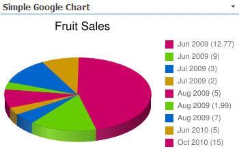
3/11/2011 00:46 | Per table below,
Title Quatity
Bananas 5
Apples 5
Peaches 10
Bananas 2
Apples 12
Apples 1
Can you let me know which column (Title or Quantity?) to add to "Data List Column Name" and which one to add to "Label List Column Name" ?
Showed on the chart are Apples (18) Peaches (10) Bananas (7) I appreciate it. Thanks a lot. |
|
Juerg
3/11/2011 18:40 | Maricel,
Data List Column Name:
Quantity
Label List Column Name:
sum:Title |
|
Maricel
3/11/2011 19:43 | Data List Column Name:
Quantity
Label List Column Name:
sum:Title
--- By doing as you told. I don't get the result showed as " Apples (18) Peaches (10) Bananas (7) " yet.
Do I need to group "Title" column?
If my view list doesn't have Group By option.
How can I add the "group by" in the Chart? Really appreciate your assistance. |
|
Juerg
3/14/2011 18:46 | Maricel,
can you quickly check the web part�s version number by opening the web part�s tool pane and looking it up at the top ? |
|
Maricel
3/15/2011 01:33 | Hi Juerg,
Version for Google Chart web part I have is 1.1.16 version
Regards,
M |
|
Juerg
3/15/2011 17:44 | Maricel,
you've got the most recent version.
Can you send a screen shot of your chart to [email protected] ? |
|
Ryan S
3/15/2011 19:26 | Can you please support text fields in addition to numeric/currency? This is the more common need that we have so for us the web part is great but of limited use currently. |
|
Jorge
3/16/2011 09:20 | Is it possible to add a default value to the Search Filters? Great web part. |
|
Ryan S
3/16/2011 14:42 | My apologies, the web part does support grouping on a text field. I misunderstood how this could be done. |
|
Juerg
3/16/2011 18:24 | Jorge,
we have now added the possibility to preset the dropdown filters by adding the preset value as follows:
@Month=April |
|
chartwebpartfan
3/17/2011 21:44 | awsome job guys. Only one thing is missing I guess. I used the same list that you guys have and I put below details.
Data List Column Name: Sales 2008,Sales 2009
Label List Column Name: sum:Title:(x).
It does the sum only for Sales 2008 but it doesn't do addition for Sales 2009.
Also, If you have lets say two Jan entries then you also see one more Jan bar in the end as well, I think it should not be shown. |
|
Farewell
4/8/2011 08:59 | Hi Juerg, I've tried using this web part to display the graphical summary of Sharepoint out-of-the-box surveys in bar charts but i'm not sure which columns to input the web part options. Able to advise? Thanks. |
|
Dom
4/12/2011 14:01 | Hi,
Im having issues with the chart colours, the colours are fine until I use a pie chart, the chart only expressess the first colour I enter. I have tried using the "|" character however when doing so the colour is expressed on the legend but not the chart? Can you resolve this please?
Ta |
|
Jared
4/14/2011 23:01 | Hi, I'm trying to create a bar graph and am having issues. I think it has to do with how my data is stored. The list has people and rates for several different measures, so it looks something like this...
NAME Measure 1 Measure 2 Measure 3 A 50% 60% 70% B 45% 70% 90%
I want to have it set up so that each bar is each measure for just one person with the ability to filter by person.
In Data List Column Name we have Measure 1, Measure 2, Measure 3
List Column Name - not sure what to put here
Search Filter(s) - @NAME
Thoughts? |
|
Arthur
4/15/2011 11:26 | Hi, guys. This is a wonderful webpart and I appreciate that Amrein made it available for free. However, I can't get the View Name to work properly. The List Name is correct and the chart is shown. But when I enter a View Name (i.e. AllItems), it just says no list is found.
Could you lend me a hand on that?
Thanks a lot. |
|
Chintan
5/3/2011 16:13 | Adam - its working fine with Calculate column. I am not getting any errors. However, when i use 4 of my calculate column in "Data List Column Name" field. Data are not showing correct. Did any one faced this problem? Or Do i need to purchase License version to get it correct? |
|
Chintan
5/4/2011 18:19 | Thanks for providing wonderful web part. I am using 1.1.14 version.
Issue-1:I have 2 numeric columns (C1,C2). If i use C1,C2 in "Data List Column Name". Bar is shown with correct value for C2. While C1 bar will resemble C2 and value will not come correct. If i reciprocal this series (C2,C1) then C1 shows correct bar while C2 Bar will resemble C1. So, 2nd value is consider for chart and 1st value resemble 2nd value. Am i missing any postfix or prefix? Or my syntax is wrong?
Please advise |
|
Don
5/16/2011 20:49 | How do we upgrade? When I run install2010.bat I get:
A solution with the same name "aegooglechartwebpart.wsp" or id "5b492743-d0d1-4601-b130-f9d678059977" already exists in the solution store.
AEGoogleChartWebpart.wsp: The Solution installation failed. |
|
Juerg
5/17/2011 18:52 | Don,
the easiest method is to just replace the web part DLL as follows (assuming it�s been deployed to c:\windows\assembly):
- use Windows File Explorer either directly at the server or via RDP (but not via a network drive) to navigate to c:\windows\assembly
- highlight the DLL and choose �Uninstall� from the right mouse button context menu.
- then use drag& drop to place the new version in the GAC.
- Issue an �iisreset� command (using the CMD prompt)
|
|
Quest
5/17/2011 21:46 | Anyone have issue using columns with spaces in them.
One of my list has a column name "inventory amount" and it
Label column error:Inventory Amount |
|
Aaron
5/19/2011 22:34 | Hi Juerg,
Awesome web part! I love it!
Is there a max # of records it can process however? I'm not getting back the full results I am looking for.
Thanks! |
|
Aaron
5/24/2011 15:50 | I am also wondering if there is a way to filter the data by date range? |
|
Nicol�s
6/1/2011 01:45 | Guy this is an excelente tool!!! I 've a feature request. Its posible to add paramenter for "pivot" and create new series, for example, if i've the following view:
Product year sales
p1 2009 1000
p2 2009 1500
p3 2009 1400
p1 2010 2000
p2 2010 2500
p3 2010 2400
With the following parameters:
Data list column name: Sales
Label list column name: Year
Pivot column: Product
Then i get the following series:
Year p1-sales p2-sales p3-sales
2009 1000 1500 1400
2010 2000 2500 2400
Thanks for your great support |
|
themightym
6/2/2011 12:47 | Awesome!!! Worked 1st time...placed the dll in the bin folder, added the webpart and installed the solution on WSS 3.0 |
|
mutanic
6/2/2011 16:04 | This is awesome, thanks bro...But I still have aproblem here.
After configuring the list name, data list column & label list column as required, the chart won't displayed. Is it require internet connection? Currently I'm working on company intranet only, is there any way I can use this web part on my sharepoint without connecting to the internet??? :-( |
|
Juerg
6/2/2011 16:14 | mutanic,
yes, your browser needs a connection to the internet (since the chart is actually created by www.google.com) |
|
mutanic
6/2/2011 16:24 | Juerg, thanks for the answer...If my PC got internet connection & I deploy Google Chart web part in the sharepoint (that's mean I can see it already), will the rest of user on the intranet (which don't have internet connection) able to see the chart?? |
|
Juerg
6/2/2011 16:34 | mutanic,
unfortunately not, since the chart is fetched from Google by the browser (as opposed to the Server).
|
|
mutanic
6/2/2011 17:24 | Hi Juerg, why I can't create a chart for my list? I want to group by BizzCentre & get sum of Profit for each of it. Is there any limitation for certain column type? I got this error ; "Data column error: Business Centres (Input string was not in a correct format.)" |
|
mutanic
6/2/2011 17:26 | Sorry I forgot to mention here, I use dropdownlist for BizzCentre & currency for Profit. |
|
Juerg
6/3/2011 12:19 | Aaron,
yes, there is a limit to the size of data than can be charted. This is a technical restriction since the data is transferred to Google via the URL (which has a limit of about 4,000 characters).
You can set up a date range filter by adding two filters as follows: Example (assuming that your date column is named �Date�):
Date>;Date<
(ie. you can use the �>�, �>=�, �<� and �<=� comparison operators). |
|
Pete Wiggins
6/6/2011 16:40 | I'm trying to get a 3D piechart from a list column which is populated from a multi-select dropdown. The chart legends stop as soon as a multiple should appear (it appears the entry is a list with ;# as the delimiter). Any fix for this?
|
|
Juerg
6/8/2011 15:36 | Pete,
we have now fixed the problem with the �multiple selections� Choice field.
Please re-download the updated Zip file from our web site, extract and then replace the DLL, followed by an �iisreset� command if you placed the DLL in c:\windows\assembly.
|
|
Pete Wiggins
6/8/2011 16:27 | Hi Juerg,
I installed using the install2010.bat file previously. Can I just re-run that with the updated files? I cannot see where the dll resides.
|
|
Juerg
6/8/2011 16:34 | Pete,
please replace the DLL as follows (assuming it�s been deployed to c:\windows\assembly):
- use Windows File Explorer either directly at the server or via RDP (but not via a network drive) to navigate to c:\windows\assembly
- highlight the DLL and choose �Uninstall� from the right mouse button context menu.
- then use drag& drop to place the new version in the GAC.
- Issue an �iisreset� command (using the CMD prompt)
|
|
Jon
6/10/2011 19:42 | Is there any support for mouseover popup of data? I see there is in Google. |
|
brian
6/22/2011 10:39 | Hi! This is a great web part. However, I have a question. How to sort the Label list column name by Count in Asc/ Desc order? Thanks for the help. |
|
Chris O
6/27/2011 15:30 | I've a request to add a AVG function in it. If this is possible it gonna make me very happy |
|
BCTransfer
6/28/2011 18:19 | When install it on SharePoint 2010, the automatic installation does not work.
It shows : Object reference not set to a instance of an object
AEgooglechartwebpart.wsp: The Solution installation failed.
|
|
Juerg
6/28/2011 18:38 | BCTransfer,
you need to have full control access to the SQL Sharepoint Admin Content database when executing the "addsolution" command. |
|
Juerg
6/29/2011 14:21 | Chris O, we have now added the "avg:" aggregation function (please see the updated description at the top of the page). |
|
Chris O
6/30/2011 12:14 | Thank you, avg function works briliant!!! |
|
Matthew Walters
7/11/2011 11:30 | I agree with all the other comments here, it's a great tool. I have a problem where I'm showing several charts all based on the same list but different views of that list - the charts seem to ignore some of the list filters. (eg I have a list showing contracts and cancellations by date and wanted to see a chart of contract values in that period, excluding cancellations. The chart filter combo only shows 'Contract' as the available filter, but leaving this blank includes the negative values from the cancellation).
I read earlier comments and you ask if there are multiple charts but I can't see an answer. I've worked around with added filters in the chart but it would be nice to avoid these if I can (running 1.1.24). |
|
Chris O
7/15/2011 11:49 | One little request/question. I have the following Lable List Column Name: "avg:Date" and this works perfect. But when i want to change the format of date to MM-dd-yyyy, this is not possible, can this be changed, without removing the avg function? |
|
Ana Karen
7/19/2011 21:20 | hi, I have a doubt, l can't use correctly the filters. In my table at ShareNet I have one column that contains my main metrics.. I have 4 thinks to measure in 8 countries, so I used @Metrics ... and its works good, but I just see 4 little graphics at the same time without filters, could one of you help me please!? :) Thank you in advance :D! |
|
ben
7/22/2011 12:13 | Can it be adapted to sharepoint foundation ? |
|
Juerg
7/22/2011 19:57 | Ben,
the web part works fine with SP 2010 Foundation |
|
Francesco C
7/26/2011 09:59 | Hello, what the Google Chart Web Part Licensed Version includes exaclty? Is the cost of it 75 USD for 1 year? And if i want to extend the license for more than 1 year? Thanks a million |
|
Juerg
7/26/2011 12:25 | Francesco,
the licensed version includes technical support for one year. This can optionally be renewed for another year at the end of the 1 yr. support period.
|
|
Lia
7/26/2011 22:07 | Great webpart! Is there a known limitation for the list size? The list I'm testing it with has more than 4,000 items and the sum doesn't appear to be calculated correctly. Also is there a limit for the items in the search filters (drop-down)? Thanks in advance! |
|
Jim
7/27/2011 16:57 | Love the charts. Just updated to 1.1.25 in hopes of solving an issue. Have a several similar charts on various columns of a list. All working except one. That one chart returns an error: "Label column error: Test Result - CSO". Have looked for typos, etc. with no luck. If I change the column name (ex. put in an extra space) I get a "Label List column not specified or not found" error so I assume the column name is correct. What is the "Label column error" message telling me?
|
|
Jim
7/27/2011 21:42 | Turns out this was a user error. The error was caused by an issue with the view. Once I fixed that the problem was solved. |
|
Juerg
7/29/2011 18:40 | Lia,
there is actually no List size limitation and also no filter dropdown size limitation. Is the sum calculated by the web part lower than the correct sum ? |
|
Lia
8/1/2011 22:28 | Yes, the sum amount is much lower than the actual one. |
|
Ashtyn
8/4/2011 18:47 | I was wondering if this free webpart can make multiple lines on a line chart? I've ran into problems with other webparts only allowing a single line. Thanks. |
|
Juerg
8/4/2011 20:00 | Ashtyn,
yes, just enter the mutliple data series into the web part's "Data List Column Name" (separated by commas) |
|
Ashtyn
8/5/2011 18:08 | Great, thanks for the quick response. Also, is there a way to make the chart x-axis label vertical instead of horizontal? (If there's a better place for me to post these questions, like a forum, please let me know!) |
|
Juerg
8/8/2011 19:29 | Ashtyn,
the Google Chart API unfortunately does not allow for vertical X-axis labels, but you might consider (if you are using a vertical bar chart) to use a horizontal bar chart. |
|
Stefan
8/9/2011 11:59 | Great free web part, but compared to the commercial ones - like Nevron Chart Web Part for example, is just too poor on options, features and data sources. |
|
Ashtyn
8/10/2011 00:25 | Hi again, I'm trying to use search filters to change the display of my line chart. The x-axis of my chart displays the field "Year-Month" (2010-01, 2010-02, ... 2011-01, 2011-02, 2011-03, etc...). I would like to make it easy for viewers of the site to view whatever months they would like (like the last 6 months, last 12 months, whatever).
I have added the filter "@Year-Month>=;@Year-Month<=" and now drop down boxes appear, they work pretty well! I can filter the graph ex: Year-Month >=2011-01 to get only 2011 results. But, now in the filter drop-down box the dates BEFORE 2011-01 no longer appear, so if I wanted to view something in 2010 I'd have to refresh the page. Is there any solution to this?
Thanks! |
|
Ashtyn
8/10/2011 22:24 | Never mind, I figured it out! |
|
Ashtyn
8/16/2011 00:10 | Is there a way to set a default value to the filter and still allow the drop-down boxes in order to re-filter?
Thanks. |
|
John
8/16/2011 21:10 | What is the correct, full, syntax for the Site Name field.
I have a site called "admin" where all of our extracted data is stored and not visible to the end-user directly.
I am trying to post the Google Chart in a sub site/workspace of the extranet collection.
How do i reference the data path to the List to be shown in the webpart?
for example:
<extranet>/admin/data/List (source list)
<extranet>/data (destination webpart)
<extranet>/sub/site/data (destination webpart) |
|
jmathew
8/18/2011 20:46 | This is great.I just need some help in displaying Revenue Forcast, Revenue Achieved and balance together. I tried entering this in Data List Column Name and it doesn't populate correctly. |
|
Ashtyn
8/18/2011 21:55 | Jmathew,
I was able to put multiple values in the "Data List Column Name" by separating by commas ex: Results,Filtered Results,Target
Make sure there's no space after the commas. Otherwise, I think separating items by | works, ex: item1|item2 |
|
Ashtyn
8/19/2011 17:17 | I think I've found why a lot of people have had problems putting a "view name" in. I was experiencing the same problems - where it says "Data column error:..." when I try to display a view for a list, when I used the default view there were no problems then when I put in the view name I had problems. I troubleshot it a lot, and found out the problem was that I was using the default column (the one automatically created when you make a new list, initially named "Title") as my Label List Column. As soon as I changed my Data List Column to one of the other columns, it worked fine. |
|
Javier
8/20/2011 21:48 | Is it possible to combine bar charts with line charts? I have my data in vertical bars and works great! but I want to draw an horizontal line (to depict a limit) similar to the example posted on top of this page, I need to use a line marker but I need the value to come from an item in the list and not entered manually (as my filter changes value data range and the limit needs to be moved depending on the month)
Google mentions Compound Charts and Line markers associated to series, but I don't know where to tell the second series (and hide it as per Google) in the web part? Is it possible? |
|
Ken
8/23/2011 00:15 | I would like to use the Search Filter feature on a Lookup column. However, the search filter places the row number in front of the data in the column (ex. "Bob" becomes "6;#Bob" - if "Bob" was the sixth item in the referenced table). So, when I try to filter by "6;#Bob" nothing appears since it is not an entry in the table. Any suggestions? |
|
Tim
8/23/2011 00:52 | Am receiving the error "sharepoint list not found!". The list is in the same site as the webpart and I tried all 3 different formats of the list name field. The only thing I can think of, would be am trying to use an external list. Is there any issues with external sites? |
|
Juerg
8/23/2011 15:03 | Ken,
we have fixed this problem with version 1.1.23 on June 8, 2011.
Please re-download the ZIP file, extract and replace the DLL (also do an IIS Reset if you have placed the DLL in the GAC). |
|
Juerg
8/23/2011 15:23 | Tim, are you referring to an "external" List defined via BCS ? This should actually work OK.
Just enter the List name (without any path information) into the "List Name" field and leave the "Site Name" field empty (since the List is defined in the same site as the web part). |
|
Juerg
8/23/2011 17:41 | jmathew,
can you send us the details of your setuo to [email protected] ? |
|
Tim
8/24/2011 00:51 | Juerg - Thanks for the reply. Yes, our external list is setup through BCS. I just tried it again, only filling out the List Name, Data List Column Name, Label List Column Name fields. Am getting the same error. I have tried with 2 different external lists with same error. I have even copied/pasted the name to make sure I did mis-type the name. |
|
Tim
8/24/2011 00:56 | Another note - I tried putting in "Links" as the list just to see what happened and this time I get errors about the data columns, which is expected. So it looks like it found the "links" table, which is a "normal" list, but it isn't find any external lists. |
|
Juerg
8/24/2011 12:51 | Tim, can you append /trace to the web part's "Chart Title" setting to put the web part into trace mode. This will give the detailed reason of the "Sharepoint List not found" message. |
|
Tim
8/24/2011 17:09 | Error: No default finder found for ViewGroup associated with SpecificFinder (Read Item) operation 'monthlyClosedRead Item' in EntityNamespace 'http://sharepoint', Entity 'ilient'. |
|
Tim
8/24/2011 17:49 | Sort of figured it out, but some was up with my BCS connection. I redid my connection and operations and the chart is now working without issue! Thanks for the help the /trace is what pointed me there. |
|
Scannian
8/29/2011 23:20 | Is there any way make the data label represent a percentage of the total pie? This is the only function I see that is missing for me at the moment. |
|
Flag
8/30/2011 05:17 | Great tools!
Can this webpart supports BDC connection? |
|
Juerg
8/30/2011 14:55 | Flag,
yes, the web part can work with SP 2010 "external" Lists created via BCS/BDC. |
|
Flag
8/31/2011 05:04 | How about BDC created in MOSS2007? And do all data goes to Google to generate the chart? |
|
Juerg
9/2/2011 14:41 | Flag, this only works with SP 2010.Yes, the data is transmitted to Google to create the chart (see Google's privacy policy: http://www.google.com/privacy/privacy-policy.html ) |
|
Juerg
9/7/2011 20:04 | Scannian,
we have now added the new �percentage� Label formatting option: You can append the data value as a percentage of the total to each label by adding the % placeholder to the "Label List Column Name" (separated by a colon). The placeholder can be surrounded by other characters.
Please re-download the ZIP file and replace the DLL. Also restart IIS to unload/reload the DLL |
|
Scannian
9/9/2011 16:20 | The percentage has created some excitement for the project owner. It was awesome to see how fast you turn this over for us. THANK YOU!!!!! |
|
Jeg
9/14/2011 21:33 | Hi, I am trying to use sum: on list label with two data label columns (using a vertical stacked bar chart). But it looks like it's not doing some separately for those data label columns. It's working fine with one Data Label column. Is there any workaround for more than one data label columns? Thanks! |
|
Juan Sebastian
9/15/2011 18:43 | Hey great webpart, i have a doubt, im going to implement this webpart in a intranet site, i want to know what port this webpart uses to comunicate with google charts, so i can give the permission in the server to acces to that port, thanks |
|
Juerg
9/16/2011 13:40 | Juan,
the parameters to create the chart are actually passed via HTTP.
|
|
RvB
10/7/2011 16:46 | Created a separate list view to limit the records (i.e. by Evaluation Type = Process Area) and using Label List Column Name: count:Status:(x). The Chart also includes a calculated @Month Assigned parameter as a Search Filter drop down. When the chart initially comes up (without an entry filled in the drop down combo box) it appears to use the view above to display the correct number of qualifying records (i.e. those with evaluation type= process area). However, when you select an available month from the drop down box, it appears to display all records for that month regardless of criteria (i.e. all Evaluation Types). Appears to ignore the view name to use and reverts back to the default view for the List. Any suggestions as to what I may be doing wrong?
|
|
Mike
10/20/2011 09:54 | Hello, I have a simple table with following values: name, department and sum.
I've connected a SP filter to AE Google Chart to filter graph with the values based on the current user's department. Is there a way to define this filter somehow in "Search filter(s)". I've tried department=filter_name, but it doesn't work, thanks in advance. |
|
Juerg
10/20/2011 15:21 | Mike,
you can connect the Chart Web Part to a Sharepoint Filter Web Part by adding the "$" prefix to the column to be filtered.
Example:
$Department
|
|
Raj
10/25/2011 21:03 | Can I put two of these charts on the same web page in SharePoint? it gives me a list not found error |
|
Juerg
10/26/2011 14:58 | Ray,
you can actually place multiple Google Chart web parts onto the same page. It looks like you did not correctly configure the web part�s �Site Name� and �List Name� settings.
|
|
Eric
10/26/2011 20:51 | Stacked Bars issue. I want to do the following:
Department = X-Axis (HR, IS, etc.)
Tests = Y-Axis (Count Tests for each Dept)
Stacked = Test Status (Complete, InComplete)
I have the X & Y but can't get the Stacked to work in order to Count the Status.
Help?! |
|
Johnny
10/27/2011 00:50 | Hellio I am trying to use a stackedbar however i am only getting a maximum 11 items.
is there a way to increase this?
|
|
Eric
10/27/2011 19:17 | Johnny - how did you setup your stacked bar? What did you use for Data List Column Name and Lable List Column Name? I'm having trouble even setting up the staked bar - let alone running into 11 items max.
|
|
Troy
11/2/2011 04:59 | Great tool, however I have a date field that I am using as the Label List Column Name and wish to format this and sum it. "sum:WeekEnding" works fine as does "WeekEnding:d MMM" however how can I sum the field and format the date at the same time? sum:Weekending:d MMM" does not seem to work? |
|
Bob
11/6/2011 03:31 | App cannot find list location in spite of relative and full links. Also tried blank, does not display. Site list link is on top level place where google app is HELP! |
|
Karl W
11/22/2011 21:57 | This is a great web part! I'm connecting this web part to a "Query String (URL) Filter" web part and it works fine except for one issue. The Chart displays additional records other than what's being filtered by the URL query string. For example if my URL ends with ?MeasureID=5 it displays records with the ID of 5 and 15 and 25 and 50... The Search Filter is set to $ID. It's acting as if the Search Filter is saying display all fields that "contain" 5 instead of "equals" 5. |
|
Juerg
11/23/2011 15:22 | Karl,
the filter indeed uses �contains� as the comparison operator.
You might use the following workaround:
Create a new �Calculated� column (name it, say �CalcID�) in your Sharepoint List and just enter your �ID� column name into the Formula field. Make sure to select �Number� as the data type.
Also cange the web part�s �Search Filter� to �$CalcID�.
The web part should now correctly filter.
|
|
noahs
12/2/2011 02:40 | Is there any support for mouseover popup of data? I see there is in Google.. |
|
Mike
12/7/2011 18:41 | I have an external list with views added to the external list to filter results. When pointing the chart at these views, I am getting data back for all items in the external list, not the exepected filtered items. |
|
Bonnie
12/8/2011 19:17 | Can this be used with a hosted Sharepoint 2010 or Office 365? If so, how do you install it? |
|
Juerg
12/8/2011 19:31 | Bonnie,
yes, please download the �Sandboxed Solution� Zip file, extract and then upload the WSP file into your Sharepoint Solution Gallery. |
|
JimBob
12/15/2011 05:32 | I have a simple Wiki page with two web parts. A URL Filter. An AE Google Chart (sandboxed).
When I go to configure the URL Filter's Connection it says the connection type is not compatible with any other web parts on the page.
Am I missing a configuration option or something? |
|
Juerg
12/15/2011 12:41 | JimBob, connecting the Chart Web Part to an URL Filter Web Part works as expected on a SP 2010 page (we did not yet check if this also works when using the "sandbox" version):
|
|
JimBob
12/16/2011 04:24 | Thanks Juerg. For me the 'Connection' option on the AE Google Chart web part is greyed out. I have checked and unchecked the 'Allow Connections' on both the Chart and the Filter web part. Maybe it really is a problem with the Sandboxed Solution or maybe I have some other misconfiguraiton that I just can't see. |
|
JimBob
12/16/2011 06:48 | Hi Juerg, I have installed the full solution and the filter option works. So it looks like the issue was to do with the sandbox version. Thanks again for your help. |
|
David
12/21/2011 16:33 | Great tool! I feel bad because all of your comments start with great tool, then have a reccomendation after it lol. Anywho, is there a way to limit the decimal places on the chart. I have a chart that is using the average function, but my results are showing a large amount of decimal places for teh average. I would love to be able to add something to keep this at "0" decimals, or round it. Does this exist yet? Thanks! (example below) https://chart.googleapis.com/chart?chs=950x300&cht;=p&chts;=000000,17&chd;= t:12.3333333333333,2,4,5&chf;=bg,s,FFFFFF&chco;=000000&chdl;= Dave1%20(12.3333333333333)|Dave2%20(2)|Dave4%20(4)|Dave5%20(5)&chds;= 0,12.3333333333333&chg;=16.67,20&chdlp;=t&chtt;=Crikey |
|
Juerg
12/22/2011 13:06 | David, we have now fixed this problem by rounding the average to not more than two decimal places:
Please re-download the updated Zip file, extract and then replace the DLL, followed by an �iisreset� command if you placed the DLL in c:\windows\assembly. |
|
David
12/22/2011 13:36 | Wow you are awesome!!! Thanks so much for updating this so quickly, much appreciated! |
|
Mar
12/27/2011 22:09 | I found this webpart very useful (it saves lot of my time as a developer) but is this free to use in production and to distribute? I see there are 2 versions
Free and Google Chart Web Part Licensed Version.
Whats the difference? PLease get back to me as soon as possible. Thank you.. |
|
mar
12/28/2011 17:45 | Getting Weird error. I added webpart to my web page then i entered site name "xxx-xx-xxxx-01:8010" . it says 'Site not found'. This is my dev machine and site is on 8010 port.
Isn't it valid site? |
|
Juerg
12/29/2011 13:44 | Mar,
the Google Chart Web Part is actually free. The licensed version gives you priority support but is functionally equivalent to the free version.
Please enter the �Site Name� as a relative path (ie. do not enter an URL):
Site Name: Enter the name of the site that contains the Sharepoint List containing the data to be charted.
- leave this field empty if the List is in the current site (eg. the Web Part is placed in the same site)
- enter a "/" character if the List is contained in the top site
- enter a path if the List is in a subsite of the current site (eg. in the form of "current site/subsite")
- enter a path if the List is in a different site than the current site (eg. in the form of "/top site/subsite")
|
|
Juerg
12/29/2011 18:41 | Mike,
we were now able to fix the problem with External Lists and List Views.
Please re-download the updated Zip file, extract and then replace the DLL, followed by an �iisreset� command if you placed the DLL in c:\windows\assembly. |
|
mar
1/5/2012 22:47 | Can we add hyperlink to each bar in vertical bar graph (kind of tooltop but when clicked on bar it has to load another webpart) ? please let me know as soon as possible |
|
mar
1/5/2012 22:49 | Also, is it possible to send selected filter value from google chart webpart to another webpart (like list view webpart)? |
|
Juerg
1/6/2012 14:39 | mar,
this is both not possible (ie. you cannot add URL's to the data values and the web part's filters cannot send their values to other connected web parts) |
|
Tracey
1/11/2012 16:55 | The web part was installed and activated at the site collection level but I do not see it in my top site in the web parts gallery and it is not available in the add a web part functionality...help appreciated! |
|
Juerg
1/11/2012 17:00 | Tracey,
a common installation error is to add the �Feature� to the Central Administration web site (wrong) as opposed to the Sharepoint application�s top site (correct). Can you quickly check ? |
|
Tracey
1/11/2012 17:04 | Hi Juerg - it seems it was installed on the wrong site collection!! Thank you for your prompt response - I really appreciate it. |
|
Jesus Lopez
1/12/2012 10:56 | The Sandbox solution (16 nov 2010) is out of date that Farm solution (23 dec 2011), is this correct? Thanks. |
|
Neptune
2/6/2012 19:18 | Hi, I am using the sandboxed webpart and activated successfully but when I tried to add the webpart on a page, it gives me an error saying "Unable to load assembly group. The user assembly group provider threw an exception while trying to provide user assemblies for the specified assembly group.".
Can you help me getting out of this error?
Thank you very much.
Neptune. |
|
Matthew
2/8/2012 03:03 | Here is my list:
Title-----Status
_____________
bla------Complete
ble------Complete
bli-------In Progress
blo------Not Started
blu------Complete
How can I configure the widget to present the data like this:
Complete: 3
In Progress: 1
Not Started: 1
What values do I put in Data List and Label List? |
|
Matthew
2/9/2012 00:02 | I was able to resolve the problem i posted above.
By adding the "ID" field to my view, I am able to enter that into the widget.
The solution is :
Data List = ID
Label List = count:Status:x
hope others find this useful |
|
Juerg
2/9/2012 17:08 | Neptune,
to fix the problem, do the following:
1 Reset the password of the managed account for SharePoint 2010 user code service as follows:
(a) Launch Central Aministration , then click �security�
(b) Under General Settings, click �Configure managed accounts�
(c) Click the edit icon, just in front of the managed account
(d) Reset the password or reuse existing password and click ok
2 Restart the SharePoint 2010 User Code Service as follows:
(a) In the command prompt, type services.msc
(b) Restart �SharePoint 2010 User Code Host� service
|
|
Neptune
2/11/2012 18:29 | Thank you very much Juerg.
It's working now. Really appreciated.
Thank you,
Neptune. |
|
Neptune
2/11/2012 19:08 | Hi Juerg,
My list has 598 records and I have created a filtered view for chart with groups. The total items displayed in this filtered view is 126 grouped respectively. Now when I tried to create a chart with this view for this 126 items, it only shows 30 items in chart. I was wondering if there are any limitation with Sandboxed solution and/or with view settings?
I hope this is not just my issue.
Thank you very much.
Neptune. |
|
Mat Hurst
2/15/2012 11:24 | I have started encountering problems with the stacked bar function of your Google Chart Webpart.
It would appear that the Webpart is picking an arbitrary end point on my source data list.
I contacted [email protected] on 10/2/2012 but have yet to hear back. Do you have any suggestions? |
|
JJTrainer
2/16/2012 07:05 | @Neptune, Do you have paging enabled for your view in SharePoint? By default, SharePoint uses 30 items per page. Try changing the page limit to 200 and see if you get all 126 items in your chart. |
|
Neptune
2/16/2012 17:29 | Bingo JJTrainer, Works like a charm.
Thank you very much.
Neptune. |
|
Juerg
2/17/2012 13:55 | Mat
we found a bug in the horizontal stacked bar code and fixed it.
Please download the new version from this page and replace the DLL. |
|
Mat Hurst
2/17/2012 14:29 | Juerg
Thanks for your help - this now works for Bar and Stacked Bar options, but still does not work for Pie Charts. |
|
Thomas
2/17/2012 16:05 | Mat
the pie chart works only with one single data list column (Data List Column Name).
|
|
Phil
2/17/2012 16:44 | I'm using the chart to represent % of a goal that has been reached. For example; my goal is 60, I'm currently at 30. So the bar graph would display 50%. I have this working fine.
However the left vertical axis only display 50, because that is the largest % reached. I want the left axis to display 100 at all times, so you can tell you've only reached 50% of the goal that is 100%. Any thoughts? |
|
Thomas
2/17/2012 17:49 | Phil,
you can overwrite the calculated maximum value by entering "&chds;=0,100&chxr;=1,0,100" into the "Extra Google Chart Parameters" field |
|
Idan Ksher
2/24/2012 18:37 | Attempting to use the tool to create a stacked bar chart based on value counts in several columns. Obviously having issues:
The List:
Title-----Status1-----Status2-----Status3
------------------------------------------------
ABC-------A-------------A------------B
DEF-------B--------------A-----------B
ABC-------A--------------A-----------C
GHI-------A--------------A------------A
How can I configure the tool to present the data where the stacked bar chart is based on the count of values in the column(s):
A:3 A:4 A:1
B:1 B:0 B:2
C:0 C:0 C:1
Status1 Status2 Status3 |
|
bugrahan yavuz
2/24/2012 22:37 | Hello,
Since I'm very new to SharePoint, I wasn't able to add google chart web part into the SP. I have been given the role of full control over the content but I don't have any access to the SP server. When I tried to install this web part, I couldn't make it happen in my computer in department. Any suggestions? |
|
Juerg
2/27/2012 10:11 | Bugrahan,
In this case you can download the �Sandboxed Solution� (see top of this page), extract the AESBGoogleChartWebpart.wsp file and then upload the file to your Sharepoint Server�s �Solution Gallery� via �Site Actions/Sites Settings/Galleries/Solutions�.
After having uploaded the file, please then �activate� the solution. |
|
Thomas
2/27/2012 16:55 | Idan,
There is a count feature (count:) but it works only with one single column:
Label List Column Name:
count:Status1
Data List Column Name:
Empty
and therefore it can�t be a stacked bar. |
|
Jeremy
2/29/2012 16:24 | When using the filter, it breaks the numbers into decimals. Any way to avoid that and return whole numbers? |
|
Tat
3/2/2012 10:50 | I want to create a stacked bar with the list:
City Status
Basel error (3)
Basel ok (2)
Basel open (4)
Gossau error (4)
Gossau open (5)
Gossau ok (6)
Cheseaux open (1)
Cheseaux ok (3)
Cheseaux error (1)
Schafisheim ok (1)
Schafisheim open (2)
Schafisheim error (3)
What do i have to fill in in the fields "data list column name" and "Label list column name"??
I have tried different ways, but still don't have the solution, can you help me please?
Thanks |
|
Thomas
3/2/2012 11:30 | Jeremy
I suppose you mean the axis numbers. The whole chart is produced dynamically, depending of the underlying values. You can define the axis numbers absolutely, but then you must also define the range and the scale absolutely and you have to be sure, that the values don�t exceed the maximum. Otherwise the chart is wrong.
E.g. you set the maximum to 300. Add into the field "Extra Google Chart Parameters" &chxr;=0,0,300,10&chg;=3.333,100&chds;=0,300
Explanation:
Range numbers: &chxr;=0,0,300,10 -> 0: Axis 0 | 0: First number | 300: Last number | 10: step
Grid: &chg;=3.333,100 -> 3.333: Axis 0, 100/3.33=30 grid lines | 100: Axis 1, 100/100=1 grid line
Scale max., min.: &chds;=0,300 -> 0: min. value | 300: max. value
|
|
Thomas
3/2/2012 15:45 | Tat
I assume you like to get a stacked bar chart similar to:
Basel ErrorErrorErrorOkOkOpenOpenOpen
Goss. ErrorErrorErrorErrorOkOkOkOkOkOkOpenOpenOpenOpenOpen
�
To reach this goal you must set the data table in the following form:
| City |
Status Open |
Status Ok |
Status Error |
| Basel |
3 |
2 |
3 |
| Gossau |
5 |
6 |
4 | Web part settings belonging to this table:
"Data List Column Name": Status Open,Status Ok,Status Error
"Label List Column Name": City
"Chart Type": HorizontalStackedBar |
|
Tat
3/2/2012 17:07 | Thank you for the answer.
The problem is, i have a list like this:
City Status Open Error OK Status-Nr
Basel Open 1 0 0 1
Basel Error 0 1 0 1
Gossau Ok 0 0 1 1
How can i count the entries together? |
|
Thomas
3/6/2012 10:15 | Tat,
there is a web part count feature, but it counts only one column at a time and you can't combine it with stacked bars. I think it's not possible to change your sharepoint list with sharepoint list features so that it fits to the input requirements of the web part. If the source would be a SQL query, then we could arrange it. |
|
Debi
3/22/2012 00:12 | I have this working just fine and doing the correct calculations, is there a way to get a number like 49,613.00 to display like that rathe than 4961300? |
|
David
3/22/2012 04:05 | Is it possibe to connect more than 1 SharePoint filter webpart? For example could you write $col1;$col2 in the Search filters section and connect 2 filter webparts? |
|
Thomas
3/22/2012 10:41 | David,
no, this is not possible. The Google Chart Web Part as a data consumer can have only one sharepoint data provider. But perhaps there is another solution for you. What is your intention?
|
|
David
3/22/2012 13:43 | Thanks Thomas. I have 4 charts each connected to the same list creating a kind of dashboard. I want to filter all of the charts at once by region and year. I could use drop downs on each chart, but if i could use SharePoint filters I would only need one set of drop downs connected to all four charts. Is there any other way of getting a similar effect. |
|
Thomas
3/22/2012 16:20 | Dave,
each chart web part can consume only one single field. If you configure a new calculated column e.g. Region & � � & Year in the sharepoint list and if you can use this column as input for a combo filter then there is only one field value for the four connected charts and it could work this way. |
|
Thomas
3/23/2012 10:42 | Debi,
when you enter into the web part configuration field: "Extra Google Chart Parameters" the string: "&chxs;=1N*scUSD" then the vertical axis (=1, horizontal axis=0) numbers get the $ character (=cUSD) and grouping specifiers will be shown (=s). |
|
marc
3/30/2012 20:36 | I there a way to pull data from multiple lists into one chart? |
|
Thomas
4/2/2012 10:44 | Marc,
right now you can pull data only from one single list or from another field provider. |
|
Ralph90245
4/6/2012 21:03 | Hi. My issue is not necessarily a problem with your charting webpart but here goes� We have several charts on a page�in one case as many as six. All the chart webparts present different perspectives of the same source data. So, also on the page is a list filter webpart (or an html form webpart) that provides a common filtering variable to all the chart webparts. Once the page loads and a filter value selected; everything works as expected with the various chart webparts displaying the appropriate records for the selected filter value. So the structure, configuration, and connections are all good. My problem is the initial state. When the page is first displayed the charts display data for all records on the source list (as expected). But the underlying list is fairly large and initial load can take a very long time. I can�t filter the source views because I need the user to be able to select the data subset via the filter webpart. I can�t use your built-in search filter dropdown feature because it is only affects its host webpart and none of the other charts. So I need to use the �$� search filter connection feature in order to affect all the charts with one action. Which works like a charm. But we are using SharePoint Server 2010, but not Enterprise. So I do not have access to the full suite of Enterprise filter webparts. The free list filter webpart does not have a default value capability. I can set a default value in an HTML Form webpart but cannot trigger it to apply during page load. Do you know of a way to restrict the initial dataset (e.g. pass a default filter value) during page load � before the user makes a filter selection? Ideally I would love to have the charts initially show no records. And only begin to show data once the user has made a filter selection. |
|
Ralph90245
4/6/2012 23:22 | Got another question. How can I force a verticalbar chart to show all twleve months even if no data exists for a specific month? Specifically, in one case we want to show a column for each month of the year. But the chart collapses the month's 'space' if there is no data for that month and truncates the number of columns to only those that have a value. I've tried adding an additional x-axis label parameter with all twelve month names. But all that did was replace the data's value with the provided label. And it doesn't force the chart to show twelve columns. If I construct a dummy HTML page that sends data directly to Google's chart API, the x-axis label gets the desired result. |
|
Deanna
4/19/2012 21:53 | Matthew's post (2/9/2012 00:02) was the key I'd been looking for to total up text items rather than numbers. THANK YOU! |
|
Tania Ramos
4/26/2012 21:32 | I'm using the Google Chart Sharepoint Web Part, and I have a doubt. I would like
to know if you could help me.
My List contains the following columns:
Name of Project - Month - %Execution
example:
Name of Project - Month - %Execution
Project A Jan 25%
Project A Feb 35%
Project A Mar 40%
Project B Jan 10%
Project B Feb 20%
Project B Mar 30%
I'm using as data series only the column %Execution.
Each bar represents the %Execution of the project in each month.
So we would like to know if it is possible to:
1)Show above only the Project Name once. (for all the months to that project) -> it's showed to each column
2)Show each bar of the months in a different color.
Is that possible?
Or the problem is how I'm using my view. Do you suggest any thing else to solver this matter?
Thanks a lot,
Tania Ramos
|
|
Thomas
4/27/2012 10:20 | Tania,
change the list this way:
Month Pr A Pr B Pr C
Janua 25% 10% 20%
Febru 35% 15% 25%
March 40% 25% 30%
Label List Column Name=Month
Data List Column Name=Project A,Project B ,Project C
Chart Color=FF0000,00FF00,0000FF
Then the x-Axis labels would be: January February March
and the legend: Color 1 Project A, Color 2 Project B, Color 3 Project C
|
|
Nate
4/30/2012 14:43 | I have a question regarding the Sum and Avg functions. When trying to display the Sum or Avg per day/date, I cannot seem to format it to remove the 12:00:00 AM from the label. I've tried all of the formatting options, what am I missing? (ie. avg:Date:MM-dd) Can these not be combined? |
|
Thomas
5/1/2012 09:43 | Nate,
you�re right this combination is not yet supported. But we will do it in the next web part version. |
|
Denis
5/1/2012 13:15 | Really nice tool, thank you very much!
But I am stuck a bit -- I can't change sort order on pie chart, even though I changed default list view sort order. I need to sort by title, not by value.
Any ideas please? |
|
Denis
5/1/2012 14:30 | I sorted my issues with column and segments order -- I had to explicitly specify view name. Before it was empty.
Thanks again, the web part is simply brilliant. |
|
Jean
5/1/2012 18:11 | Is there anyway to make the chart fit the screen? Right now the pixel limitation produces a pretty small graph. |
|
Thomas
5/3/2012 10:24 | Jean,
right now there is no way to make the chart fit the screen if you already are close to the pixel limitation. As soon as we migrate to the next version of the Google Chart API this problem will be solved. |
|
Steven
5/3/2012 18:41 | Hi guys,
Great work on the part and thankyou for making it free.
I've used and added the 2010 version and set it up correctly as best I can see but upon my page rendering, I'm seeing a placeholder image with a Red X.
I've searched this thread and seen Patrick had a problem like it a few years ago but I can't see the resolution.
Any ideas would be appreciated.
Cheers,
Steven |
|
Jon Antalvari
5/23/2012 20:27 | I have set up the chart and values several different ways and I only see an outline of a rectangle with an x in it and the words Google chart next to it. I do have Internet access and the webpart is working in another site. Any ideas? The version is 1.1.23. |
|
StephenB
5/29/2012 14:57 | Is there a way to have two values shown using the Lable List Column Name for a pie chart. e.g I have a column called site that I want to show the value of each site and that as a percentage, i.e. Site:(x)(%) At the moment this is giving me both the percentage and the value but in a weird way, as if it is repeating what is in the field. Like this, SiteName (123456)(%) (x)(19%) Does anyone know how to get this like this, SiteName (123456)(19%)? Any help at all would be much appreciated. |
|
Thomas
5/29/2012 16:55 | Stephen,
you can only use one feature at once, value or percent. |
|
StephenB
5/30/2012 10:36 | Hi Thomas,
Thanks for your quick reply.
Is there any way to represent the 2 values on the one chart at all that you know of? |
|
Thomas
5/31/2012 14:58 | Stephen,
we will correct that in the next release. |
|
James
6/5/2012 21:54 | I have three columns: Event, Event Type, and Year. I would like to count the number of occurances of event type grouped by year. Is this possible?
I tried:
Data List Column Name - Year
Label List Column Name - count:Event Type |
|
James
6/5/2012 22:15 | How would I prevent the data labels from running together on a vertical bar chart? |
|
Thomas
6/6/2012 10:23 | James,
you can create a new Sharepoint view from the original list containing one column:
The one and only columnis a calculated column, e.g. �Event Type Year�:
=[Event Type] &" "& [Year]
Example:
Event Type Year
Seminar 2010
Congress 2010
Seminar 2010
Congress 2011
Seminar 2011
Web part configuration: Label List Column Name:
count:Event Type Year
�Data List Column Name� is empty. This way you get the count grouped by event type and year.
|
|
Thomas
6/6/2012 10:29 | James,
you should enlarge the configuration setting: Chart width (px) |
|
eri
6/7/2012 11:38 | Hi, is it possible to show on the y-axis the percentage of the values of the x-axis? |
|
Thomas
6/7/2012 14:35 | eri,
could you please explain it in more detail? |
|
eri
6/7/2012 15:19 | To counts the number and to append the data value as a percentage to the labels, we can use count functions. For example count:Data:(%)
On the y-axis of verticalBar chart, I want to show these percentage values.
To percents value, which is the function that can we use?
|
|
Thomas
6/7/2012 15:36 | eri,
I am sorry, there is no such feature. |
|
Thomas C.
6/20/2012 14:05 | I spotted a little problem with the diplayed name of data list colums. In one of my charts I have a column called +3j (for "more than 3 days" in french) and the + does not appear. |
|
Thomas
6/21/2012 17:27 | Thomas,
we will fix that in the September release. |
|
Francisco
6/27/2012 19:46 | Awesome tool!! Great job.
I am having a problem when trying to add more than 3 Data List Column Names, using a Horizontal Stacked Bar, and I would like to see up to 5. Is it possible, or is 3 the maximum? There is a comment, where someone mentions to have used 11!
Thanks |
|
Thomas
6/28/2012 14:54 | Francisco,
5 Data List Columns should be OK, using a Horizontal Stacked Bar. If you haven't got version 1.1.39 (the version info can be found at the top of the web part configuration pane) please download it from this page. Otherwise send the chart image link (chart, context menu, properties) to [email protected] |
|
Francisco
6/28/2012 23:13 | Thanks. I have tried again, and now it works. I was trying to filter with the web part, but when writing sum:Title:(x) it just displayed the value of the last chosen column. Now I apply a filter on a new List view, and use that view for your web part. It works well and displays the 5 columns on the stacked bar (unfortunately not the total value, but it can bee seen on the axis). |
|
kevin
7/12/2012 17:54 | First thanks for the web part. Big improvement over the OOB chart part for simple charts.
I was able to deploy the web part successfully to our dev farm and add the webpart to a page and create a chart. The potential issue I am seeing is when I review the page load with the Developer Dashboard under Asserts and Critical events I get a 90hv Unexpected General error. If I remove the chart webpart the error is not longer displayed so I am certain it is coming for the chart web part. I research the error and found this on the microsoft msdn forumn.
"The SPBaseCollection is being returned and used after the SPWeb that was used to get it has been closed. This will leak memory. Returning SP objects in method calls is not a good practice. It is like returning System.IO.Stream objects and expecting callers to clean up. Whatever needs to be done with the SPBaseCollecton should be done before closing the SPWeb object."
Has this error been seen before or is it particular to our installation? Is it really a concern? Input would be appreciated.
Here are the details from the error report
General Unexpected 90hv Detected use of SPRequest for previously closed SPWeb object. Please close SPWeb objects when you are done with all objects obtained from them, but not before. Stack trace: at Microsoft.SharePoint.SPListItemCollection.EnsureListItemsData()
at Microsoft.SharePoint.SPListItemCollection.get_Count()
at SimpleChartWebpart.SimpleChart.OnPreRender(EventArgs e)
at System.Web.UI.Control.PreRenderRecursiveInternal()
at System.Web.UI.Control.PreRenderRecursiveInternal()
at System.Web.UI.Control.PreRenderRecursiveInternal()
at System.Web.UI.Control.PreRenderRecursiveInternal()
at System.Web.UI.Control.PreRenderRecursiveInternal()
at System.Web.UI.Control.PreRenderRecursiveInternal()
at System.Web.UI.Page.ProcessRequestMain(Boolean includeStagesBeforeAsyncPoint, Boolean includeStagesAfterAsyncPoint)
at System.Web.UI.Page.ProcessRequest(Boolean includeStagesBeforeAsyncPoint, Boolean includeStagesAfterAsyncPoint)
at System.Web.UI.Page.ProcessRequest()
at System.Web.UI.Page.ProcessRequest(HttpContext context)
at ASP.DEFAULT_ASPX_944554324.ProcessRequest(HttpContext context)
at System.Web.HttpApplication.CallHandlerExecutionStep.System.Web.HttpApplication.IExecutionStep.Execute()
at System.Web.HttpApplication.ExecuteStep(IExecutionStep step, Boolean& completedSynchronously)
at System.Web.HttpApplication.PipelineStepManager.ResumeSteps(Exception error)
at System.Web.HttpApplication.BeginProcessRequestNotification(HttpContext context, AsyncCallback cb)
at System.Web.HttpRuntime.ProcessRequestNotificationPrivate(IIS7WorkerRequest wr, HttpContext context)
at System.Web.Hosting.PipelineRuntime.ProcessRequestNotificationHelper(IntPtr managedHttpContext, IntPtr nativeRequestContext, IntPtr moduleData, Int32 flags)
at System.Web.Hosting.PipelineRuntime.ProcessRequestNotification(IntPtr managedHttpContext, IntPtr nativeRequestContext, IntPtr moduleData, Int32 flags)
|
|
Debi
7/12/2012 18:38 | I was wondering if there ever was an update that allowed the months in the chart to appear sequantially. I have a chart that adds monthly data but from right to left is not Jan, Feb, March etc....
Thanks |
|
Juerg
7/13/2012 12:24 | Kevin,
we checked and can confirm the �90hv� error issued by the Sharepoint Developer Dashboard when placing a Google Chart web part on the page that refers to a Sharepoint List in another site.
This is a spurious error since the SPWeb �Open� and �Dispose� methods are actually properly handled by the web part. The Microsoft SPDisposeCheck utility (as used by the dashboard) is not always able to properly understand the flow of the execution and sometimes thus emits scary false alarms.
|
|
Jon Antalvari
7/19/2012 16:23 | I am trying to install your newest version of software. I have an older version 1.1.23. What is the best way to uninstall the product so I can reinstall? |
|
Jon
7/19/2012 16:39 | I saw an earlier post about just replacing the .dll file in the C:\windows\assembly folder. I do have another question though. I am having a problem that I thought the newest version would cure. I have a label list called out as Plants(x). In my chart, it shows the number, which are days with as 1200.000. I want it to simply show as 1200. The column is set for 0 decimal places. Any ideas on this? The base list shows it without the .000. |
|
Juerg
7/19/2012 16:55 | Jon,
you can use either one of the following two methods after having downloaded the Zip file:
Please replace the SimpleChartWebpart.dll as follows (assuming it�s been deployed to c:\windows\assembly):
- use Windows File Explorer either directly at the server or via RDP (but not via a network drive) to navigate to c:\windows\assembly
- highlight the DLL and choose �Uninstall� from the right mouse button context menu.
- then use drag& drop to place the new version in the folder.
- issue an �iisreset� command (using the CMD prompt)
or use the following Sharepoint PowerShell cmdlet:
Update-SPSolution �Identity AEGoogleChartWebpart.wsp �LiteralPath c:\AEGoogleChartWebpart.wsp �GACDeployment
(assuming that you placed the extracted WSP file in the c:\root folder on your Sharepoint web front end server). |
|
Rasmus
7/24/2012 15:27 | Just tried downloading and installing the Sandbox version. Great stuff. I do however have some trouble with lookup fields.
"Data List Column Name" is set to "Weighted Value" (just a number). This works well if I use it with other normal fields on the list (like "Assigned To" that's a user field).
But when I set "Label List Column Name" to "Status" that is a lookup field to another list I just see a list of "Label column error:Status" in the Web Part rendering.
Also notice that I have a field called "Status:Parent". This is an extra field coming from the lookup list. SharePoint automatically uses the ":" syntax, not sure if this screws up with your "sum:" syntax (also using ":").
Am I doing something wrong here? |
|
Thomas
7/25/2012 11:37 | Rasmus,
the web part can�t handle lookup columns yet. We will consider that for the next major release.
|
|
Rasmus
7/25/2012 13:28 | I got the lookup field working when I specified the view explicit. Even though that all the fields I used were in the default view, it kept saying that the lookup field wasn't on the list item (ArgumentException).
So apparently lookup fields do work, however my field called "Status:Parent" does of course not work since you are using the colon internally. |
|
Tim
7/25/2012 17:02 | Hi, Not sure if i have found an issue with this tool or if its a feature:
I have added a list and get a box with an X within it labelled Google Chart.
The link
The list has apprxo 500 rows. |
|
Thomas
7/26/2012 10:31 | Tim,
from developers.google.com: The longest URL that Google accepts in a chart GET request is 2048 characters in length, after URL-encoding (e.g., | becomes %7C). For POST, this limit is 16K. If URL length is a problem, here are a few suggestions for shortening your URL:
If you are using a text encoding data format, remove leading zeros from numbers, remove trailing zeros after decimal points, and round or truncate the numbers after decimal points. Sample data less frequently; i.e., reduce granularity. Remove accoutrements and decorations, such as colors, labels, and styles, from your chart and especially for your case: Instead of "Jun 2012" use "06/12". |
|
Thomas
8/2/2012 17:43 | Rasmus,
you must replace the colon ":" in the configuration field "Label List Column Name" by [(:)] e.g.: Status[(:)]Parent (Web Part Version 1.1.41)
|
|
James Grizzle
8/17/2012 18:29 | I have a Web page with a few Google Chart Web Parts. These Web Parts are connected to a list filter. On my list filter web part, If I deselect "Send first row to connected Web Parts when page loads", the page throws an error. it would be nice to de-select that option so that my users could have a full view of the data once they load the page and then have drill down capabilities due to the filter. I am using version 1.1.39 of the Google Chart Web Part. The error is as follows:
System.InvalidCastException: Unable to cast object of type 'System.DBNull' to type 'System.String'.
at SimpleChartWebpart.SimpleChart.ReceiveField(Object objField)
at System.Web.UI.WebControls.WebParts.RowCallback.Invoke(Object rowData)
at Microsoft.SharePoint.WebPartPages.DataFormWebPart.PrepareAndPerformTransform(Boolean bDeferExecuteTransform) |
|
Bryan
8/22/2012 22:22 | I can get it to group or aggregate the first data series by using sum:Project, but it won't aggregate the 2nd part of the data series, for the stacked bar. |
|
Thomas
8/28/2012 09:31 | James,
we figured out that the DBNull value delivered from the list filter and our Chart Web Part are not compatible. This has now been fixed. |
|
MattP
9/30/2012 21:22 | Great tool, but I have having a hard time with a VerticalBar chart. I have a list with three columns - Name, Status, and Previous Status. The values in the Name column are all unique, and the values in the Status and Previous Status columns are one of these three values - On Track, Warning, In Trouble. I want a vertical bar chart that would show numbers up the Y axis, On Track, Warning, and In Trouble on the X axis, and two vertical bars above each X axis value showing the total number of Status values and total number of Previous Status values. I have tried every combination of settings I can think of, but the best I can get is a single vertical bar with either Status values, or PreviousStatus values. Usually it will give me an error. I tried entering count:Status,count:PreviousStatus in the Label List field, but it says "Label List column not specified or not found : PreviousStatus,count" |
|
Rich H
10/26/2012 16:27 | How do I use the Google Chart to show counts rather than having to use a numerical column from a list. For example, a pie chart that contains the number items in the list for each status. |
|
Rich H
10/26/2012 16:43 | Sorry, figured out how to do the counts, but my pie chart does not have lables attached to each piece of the pie. How do I get the lables to show up? |
|
Rich H
10/26/2012 20:42 | For some reason "count:ColumnName:(%)" does not work? "count:ColumnName:(x)" does display the count, but we would like to display the percentage of the total. Thoughts? |
|
Thomas
11/7/2012 10:04 | Rich,
leave the configuration field "Data List Column Name" empty. Enter into the configuration field "Label List Column Name":
count:MyListColumnName:(x)
where MyListColumnName is the Sharepoint List Column Name. (x) is the format template for the value rendering.
To get a Pie legend, enter into the configuration field "Extra Google Chart Parameters":
/pielegend |
|
Tim
11/27/2012 10:50 | Charts working nicely all except getting % to work in charts.
For Instance Pie Chart with the following:
Data List Column Name - Hours Worked
Label List Column Name - sum:Client Types:(%)
Display the Client Types in a pie chart without a value or percentage.
It appears to sum the Hours Worked correctly.
Can you help with some trouble shooting ideas on how to get the % to of each Client Types to show up.
cheers,
tim
|
|
Thomas
11/28/2012 10:17 | Tim,
we added the percentage feature to the sum: mode. Please download the updated version 1.1.45. |
|
Bob Terry
12/18/2012 17:09 | So far I haven't seen this web part succcessfully locate a target list :(
Here is my URL: http://mssharepoint01/Lists/12_27_12/AllItems.aspx
How should this be referenced? I've tried every possible combination... |
|
Ron
1/2/2013 03:10 | I have a horizontal bar chart and the labels are rather long for each bar. Can I configure to put the labels in the bars or to truncate the label to a specific length? |
|
Juerg
1/4/2013 14:02 | Ron,
you could actually create a new List column of type �Calculated� and then apply the following formula:
=LEFT([Title],10)
The above example refers to the �Title� column and truncates it to a maximum of 10 characters. |
|
Justin Mitchell
1/16/2013 17:25 | I have seen this question asked many times now but not answered. The multiple series seems to work fine except when you do sum. It only sums the first series and not the second. Can we get an update on how to fix this or is this a feature request? |
|
Avi Pawar
1/24/2013 16:14 | I am testing this webpart - Horizontal bar chart. 2 Questions
1. Can you show the actual value on the bar? Either display or by hover.
2. Can you link each bar to another chart or html page?
|
|
Thomas
1/25/2013 15:14 | Avi
1. You can show the numbers directly in or on the bars:
Enter in the miscellaneous section of the web part configuration, field �Extra Google Chart Parameters�, e.g. for two data columns:
&chm;=N,000000,0,,11|N,000000,1,,11
For each Data Column you need: N,000000,0,,11
where 0 is the columns enumeration, starting at 0. The divider is |. 11 is the font size in pixels, 000000 is the font color.
2. That isn't possible because the chart is delivered as one image.
But you could enter relative html links into the �footer� Miscellaneous Web Part configuration field, e.g.:
<a href='Forms/AllPages.aspx'>Sales</a> |
|
Raggis
1/28/2013 11:09 | As :Louise K
2/14/2011 17:27 I have a chart that uses search filters (drop-down). When I select a filter, the chart ignores the View setting. I have a view which filters out certain items, but these items are included when I select a search filter. they are not displated in the unfiltered chart.
I have the same issue as above, any way that the filter can filter on the "View Name" and not the "List Name" ? |
|
Raggis
1/28/2013 14:42 | I worked it out by updating to the New Version. |
|
Mike
2/5/2013 00:05 | Are there any plans to make this web part available for SharePoint Foundation 2013? |
|
G Goyal
2/5/2013 07:17 | Hi, I am using your Chart. I am facing a problem with data column. I have a person field in my list & it can have multiple value within in. I am using function in chart : "count:Assigned To(x)". It is working fine when this field contains single resource name. If I put more then one resource in this field, It shows "Resource Name (ID), Resource Name (X)". It shows ID of last resource with first resource name. I want to remove this ID. How can I show this without ID ? |
|
Juerg
2/5/2013 12:15 | Mike,
the Google Chart Web Part is actually compatible with Sharepoint 2013.
Please use the install2013.bat file (contained in the Zip file) for installation. |
|
Daniel W.
2/12/2013 20:22 | Great tool! I am just running into one problem with the Search Filter. I want to add a filter for Status. In my list, the Status Column has 2 choices: "Loss" and "Near Loss". If I add the filter using @Status and I try to filter to just "Loss", it shows both "Loss" and "Near Loss" - I suspect it's doing a "Contain" lookup - is there a way to return an exact text string rather than using Contains? |
|
Juerg
2/14/2013 20:10 | Daniel,
you are right in that the default comparison operator is �Contains�.
We thus have added the new �==� (equals) search operator option as follows:
@Status==
Please re-download the updated Zip file, extract the WSP file and then update the web part solution. |
|
Daniel W.
2/14/2013 20:35 | The updated version works great Juerg - thanks! |
|
Daniel W.
2/14/2013 20:48 | Actually I do have one other question - I noticed that when I show a simple bar chart Forms Submitted (X axis) by Office (Y axis) for example, all the bars are the same color. If I have 10 Offices, I am seeing 10 yellow bars. How can I set a different color for each bar? Chart Color seems like it's what I should use for this but even if I put in 10 RGB codes, separated by commas I still only see one color for all (though the color does change to a different one). Here are my chart settings:
Data List Column Name - Office
Label List Column Name - count:Client
Chart Type - HorizontalBar
Chart Color - AFD8F8,F6BD0F,8BBA00,FF8E46,008E8E,D64646,8E468E,588526,B3AA00,008ED6,9D080D,A186BE |
|
Juerg
2/18/2013 14:06 | Daniel,
to color the bars of a single series bar chart, please enter the desired rrggbb color values into the web part�s �Chart Color� setting, separated by | �pipe� characters.
Example:
AFD8F8|F6BD0F|8BBA00|FF8E46|008E8E|D64646|8E468E|588526|B3AA00|008ED6|9D080D|A186BE |
|
Daniel W.
2/19/2013 22:45 | Thanks again! One other thought came to mind - when I am using multiple filters, the filtering happens as soon as I select the first filter and the page content reloads. If I want to filter by 3 criteria, I have to see 3 page reloads - anyway to have an option where the user can make all their filter suggestions and then click "Apply" to have them all apply at once? |
|
Bruce H.
2/20/2013 21:06 | I am having a weird issue with the data in the X/Y axis not sorting correctly. For example, I have a list which has 2 columns: Year and Total. The list looks like this:
Year|Total
2009|$50,000
2010|$49,000
2011|12,000
2012|$41,000
When I set my Data List Column Name to "Total" and my Label List Column Name to "sum:Year", the chart is generated but the Years on the Y axis are in random order (2010, 2009, 2012, 2011). Is there a way to control the sort? The calculations for each year are correct but just not in the right order |
|
Renee M.
3/11/2013 15:16 | Hi! I was wondering if you've added the feature to be able to show both the value and percentage in the List Column Name? There was a post regarding this last May. Thank you! |
|
Juerg
3/11/2013 15:47 | Renee,
we have now fixed the problem when both specifying the value and the percentage formatting option in the web part�s �Label List Column Name� setting:
Example:
sum:Month:(x)(%)
now properly renders as
|
|
VP
3/11/2013 18:36 | Very easy to use, but I can't seem to get my bars to be different colors. They are all the same. |
|
Juerg
3/11/2013 18:45 | VP,
please check the comment made on April, 27, 2010 further above on this page that explains how to assign colors to the bars. |
|
Luka
3/14/2013 16:51 | Hi
does anyone know how to display the axis x legend directly on bars |
|
Juerg
3/14/2013 17:57 | Luka,
there is a possibility to display the chart values at the top of each bar, but it is not possible to place the x-axis legend on the bars. |
|
Andrew
3/15/2013 21:48 | I am trying to get shape markers onto my chart for a specific Y value for each data series. I currently have 6 columns in SharePoint 2010 that the data list column name is pulling from and what I would like to do is place a shape marker on each series beginning with 0 and never endng, but not on a data point contained within that series. I haven't had an issue getting shape markers onto the series for each data point, but I can't figure out how to set my shape markers to appear on my data series columns at a specified y value. Can anyone tell me what parameters I should be setting? |
|
Amy
3/21/2013 13:58 | Pls help, I am trying to make a dashboard with multiple charts on same page pointing to different sharepoint lists.
My dashboard page is here:
//share/sites/xxx/ABC/Projects/Dashboards
I am trying to chart a list from this site:
//share/sites/xxx/ABC/Projects/ProjectA
I have tried every combination in the Site Name field but I always receive "Site not found" in the chart box. What should I enter in the Site Name box to chart this list? |
|
Juerg
3/21/2013 15:03 | Amy,
please enter the relative path pointing to the site hosting the list into the "Site Name" setting:
/sites/xxx/ABC/Projects/ProjectA |
|
???
4/1/2013 12:42 | the data list column type must be number ?
i have one list , one column name is Status (Completed,Not Completed), one columen is person , i want to show how many records by person by status , when i set up data list column is status , the error message show
string input format error , so it is must number type ? |
|
Bruno
4/6/2013 02:20 | Are there any plans to increase Chart size ? I have a demand to show charts in full screen on a LCD TV. I need it bigger than 600x400 |
|
enrico
4/8/2013 08:37 | I would like to make a pie graph of the percentage from a "yes/no(checkbox)" column. I want to see only two parts, the ratio of the yes and no situations. how can i do it? |
|
Ramesh
4/9/2013 08:14 | @Juerg: I have designed one chart webpart, data is coming from three column of List. I am displaying Two series. Chart is working fine, I have added three drop down(each for three column) for filter, now filter is not reflecting in graph. Any help would be appreciated. Thank You. |
|
DB
4/10/2013 19:05 | Hi, I need set red goal line not at % but on value where y-axis = 100. Can you help me?
Thanks |
|
Juerg
4/10/2013 19:45 | enrico,
please leave the "Data List Column Name" setting empty and enter the following into the "Label List Column Name" setting:
count:Active:(%)
(assuming that your Yes/No column is named "Active").
Since a Yes/No column returns no value if not checked (and thus the pie chart legend would just display the percentage for the "No" segment, we recommend that you use a "Choice" field instead using "yes" and "no" as the two possible values for this field:
You also could add a "calculated" column and us the following formula:
=IF(Active=TRUE,"Positive","Negative")
This would allow you to keep the Yes/No column and control the chart labels.
|
|
Juerg
4/11/2013 14:46 | DB,
we have now added the option to specify an absolute y value (as opposed to a precentage) when adding a horizontal marker line to the chart.
Example:
&chm;=h,FF0000,0,y=100,1
The above example places a horizontal line at y=100
Please re-download the updated Zip file, extract the WSP file and then update the web part solution. |
|
Daniel
4/15/2013 20:58 | I have a basic list which contains Due Date. I want to add a Search Filter so the user can specify a specific Due Date (or range of Due Dates) to display. I have tried the following in the Search Filter but anytime I try to filter by Date, it shows 0 results:
@DueDate>;@DueDate< (idea here is user can specify their date range to show) but brings back 0 results.
Even if I just stick with one Date filter, like @DueDate> it still brings back no records. Am I formatting it incorrectly? |
|
Juerg
4/18/2013 11:02 | Daniel,
we have now added support for filtering by columns of type Date/Time.
Please re-download the updated Zip file, extract the WSP file and then update the web part solution. |
|
Daniel
4/18/2013 14:07 | Juerg - Thanks for the update. Filtering does now work with Date/Time fields but I am noticing one problem with it. Even if my Date/Time field is set to Date Only, the dropdown list of Dates always shows the 12:00AM time. If I switch to my list view and filter, I can see it displaying as just the date (no time appended). Is it possible to update it so that if the column is set to Date Only that it shows just the date? |
|
Daniel
4/18/2013 14:13 | One other issue I noticed with the new version - If I use the following in my Filter: @Due Date>^ - it sorts the list of values as if they were text rather than as dates. So I am seeing this in the ordering:
2/1/2013 12:00:00 AM
2/1/2014 12:00:00 AM
4/10/2013 12:00:00 AM
Can it sort them as Dates rather than as Text? |
|
Juerg
4/18/2013 14:32 | Daniel,
we have now fixed this and the web part now honors the �Date Only� setting in the column�s definition.
To correctly sort the filter dropdown boxes, please sort your List View by the date column and then specify the List View name in the web part�s �View Name� setting. The �^� sort order option is then not needed any more (please remove). |
|
Kishor
4/24/2013 12:00 | I have column of date & a want to saggrigate data as per month in x axis i give lable list column -->count:date:MM but it shows full date like mm-dd-yyy:tt:mm:ss |
|
Daniel
4/25/2013 14:11 | Now that we have support for filtering Date/Time columns, is there anyway to support [Today] in the Filter? For example, I have a chart showing Tasks and I have a filter for Due Date. I want the filter to always default to [Today] but give the user the ability to change it if needed. Can [Today] support be added? I tried using @Due Date<=[Today]
Thanks! This is a truly great tool! |
|
ARK
4/27/2013 02:33 | Your Chart Web Part is excellent!!! How can I ensure that if I have 2 values in a column ('Expired" and "OK"), then my chart color is always Red for expired and Green for OK? |
|
Juerg
4/27/2013 13:32 | ARK,
please create a new List view and sort it by your status column ("Expired","OK") and enter the name of the view into the web part's "View Name" setting.
Then enter the following values (red and green) into the web part's "Chart Color" setting:
ff0000,00cc00 |
|
Juerg
4/27/2013 15:04 | Kishor,
we have now added the option to format the label dates when using the "count" and "sum" aggregate functions.
Please re-download the updated Zip file, extract the WSP file and then update the web part solution. |
|
Debi
5/21/2013 00:48 | Using the Google chart to chart some costs over time. I have a "closing date" that I have converted to Month name. My problem is that if the closing date is blank - the chart shows is as $0 - so I have May 00000, $0, Jun $243131, July 234. Any ideas? the column is blank the one that shows $0 |
|
Juerg
5/22/2013 16:38 | Debi,
is your �closing date� column a �calculated� column ?
You might create a new List View that filters out the items that have a blank value in this column and then enter the name of the List view into the web part�s �View Name� setting. |
|
stace
5/27/2013 08:27 | Hi, I am having trouble using this chart web part on a library that contains folders. If I dont specify a view name the chart displays the correct data, but as soon as I specify a view (which sorts the data) the resulting chart is incorrect. Is there any work around for this? |
|
Juerg
5/29/2013 14:01 | Stace,
we have now located and fixed the problem when using a List View that includes folders.
Please also make sure to set the List View�s �Folders� setting to �Show all items without folders� if you want to chart all the items, including the ones contained in the folder(s).
Please re-download the updated Zip file, extract the WSP file and then update the web part solution. |
|
lattelis
5/30/2013 16:11 | Hello,
Since today, I have a problem with the webpart.
I have a red cross picture in place of my chart.
I have installed the upgrade but it changes nothing.
Thanks
|
|
Andr�
6/2/2013 11:31 | I have installed your great web part.
I have installed the web part on the same site as where the list is. Still I get the error message SharePoint list not found.
I have installed it on O365. Currently O365 is on version 14.5 in the procees were data has been moved on the server, but where the front end isn't on 2013 yet
How can I get this working on O365? I have downloaded the vresion where O365 is mentioned |
|
Juerg
6/3/2013 12:56 | Andr�,
did you just enter the name of the List in the web part's "List Name" setting (correct) as opposed to entering the List URL (wrong) ? Since the web part is placed in the same site as the List, you also need to leave the web part's "Site Name" setting empty. |
|
Andr�
6/3/2013 17:23 | Hi Juerg,
it is now working on one site in the same site collection, but not on the initial one, where I have a list on the same site as the webpart, Left the site label blank and added the list name, not the url |
|
Daniel
6/4/2013 15:14 | With the filtering option, is it possible to add an "Apply Filters" button? If I have 3 filters on my chart, the chart automatically refreshes when I select the first filter...then refreshes again when I select the 2nd...and once again when I select the 3rd. Can an option be added to allow the user to apply all their filters at once and then click a button to apply them? |
|
Andr�
6/5/2013 16:08 | I am now getting a correlation ID.. in the sandbox . I run it on O365 version 14.5 I have a sum option and the list is over 500 items
The page with the graph takes a lot of time to display the page but it ends up with a
Web Part Error: Sandboxed code execution request failed. Correlation ID: 096d229c-9599-d02f-c367-26ccf4efdce9. |
|
Nicolas
6/21/2013 20:44 | I have a problem with date time format. I have a lot of dates and I wanted to group by month, so I created a calculated column, just with the initial day of every month.
ie:
Original Date------Calculated Date
5/13/2013 5/1/2013
5/16/2013 5/1/2013
6/4/2013 6/1/2013
6/23/2013 6/1/2013
Writing "count:Original Date:yyyy-MMM" in "Label List Column Name" works fine, but gave me one column for every day (not what I want). Writing "count:Calculated Date:yyyy-MMM" gave the right columns (one for each month), but the format to the date is still in ISO format (ie: 2013-05-01 00:00:00) and not the one I define (yyyy-MMM -> 2013-may).
I guess that the format is only applying to datetime fields, and not calculated fields, even when this field contains a datetime value.
Hope you can help me.
Regards,
Nicolas |
|
MAW
7/5/2013 18:26 | I'd like to limit the data used in a line chart to the last 10 entries (weeks in my case). I see posts about filtering data but is there a way to use Date>;Date< to do this? Thanks |
|
Juerg
7/6/2013 17:37 | MAW,
you can create a new List View, sort it by "Created (descending)" and limit the View to 10 items. This view will return only the most recent 10 entries. You then can enter the VIew name into the web part's "View Name" setting. |
|
MAW
7/8/2013 19:16 | Juerg, that worked perfectly. Thanks! |
|
Mark
7/8/2013 21:39 | I have a Label List Column Name that is using the average function (i.e. avg:Customer). When the bar chart is displayed, however, I can't figure out how to sort based on the results from highest to lowest like I can using a custom view normally. Is there a way to combine both the use of the avg: function AND sort it's resulted data from high to low? |
|
MAW
7/8/2013 22:00 | Is there an easy way to add a second y-axis to a chart? I already have a vertical bar and want to add a line over it. All of the data is in the same list. |
|
PD
7/17/2013 04:52 | Hello, I understand that we can chart multiple values, provided we have them in different columns. But I would like to know if it is possible to group values and display counts/totals in each category? For ex: Say I have this list -
Apple 1
Orange 3
Banana 1
Apple 2
Orange 1
Banana 2
Apple 3
Orange 5
Banana 6
Apple 4
Orange 3
Banana 2
It should display 3 bars (vertical or horizontal), 1 for Apple, another for Orange and a third for Banana, along with their totals.
Is it even possible?
Second Question -
Is it possible to plot only a few records that match a certain criteria and ignore the ones that don't? For ex: Display only those Agents that are selling more than 10K units a year. I know we can create different views and achieve this, but I don't want to create 10-15 views just for this. I'm sure there might be a better way of achieving this. |
|
PD
7/17/2013 04:54 | Adding more info th my first question above - The list of Apple, Orange and Banana contain only 2 columns. One for the list of fruits, and another for the individual item counts. |
|
MAW
7/17/2013 15:56 | PD: For your second question, build a list view that has only the items that you want to display in the chart then buid the chart off of that list view rather than the list itself. I just did this and it works great. |
|
PD
7/19/2013 09:51 | Hi, thanks for the response, MAW. But as I had mentioned in my post earlier, I am well aware that I can make it work using Views, its just that I did not want to create 12-15 views for this. Anyway, seems like I don't have a choice.
So I have created a bar graph which shows a count of items that are grouped together by a set of values. But when I plot them on the chart, the Y-axis displays those numbers with 13 zeroes after the decimal. The field I have is a text field, but it stores numbers (this was developed by someone else, not by me). I saw several older posts that talk about decimal precision, and they're asked to download the latest version, but I'm already using the latest version (1.1.53). I had never installed any previous versions earlier, so this is the only version I have on my computer. Any ideas on how to trim down those zeroes ? I don't need any zeroes as the numbers will always be integers. I tried this with horizontal as well as with vertical bar charts, all the same. |
|
MAW
7/19/2013 17:30 | How can I specify how many decimal places a percentage label will show? It seems to default to two but I need one more. |
|
MAW
7/19/2013 23:19 | PD: I found the answer to my own question and think it will work for you as well. I was needing to add this for a percentage and used &chm;=N*p2* with the "*x* defining the number of decimal places. I found it on this site https://developers.google.com/chart/image/docs/chart_params in the Text and Data Value Markers chm [Bar, Line, Radar, Scatter] section. |
|
Robert
7/23/2013 11:20 | When I try to make a bar chart and give each bar its own colour it doesn't work.( I'm using Sharepoint 2010)
It works for piecharts fine but not for bar charts. |
|
PD
7/25/2013 02:49 | Hey MAW, thanks for the response man. I tried using "&chm;=N*p2*" (without the quotes) in the Google Parameters textbox, but it still shows 13 decimal digits. Not sure what I'm doing wrong. I have a line chart, but its the same for a Pie chart or a Bar chart as well. The version is also the latest one, checked it again (1.1.53) |
|
MAW
7/27/2013 01:19 | If you create a chart from a private view will it prevent others from being able to see the chart? If so, beware because you cannot change a view from private to public once it is create, you have to recreate your view and repoint your chart! What a pain!!! |
|
Juerg
7/27/2013 18:31 | MAW,
"personal" views can only get accessed by the owner of the view and personal views can indeed not be changed to a public view via the web interface. |
|
Juerg
7/27/2013 18:43 | Robert,
just enter the color values separated by pipe characters (as opposed to commas) to assign individual colors to the bar chart.
Example:
000000|ff0000|cccccc|00ff00|0000ff |
|
Juerg
7/27/2013 18:52 | PD,
can you send us a screen shot (to [email protected]) illustrating the problem ? |
|
Juerg
7/27/2013 18:59 | Mark,
this is unfortunately not possible since you cannot sort a Sharepoint list by the sum, count or average of a group. |
|
MAW
7/28/2013 18:49 | Juerg... my plan was to allow people to see the data in the chart but not the source list view (by keeping it personal). Obviously that is not possible. Might be worth a note somewhere in the documentation so that others don't end up having to duplicate efforts the way I'm going to have to. Thanks! |
|
Cam
7/30/2013 06:45 | Hello,
I'm trying to display a graph of how many tasks in a list are completed each day. I have a view which filters the list to completed items and then I've been using the modified date to work out when it was completed (I realise I'm making an assumption there). The issue I think I'm having is that the Modified field is a date and time so i'm getting hundreds of values with a count of 1. Can I adjust the input format so it's a count of modified by date only?? |
|
Juerg
7/30/2013 19:38 | Cam,
you could create a new List column of type "Calculated" and then enter the following formula:
=TEXT([Modified],"yyyy mm dd")
and thed use this column in the web part's "Label List Column Name" field to aggregate the count per day. |
|
PD
8/1/2013 08:50 | Hello, I have sent a screenshot to Juerg as requested above. |
|
MAW
8/2/2013 01:04 | Juerg: From an older post that was missed...
Is there an easy way to add a second y-axis to a chart? I already have a vertical bar and want to add a line over it. All of the data is in the same list. |
|
Daniel
8/13/2013 21:43 | I am trying to create a simple chart with a series based on Count and I am getting stuck. I can only get additional Series working if I base them on a Number/Currency field. Here is what I am trying to do:
Additional List Columns: Job Type (Choice), Incident Type (Choice)
I want to create a Bar Chart which shows Job Tasks by Count. But I want to add a Series based on Incident Type. The attached screenshot is what I am trying to achieve. Is this possible?
http://www.flickr.com/photos/sephiroth0327/9502628709/ |
|
MAW
8/14/2013 18:41 | If a view has no data to be returned to a chart (by design, i.e. no over due items), is there a way to populate the chart with an image (something like "No Data Returned") rather than just have a blank chart that looks like it might be a problem rather than by design? |
|
Juerg
8/15/2013 11:15 | MAW,
we have now added the option to display a text if no data is present.
By default, the web part displays "Currently no data", but you can add your own text (including HTML tags if needed) by appending "/empty=your text" to the web part's "Footer" setting.
Example:
This is the footer/empty=No data is currently available!
Please re-download the updated Zip file, extract the WSP file and then update the web part solution. |
|
Nick
8/29/2013 20:46 | Hello,...I have a list that contains a custom column. I tried to base the chart of that list using the custom column, but I would not get it to work. I even tried to use the friendly name of the column. Is there anyway to do this? |
|
Nick
8/30/2013 22:39 | Nevermind, for some reason it now works with custom columns. |
|
Tony
9/6/2013 10:53 | Hi, very useful charts!
Just wondering if anyone can advise me what data will be send to google before the image file is sent back & whether the data sent are encrypted properly?
I want to use the beautiful charts but my partner is concerned about the security (having to send sensitive info to external party) |
|
Juerg
9/6/2013 12:38 | Tony,
the data is transmitted to the Google Chart web service via https (SSL) to render the chart. Google warrants that the transferred data are not stored or used for any purpose by Google. |
|
Andrey
9/11/2013 07:18 | Hello and thanks for the great job!
After reading all comments I found that now there is limitation: unpossible to get aggregated data for more than one column.
Are you planing to implement this in the near future? |
|
Jaime
9/12/2013 15:10 | I have a list created with data and I am attempting to link the webpart to the list via the site name/list name, but I keep receiving errors, SharePoint List not found! |
|
Juerg
9/13/2013 19:15 | Jaime,
can you indicate what you entered into the web part's "Site Name" and "List Name" settings, the URL of the List and the URL of the page that hosts the web part ? |
|
Juerg
9/13/2013 19:25 | Andrey,
this is correct and we have no short term plans to add this feature. |
|
MAW
9/14/2013 15:50 | I have a list where some entries have no value (blank) in the Data List Column. I want them to show up in the chart as a row that the Label List Name is blank. My problem is that all the data gets shifted around and all the information on the chart is wrong. Once I fill in a value for all list entries the problem goes away. Is there a better way to handle list entries that have a no value in the data list besides just filtering them out? In my case each entry represents a project and some of them do not have a PM assigned to the project. I need to know the count of the projects with no PM assigned rather than just filtering them out... Thanks. |
|
Lucas
9/25/2013 17:05 | Hi,
I have issues using columns with spaces in its name.
Is it possible to use them? Is there any escape char for a space?
I tried to put them in quotes, but it doesn't work.
Anyone got an idea?
Thanks
Lucas |
|
ArturoGam
9/26/2013 17:18 | is there a way to count the total of items in a list and add it to the graph? i dont want to count and group a column. |
|
Juerg
9/27/2013 18:07 | ArturoGam,
the Chart web part�s aggregate functions (like the �count� function you are using) does only display a bar for each distinct value and is not able to append a separate bar for the total count. |
|
MAW
9/28/2013 01:22 | Charts are not working in Firefox, I think it's v10. Do I have to install a plugin perhaps? |
|
Juerg
9/28/2013 13:48 | MAW,
the Chart web part should work fine in all browsers. Please note that the client computer needs access to the internet. |
|
Dermot H
9/30/2013 13:49 | I have a multiple-select choice field (called "Themes", with 7 possible selections. Users can select one or more choices, per item in my Sharepoint list. I want to be able to count all instances of each selection, across my Sharepoint list, and represent this as a pie chart. Can you please advise how I can do this? Thanks! |
|
Juerg
10/1/2013 13:54 | Dermot,
the web part is not able to count the individual entries in a multi-choice column. You unfortunately also cannot use calculated columns since Sharepoint does not allow to refer to multi-choice columns in a calculated column. |
|
Marilena
10/2/2013 14:56 | the number of the week is displyed follow by 13 zero
e.g.: 38.0000000000000 |
|
Juerg
10/2/2013 15:21 | Marilena,
can you give some more details as eg. are you referring to the data values or the labels. Also, is the week number ac "calculated column" ? |
|
Marilena
10/2/2013 15:56 | Thanks Juerg , I am referring on labels .
Yes is a " calculated column". |
|
Clint
10/4/2013 23:00 | Trying to create a vertical bar chart with percentages on the Y-Axis, data values at the top of the bars, and a target line at 90% using the following Extra Google Chart Parameters:
&chm;=h,60605B,0,0.9,4&chxs;=1N*p*&chm;=N*p0*,000000,0,-1,11
Target Line will not appear. If I change the order of the parameters in the sequencing, I can get the target line to appear but then I lose the data values. Any suggestions on what the problem may be? |
|
Daniel W.
10/10/2013 16:32 | Assuming my chart is using "count", is it possible to specify to only show the Top 5 items (based on Count)? For example, let's say my List has a Choice column called "State" with all 50 US States as choices. I only want my chart to display data from the Top 5 States (other 45 States would not be charted).
I can't do this with a view in SharePoint as far as I can see since it relies on the Count of each State - is there a way to have the chart only show the Top N results or Bottom N results? |
|
chia weng yan
10/14/2013 10:04 | Hi i am trying to group the title and get the total from 2 separate column. However i cant seem to get it to work with the total. It works fine if the title is not repeated.
sum:title (*only works fine if there is one data list column value. 2 or more it does not)
Example:
title sales1 sales2
apple 1 1
apple 1 2
banana 1 1
banana 0 1
peach 1 0
I want to show a graph with
title sales1 sales2
apple 2 3
banana 1 2
peach 1 0
but the total or sum of the title dont work. Please help
Regards,
Chia
|
|
Jane
10/22/2013 20:48 | Hi, I am able to bring up the filter feature of the chart. However, the values in the chart becomes incorrect once i start using the filter. Example, I have a list with 10 items, 5 are complete and 5 are In Progress. I display all the completed items in the chart filtered on a Region column. For some reason, as I switch the filter from Region to Region, the chart starts displaying items that are in progress. Is this a known bug? The chart settings seems to disregard the list view that it's supposed to use after postback. Thanks. |
|
Juerg
10/26/2013 18:36 | Jane,
we recommend that you update to the current version (1.1.55) by downloading the Zip file, extract the WSP file and then update the web part solution. |
|
Felipe
11/1/2013 16:48 | Hi, I'm trying to display an initially empty graph, I have multiple data and the graph always shows me all values and I do not want that, I would show on the graph the values I choose on the filter that I have. Thanks |
|
Felipe
11/1/2013 16:55 | Anyone got an idea?. Thanks |
|
Juerg
11/1/2013 17:23 | Daniel W.,
we could add a new option to limit the number of data to be displayed, but unfortunately the Sharepoint list view cannot be defined to sort the view by the count (so that say the top 5 States would be at the top). |
|
Juerg
11/1/2013 17:50 | Marilena,
we have now fixed the problem with labels referring to a numeric calculated column (eg. the trailing zeroes are now suppressed).
Please re-download the updated Zip file, extract the WSP file and then update the web part solution. |
|
Daniel W.
11/1/2013 17:50 | I think that would still be OK - I could have a related list which is populated by a workflow which keeps the count and then connect the chart to that 2nd list. Though it would be more convenient if the Chart webpart could do the filtering by sum itself, since it's already doing the sum calculation anyway. |
|
Juerg
11/1/2013 17:52 | Lucas,
are you using the column containing the space character(s) for the Data or the Label column ?
Also, do you get a specific error message ? |
|
Juerg
11/1/2013 18:00 | Felipe,
can you explain the structure of your List and your Chart web part settings ?
Would you like to have the web part display no data if the search boxes are all empty ?
Currently, an empty search box indicates to remove the filter (thus select all the data). |
|
Juerg
11/1/2013 18:46 | chia weng yan,
please use the "gsum:" aggregation option to group more than one data series.
Example:
Data List Column Name=sales1,sales2
Label List Column Name=gsum:title
Chart Type=Vertical Bar
Please note that "gsum" current only works with vertical bar charts. We also recently fixed a bug related to the "gsum" option, so please also re-download the current version, extract the WSP file and then update the web part solution |
|
Juerg
11/1/2013 19:31 | Daniel,
we have now added the new /maxdata=nn option (to be appended to the �Extra Google Chart Parameters� setting).
Example:
/maxdata=5
Please re-download the updated Zip file, extract the WSP file and then update the web part solution. |
|
Felipe
11/1/2013 22:29 | Hi,
im working with 4 columns
|
Month |
Service |
Year2012 |
Year2013 |
|
Jan |
A |
2 |
4 |
|
Feb |
A |
4 |
5 |
|
Dec |
A |
8 |
|
|
Jan |
B |
3 |
5 |
|
Feb |
B |
7 |
8 |
|
Dec |
B |
15 |
|
|
Jan |
C |
9 |
10 |
|
Feb |
C |
12 |
15 |
|
Dec |
C |
13 |
|
January to december
I created a line graph with a filter "service", because I need to compare each service per year, but after creating the chart I see the chart with all the data, for that reason I need to display the chart with no data. Thanks for your help. |
|
Juerg
11/5/2013 20:11 | Felipe,
you actually can preset the filter dropdown with one of your filter values:
Each dropdown filter can optionally be preset by adding the preset value as follows:
@Month=April |
|
Felipe
11/5/2013 20:51 | Hi, Does the webpart use "0" for empty fields yet? Can the line chart not display those values?. Thanks |
|
Arturo
11/6/2013 19:44 | How can i limit the lenght of the column name labels so that these dont overlap each other if the name is very large. |
|
Juerg
11/7/2013 10:15 | Arturo,
you might consider to add a new calculated column which refers to the column holding the labels and truncates the text using a formula like
=LEFT("[yourLabelColumn]",10)
You then can refer to this column for the chart labels. |
|
Juerg
11/7/2013 19:30 | Felipe,
no, the Google Chart API unfortunately does not allow line charts to have no data values for certain data points (it will plot them as "0" values). |
|
Alfonse M
12/8/2013 22:04 | When try to display a line graph, the image does not render until I filter the selection down. Is there a maximum number of values the chart/graph will display? |
|
Juerg
12/10/2013 16:47 | Alphonse,
it indeed might be that the amount of data to be charted extends the limit imposed by the Google Chart API.
Please thus use the �Extended Encoding� option by appending �/Extended Encoding� to the web part�s �Data List Column Name�:
Example:
Sales 2011,Sales 2012/ExtendedEncoding |
|
Nick
12/31/2013 00:48 | Is there any way to change the search filter background color and/or text color of the search filters? |
|
Juerg
12/31/2013 15:59 | Nick,
we have now added the new "/style=" option which allows to set the CSS style of the search filter area. Please append the "/style=.." option to the web part's "Search Filters" setting.
Example:
@Office Location/style=color:white;background-color:tomato;padding:5px
Please re-download the updated Zip file, extract the WSP file and then update the web part solution. |
|
Nick
1/6/2014 19:12 | Juerg,
Thank you for the update to this webpart.
However, For some reason, when I added the style tag to the search filters area, the webpart would return an error. I am using the Office365/Sharepoint Online sandboxed Solution. The version I currently have is 1.1.56. I was wondering, was the sharepoint online version updated also, or just the on-premise version? |
|
Juerg
1/6/2014 19:22 | Nick,
we have now also updated the Office365 version of the web part (its version now is 1.1.59) |
|
Hans
1/8/2014 12:00 | Thanks for a great and very useful web part! The only thing we are missing is to be able to load the WP asynchronous as pages with many instances of the WP tend to load very slow. Any chance you will add this option in the future? |
|
Juerg
1/10/2014 18:36 | Hans,
are you using interactive search filters or filter web part connections ?
If not, we could add a caching option which would get the charts from the cache for the specified amount of time to avoid having to access the Sharepoint Lists, which would considerably speed up the page load time. |
|
Bala
1/30/2014 17:16 | When I tried to upload the sandboxed solution on a SP2010 hosted server, it failed to insert with error: "The file you imported is not valid. Verify that the file is a Web Part description file (*.webpart or *.dwp) and that it contains well-formed XML."
Please give your suggestions. |
|
Juerg
1/30/2014 17:26 | Bala,
please extract the AESBGoogleChartWebpart.wsp file from the downloaded Zip file and then upload it to the Solutions gallery. |
|
Bala
1/30/2014 17:59 | Thanks for your quick help. It works great. Showing the chart based on the view name, made my life easier. Thanks for the awesome chart. |
|
Ben
2/9/2014 15:06 | I have a table with two values per year one value is much higher than the other. In order to display them properly in a line chart, I would need a second y-axis on the right. Also the data for one value would need to be assigend to the right y-axis.
I have found the extra Google chart parameters &chxt; and &chxr.; Though, one value is not set to the interval of the right y-axis.
How does this work? |
|
Karsten001
2/10/2014 12:46 | Very good tool. But I have one small problem. I have an extern list. I filled in:
List Name: nameofmylist
View Name: empty
Data List Column Name: <empty>
Label List Column Name: count:fieldname:(x)
Chart Type: Pie3D
For some reason, the result is always: Currently no data. When I enable /trace there is really no data in it, although there are about 20 rows in my list.
If I do the same with a standard list (not extern), everything works fine.
I currently use release 1.1.60
|
|
Juerg
2/10/2014 15:08 | Karsten001,
the web part should actually work fine with external lists.
Can yu send us the trace output to [email protected] ? |
|
Juerg
2/24/2014 15:43 | Ben,
we did some investigation but found that the right hand y-axis labels cannot be bound to the second data series (although you could define labels for the right hand y axis, but these labels would automatically be scaled depending on the data values). |
|
Kevin M
2/25/2014 17:57 | I have two filter dropdown boxes set using a Sharepoint list as its datasorce.
The filters work fine but I can�t seem to reset them back to their original state to show all values.
It�s stuck on the last selected values.
|
|
Juerg
2/25/2014 18:53 | Kevin,
the web part currently has no option to reset the filter values but we�ll be going to add this option in the web part�s next release. |
|
Deepak
2/27/2014 07:30 | How to remove decimals in the charts?? |
|
Juerg
3/5/2014 17:45 | Deepak,
we have now added the new �yTickStep� option (to be added to the "Options" web part setting) to allow you to configure the y axis tick step size (for example to avoid decimal fractions):
Example:
Please re-download the updated Zip file, extract the WSP file and then update the web part solution. |
|
Kevin M
3/12/2014 11:08 | Has the 'reset filter' been added to the new release which you mentioned in your previous reply?
Also, where can I see the change log? |
|
Juerg
3/12/2014 12:29 | Kevin,
we have now added the new �/reset� Search Filter option to reset the search filters to their original state.
Example:
Search Filter(s):
Title;Sales/reset=Reset
(where �Reset� in the above example is the caption displayed on the button).
Please re-download the updated Zip file, extract the WSP file and then update the web part solution. |
|
Daniel W.
3/13/2014 16:46 | Juerg - I have a suggestion for a quick enhancement. When a user is utilizing multiple filters, it sometimes needs to span to additional lines to display all the filters. It would be great if I could specify where to break to the next line. When it does it automatically, it can get very messy (see screenshot: http://i.imgur.com/dksjz43.jpg) |
|
Juerg
3/13/2014 17:24 | Daniel,
we have now added the �¬� line break option to manually insert line breaks in the search box filter (prefix the search filter by an character to force a line break).
Example:
Title;Sales;@Sales 2014;¬@Created By;@Created
Please re-download the updated Zip file, extract the WSP file and then update the web part solution. |
|
Becky K
3/20/2014 15:17 | I would like to create a vertical stacked bar chart. I am having trouble actually stacking the bars like the example above under "Chart Axis Labels" Right now they are side by side and the "Customer Names" do not match up to the bars. The names are all on top of eachother to the left of the chart, yet the bars are nice and spread out.
The data list column name is:
Paid In Full,In Contract,In Development
The Label List Colum Name is:
sum:Customer
I would like to display each customers total price broken into the three status' Paid in full, In Contract, and In Development. With customers names on the X axis and Total Price on the Y axis, Each stage should be stacked upon each other equaling the total price. Is this possible? |
|
Juerg
3/21/2014 19:02 | Becky,
can you send us a screen shot illustrating the problem to [email protected] ? |
|
Juerg
3/24/2014 16:46 | Becky,
please use the "gsum:" aggregation option to group more than one data series.
Example:
Data List Column Name=sales 2012,sales 2013,sales 2014
Label List Column Name=gsum:Customer
Chart Type=Vertical Bar
Please note that "gsum" current only works with vertical bar charts. |
|
Michelle
4/4/2014 17:21 | Juerg, Do you know how to increase the font size of the label column names? I am using Pie and Pie 3D charts. Thanks. |
|
Juerg
4/4/2014 19:34 | Michelle,
to set the pie chart label font size and font color, please enter the below into the web part�s �Extra Google Chart Parameters�:
&chxs;=0,FF9900,12&chxt;=x
In the above example the pie chart label color is set to �FF9900� and the font size is set to 12 points. |
|
Andrey
4/23/2014 05:09 | One of the best web part for SPS! Juerg, can you start post somewhere in the page the number of the last version to know if we need to update? |
|
Juerg
4/23/2014 10:12 | Andrey,
we have now added the release number to this page (the current release is 1.1.68). |
|
Steve Flores
5/12/2014 23:13 | Hi Juerg, i am using this webpart in my site. Its a great webpart and is exactly what i needed. Only question i have is, I am trying to get the chart to filter based on four fields. Two of them are Lookup fields that are working fine, the other two are date fields. Their names are "From Date" and "To Date". Once i select the date filters, the data i have displayed is gone. Is there some way i should be setting these up? I currently have them as: @Country=;@Site=;@From Date;@To Date. Any help would be appreciated. Thank you and keep up the good work! |
|
Juerg
5/26/2014 17:03 | Steve,
your version is quite old (August 2012) and we recommend that you re-download and then update the solution (the current version is 1.1.67) which will fix the problem you observe. |
|
Santhosh
5/27/2014 11:27 | Hi Juerg,
Currently I am using this webpart in my site and it�s a great webpart and is exactly what I am looking for. I have a question, how can I show the chart based on logged in user. Please help me regarding this.
Thanks in advance,
Santhosh
|
|
Juerg
5/28/2014 17:57 | Santhosh,
can you describe in more detail about how the user account should be used to display user specific data ?
One way of achieving this is to create a List View that uses the �[Me]� token to create a filtered view that depends on the logged in user.
You then can use this view in the web part (via the �View Name� web part setting). |
|
Santhosh
5/30/2014 07:46 | Hi Juerg,
Thanks for your support. I got the result.
Thanks,
Santhosh
|
|
JohnG
6/4/2014 18:49 | Hi,
I've installed the chart on to SharePoint Online 2013
works fine against a standard list.
I created an external list using sharepoint designer - external content - wcf.
I can open the external list fine on the site and see my data
but the when used on the chart I get Sharepoint List not found!
Error: Connection manager did not return valid connection. (I used the trace)
everything is on the one site.
Any thoughts on the problem?
Thanks
|
|
Juerg
6/12/2014 17:06 | John,
this might be due to a permission problem when using the web part in the Sharepoint Online �sandboxed� environment (accessing external lists works fine �on premise�).
We�ll do some investigation and hope to get more information. |
|
tacoop
6/19/2014 07:53 | if Data List Column Name and Label List Column Name in list name Are the drop-down list �CData List Column Name Fill in a drop-down list show Data column error:name (input string format is incorrect.) �C
How do I set
Thank |
|
Steve
7/16/2014 19:35 | Great chart tool! Is it possible to have a pie chart slice stand out (offset) form the pie? Thanks! |
|
Juerg
7/17/2014 17:50 | Steve,
this is currently not possible.
We plan to switch to the more recent �Google Visualization� API which will make this option available. However, the new web part release is still a few months away. |
|
Juerg
7/17/2014 17:51 | tacoop,
can you give more details of your data and how you would like to chart the data ? |
|
David
7/22/2014 16:40 | Hi, I want install it on Sharepoint 2013 and when I execute the file install2013.bat appear this message: "Object reference not set to an instance of an object. AEGoogleChartWebPart.wsp: The solution installation failed". I have read the post of Juerg 6/28/2011 and I to have full control access to the SQL Sharepoint Admin Content database when executing the "addsolution" command |
|
Jeff
9/3/2014 18:57 | I upgraded to the latest version, we're on O365, i'm trying to use a lookup field as the filter and it just won't populate. If i use the field with a colon in it customer:company then it breaks all together and i have to delete and re-create the chart? if i use just customer which other lists use it doesn't populate so i am not sure if a field from another list that is a lookup field on the list being graphed can be used, is it possible and what might i be doing wrong? |
|
Juerg
9/4/2014 20:12 | Jeff,
this problem was recently fixed in the farm version of the Char web part and we now also have updated the Office365 version.
Please re-download the updated Zip file, extract the WSP file and then upload and activate the web part solution. |
|
Dhaval
10/10/2014 08:41 | HI there,
Can you tell me how can i use the CombinedBarLine graph. can you send me an example?
Thanks heaps... |
|
Juerg
10/10/2014 14:44 | Dhaval,
the �CombinedBarLine� chart type allows to display the first series as a vertical bar chart and the second series as a line chart.
Configure the web part by entering to columns into the �Data List Column Name� setting (to plot two data series). |
|
Dhaval
10/14/2014 05:08 | Hi,
I have 3 columns namely Dev , design and Test and I am storing the effort required for each line item. I want to create a graph that will show total of each(dev,test and Design) in one graph as a sum? is this possible? What approach do you suggest?
Thanks
Dhaval |
|
Juerg
10/14/2014 21:34 | Dhaval,
you only can display all your projects grouped by the 3 columns as shown below:
|
|
Russell
10/22/2014 20:02 | What a great web part!! Excellent work. I am trying to see if it is possible to display a count of data points along with an average. I am using a line graph and displaying the average of rated entries between 0 and 4 for each day for certain categories. I have created a formatted day column called calcDay. I am pulling the average rating for each category each day using avg:calcDay:(x) in the Label List Column Name. This looks great and gives me the average value for each day in parentheses. I would like to find a way to display the count of entries for each day either in addition to or instead of the average value that is in parentheses, but still have the line be based on the average value of the ratings. Can I do this? Thanks. |
|
Dave R
12/8/2014 15:31 | I have downloaded and installed the Sandbox version into my O365 tenant (2013). When I try to connect it to an External List (BCS) I get the error: /List Name/: Sharepoint list not found!
I tried adding /trace to the Chart Title, but I don't see any trace info. |
|
Juerg
12/15/2014 14:42 | Dave,
can you temporarily enter
trace=1
into the web part�s �Options� setting and then send us the additional output generated by the web part for analysis ? |
|
Francois
1/17/2015 16:48 | Hi,
I can't connect the chart to the sharepoint filter. Connect option is disabled (grey) it can't be selected.
Therefore, the option connexion enabled is checked in the chartwebpart. |
|
Juerg
1/19/2015 10:04 | Francois,
are you on Sharepoint Online/Office365 ?
If yes, please note that the Sharepoint Online "sandbox" environment does not support web part copnnections. |
|
Francois
1/19/2015 10:55 | Yes it's Office365... So i'll keep several filters on my page. Not a big deal. Have you planned an update for these charts to the new google's one ?
|
|
Juerg
1/19/2015 11:48 | Francois,
yes, we will release a new version based on the new Google Visualization API later this year. |
|
ifshaan
1/22/2015 13:51 | Is it Possible to make the data source the sql viewer webpart? |
|
Juerg
1/22/2015 15:41 | ifshaan,
this is not possible but you actually could use our "SQL Chart" web part and configure it the same way as the "SQL Viewer" web part to select the same data. |
|
Ifshaan
1/23/2015 14:17 | Juerg,
I am aware the sql chart webpart allows this, I required a pie chart to be displayed of the data queried in the sql viewer. this would give a graphic view of data as well at the actual data. Is this likely to be implemented in future updates? |
|
Juerg
1/23/2015 18:20 | Ifshaan,
the Google Chart web part is only able to get the data from a Sharepoint List and there are no plans to have it get the data from a database (since this is already covered by the SQL Chart web part).
However, you could set up an "external" Sharepoint List which gets the data from your database. |
|
Miguel
2/2/2015 13:36 | I�m trying to use the optio /maxdata=6 (Top 6) in HorizontalStackedBar and Works fine, but I don't get to use this option with the rest of "Extra Google Chart Parameters". If I put /maxdata=6 at first and then &chm; for example, the message is "SharePoint list not found", and I put /maxdata=6 at the end (&chm;=..../maxdata=6), only setting maxdata, not apply the rest of parameters.
Please, what am I doing wrong? Thanks!!! |
|
Juerg
2/2/2015 15:27 | Miguel,
we have now fixed the bug when both specifying "/maxdata" and some extra parameters.
Please re-download the updated Zip file, extract the WSP file and then upload and activate the web part solution. |
|
Miguel
2/3/2015 10:19 | Thanks!!!
Now, It's perfect!!! |
|
Lucian
2/21/2015 13:16 | Your work is fantastic! I do have a simple question though:
I have a list where I ask people to join a petition. I know I have 62 people in total that could potentially (and hopefully) join. If they've applied to the petition then they have an entry in the sharepoint list. I want to make a 3D-pie chart to show how many have reacted to the petition and applied so far and display the result in %
(something like 50%-to-50% pie if 31 people have applied out of a total of 62, let's say)
Can you shine some light on how I do that? Thanks! |
|
Juerg
2/22/2015 16:10 | Lucian,
the Google Chart web part is not able to compare the number of list items with a fixed number.
However the KPI web part (see /apps/page.asp?Q=5843 ) actually can do this type of comparison, but displays the result as a KPI tile:
 |
|
Charles DG
2/24/2015 16:33 | Great webpart !
Small issue: apparently impossible to put a Chart width (px) > 1000
Would it be possible in the next release ?
Thanks |
|
Juerg
2/24/2015 20:04 | Charles,
this is a limitation of the Google Chart web service.
We will eventually release a new version based on the more recent Google Visualization API which will not have this limitation anymore, but this new release is will not be available before the fall of 2015. |
|
Jon
3/12/2015 16:10 | When ploting multiple data series, is there a way show the actual values of the sum as opposed to only reading it from the axis labels, I would like to see an actual dollar value. |
|
Juerg
3/13/2015 15:22 | Jon,
you can show the value numbers directly in or on the bars by entering the below into �Extra Google Chart Parameters� web part setting,
as e.g. for two data columns:
&chm;=N,000000,0,,11|N,000000,1,,11
For each Data Series you need a:
N,000000,0,,11
where 0 is the column enumeration starting at 0. The divider is |. 11 is the font size in pixels, 000000 is the font color (RRGGBB).
|
|
navid
4/9/2015 09:08 | the chart not font utf8 pershian or arabic |
|
Alejandro
4/12/2015 13:16 | Hi,
I'm working on a SP2013 on-premise environment.
After installing the web part I'm getting the following error message: 'A Web Part or Web Form Control on this Page cannot be displayed or imported. The type SimpleChartWebpart.SimpleChart, SimpleChartWebpart, Version=1.0.0.0, Culture=neutral, PublicKeyToken=233db558dc5acce9 could not be found or it is not registered as safe.'
I run the install2013.bat file and deployed and activated the solution as instructed. What am I missing?
Thank you,
Alejandro |
|
Marge
4/30/2015 15:33 | This is an awesome tool -- thanks so much. I do have one question (of course). Can we create a chart that is based on a lookup field that gets its values from the taxonomy term store in SharePoint online? When I try to do this, I get the error: Sandboxed code execution request failed. Other columns from the same view work fine. |
|
Juerg
5/1/2015 18:20 | Alejandro,
this error indicates that you are missing the safe control entry in your web.config file.
Are you using a newly created site collection? If yes, retracting and redeploying the web part to this site collection might resolve the issue. |
|
Juerg
5/1/2015 18:21 | Marge,
this is a technical limitation imposed by the Sharepoint Online "sandbox" environment (eg. a custom web part is not allowed to access the Sharepoint term store). |
|
Marge
5/4/2015 16:25 | Thanks for your reply -- I was holding out hope. But we will be using this tool for other charts and just create grouped views for the other. |
|
Eliott
5/7/2015 17:18 | I have SharePoint 2013, and installing using the 2013.bat doesn't seem to work. I was able to load the solution using Powershell, but it appeared to install to the 14 hive, not the 15, and thus it doesn't show up as a site feature for me to activate. Any ideas? |
|
Juerg
5/7/2015 19:13 | Eliott,
this actually should have worked,
However, we have now added the SP 2013 WSP package as a new download option, so you might re-install it using the SP 2013 specific solution file. |
|
Mohammad Taifour
5/14/2015 13:29 | is there a way you can get the chart images without internet connection, my environment is totally disconnected from internet |
|
Juerg
5/14/2015 14:12 | Mohammad,
the web part uses the Google Chart API and thus the browser needs to be able to connect to the internet. |
|
Gaurav Yadav
6/9/2015 10:18 | Hi, I am trying two display data from two columns in stacked bar chart i.e using 3 series data (1 in X axis and 2 in Y axis). But I am not able to do this with Free version of Amrein. Is this limitation for free version? |
|
Juerg
6/10/2015 19:15 | Gaurav,
the web part actually supports multiple data series and there are no built in limitations. Please send us the details of your problem to [email protected] and we will get back to you. |
|
Hasan
6/12/2015 11:54 | Hi,
Is there any way to change fonts and encoding for display Persian font in "Google Chart SharePoint Web Part" axis area? |
|
Juerg
6/12/2015 15:04 | Hasan,
the Google Chart API which is used by the web part unfortunately does not support for non western locales.
Please note that we will migrate to the more recent Google Visualization API later this year, which then also will add support for different locales. |
|
Joachim
6/19/2015 00:36 | I have a list with one column "Title" and one column "Order. In each row in "Title" is one of this values: red, orange, yellow, green.
Order is set to 1 if red, 2 if ornage and so on.
Then i have a view sorted by "Order". This view i used for the Chart.
I use: count:Titel
and chart colors: ff0000,ffa500,ffff00,32cd32
If i have at least one item of red, one of orange, one of yellow and on of green everything is ok. In the pie the red items are presentet in red Color in the pie and so on.
But if there are one Color missed in the list, for example yellow, all following Colors are shifted.
Any idea how to solve this ?
|
|
Joachim
6/19/2015 02:14 | Found a half solution:
I did it like postet here: http://www.wonderlaura.com/Lists/Posts/Post.aspx?ID=200
But if i add now the (Count Related) Lookup to the Chart, the Chart uses the internal Lookup-Numbers 100,200,300,400 and not the displayed values 2,0,1,1 |
|
Juerg
6/23/2015 19:40 | Joachim,
we just released a new version (1.1.79) of the web part which fixes an issue when using a �Lookup� column in the web part�s �Data List Column Name� setting.
Please re-download the updated Zip file, extract the WSP file and then upload and activate the web part solution. |
|
MikeZz
6/24/2015 14:50 | Couple quick questions since this is a google app:
1) For internal sharepoint sites, do we need to have any google liscensing like the GeoMapper web part?
2) Does our data go to Google when using this web part?
Thanks!
|
|
Juerg
6/24/2015 15:05 | Mike,
1. No, the Google Chart API does not require any licensing
2. Yes, but Google promises to not touch or keep the data you submitted (eg. it respects your privacy) |
|
Simon
7/3/2015 11:02 | HI,
I seem to having trouble with the sandbox solution with larger list views. Always get the following error:
AE Google Chart Web Part Menu
Web Part Error: Sandboxed code execution request failed. Correlation ID: f354169d-e0da-2000-1f64-dec89a9a8a30.
If I reconfigure the web part to a different view of the same list (with less data) it works fine. The table only has around 4500 rows in it.
Any ideas?
Thanks
|
|
Juerg
7/3/2015 11:43 | Simon,
please note that custom web parts on Sharepoint Online run at a low priority and thus typically can experience the 30 seconds page timeout (manifested via the �code execution request failed� error) if accessing large lists (or list views that return several hundreds of columns).
You thus need to use a list view that restricts the number of items returned to a few hundred only.
Since the Google Chart web part is not able to create charts that consist of several hundred data points, you also need to restrict the number of items for this reason too. |
|
Jon
7/28/2015 23:38 | Hey Juerg, its me again. Is there any way to configure the labels on a vertical bar chart so that they are at an angle to the chart, either 45 or 90? Just curious as I am limited to making most of my charts in horizontal bars as all the labels get jammed together. |
|
Juerg
7/29/2015 12:07 | Jon,
this is currently not possible, but we will be releasing a new version this fall which uses the more flexible Google Visualization API and (among other things) allows for tilted placemnt of the x-axis labels. |
|
Nihar
8/27/2015 09:35 | I am using this web part, this is really good. Just one issue : It takes about 1 min to load the chart, is there anyway we can speed up the loading time ?
Thanks. |
|
Juerg
8/27/2015 15:14 | Nihar,
are you on Sharepoint Online/Office365 or on-premise ?
Also, how many list items are you trying to display in the chart ? |
|
Khor
9/18/2015 11:19 | I would like to create a pie chart that displays "open" in red color and "closed" in green. I created a list view which sorts the column A-Z and, set the chart color to 00FF00|FF0000 and created search filter by month.
Everything works ok until a month's value has only "open", which the pie chart displays it in green instead of red since the chart's first color is set to green.
I would like to know if it is possible to set a specific color based on the column value. Thanks! |
|
Mrin
9/24/2015 01:02 | Hi,
This is a fantastic webpart. We are currently using this at one of our clint which reads value from a sharepoint list and disply as bar chart.
However, during production release Client Risk team have raised concenr whethere using this webpart Client are sending data to google web service to display the chart.
I am wondering what data does the web part send? Does it send to any external source to retain the data? Is there any document that i can show it to the client explaing what it does?
Thanks a lot. |
|
Juerg
9/24/2015 13:17 | Mrin,
the data (eg. the labels and the data values) is indeed sent to Google to create the chart.
However, Google states that they do not store the data on their side (so they respect the user�s privacy).
Please see http://www.google.com/policies/privacy/
Please also note that the data is sent using SSL. |
|
Juerg
9/28/2015 19:29 | Khor,
this is currently not possible, eg. the chart assigns the first color to the first pie segment etc., so if one segment is missing, then this segment�s color is assigned to the next segment.
However, you might consider to have a look at the �KPI� web part which would allow you to display 3 KPI indicators (one for each category).
Please see /apps/page.asp?Q=5843 |
|
Luis
10/6/2015 12:28 | Hi there,
Is there any way to install this webpart through a "simple" website ? I mean going to Settings, Edit Page, Add Web Part and then upload it. The point is I don't have administrator privileges but i can upload simple webparts the way i wrote before.
Thanks in advance and keep up the good work.
Luis |
|
Juerg
10/6/2015 12:31 | Luis,
you can actually download the "Office365/Sharepoint Online" verison of the web part and then upload it to the top site's "Solutions" gallery. |
|
Luis
10/6/2015 13:19 | Hi Juerg,
First of all thanks for your fast reply.
My problem is that I don't have access to solutions gallery. The only way i can upload webparts it's like this:
http://goo.gl/C1Cmcr
Sorry it's in portuguese but it's like when you are adding a webpart in the site you're working on (i tried to extract the wsp and then upload the *.webpart file this way but I got an error).
Thanks again |
|
Juerg
10/8/2015 15:09 | Luis,
you cannot add a new web part without either having permission to deploy it as a farm solution or upload it to the Sharepoint Solutions gallery (eg. simply uploading the .webpart file does NOT install the web part itself). |
|
Candace K.
10/8/2015 16:14 | I don't have numbers in any of the columns. I want the chart to show the number of projects currently in each status. But i would like each status to have it's own color. How can i set that up?
I put count:Status as my "List Label Column Name" and that was a start. Is there a way to give them colors?
|
|
Kyle Vaske
10/20/2015 17:43 | Can the chart only show data from the same Site Collection? I'm having trouble getting it to show data from one subsite on a different subsite? |
|
Juerg
10/20/2015 18:40 | Kyle,
it can actually access lists across site collections.
In this case please enter the URL of the site collection into the web part�s �Site Name� setting. |
|
Craig Roberts
11/9/2015 20:39 | I'm trying to get a bar chart of items selected in a multi-select list.
They are showing up as each unique value;
ie:
item 1
item 1; item2
item 1; item3
etc.
is there a way to fix this so it counts each instance of the items? |
|
Juerg
11/12/2015 16:39 | Craig,
we have now fixed this, eg. you now can use columns of type multiple choice in your �count� and �sum� aggregates.
Please re-download the updated Zip file, extract the WSP file and then upload and activate the web part solution. |
|
Rene
1/27/2016 16:56 | Good day! I've downloaded the zip file for SP2013. I've tried to add the wsp file by using the usual command at powershell for sharepoint but it fails. I get 'Operation is not valid due to the current state of the object.'. Any ideas? Thanks! |
|
Juerg
1/27/2016 20:07 | Rene,
can you check the below Technet post to see if you have the same issue as descriped in the post ?
https://social.technet.microsoft.com/Forums/en-US/5d18c285-ee1b-4d9b-abf0-7643c42f9f3d/error-when-adding-solution?forum=sharepointdevelopmentprevious
|
|
Rene
1/28/2016 15:36 | Thank you Juerg! For the purpose of moving forward, I will use the Excel Services to created charts for now. I will come back to your Google chart web part in the near future. I would really like to use it. Thanks for your help. I appreciate it. |
|
Relly
4/18/2016 18:16 | Hi,
I'm using "VerticalStackedBar" with 2 series (Data List Column Name = Series1,Series2) and aggregate sum (Label List Column Name) on another column. The issue is the aggregate works on single series but with multiple series, it seem to aggregate the first series (Series1) only and not the second one (Series2). Is this a known issue on version 1.1.7.3 which we are currently at? Thanks. |
|
Jorge
4/18/2016 20:14 | Hi Juerg,
I would like to follow up on a post from Jon on 07/28/2015 regarding tilted placement of axis labels. I have not been able to find how to format the settings to achieve this in the Google Documentation. What needs to be used to tilt the x axis labels of a vertical stacked bar chart so the labels do not run into each other? Thanks for all your help.
|
|
LJX
4/20/2016 15:35 | Wonderful Webpart, I have an issue with the Search Filter(s) not displaying. It accepts the Column Name i.e @Region but no dropdown / Combo Box appears. Have tried it with different types of column. Any advice is greatly appreciated. |
|
Binu Thomas
4/21/2016 10:47 | Can you please help, I getting below error. my list size is 4000 records.
Thanks in Advance
AE Google Chart
AE Google Chart Web Part Menu
Web Part Error: Sandboxed code execution request failed. Correlation ID: 9ba2749d-70cb-3000-0a20-2fd2a151603d. |
|
Juerg
4/21/2016 19:57 | Thomas,
please note that accessing a huge list on Sharepoint Online/Office365 takes quite some time and might cause the error you observe, so you would need to reduce the amount of list items to be charted (also the web part is not able to plot 4,000 or more values) by creating a list view that substantially reduces the amount of items to be processed by the web part. |
|
Juerg
4/21/2016 21:21 | Jorge,
it is not possible to tilt the x-axis labels so we recommend that you use the "horizontal stacked bar" chart type to avoid the issue. |
|
Juerg
4/21/2016 21:33 | LJX,
is it correct that you entered
@Region
into the web part�s �Search Filters� setting ?
If yes, did you specify a list view in the �View Name� web part setting ?
If so, please make sure to include the �Region� column in the specified list view. |
|
LJX
4/21/2016 22:00 | Juerg,
Thank you for the reply. That is correct I have entered @Region into the Search Filter(s)
I hadn't specified a list View. I have since added a list view that includes the column "Region" & the same result. No combo / Drop down box appears. |
|
LJX
4/21/2016 22:38 | Following on if I enter @Region=UK into Search Filter(s) I get a graph of the UK region rather than all regions when I just enter @region or leave blank I get a count of all regions. But still no drop down either way. Any ideas, your help is greatly appreciated. |
|
LJX
4/22/2016 12:14 | Juerg,
Sorry to bombard you with questions but it appears that the Search Filiter(s) i.e @Region does work until you introduce a second graph on the same page. It works fine until I add a second graph. |
|
Juerg
4/22/2016 15:33 | LJX,
can you quickly check the web part�s version number by opening the web part�s tool pane and looking it up at the top ?
Do you mean that as soon as you add a second Chart web part to the page, the dropdown filter assigned to the first chart web part disappears ? |
|
Juerg
4/22/2016 16:40 | LJX,
we found and fixed a bug (introduced in the most recent version) which causes all instances of the Chart web part to hide the search boxes if one of the instances has no search box.
Please re-download the updated Zip file, extract the WSP file and then update the web part solution. |
|
LJX
4/25/2016 09:28 | Juerg,
I updated with the new version you gave me & it worked. Thank you so much for your support. |
|
Juerg
4/29/2016 20:41 | Relly,
to aggregate (sum) two data series, please use "gsum:" (as opposed to "sum:" in the "Label List Column Name" setting. |
|
Relly
5/3/2016 16:25 | Thanks Juerg, that worked!!! Is there an equivalent to combine 2 data series but using avg? I tried "gavg:" but did not work. Thanks. |
|
Juerg
5/3/2016 16:55 | Relly,
this is currently not supported, but we'll check if we can add this option the the web part's next major release. |
|
Bruce
5/11/2016 11:43 | Hi there,
I just wondering is it possible to connect the chart web part to 2 sharepoint list filter web part as seems I can only connect one?
Thanks |
|
Juerg
5/11/2016 12:59 | Bruce,
you actually can connect multiple filter web parts to the Google Chart web part as shown in the below example (eg. enter each filter column, prefixed by an �$� character):
Search Filters:
$Size;$Color
|
|
Yan Bonne
5/23/2016 09:45 | Hi, great web part!
I have a question -I tried to achieve a chart like the Combined chart example above. I have 2 number fields for the "actual" and "goal". I created a "month" field to group by the "actual" and "goal" fields per month. I add the 2 fields to the "Data List Column Name" input and in the "label" input I add "sum:month".
For some reason only the first field got summarized while the second run without summarizing..
Any help would be appreciated!
Thanks in advance!
Yan |
|
Candace K.
5/24/2016 21:18 | I have a column chart. X axis is Name column (with A, B, C, D, E) as drop down options in the list. The Y Axis is Job (with Z, Y, X, Q) as drop down options from the list. I don't want my chart to show Name E in the X axis. How can I exclude just that name? |
|
Relly
5/27/2016 12:10 | Hi Yan,
As Juerg had mentioned above, you have to use "gsum:" to sum up the group instead.
|
|
John
5/31/2016 10:06 | I cannot change the color of chart or line to other color, every time I change to other color, it will content to display orange color only. please help |
|
Juerg
6/1/2016 15:23 | Candace,
you need to create a new list view which filters out the items that have a name of �E�.
Please then enter the list view name into the web part�s �View Name� setting. |
|
Juerg
6/1/2016 15:26 | John,
do you want to change the color of the line (in a line chart) or the bars (in a bar chart) ?
If yes, what exactly did you enter into the web part's "Chart Color" setting ? |
|
John
6/2/2016 05:35 | Hello Juerg,
I just found the way based on the other comment on above, thx, now I got another problem, how to make the bar chart, the x axis name into a legend in different color? because the name in x axis is too long and overlap with the next one. |
|
Danial
6/2/2016 11:14 | What is the code for stacked the same name of data in bar column? |
|
Juerg
6/2/2016 21:59 | John,
can you send a screen shot to [email protected] to illustrate the issue ? |
|
Juerg
6/2/2016 22:00 | Danial,
can you give some more information (I actually am not able to understand your post) ? |
|
Dominic
6/13/2016 10:10 | Hi! how do you install this onto a Sharepoint 365/online installation? The sandboxed option doesn't work |
|
Juerg
6/14/2016 19:38 | Dominic,
can you give the details of the error or problem ? |
|
Kaj
6/19/2016 12:22 | Hi, I'm getting an error when configuring the web part. I'm on Office 365/SharePoint Online. The error is:
Data column error: Stage (Input string was not in a correct format.)
This message is repeated for each of the items in my list view. So I know the web part is able to get to the list and retrieve items, but looks like it is having an issue processing the data in the fields. |
|
Juerg
6/19/2016 14:17 | Kaj,
what is the data type of the column you entered into the web part's "Data List Column Name" setting ? |
|
Rodrigo
6/21/2016 22:59 | Hi, I have a list with several columns. I want to count the amout of rows per phase (one column with options Phase 1, Phase 2 and Phase 3) and with status (another column with options "Closed","Assigned", "Under Execution") not equal to "Closed".
First I tried to put Phase into Data List column and in Label List Column but I could not be able to count the amount of items. I tried putting in the label list column the string count: Phase, but still not work. Any hint?
I also didn't manage to put a filter "not equal to". |
|
Juerg
6/26/2016 15:23 | Rodrigo,
please create a list view with a filter that only selects the rows having a Status of �Closed� and then enter the list view name into the web part�s �View Name� setting and entering
count:Phase
into the "Label List Column" setting to display the number of different �Phases�. |
|
Dave M
7/15/2016 21:26 | I'd like for the number of items assigned per user to display on a pie chart, but the count and sum functions don't seem to work on the Data List Column Name, regardless of whether I put an (x) after the column name. Oddly, these functions work on the Label List column name. |
|
Stu
7/18/2016 12:13 | Great web part,
Is there anyway of generating a funnel chart?
Cheers |
|
Juerg
7/18/2016 12:42 | Stu,
unfortunately not (the Google API used by the web part does not support funnel charts). |
|
Juerg
7/18/2016 14:26 | Dave,
to chart the number of items assigned per user, please enter the below into the web part�s �Label List Column Name� setting:
count:Assigned To:(x)
(the above example refers to a Sharepoint Task list) |
|
Bryant
8/10/2016 19:19 | Hi Juerg,
Would it be possible to pass a value to the View Name using either a connected filter web part or URL parameter? I have views for tasks "Due in next 10 days", "Due in next 30 days".
Otherwise, is it possible to create a stacked bar chart to display tasks assigned and due in next 10 days / 30 days / etc. |
|
Juerg
8/11/2016 12:27 | Bryant,
we have now added the option to pass in the "View Name" via an URL parameter or via a web part connection as illustrated below:
via web part connection:
View Name=[filter]
via URL parameter:
View Name=[Parameter Name]
(where "Parameter Name" is the name of your URL parameter).
Please re-download the updated Zip file, extract the WSP file and then update the web part solution. |
|
Thorvald
8/18/2016 12:42 | As you probably know, code based sandboxed solutions are deprecated and will stop working by the end of this month for O365/SP Online.
Will this affect this solution? |
|
Juerg
8/18/2016 12:46 | Thorvald,
As you already noticed, Microsoft just announced to stop supporting �sandboxed� web parts for Office365 by the end of this month.
The �Activation� process unfortunately has already been disabled.
We are currently in the process of re-creating our Office365 web parts using the new �client web part� model. However, this process will take several weeks, so the web parts will become available one by one over the course of the coming weeks.
This includes the �Google Chart� web part.
We are currently also working with Microsoft to get an extension of the August 31 deadline until November 30, 2016. |
|
Kieran
9/19/2016 11:41 | Hi,
I am using the Line Chart with my SP list which has 15 numeric columns. I would like to have a filter on the graph which has a dropdown of each column name of my SP list so the user can decide which column to have the graph based on.
At the moment I have the 'Data List Column Name' field set to 1 of the columns and so the user has to edit the graph and change this field to specific column name each time...which is cumbersome.
Is it possible to use the filter on the column name. I cant seem to get it working.
Thanks,
Kieran |
|
Juerg
9/19/2016 13:10 | Kieran,
we have now added the option to transmit the �Data List Column Name� value dynamically via a filter web part.
- Connect the Chart web part to a filter web part (using the �Get Field from..� connection type)
- Enter
[filter]
into the web part�s �Data List Column Name� setting. Please re-download the updated Zip file, extract the WSP file and then update the web part solution. |
|
Stu
10/6/2016 16:02 | Hi Juerg,
I am having trouble trying to set the Search Filter using a Lookup column field.
I have a column called 'Division:' which is a lookup to a separate list which also has a 'add a column to show each of these additional fields 'Title' included.
I then have another column called 'Division' (minus the colon) which is a lookup to 'Division:Title' - I created this column as I did not want the Division items to appear as hyperlinks in the list.
Basically, I would like to filter my charts by one of these lookup columns; Division or Division:
I have tried @Division but get error:
Ideas List: SharePoint List not found!
Error: Value does not fall within the expected range.
If I change the filter to @Month Submitted (which is the name for the created column) it works.
Please help! - Thanks |
|
Juerg
10/10/2016 15:15 | Stu,
please use
@Division:Title
to refer to a lookup column which in your case uses "Title" as one of the additional lookup fields. |
|
Dheepa
10/20/2016 17:01 | Any idea when these will be available for SP online? |
|
Juerg
10/20/2016 20:08 | Dheepa,
the Google Chart Sharepoint Add-In is scheduled to be released by the end of the year.
It also will probably not include all the features offered by the current �sandbox� version in its first release. |
|
John
1/3/2017 05:18 | Any updates on the availability of the SP Online version? |
|
Juerg
1/3/2017 12:49 | John,
the new version of the Office365 Chart web parts is scheduled for release by the end of January 2017. |
|
Magnus
2/2/2017 15:29 | Any updates on the SP online version release? |
|
Rod
2/15/2017 01:34 | Ditto: Any updates on the SP online version release? |
|
Juerg
2/15/2017 10:29 | Magnus and Rod,
the new version is based on the Microsoft "Sharepoint Framework" which unfortunately still has not yet been officially released. |
|
Rod
2/26/2017 02:05 | Many thanks for the response Juerg.
SPFX now GA. https://github.com/SharePoint/sp-dev-docs/wiki/Release-Notes-GA
What sort of time line could be expected for maybe a RC version if not final.... Really appreciate the efforts of the team |
|
Juerg
2/27/2017 11:41 | Rod,
the SPFX framework has now been released, but it looks like it still will take a few weeks until it is rolled out to all Office365 tenants.
We are currently working on an SPFX based version of the web part but the forthcoming version will not yet contain all the features that were supported by the "sandboxed" version (it is a complete re-design). We thus appreciate any feedback regarding the features needed to be supported by the new web part. |
|
Rod
2/28/2017 15:50 | Again thanks for the response Juerg.
Given the fact that this is a re-design, suggest start again with the hindsight gained from the early days. I believe most would be happy enough just to get something working in an O365 environment, and you can advance from there. |
|
Rod
3/26/2017 19:59 | Any updates on an upcoming beta or preview version for SharePoint online leveraging the new SPFX framework? |
|
Juerg
3/27/2017 11:31 | Rod,
the new release is still some weeks away (due to the fact that we also need to release about 40 otther web parts and that the Chart web part is among the most compley web parts to build). |
|
Sanjana
4/25/2017 07:32 | What are the limitations of Non-licensed version? is it a trial version with limited time period or some functionalities are blocked? |
|
Juerg
4/25/2017 10:20 | Sanjana,
there are no technical limitations but the licensed version adds �priority� technical support. |
|
LM
5/16/2017 17:57 | Are there instructions for installing this in SharePoint Online? Never tried this before. |
|
Juerg
5/17/2017 10:51 | LM,
it is still in the works (Microsoft just recently released the new Sharepoint SPFx �Framework� on which the new Office365 web parts are based upon, so our new development environment is finally ready) and we hope to have it ready in July. |
|
Lola Gomez
5/30/2017 23:13 | I was wondering if the newest version 1.1.94 uses the new Google API. I know that the original one that this solution is based upon is depreciated. Also, if it has moved over to the new version, do you know how to get a pie chart to animate? Thanks! Great solution! |
|
Juerg
5/31/2017 11:12 | Lola,
we are working on a new version which is based on the Google Visualization Chart web service.
What exactly do you mean by "getting a pie chart to animate" ? |
|
Lola Gomez
6/1/2017 00:59 | Thanks so much for your prompt response! Will this new version be compatible with on-premises 2013? By "animate", I mean that Google seems to support startup animations as documented here: https://developers.google.com/chart/interactive/docs/animation
Thanks so much! |
|
Juerg
6/1/2017 11:28 | Lola,
yes, it also will be available on-premise.
The animation feature animates a chart by visualizing the transition from one set of data to another set, so we'll probably apply the animation between two chart data sets. |
|
Matt
6/30/2017 05:13 | Hi Juerg,
we have successfully installed the webpart however when we configure the webpart the piechart or other charts don't display. It just has a comment "Google Chart" |
|
Juerg
7/1/2017 18:02 | Matt,
can you send a screen shot to [email protected] to illustrate the issue ? |
|
Rod
7/11/2017 22:13 | Still waiting patiently...any updates for the online (SPFx) version? |
|
Juerg
7/12/2017 15:10 | Rod,
we are still working on it (it is a lot of work both due to the complexity of the web part and the fact that it needs to be re-designed from the ground up). |
|
Mary
7/21/2017 00:34 | I am using this with an external list successfully, but it seems to be ignoring filters in the view that are set with "Data Source Filters", which are passed through and executed on the server side of the data. Regular Filters set using the "Filter" section of the view configuration work fine. Any idea what I am doing wrong? |
|
Juerg
7/24/2017 19:06 | Mary,
we have now added better support for external lists with views using data source filters.
Please re-download the updated Zip file, extract the WSP file and then update the web part solution. |
|
gogi100
10/25/2017 14:46 | how much i can use number elements in field Label list Column Name and how? |
|
gogi100
10/25/2017 14:51 | i have one elelment in label list column name and three in data list column name. i can not grouping those 3 elements for label list element. also, i need set count label list element in this chart. how? |
|
Shirish B
10/25/2017 19:30 | Hi,
Do you have this web part available on SharePoint Store? How do we install this on O365 SharePoint?
Thanks.
- Shirish |
|
Juerg
10/27/2017 19:15 | Shirish,
unfortunately not.
Microsoft deprecated sandboxed solutions on Office 365 quite a while ago and we are currently working on a new version using the Sharepoint SPFx Framework.
However, this version is still about 2 months away. |
|
Juerg
11/13/2017 15:56 | gogi100,
you actually only can either use the sum or the count aggregate, but cannot combine both.
Can you send a sketch/eg. describe on how exactly you want to count the labels ? |
|
Sim
11/22/2017 18:47 | Hello,
I am trying to build a bar chart on two Data List fields applying the sum: in the Label Name field to aggregate the data - the chart comes out incorrect. When I reduce the data fields to one, chart comes out fine. I am separating the data fields by comma as indicated in the instructions. Is there a "trick" to display aggregation on more than one data field?
Thank you,
Sim |
|
Juerg
11/23/2017 18:25 | Sim,
please use the "gsum:" aggregation option to group more than one data series.
Example:
Data List Column Name=Sales 2016,Sales 2017
Label List Column Name=gsum:Customer
Chart Type=Vertical Bar
Please note that "gsum" current only works with vertical and horizontal bar charts. |
|
Stuart
12/12/2017 14:49 | Hi,
Can you please provide an example of using the CombinedBarLine chart? where/how do enter the data to generate this? Do you add 2 separate data columns using 'label list column' and separating with '|'? I can't seem to get this working as per your image in the top of this page (example showing Actual and Goal as bar & line). Thanks in advance! |
|
Juerg
12/12/2017 18:42 | Stuart,
the �CombinedBarLine� chart type allows to display the first series as a vertical bar chart and the second series as a line chart.
Configure the web part by entering to columns into the �Data List Column Name� setting (to plot two data series). |
|
Talha
12/18/2017 07:04 | I could not install google chart on SP Online. Please guide me |
|
Juerg
12/18/2017 15:26 | Talha,
unfortunately not.
Microsoft deprecated sandboxed solutions on Office 365 quite a while ago and we are currently working on a new Office 365 version using the new Sharepoint SPFx Framework.
However, this version is still about 3 months away. |
|
Jessica
1/16/2018 21:20 | We have a SharePoint list that updates every 15 minutes with our latest sales numbers. List items contain the time stamp, total $ amount of orders placed, and total $ amount of orders that have shipped. It runs from 4:10 am until midnight. Does anyone have expertise with formatting the Extra Google Chart Parameter? We are trying to display a line chart that shows currency in increments of $500,000 on Y axis and time stamps on X axis in increments of 4 hours...starting at 4am and going until 12am. We would like the latest $ amounts and time stamp to show as labels above each line. Is this possible? Can anyone assist? Thanks! |
|
Juerg
1/17/2018 18:19 | Jessica,
please configure the web part as follows:
List Name: Name of your List
Data List Column Name: DailyOrdered,DailyShipped
Label List Column Name: ActivityTime
Chart Type: Line
Extra Google Chart Parameters: &chxs;=1N*scUSD
Options: labelskip=4 |
|
Jessica
1/17/2018 21:49 | Hi Juerg,
Thanks for your help. That enabled me to get the time stamps to show correctly.
Here is how I solved getting the latest data to show as labels on the chart:
&chxs;=1N*scUSD&chm;=N*scUSD,4c7fa7,0,81,20,,lt:-326:-8|N*scUSD,26bd69,1,81,20,,rb:-200:-15&chg;=0,7,2,3,5
|
|
Jason
2/1/2018 16:46 | Is there a requirement to have enterprise license for each user that access the web part? |
|
Juerg
2/1/2018 16:49 | Jason,
this is a free web part so you will not need a license. |
|
Matt
2/6/2018 05:06 | Hi really lovin the app, just an issue that comes up for us.
When we set the Chart >750px width or >400px height the chart disappears is there something that we may be doing wrong?
Thanks |
|
Juerg
2/6/2018 10:06 | Matt,
please note that the maximum chart size is 300,000 pixels, so when choosing say a height of 400px, your maximum width then would be 750px. |
|
Natasha
3/9/2018 16:12 | Hi, thank you for the great web part! Could you please provide instructions on how to configure a stack bar chart? we have a column of Dollar Amount and a category with Yes/No and would like to display a bar that consists of Yes amount and No amount shown in different colors. |
|
Juerg
3/12/2018 19:24 | Natasha,
you cannot stack a single data series as one single stacked bar.
Please rather use the below settings to create a chart consisting of two bars:
Data List Column Name:
your "Amount" column name
Label List Column Name:
gsum:Your Category column name
Chart Type:
Vertical Bar
 |
|
Natasha
3/15/2018 02:14 | Hi Juerg, thank you for your reply. Would you please describe a scenario that would produce a stack bar chrart? Maybe we can reconfigure our data to still use that visual. |
|
Juerg
3/15/2018 11:11 | Natasha,
a stacked bar chart is useful to display multiple data series as eg. Sales 2016 vs. Sales 2017:
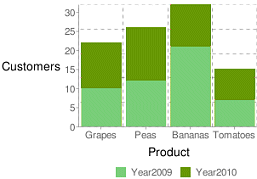 |
|
Natasha
3/15/2018 19:20 | Thank you! |
|
Lola
4/5/2018 21:07 | Hi there, Does this latest version include an update for the new Google chart API? If not, do you know when this will become available? Thanks! |
|
Juerg
4/6/2018 19:45 | Lola,
a pre-release version is already available.
Please download it from
SP 2010: www.amrein.com/download/AEChartWebpart.zip
SP 2013: www.amrein.com/download/AEChartWebpart2013.zip
SP 2016: www.amrein.com/download/AEChartWebpart2016.zip
Please also note that the new version will need to be licensed (at US$ 150/per WFE server).
|
|
JohnF
4/24/2018 01:28 | Excellent product first of all.
I seem to be struggling with drilling down.
I have 3 search filters, if I select an item from a filter the rest of the filters stay populated with the original listings (even if that is no longer valid based on the first selection)
However, the drill down seems to work properly when the webpart is in edit mode with the webpart properties displayed.
Is this a bug? |
|
Juerg
4/24/2018 14:36 | John,
to make the filter dropdowns cascaded, please add the below to the web part�s �Options� setting:
cascadedfilters=2 |
|
Bob
5/14/2018 16:27 | Hello,
Is there an update on the o365 version? -Thank you |
|
Juerg
5/14/2018 19:47 | Bob,
not yet (the Office 365 version is scheduled for August 2018). |
|
Stefan Breedveld
5/28/2018 15:24 | I am having a weird issue with the data in the X/Y axis not sorting correctly. For example, I have a survey list with the column (option set) year:
Year
2014
2015
2016
2017
2018
When I set my Label List Column Name to "count:Year" the chart is generated but the Years on the Y axis are in random order (2017, 2014, 2015, 2016, 2018). Is there a way to control the sort? |
|
Juerg
5/28/2018 15:35 | Stefan,
please make sure to sort your list view by �Year�.
If you did not enter a list view name into the web part�s �View Name�, please do so. |
|
Asad
5/31/2018 20:22 | Is there anyone who can assist me with my question about using sharepoint list columns as a category with summed data? https://sharepoint.stackexchange.com/questions/242675/use-columns-as-x-axis-in-google-chart-for-sp2010 |
|
Juerg
6/1/2018 18:59 | Asad,
please configure the web part as follows:
Data List Column Name:
Department 1, Department 2, Department 3,etc.
Label List Column Name:
sum
Chart Type:
VerticalBar
Chart Color:
ff0000,ffcc00,66cc99,etc.
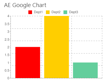 |
|
Asad K.
6/22/2018 19:16 | Is there a way to exclude data columns where the sum = 0? So they don't take up space in the chart? |
|
Juerg
6/25/2018 16:16 | Asad,
are you using the �sum:� or the �count:� aggregator in the web part�s �Label List Column Name� setting ? |
|
Asad K
6/25/2018 16:18 | I am using "sum". |
|
Juerg
6/26/2018 11:30 | Asad,
suppressing empty series (when using the �sum� aggregator) is currently not possible. |
|
Asad K
6/26/2018 15:12 | If i use "Count", am i still able to accomplish the same thing as "sum"? Does "Count" allow you to suppress empty series? |
|
Juerg
6/26/2018 18:26 | Asad,
actually not.
Both aggregators do currently not support suppressing empty data series. |
|
Marc
7/19/2018 16:24 | Is there an option to remove the gridlines and vertical axis labels on a vertical barchart? |
|
Marc
7/19/2018 17:44 | me again, found a way to hide the y axis labels by specifying the following :-
&chxt;=x
Which means show only the x axis, I do still see a vertical dashed line but I'll report back if i find a way to hide this too
Regarding gridlines couldn't find a way to hide them but I've found a hack to set them beyond the values used in my chart
&chg;=500,500 |
|
Asad
7/30/2018 19:50 | I'm stuck again! I want to create a pie chart to show the progress of something. My "100%" is a number, 2500 and I have a list that has one item in it that holds a number that will change. If my list says there are 32 items complete, i want the pie chart to show 32/2500. How can i do this? Is a pie chart not the best way? |
|
Juerg
7/30/2018 20:42 | Asad,
the Chart web part is not able to display a single value as a percentage.
For this you would need to use our KPI web part (see /apps/page.asp?Q=5843) which can be configured to display a single value as a percentage:
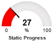 |
|
Bob
8/13/2018 17:33 | Hi there, is the O365 version still scheduled to be released this month? |
|
Juerg
8/15/2018 19:34 | Bob,
unfortunately not. The release has been shifted to the end of this year. |
|
Jason
8/28/2018 16:38 | Is there a way to have a ComboBarLine chart using 3 series? I would like to have the series 2 as a bar and series 2 and 3 as lines. The closest I can come is using the extra chart parameters using "&chd;=s3:1XQbnf4,EWoQMUB,9halxp9" but that doesn't really work |
|
Juerg
8/28/2018 19:07 | Jason,
the free Google Chart web part only supports 2 data series when using the �Combined Bar/Line� chart option.
However, you might consider our new �Chart� web part which does support this option:
You can download it from
SP 2010:
www.amrein.com/download/AEChartWebpart.zip
SP 2013:
www.amrein.com/download/AEChartWebpart2013.zip
SP 2016:
www.amrein.com/download/AEChartWebpart2016.zip
Please also note that the new version will need to be licensed (at US$ 150/per WFE server). |
|
Paul
10/24/2018 17:26 | I am trying to deploy the SP2016 version of the chart WP using install.bat and keep getting a message that the AEGoogleChartWebpart.wsp can't be found. All files were extracted to the same file location D:\Installs\Features\AEGoogleChartWebpart2016. Any advice please? Thanks |
|
Juerg
10/24/2018 18:54 | Paul,
please open a CMD prompt on the WFE server (using the "Run as Administrator" option) and then change the directory to the folder that contains the extracted files and then enter "install2016" to deploy the solution. |
|
Bob
1/3/2019 18:43 | Hi there, any update or timeline on a charting tool for O365? |
|
Juerg
1/4/2019 10:34 | Bob,
Microsoft just improved their "Quick Chart" web part for Office 365 which now also can get data from a Sharepoint list. |
|
Jacob
2/14/2019 19:21 | Is there a way to force the horizontal axis labels to display vertically? I have tried entering hAxis.slantedText=true and hAxis.slantedTextAngle=90 various ways in both the "Extra Google Chart Parameters" and "Options" properties but haven't been able to make it work. I am using the stacked vertical bar chart on SharePoint 2013 if that matters. |
|
Juerg
2/15/2019 10:49 | Jacob,
the free Google Chart web part does not support slanted axis labels.
However, we also have the �AE Chart� web part which is based on the Google Visualization Charts and lets you slant the labels.
You thus might consider to download the �AE Chart� web part from
SP 2010:
http://www.amrein.com/download/AEChartWebpart.zip
SP 2013:
http://www.amrein.com/download/AEChartWebpart2013.zip
SP 2016:
http://www.amrein.com/download/AEChartWebpart2016.zip |
|
Sonia Woolf
4/9/2019 19:50 | Is there a version that can be installed locally on a site collection? |
|
Juerg
4/10/2019 11:28 | Sonia,
yes, please download the
Google Chart Web Part
sandboxed Solution (on premise only)
extract the WSP file, upload it to your site collection�s �Solution gallery� and then activate the solution. |
|
sivaprakash
4/12/2019 07:27 | Do we have this chart webpart for office365 now? |
|
Juerg
4/12/2019 13:14 | sivaprakash,
no, we decided to not publish an Office 365 version since Microsoft now has the out-of-the-box "Quick Chart" web part. |
|
Sonia Woolf
4/30/2019 02:37 | First, thank you this has saved me!! I want to do a pie chart by status but I want to group the statuses - is that possible? |
|
Juerg
4/30/2019 14:09 | Sonia,
to display the number of statuses grouped by status please enter the below into the web part�s �Label List Column Name� setting:
count:Status:(x) |
|
Asif
5/6/2019 21:46 | Hi, I am using this webpart in SP2013. its working fine, I have one issue, I have a search Filter which is text field, called project No. it someone enter a project Number let say 123 in one item and in other item the project number is 123^ (^=white space), the filter treat it as two different values. while sharepoint's list filter treat it as same value, can you please update your webpart accordingly or if there is any setting I can set to avoid it. Thanks. |
|
Juerg
5/9/2019 16:53 | Asif,
what we can do is to add the new �begins with..� search behavior (as opposed to an exact match).
However, this would then select all project numbers that say start with �123�.
Would this behavior be OK in your use case ? |
|
Sonia Woolf
8/5/2019 16:09 | Is there a way to do a stacked bar with views based on a particular status in a dropdown column? Basically it would be ONE bar separated by colors on the 4 available statuses. Thanks. |
|
Juerg
8/5/2019 18:26 | Sonia,
yes, please create 4 new calculated columns as illustrated below:
=IF(Status="Closed",1,0)
plus 3 similar columns for the other 3 status values.
Please then also create another calculated column (name it, say "Series") which will be needed for the grouping in the Label List Column Name setting and has the below formula:
="DontCare"
(it does not matter which text you assign to that column)
Label List Column Name:
gsum:Series
Please then put the 4 new columns into the web part's "Data List Column Name" setting, separaterd by commas:
Closed,Closing,Keep,Open
Finally suppress the "DontCare" series name by adding the below to the web part's "Extra Google Chart Parameters" setting:
&chxl;=0:|
This should produce a vertical stacked bar chart. |
|
shah
9/3/2019 16:48 | Hi
Why there is "image-charts.com" label on all charts?
Pie is always displayed as 2D even though 3D is selected in the settings? |
|
Juerg
9/3/2019 16:57 | shah,
please note that the free "image-charts.com" API displays a watermark.
However, since Google still has not yet terminated its "Image Chart" support, you might want to use the Google API by adding the below into the web part's "Options" setting:
provider=https://chart.googleapis.com |
|
Alex M
10/22/2019 00:08 | Hi there, does it still work on Sharepoint Online as of today? If so, what version should I download? Thks in advance, |
|
Juerg
10/22/2019 10:19 | Alex,
the web part currently unfortunately does not support Office 365 / Sharepoint Online. |
|
Jasmin
12/3/2020 12:34 | Hi Juerg,
I am currently using the Chart Webpart to display the number of tasks with a specific status. The requirement would be to also show Overdue tasks - is there a way to calculate if a task is overdue in the webpart? (Using a workflow to update the check/update the status is not possible in my scenario.) |
|
Juerg
12/3/2020 15:44 | Jasmin,
yes, by creating a list view using the below view filter expression:
Due Date is less than [Today]
You then enter the list view name into the web part's "View Name" setting. |
|
miguel
2/4/2022 17:48 | Hi. Is there a code for this web part? I am also making one, and i am having trouble using properties from the property pane. The chart disappears as soon as I update one of the properties, and I can't understand why. |
|
miguel
2/4/2022 18:01 | can one have access to source code? |
|
Juerg
2/4/2022 18:13 | Miguel,
we usually do not make the source code for our web parts available to customers.
Also please note that the old Google Chart API has been deprecated quite some time ago (although it is still working), so we recommend that you rather use the "Google Visualization API" to create your web part. |
|
Scott
5/6/2022 14:14 | Been trying to add X,Y axis labels with Regions; Entries
I keep getting error
"Simple axis (chxt=x,y) are free forever. Multiple axis feature (chxt=x,x,y,t,t,r,r) is only available for [Enterprise + subscriptions] |
|
Juerg
5/9/2022 14:16 | Scott,
please switch to the Google Chart API by addnig the below to the web part's "Options" setting:
provider=https://chart.googleapis.com |
|
Scott T
5/12/2022 15:44 | My Date (datatype) named CreatedDate is date only and set to standard date.
I am attempting to add DateCreated to the Data List Column Name but continuously get Data column error: CreatedDate (Input string was not in a correct format.)
I have version 2.0.1 |
|
Juerg
5/31/2022 16:43 | Scott,
your "Date List Column Name" needds to point to a numeric column (as opposed to a date or a text column). |
|
Scott
5/31/2022 18:31 | What is used to separate multiple options? |
|
Juerg
6/1/2022 11:44 | Scott,
please use the "|" pipe character to separate multiple options in the web part's "Options" setting. |


 Both the web parts we have purchased are simple to install & use and work well. Customer support is excellent! Thank-you


 Web Part Installation Instructions
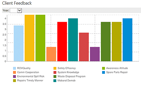
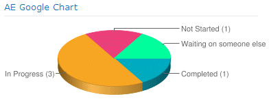
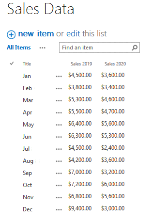
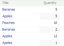
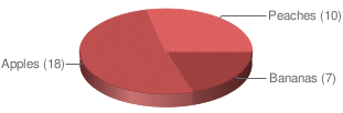
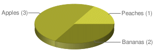
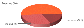
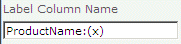

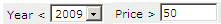
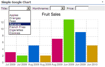
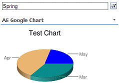
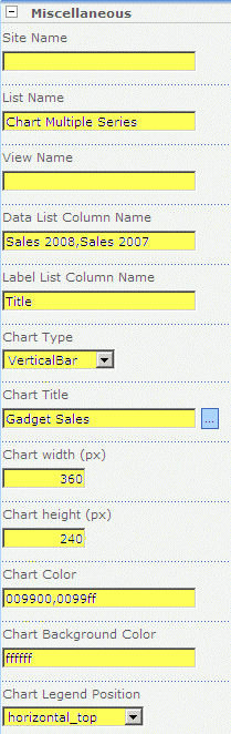
 Post a Comment